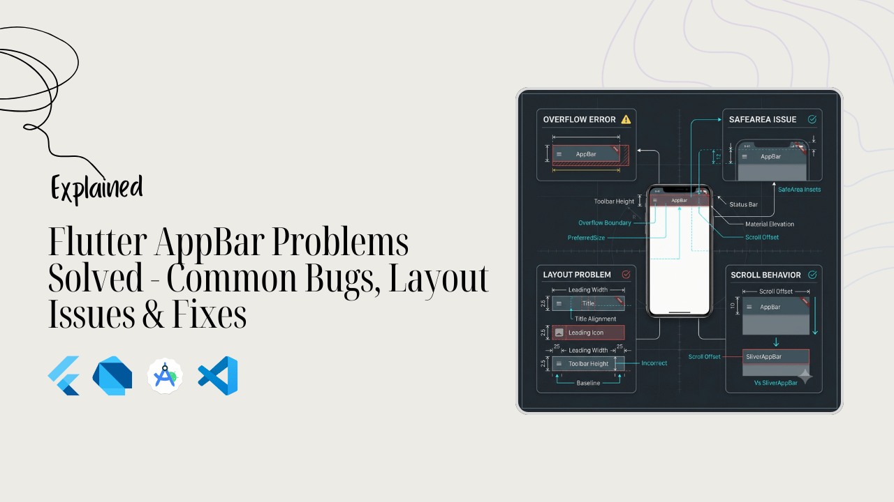
Hey everyone! If you’ve been building apps with Flutter for more than five minutes, you already know the AppBar is a massive piece of real estate.
It’s the first thing your users see. It holds your branding, your navigation, and your primary actions. But let’s be real: sometimes the AppBar just refuses to cooperate.
You change the background color, and absolutely nothing happens. You try to center the title, and it stays stubbornly glued to the left.
Or worse, your beautiful header layout suddenly gets sliced in half by the device’s camera notch, throwing a massive wrench into your clean UI design.
If you are stuck in a frustrating debugging loop right now, breathe. You are definitely not alone. Every single Flutter developer has been right where you are.
In this guide, we are going to walk through the most common Flutter AppBar bugs, layout issues, and theme conflicts.
We will look at exactly why they happen and how to fix them with clean, practical code. Let’s get your layout looking pixel-perfect.
Build Your First Real Flutter App
Learn how Flutter works by creating a complete Android app from scratch. No prior Flutter experience required.
Why Your AppBar Color Isn’t Changing
You open your code, set backgroundColor: Colors.red, hit hot reload, and… nothing happens. The background stays stubbornly gray or blue. It is incredibly frustrating, but there is usually a very simple reason behind it.
Most of the time, this issue comes down to Theme Conflicts or Material 3 defaults.
In modern Flutter, the global app theme often overrides local parameters. If your ThemeData has an active appBarTheme or a specific colorScheme set up, those global styles will aggressively fight your local code.
Another massive culprit is how Material 3 handles surfaces. Under Material 3, the AppBar changes color dynamically based on its elevation or whether a scroll view is moving underneath it.
If you want a solid, unshakeable background color, you have to explicitly tell Flutter to stop modifying it.
Here is the quick fix to override the theme and force your custom color:
appBar: AppBar(
  // Force a solid background color locally
  backgroundColor: Colors.red,

  // Set surfaceTintColor to transparent to stop Material 3
  // from tinting the color based on elevation or scrolling
  surfaceTintColor: Colors.transparent,
  title: const Text('Fixed Color AppBar'),
),
Code language: Dart (dart)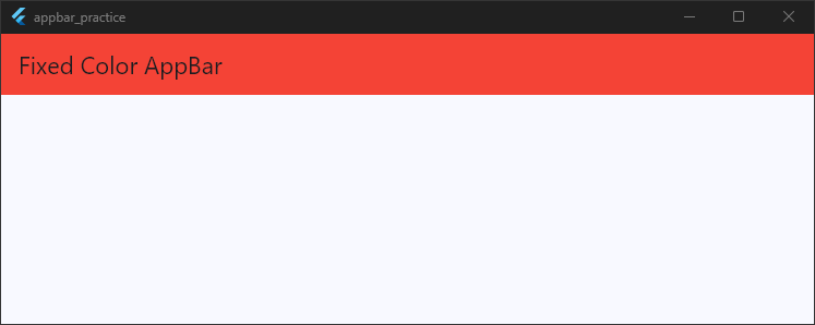
If you find yourself fixing this on every single screen, stop using local fixes. Instead, fix it globally inside your main.dart file so your entire app stays consistent:
theme: ThemeData(
  useMaterial3: true,
  appBarTheme: const AppBarTheme(
    backgroundColor: Colors.red,
    surfaceTintColor: Colors.transparent,
  ),
),
Code language: Dart (dart)
Fixing it in the theme saves you from writing repetitive code across your project.
Fixing AppBar Elevation and Shadow Issues
You want a crisp, distinct shadow underneath your header to separate it from the content below. You type elevation: 4.0, save, and… flat white. No shadow. The layout completely refuses to show that subtle depth.
This happens because Material 3 changed how elevation works.
In older versions of Flutter (Material 2), elevation automatically threw a physical drop shadow. In modern Material 3 design, elevation is communicated through surface tinting color shifts instead of deep shadows.
The background color shifts slightly darker or lighter as the widget gets “higher,” but it remains completely flat.
If you want that classic drop shadow back, you need to configure two specific properties alongside your elevation: scrolledUnderElevation and shadowColor.
Here is how to bring back a beautiful, dependable drop shadow:
appBar: AppBar(
  title: const Text('Fixed Elevation'),
  // Set your desired elevation height
  elevation: 4.0,

  // MATCH THIS: Keeps the shadow look uniform when scrolling starts
  scrolledUnderElevation: 4.0,

  // FORCE SHADOW COLOR: Material 3 defaults this to transparent or a subtle tint
  shadowColor: Colors.black.withValues(alpha: 0.5),
),
Code language: Dart (dart)
By matching the scrolledUnderElevation to your standard elevation and giving it an explicit shadowColor, you force the engine to draw a clear physical shadow that stays put.
Why Your AppBar Back Button Isn’t Showing
You push a new screen onto your navigation stack, expecting Flutter to automatically handle the navigation UI. But when the new screen loads, the back arrow is completely missing.
Your users are trapped on the page with no intuitive way to return home.
This usually happens for one of three reasons:
- Wrong Navigation Method: You used a replacement route instead of a push route.
- Scaffold Nesting Issues: The widget tree isn’t structured to read the current
Navigatorcontext correctly. - Explicitly Disabled Leading Widget: The theme or local parameters are hiding it.
Let’s look at a full, working example that breaks down the wrong way versus the right way to build this layout.
import 'package:flutter/material.dart';

void main() {
  runApp(const MyApp());
}

class MyApp extends StatelessWidget {
  const MyApp({super.key});

  @override
  Widget build(BuildContext context) {
    return MaterialApp(
      title: 'AppBar Practice',
      debugShowCheckedModeBanner: false,
      theme: ThemeData(
        useMaterial3: true,
        appBarTheme: const AppBarTheme(
          backgroundColor: Colors.red,
          surfaceTintColor: Colors.transparent,
        ),
      ),
      home: const HomeScreen(),
    );
  }
}

class HomeScreen extends StatefulWidget {
  const HomeScreen({super.key});

  @override
  State<HomeScreen> createState() => _HomeScreenState();
}

class _HomeScreenState extends State<HomeScreen> {
  @override
  Widget build(BuildContext context) {
    return Scaffold(
      appBar: AppBar(title: const Text('Home Screen')),
      body: Center(
        child: ElevatedButton(
          onPressed: () {
            // FIX #1: Use push() so a back route exists in the navigation stack.
            // DO NOT use pushReplacement() if you want a back button!
            Navigator.push(
              context,
              MaterialPageRoute(builder: (context) => const DetailScreen()),
            );
          },
          child: const Text('Go to Details'),
        ),
      ),
    );
  }
}

// --- DETAIL SCREEN ---
class DetailScreen extends StatelessWidget {
  const DetailScreen({super.key});

  @override
  Widget build(BuildContext context) {
    return Scaffold(
      appBar: AppBar(
        title: const Text('Detail Screen'),

        // FIX #2: Ensure automaticallyImplyLeading is true (this is the default).
        // If this is set to false, Flutter will never generate the back button automatically.
        automaticallyImplyLeading: true,

        // FIX #3: If the arrow STILL isn't showing, or you want to force a custom look,
        // manually provide a BackButton widget in the leading slot.
        leading: const BackButton(
          color: Colors.black, // Ensure contrast against background
        ),
      ),
      body: const Center(child: Text('You made it to the details page!')),
    );
  }
}
Code language: Dart (dart)
The Quick Checklist to Fix It:
- Check your routing logic: If you navigate using
Navigator.pushReplacement(), the previous screen is erased from memory. There is no route to go back to, so Flutter hides the arrow. Stick toNavigator.push(). - Look at
automaticallyImplyLeading: If a teammate accidentally set this tofalseinside a shared layout component or global theme, the automatic arrow disappears completely. - Verify context structure: Make sure your
Scaffoldsits cleanly inside a widget tree wrapped by aMaterialApp. If your structure is broken, look at our Flutter Scaffold Common Errors guide to get your structural context aligned correctly.
Why Your AppBar Isn’t Appearing Inside the Scaffold
You created your AppBar widget, styled it beautifully, but when you run your app, the top of the screen is completely empty.
The header area is just an empty void, or worse, your body content crashes straight into the very top edge of the device screen.
When an AppBar refuses to show up, the culprit is almost always incorrect nesting inside the Scaffold or wrapping it in an incompatible layout widget.
The Scaffold widget is designed with highly specific, dedicated slots. It expects the AppBar to be passed directly into its appBar property—not stuffed inside the body or wrapped in generic layouts like a Container, Column, or Padding.
If you wrap it in a container without defining constraints, the layout engine gets confused, shrinks its dimensions to zero, and it vanishes entirely.
Let’s look at a full example showing exactly how this layout breaks, and the clean way to fix it.
body: Column(
  children: [
    // BUG: Wrapping AppBar in a Column or Container causes layout collapse
    // or breaks standard structural positioning entirely!
    AppBar(title: const Text('Broken Layout')),
    const Expanded(child: Center(child: Text('Content Area'))),
  ],
),
Code language: Dart (dart)
return Scaffold(
  // FIX: Always pass the AppBar directly into the dedicated appBar property.
  appBar: AppBar(
    title: const Text('Perfectly Visible AppBar'),
    backgroundColor: Colors.blueGrey[50],
  ),
  body: const Center(
    child: Text('Your body content sits safely below the header now.'),
  ),
);
Code language: Dart (dart)
The Rules for Scaffold Layout Success:
- Use the dedicated parameter: The
Scaffoldwidget relies on its uniqueappBarslot to calculate spacing automatically. This ensures your body content doesn’t bleed into the status bar area. - Avoid layout wrappers: Do not put an
AppBarinside aContainerjust to add padding or margins. If you want a custom-sized header that supports complex sizing wrappers, you must use thePreferredSizewidget instead, or implement aSliverAppBar.
If your screen is throwing layout crashes or rendering unexpected blank sections, your widget tree structure might be experiencing wider architectural issues.
How to Fix an AppBar Title That Won’t Center
You want your title text centered perfectly in the middle of your header. You save your changes, check the screen, and it is stuck over on the left side.
Or worse, it looks perfect on iOS but shifts completely to the left whenever you test it on an Android device.
This happens because Flutter respects the design guidelines of the platform your app is running on.
By default, Material Design (Android) aligns header titles to the left side to leave roomy space for actions. Apple’s Cupertino design (iOS) centers the title by default.
If you do not explicitly declare your alignment intention, Flutter dynamically moves your text based on the user’s operating system.
To override this automatic platform behavior and lock your title directly in the center on every single device, you must use the centerTitle property.
Here is a clean, complete example showing how to force centering and safely handle long text:
return Scaffold(
  appBar: AppBar(
    // FIX #1: Force the title to stay centered on both Android and iOS
    centerTitle: true,

    title: const Text(
      'Centered Title',
      // FIX #2: Use text properties to handle long titles gracefully
      overflow: TextOverflow.ellipsis,
      maxLines: 1,
    ),
    actions: [
      IconButton(icon: const Icon(Icons.notifications), onPressed: () {}),
    ],
  ),
  body: const Center(
    child: Text('Notice how the title stays perfectly centered!'),
  ),
);
Code language: Dart (dart)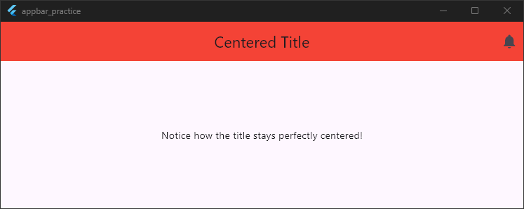
Pro Tips for Alignment Success:
- Always explicitly set
centerTitle: true: Never rely on defaults if you want a uniform look across ecosystems. Adding this single line ensures design consistency for all users. - Watch out for row layouts: Do not wrap your title text widget inside a
Rowwidget trying to center it manually with alignment fields. ARowexpands aggressively across the header, fights the internal layout constraints of theAppBar, and breaks the centering code completely. Keep the title widget simple.
If your title looks right but your trailing action icons are acting up, you might be creeping into layout boundary issues.
How to Fix AppBar Overflow and Clipping Problems
You add a few helpful utility buttons to the right side of your header, or you type out a descriptive, detailed page title.
You hit save, and your screen immediately flashes a glaring black-and-yellow striped construction box. Your UI is broken, your text is clipped, and your action buttons are spilling off the edge of the device screen.
This happens because the AppBar has rigid, finite horizontal space. If your title text is too long, or if you cram too many IconButton widgets into the actions array, Flutter runs out of pixels.
Instead of automatically shrinking the elements to fit, the layout engine throws an actions overflow layout error.
To fix this, you must handle long text gracefully and bundle excess action items into a clean overflow popup menu.
Let’s look at a full, practical layout example that fixes text clipping and handles multiple action buttons flawlessly:
return Scaffold(
  appBar: AppBar(
    // FIX #1: Guard long titles against clipping by setting overflow and maxLines
    title: const Text(
      'Super Long Workspace Title That Would Usually Overflow The Screen',
      style: TextStyle(fontSize: 18),
      overflow: TextOverflow.ellipsis,
      maxLines: 1,
    ),

    // FIX #2: Keep primary actions minimal, bundle the rest in a PopupMenuButton
    actions: [
      IconButton(icon: const Icon(Icons.search), onPressed: () {}),
      PopupMenuButton<String>(
        onSelected: (value) {},
        itemBuilder: (BuildContext context) {
          return [
            const PopupMenuItem(value: 'settings', child: Text('Settings')),
            const PopupMenuItem(
              value: 'profile',
              child: Text('View Profile'),
            ),
            const PopupMenuItem(value: 'logout', child: Text('Logout')),
          ];
        },
      ),
    ],
  ),
  body: const Center(
    child: Text('No yellow lines here! Everything fits beautifully.'),
  ),
);
Code language: Dart (dart)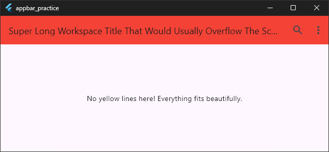
Fast Fixes to Remember:
- Truncate your text: Always wrap long title strings in a
Textwidget configured withoverflow: TextOverflow.ellipsis. This cleanly cuts off text with three dots (...) instead of breaking the box constraints. - Consolidate your actions: Limit your top-level header buttons to a maximum of two items. If you need more utility options, use a
PopupMenuButtonto store them safely inside a drop-down menu. - Remove tight padding constraints: If you are trying to squeeze elements into the header manually, avoid wrapping action items in heavy
Paddingor customContainersizing blocks. Let the default structure handle spacing.
Dealing with yellow box errors across other sections of your app? Take a look at our Flutter Layout Overflow Fixes guide to master responsive layout sizing and keep your user interfaces completely pixel-perfect.
Fixing Scroll Color Glitches on Your AppBar
You spend time setting a perfect, crisp background color for your header. Everything looks beautiful when the app opens.
But the second you start scrolling down a list, the AppBar suddenly morphs into an entirely different shade of gray or purple. Stop scrolling, and it stays changed.
This unexpected shifting behavior is one of the most common complaints developers have after moving to Material 3.
It happens because of a dynamic feature called scrolled under coloration. By default, Material 3 wants to visually signal depth.
When scrollable content (like a ListView or SingleChildScrollView) passes underneath the header, the AppBar automatically blends a dynamic tint color onto its background.
If you want a solid, unshakeable layout background that keeps its exact color no matter where the user scrolls, you need to turn off this automatic tinting behavior.
Here is a full, working layout showing exactly how to lock down your colors:
theme: ThemeData(
  useMaterial3: true,
  appBarTheme: const AppBarTheme(
    backgroundColor: Colors.white,
    // FIX #1: Stop Material 3 from blending colors on scroll
    scrolledUnderElevation: 0.0,
    surfaceTintColor: Colors.transparent,
  ),
),
Code language: Dart (dart)
return Scaffold(
appBar: AppBar(
title: const Text('Locked Color Header'),
// Local override example:
backgroundColor: Colors.white,
// FIX #2: Keep local elevation flat when content passes underneath
scrolledUnderElevation: 0.0,
surfaceTintColor: Colors.transparent,
),
body: ListView.builder(
itemCount: 30,
itemBuilder: (context, index) {
return ListTile(title: Text('Scroll Item $index'));
},
),
);
Code language: Dart (dart)
The Recipe to Prevent Shifting Colors:
- Set
scrolledUnderElevationto0.0: This tells the engine not to recalculate depth values or apply elevation effects when elements pass underneath the header zone. - Clear the
surfaceTintColor: Setting this parameter toColors.transparentensures that no secondary accent shades are dynamically painted over your base layout colors.
If you are fighting other erratic color or design shifts across your screens, your global style settings might be competing with each other.
How to Fix Status Bar Overlap Problems
You launch your app on a real device, and your heart sinks. The top status bar—complete with the clock, battery percentage, and cellular signals—is sitting directly on top of your app bar title.
Or even worse, the device’s physical camera notch is slicing right through your action buttons, making them impossible to tap.
This layout disaster happens when the AppBar does not know where the operating system’s UI boundaries end and where your app’s interactable space begins.
By default, a standard AppBar passed into the appBar slot of a Scaffold automatically calculates the necessary top padding to clear the status bar.
However, if you are building a custom header, using an advanced layout like Stack, or wrapping your structural elements incorrectly, you break that automatic calculation. The system graphics will crash straight into your interface elements.
Let’s look at a full example showing how to cleanly isolate your header from system icons using the SafeArea widget and built-in layout properties:
return Scaffold(
  // FIX #1: Keep AppBar in the dedicated slot so it auto-pads the status bar
  appBar: AppBar(
    title: const Text('Safe System Layout'),
    backgroundColor: Colors.blueGrey[50],
  ),

  // FIX #2: If you are building a custom top layout inside the body,
  // ALWAYS wrap that content inside a SafeArea widget.
  body: SafeArea(
    top: true, // Guarantees content stays clear of notches and status bars
    child: Column(
      children: const [
        Padding(
          padding: EdgeInsets.all(16.0),
          child: Text('Your interface elements are fully protected here.'),
        ),
      ],
    ),
  ),
);
Code language: Dart (dart)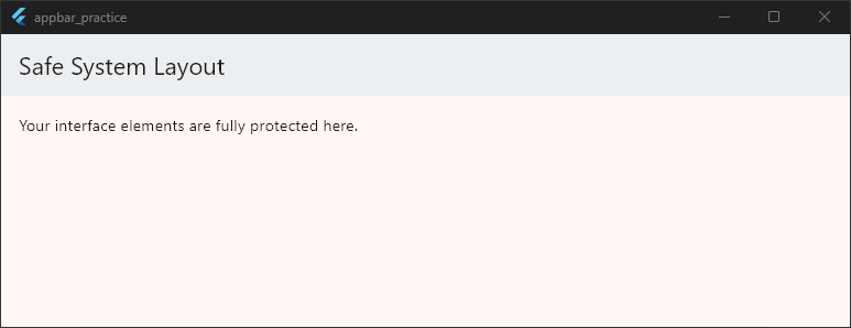
Quick Checklist to Avoid Overlap Bugs:
- Don’t pull the AppBar into the body: Keep the
AppBarinside theappBarparameter of theScaffold. If you pull it into thebodycolumn, it loses its built-in padding context and slips directly under the status bar. - Deploy the
SafeAreawidget: If you choose not to use a standardAppBarbecause you are designing a fully custom header layout, wrap your topmost body widgets in aSafeArea. This widget queries the device settings and automatically injects the exact padding needed to clear notches, pinholes, and system text. - Check system overlay styles: If your text matches the color of the status bar exactly, it will look like an overlap error because the icons disappear. Use
SystemChrome.setSystemUIOverlayStyleto toggle between light and dark system icon profiles.
Resolving AppBar Theme Conflicts
You write custom layout styles for your top bar, but the second you open a new page, the design defaults right back to an old style.
Or maybe you change your app’s primary theme color, and your header remains locked in an entirely different palette.
This happens because Flutter looks at a strict hierarchy when rendering colors and typography.
Local widgets are designed to inherit styles from the global ThemeData of your app. If your project has a highly opinionated global theme, it will constantly fight and override your individual AppBar choices.
The secret to winning this layout battle is understanding the styling hierarchy: Local widget properties beat global AppBarTheme properties, which beat generic ColorScheme colors.
Let’s look at a comprehensive example that shows how to configure your themes globally so you never have to write repetitive local overrides again:
return MaterialApp(
  // FIX #1: Define a unified global style instead of overriding every screen
  theme: ThemeData(
    useMaterial3: true,

    // Setup your base application palette
    colorScheme: ColorScheme.fromSeed(
      seedColor: Colors.deepPurple,
      primary: Colors.deepPurple,
    ),

    // Specify dedicated header rules that override general colorScheme rules
    appBarTheme: const AppBarTheme(
      backgroundColor: Colors.deepPurple,
      foregroundColor: Colors.white,
      // Colors title and icons globally
      elevation: 0,
      centerTitle: true,
    ),
  ),
  home: const HomeScreen(),
);
Code language: Dart (dart)
return Scaffold(
appBar: AppBar(
title: const Text('Clean Theme App'),
// FIX #2: Only use local properties for deliberate design exceptions
// backgroundColor: Colors.amber, // This would override the global theme cleanly
),
body: const Center(
child: Text('This screen cleanly inherits the uniform global theme.'),
),
);
Code language: Dart (dart)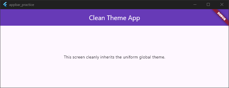
Tips to Eliminate Theme Battles:
- Target the right theme parameter: Do not just rely on
primaryColororaccentColorinside yourThemeDatablock. Modern Flutter layouts rely heavily on the structuredcolorSchemeobject and the explicitappBarThemeconfiguration. - Use
foregroundColorfor icons and text: Instead of styling your title text color and your icon colors separately inside your code, setforegroundColorin your theme. It automatically applies that unified shade to the title text, back arrows, and trailing actions. - Audit third-party packages: If you use external routing or UI packages, they might inject their own base themes into the tree. Always make sure your custom
ThemeDatasits at the very root of yourMaterialApp.
Taming Material 3 Migration Issues
If you recently updated Flutter or toggled useMaterial3: true in your theme, you likely noticed your AppBar instantly transformed.
The classic drop shadow vanished, the background color turned a strange shade of gray, and the layout height grew noticeably taller.
Material 3 is the modern design standard for Flutter. While it brings sleek updates, migrating an existing project can completely break your carefully crafted layout consistency.
The three biggest pain points during a Material 3 migration are:
- Increased Default Height: The standard
AppBarheight increased from 56 pixels to 64 pixels to give elements more breathing room. - Missing Component Shadows: Drop shadows are completely turned off by default.
- Dynamic Tint Layers: The background shifts colors based on elevation and scrolling.
If your existing layout design requires the classic, predictable look, you can explicitly configure your new theme to match your old UI specifications.
Let’s look at a complete example showing how to normalize these Material 3 changes:
theme: ThemeData(
  useMaterial3: true, // Keep the modern engine active
  // FIX: Reconfigure the global theme to restore classic design patterns
  appBarTheme: AppBarTheme(
    backgroundColor: Colors.blue,
    foregroundColor: Colors.white,

    // 1. RESTORE HEIGHT: Force the classic 56px height if 64px breaks your layout
    toolbarHeight: 56.0,

    // 2. RESTORE SHADOWS: Bring back the physical drop shadow
    elevation: 4.0,
    shadowColor: Colors.black.withValues(alpha: 0.5),

    // 3. LOCK COLORS: Stop dynamic tint shifting when content scrolls
    scrolledUnderElevation: 0.0,
    surfaceTintColor: Colors.transparent,
  ),
),
home: const HomeScreen(),
Code language: Dart (dart)
class _HomeScreenState extends State<HomeScreen> {
@override
Widget build(BuildContext context) {
return const Scaffold(
appBar: PreferredSize(
// Ensure the preferred size container matches your custom toolbar height
preferredSize: Size.fromHeight(56.0),
child: CustomAppBar(),
),
body: Center(
child: Text(
'Classic look restored safely under the Material 3 engine!',
),
),
);
}
}
Code language: Dart (dart)class CustomAppBar extends StatelessWidget {
const CustomAppBar({super.key});
@override
Widget build(BuildContext context) {
return AppBar(title: const Text('Normalized Header'));
}
}
Code language: Dart (dart)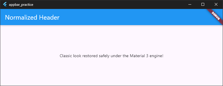
Quick Migration Fixes:
- Fixing Component Heights: If the taller 64-pixel header layout pushes your body content down too far, use the
toolbarHeightproperty inside your globalAppBarThemeto lock it back to 56 pixels. - Removing Dynamic Tint Layers: If you want your exact background color to stay consistent, always set
surfaceTintColor: Colors.transparentandscrolledUnderElevation: 0.0. - Restoring Physical Shadows: Material 3 requires an explicit
shadowColorto render physical elevation depth. Without it, your elevation changes will remain completely invisible.
Wrapping It Up
Debugging layout issues doesn’t have to be a guessing game.
By mastering how the AppBar interacts with context spacing, theme hierarchies, and modern Material 3 specifications, you can easily build robust, beautiful user interfaces that scale across any device.
Take a look at your current code, implement these centralizing theme configurations, and save yourself from repetitive local debugging loops. Happy coding!
Start Learning Flutter the Right Way
You’ve finished this guide. If you’d like to keep learning, start with the free class or jump straight into the complete Foundation Course.