
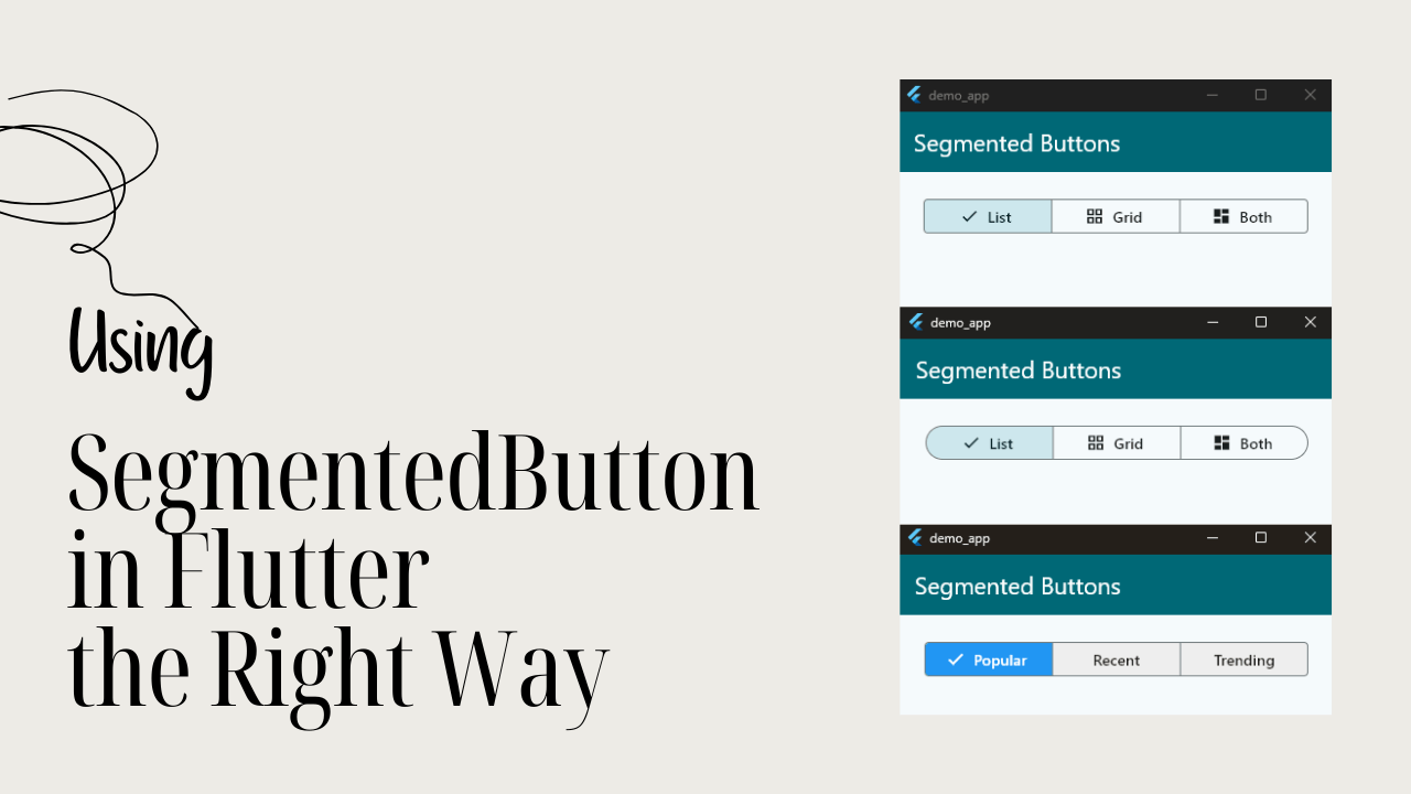
Segmented buttons help users make quick choices. They sit right in front of the user. No menus. No extra taps. Just clarity.
In Flutter apps, this pattern is everywhere. Theme switches. Filters. View toggles. Small decisions that need fast answers.
Why developers use segmented buttons
- They reduce friction
- They show all options at once
- They feel modern and familiar
- They work great on mobile screens
- They keep users focused
Segmented buttons are not flashy. But they are powerful. When used correctly, they make your app feel faster, cleaner, and more intentional.
What is a Segmented Button
A segmented button is a UI control made up of multiple connected buttons. Each segment represents a clear option. When a user taps one segment, the state updates instantly.

Instead of hiding choices inside a menu, segmented buttons show everything upfront.
Key characteristics of segmented buttons
- Arranged in a single horizontal row
- Each segment acts like a button
- One or more segments can be selected
- Selection is visually highlighted
- Designed for quick, simple decisions
Segmented buttons are best for small option sets. Usually between two and five choices. They help users decide faster, with less thinking and fewer taps.
🚀 Ready to Build Your First Flutter App?
Learning widgets is just the beginning. Join my free Flutter class and build your first Flutter app while discovering how these widgets work together in a real project.
When to Use Segmented Buttons
Segmented buttons work best in very specific situations. Use them when speed and clarity matter more than flexibility. They are ideal when users already understand the options.
Use segmented buttons when
- The number of choices is small
- Options are closely related
- Only one option is active at a time
- Users need to switch often
- Instant feedback is important
Avoid segmented buttons when
- There are too many options
- Labels are long or complex
- Options are rarely changed
- The action triggers heavy navigation
Segmented buttons are about quick decisions. If the choice needs explanation, use a different control.
SegmentedButton in Flutter (Material 3)
Flutter provides a built-in widget called SegmentedButton. It follows Material 3 guidelines. And it looks right at home in modern apps.
This widget is flexible and type-safe. It works with enums, strings, or any custom type.
What makes Flutter’s SegmentedButton special
- Part of Material 3
- Uses generics for strong typing
- Selection is handled with a
Set - Supports single and multiple selection
- Easy to theme and customize
Unlike older toggle patterns, this widget is intentional. It guides you toward better UI and better state management.
If you are building with Material 3, this is the right tool.
Basic Example
Let’s build a simple segmented button step by step. This example switches between List and Grid views. It’s a very common and practical use case.

Step 1: Define the options
Start by defining an enum. Enums make your code safer and easier to read.
enum ViewType {
  list,
  grid,
}
Code language: PHP (php)
Each enum value represents one segment.
Step 2: Create a StatefulWidget
Segmented buttons need state. The UI must react when the selection changes.
class ViewToggle extends StatefulWidget {
  const ViewToggle({super.key});

  @override
  State<ViewToggle> createState() => _ViewToggleState();
}
Code language: JavaScript (javascript)
Step 3: Store the selected value
Flutter’s SegmentedButton uses a Set. Even for single selection.
class _ViewToggleState extends State<ViewToggle> {
  Set<ViewType> selectedView = {ViewType.list};
Code language: JavaScript (javascript)
Here:
Setensures uniqueness- One value = single selection
- Multiple values = multi selection
Step 4: Build the SegmentedButton
Now create the widget.
@override
Widget build(BuildContext context) {
  return SegmentedButton<ViewType>(
    segments: const [
      ButtonSegment(
        value: ViewType.list,
        icon: Icon(Icons.list),
        label: Text('List'),
      ),
      ButtonSegment(
        value: ViewType.grid,
        icon: Icon(Icons.grid_view),
        label: Text('Grid'),
      ),
    ],
    selected: selectedView,
    onSelectionChanged: (Set<ViewType> newSelection) {
      setState(() {
        selectedView = newSelection;
      });
    },
  );
}
Code language: PHP (php)
Let’s break this down.
Step 5: Understand each part
segments Defines the buttons. Each ButtonSegment needs:
- A
value - A
labeloricon(or both)
selected Holds the current selection. This must match the segment values.
onSelectionChanged Triggered when the user taps a segment. It returns a new Set.
You update the state. Flutter redraws the UI.
Step 6: What happens on tap
- User taps a segment
- Flutter updates the selected
Set setStateis called- The selected segment highlights
- The UI stays in sync
No extra logic needed.
Why this approach is good
- Strongly typed
- Predictable state
- Easy to extend
- Matches Material 3 behavior
This is the foundation. Once you understand this, styling and multi-selection become easy.
Single vs Multi Selection
Flutter’s SegmentedButton supports two selection modes. Single selection and multi selection. The difference is subtle, but important. Understanding this early will save you bugs later.
Single Selection
Single selection means only one option can be active at a time. This is the default behavior.
Examples:
- List / Grid
- Light / Dark
- Ascending / Descending
Even here, Flutter still uses a Set. The rule is simple. The Set must contain exactly one value.
Set<ViewType> selectedView = {ViewType.list};Code language: HTML, XML (xml)If the user taps another segment:
- The old value is removed
- The new value is added
Flutter handles this automatically.
SegmentedButton<ViewType>(
  segments: segments,
  selected: selectedView,
  onSelectionChanged: (value) {
    setState(() {
      selectedView = value;
    });
  },
);
Code language: HTML, XML (xml)
You don’t manually toggle values. You trust the widget to manage the selection.
Multi Selection
Multi selection allows more than one segment to be active. This is useful for filters.
Examples:
- Content categories
- Search filters
- Tags or labels
To enable this, set:
final bool multiSelectionEnabled = true;Code language: PHP (php)Then use a Set that can grow or shrink.
Set<String> filters = {'Popular'};Code language: JavaScript (javascript)SegmentedButton<String>(
multiSelectionEnabled: true,
segments: const [
ButtonSegment(value: 'Popular', label: Text('Popular')),
ButtonSegment(value: 'Recent', label: Text('Recent')),
ButtonSegment(value: 'Trending', label: Text('Trending')),
],
selected: filters,
onSelectionChanged: (value) {
setState(() {
filters = value;
});
},
);
Code language: JavaScript (javascript)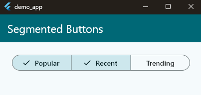
Now:
- Tapping adds or removes values
- Multiple segments can stay active
- State stays predictable
Key Differences at a Glance
- Single selection
- One active option
- Default behavior
- Best for mode switching
- Multi selection
- Multiple active options
- Requires
multiSelectionEnabled - Best for filters
💡 Put Your Knowledge Into Practice
You’ve learned how SegmentedButton works. Now let’s use it in a real Flutter app and explore how widgets come together to create a great user experience.
Common Mistake
Trying to control selection manually.
Don’t do that.
Let the widget own the behavior.
You only react to the new Set.
That’s the Flutter way.
Styling & Customization
The default SegmentedButton looks good out of the box. But real apps need branding. Colors, shapes, spacing, and behavior all matter.
Flutter gives you full control through ButtonStyle.
Styling the Selected and Unselected States
The most common need is changing colors. Selected segments should feel active. Unselected ones should stay subtle.
SegmentedButton<ViewType>(
  style: ButtonStyle(
    backgroundColor: WidgetStateProperty.resolveWith(
      (states) {
        if (states.contains(WidgetState.selected)) {
          return Colors.blue;
        }
        return Colors.grey.shade200;
      },
    ),
    foregroundColor: WidgetStateProperty.resolveWith(
      (states) {
        if (states.contains(WidgetState.selected)) {
          return Colors.white;
        }
        return Colors.black87;
      },
    ),
  ),
  segments: segments,
  selected: selectedView,
  onSelectionChanged: onChanged,
);
Code language: JavaScript (javascript)
Here’s what’s happening:
- Flutter passes the current state
- You check if the segment is selected
- You return the correct color
Adjusting Shape and Border Radius
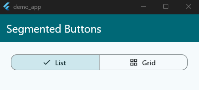
Segmented buttons are connected. But you can still control how rounded they feel.
shape: WidgetStateProperty.all(
  RoundedRectangleBorder(
    borderRadius: BorderRadiusGeometry.circular(12),
  ),
),
Code language: CSS (css)
This works well with modern UI designs.
Controlling Borders and Outlines
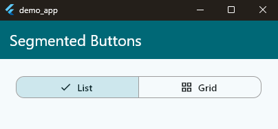
Borders help separate segments visually.
side: WidgetStateProperty.all(
  BorderSide(color: Colors.grey)
),
Code language: CSS (css)
You can:
- Use strong borders for contrast
- Remove borders for a flat look
Icon-Only, Text-Only, or Mixed
Each ButtonSegment is flexible.
ButtonSegment(
  value: ViewType.list,
  icon: Icon(Icons.list),
),
Code language: CSS (css)
ButtonSegment(
value: ViewType.grid,
label: Text('Grid'),
),
Code language: JavaScript (javascript)ButtonSegment(
value: ViewType.both,
icon: Icon(Icons.dashboard),
label: Text('Both'),
),
Code language: JavaScript (javascript)Choose based on clarity, not style alone.
Padding and Density
If the button feels too large or tight, adjust padding.
ButtonSegment(
  value: ViewType.list,
  icon: Icon(Icons.list),
  label: Padding(padding: EdgeInsets.all(12), child: Text('List')),
),
Code language: PHP (php)
This is especially useful for compact layouts.
Theme-Wide Styling (Recommended)
For consistency, style segmented buttons globally.
theme: ThemeData(
  segmentedButtonTheme: SegmentedButtonThemeData(
    style: ButtonStyle(
      shape: WidgetStateProperty.all(
        RoundedRectangleBorder(borderRadius: BorderRadius.circular(4)),
      ),
    ),
  ),
),
Code language: CSS (css)
This keeps your UI consistent across screens.
Disable Interaction When Needed
You can disable a segmented button entirely.
onSelectionChanged: null,Code language: JavaScript (javascript)Flutter will:
- Reduce opacity
- Block taps
- Keep visuals consistent
Styling Tips That Actually Matter
- Keep contrast high for selected states
- Avoid too many colors
- Match your app’s theme
- Test with dark mode
- Prioritize clarity over decoration
Segmented buttons are small controls. But users touch them often. Good styling here improves the whole app experience.
Common Mistakes
Segmented buttons are simple. But a few small mistakes can hurt UX or break state logic. Here are the most common ones to avoid.
Treating Segmented Buttons Like Tabs
Segmented buttons are not tabs. They should not control heavy navigation.
❌ Switching entire screens
❌ Triggering expensive API calls
❌ Replacing TabBar
They are meant for quick, lightweight changes.
Using Too Many Options
Segmented buttons work best with 2–5 options.
More than that:
- Looks crowded
- Becomes hard to scan
- Loses the “quick choice” benefit
If you need more options, use a dropdown.
Ignoring the Set-Based State
This is a big one.
SegmentedButton always uses a Set. Even for single selection.
❌ Trying to store a single value
❌ Manually toggling items
❌ Forcing selection logic
Let Flutter handle it. You just react to changes.
Long or Unclear Labels
Segments should be short and obvious.
❌ “Sort Items by Date Created”
✅ “Recent”
If the label needs explanation, it doesn’t belong here.
Over-Styling the Control
Too many colors.
Too many borders.
Too many effects.
This makes the control harder to understand. Segmented buttons should blend in, not shout.
Forgetting Accessibility
Low contrast hurts usability. Small tap targets frustrate users.
Always:
- Keep text readable
- Maintain sufficient padding
- Test with dark mode
Final Thought
Segmented buttons work best when they stay simple. If you have to explain how to use them, something is wrong.
Clarity first. Always.
🌱 Keep Building with Flutter
Every widget you learn brings you one step closer to building complete Flutter apps. Join my free Flutter class and let’s continue your Flutter journey together.

Comments are closed.