The Flutter container techniques experienced developers use to create smoother, more professional mobile apps.

Have you ever wanted to make a Container clickable, add a smooth animation, or create a beautiful glassmorphism card, only to wonder why Container doesn’t have an onPressed or onTap property?
You’re not alone. Many Flutter beginners search for things like Flutter Container clickable, Flutter Container on tap, or Flutter Container animation, expecting the Container widget to handle interactions by itself.
But Container has a different job. It’s designed to define layout, styling, and decoration, while other widgets add gestures, animations, and visual effects.
The good news is that once you understand how these widgets work together, building interactive Flutter UIs becomes surprisingly simple.
In this guide, you’ll learn how to make a Container respond to taps, when to use GestureDetector or InkWell, how to add ripple effects, create smooth animations with AnimatedContainer, build expandable cards, apply hover and transform effects, and design modern production-ready interfaces.
We’ll also cover common mistakes, performance tips, and real-world patterns used in professional Flutter apps.
By the end of this tutorial, you’ll know how to transform a simple Container into an interactive, polished UI component that feels right at home in a production application.
- The Flutter container techniques experienced developers use to create smoother, more professional mobile apps.
- Making a Container Clickable
- GestureDetector vs InkWell
- Container with InkWell
- Ripple Effects
- AnimatedContainer Explained
- Expand and Collapse Animations
- Hover Effects
- Transform and Rotation Effects
- Responsive Interactive Cards
- Foreground Decoration
- Glass Effects and Advanced UI
- Performance Considerations
- Container Anti-Patterns
- Production UI Examples
Making a Container Clickable
One of the first things Flutter developers try to do is make a Container respond to a tap. You might even look for an onTap, onPressed, or onClick property on the Container.
The problem is…
Container isn’t designed to handle user interactions.
Its job is to control layout, size, padding, margins, colors, borders, and decorations. It doesn’t listen for gestures or touch events.
That’s why this code won’t work:
body: Container(
  onTap: () {
    print('Tapped!');
  },
),
Code language: Dart (dart)
The Container widget simply doesn’t have an onTap property.
Instead, Flutter lets you add interactivity by wrapping the Container with a widget that can detect gestures, such as GestureDetector or InkWell.
For example, you can make a Flutter Container clickable using GestureDetector.
body: GestureDetector(
  onTap: () {
    print('Container tapped!');
  },
  child: Container(
    width: 200,
    height: 100,
    color: Colors.blue,
    alignment: Alignment.center,
    child: const Text('Tap Me', style: TextStyle(color: Colors.white)),
  ),
),
Code language: Dart (dart)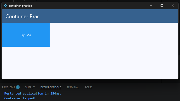
Now, tapping anywhere inside the Container triggers the onTap callback.
This is one of the most common solutions when developers search for:
- Flutter Container click event
- Flutter Container on tap
- Flutter Container onclick
- Flutter make Container clickable
Later in this guide, you’ll also learn about InkWell, which not only detects taps but also adds a beautiful ripple animation that follows Material Design guidelines.
For now, remember this simple rule:
A
Containerdefines how something looks. Widgets likeGestureDetectorandInkWelldefine how it behaves.
GestureDetector vs InkWell
Both GestureDetector and InkWell can detect taps, but they serve different purposes. Choosing the right one depends on the kind of user experience you want to create.
GestureDetector
GestureDetector focuses on detecting gestures. It doesn’t add any visual feedback when the user taps the screen.
body: GestureDetector(
  onTap: () {
    print('Tapped!');
  },
  child: Container(
    width: 200,
    height: 100,
    color: Colors.blue,
    alignment: Alignment.center,
    child: const Text(
      'GestureDetector',
      style: TextStyle(color: Colors.white),
    ),
  ),
),
Code language: Dart (dart)
This is a great choice when you want complete control over the interaction or you’re building a custom animation.
Besides onTap, GestureDetector also supports many other gestures, including:
onDoubleTaponLongPressonPanUpdateonVerticalDragUpdateonHorizontalDragUpdateonScaleUpdate
InkWell
InkWell also detects taps, but it provides built-in Material Design feedback.
When the user taps the widget, Flutter automatically displays a ripple animation.
body: Material(
  color: Colors.transparent,
  child: InkWell(
    onTap: () {
      print('Tapped!');
    },
    child: Container(
      width: 200,
      height: 100,
      color: Colors.blue,
      alignment: Alignment.center,
      child: const Text('InkWell', style: TextStyle(color: Colors.white)),
    ),
  ),
),
Code language: Dart (dart)
This makes your app feel more responsive because users receive immediate visual feedback after touching the screen.
Which One Should You Use?
As a general rule:
- Use
InkWellfor buttons, cards, list items, and other Material Design widgets where a ripple effect improves the user experience. - Use
GestureDetectorwhen you need custom gestures, custom animations, or when you don’t want any built-in visual effects.
Neither widget is better than the other. They simply solve different problems.
If your goal is to make a Flutter Container clickable with a professional-looking touch animation, InkWell is usually the better choice. If you only need to listen for gestures, GestureDetector is often the simpler solution.
In the next section, we’ll take a closer look at InkWell and learn how to create beautiful ripple effects on a Container.
Container with InkWell
If you’re building a Material Design app, InkWell is usually the best way to make a widget interactive.
It detects taps just like GestureDetector, but it also displays Flutter’s built-in ripple animation, giving users immediate visual feedback.
Many beginners try something like this:
body: Material(
  child: InkWell(
    onTap: () {},
    child: Container(color: Colors.blue),
  ),
),
Code language: Dart (dart)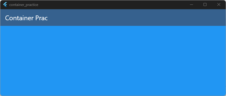
The tap works, but the ripple effect often doesn’t appear.
Why?
Because InkWell paints its ripple on the nearest Material widget. A decorated Container paints on top of the Material, hiding the ripple underneath.
The recommended solution is to use the Ink widget instead of a decorated Container.
body: Padding(
  padding: const EdgeInsets.all(16),
  child: Material(
    borderRadius: BorderRadius.circular(16),
    child: InkWell(
      borderRadius: BorderRadius.circular(16),
      onTap: () {
        print('Container tapped!');
      },
      child: Ink(
        width: 220,
        height: 100,
        decoration: BoxDecoration(
          color: Colors.blue,
          borderRadius: BorderRadius.circular(16),
        ),
        child: const Center(
          child: Text('Tap Me', style: TextStyle(color: Colors.white)),
        ),
      ),
    ),
  ),
),
Code language: Dart (dart)
Now the ripple is painted correctly on the Material, so both the background and the animation are visible.
Customizing the Ripple
You can also customize the ripple and highlight colors.
Material(
  borderRadius: BorderRadius.circular(16),
  child: InkWell(
    borderRadius: BorderRadius.circular(16),
    splashColor: Colors.white24,
    highlightColor: Colors.white10,
    onTap: () {},
    child: Ink(
      width: 220,
      height: 100,
      decoration: BoxDecoration(
        color: Colors.blue,
        borderRadius: BorderRadius.circular(16),
      ),
      child: const Center(
        child: Text(
          'Custom Ripple',
          style: TextStyle(color: Colors.white),
        ),
      ),
    ),
  ),
)
Code language: Dart (dart)
Using Ink is considered a best practice whenever you want a colored or decorated surface with an InkWell ripple.
As a general rule:
- Use
GestureDetectorwhen you only need to detect gestures. - Use
InkWellfor Material Design widgets that should provide touch feedback. - Use
Inkinstead of a decoratedContainerwhen you want the ripple effect to remain visible.
This combination creates interactive widgets that look polished and behave exactly as users expect.
Ripple Effects
One of the reasons developers love InkWell is its built-in ripple animation.
When a user taps a widget, a circular wave spreads out from the touch point. This small animation provides immediate feedback and makes your app feel much more responsive.
body: Padding(
  padding: const EdgeInsets.all(16),
  child: Material(
    borderRadius: BorderRadius.circular(16),
    child: InkWell(
      borderRadius: BorderRadius.circular(16),
      onTap: () {},
      child: Ink(
        width: 220,
        height: 100,
        decoration: BoxDecoration(
          color: Colors.blue,
          borderRadius: BorderRadius.circular(16),
        ),
        child: const Center(
          child: Text('Tap Me', style: TextStyle(color: Colors.white)),
        ),
      ),
    ),
  ),
),
Code language: Dart (dart)
When you tap the widget, Flutter automatically creates the ripple effect. No animation code is required.
Customizing the Ripple
You can customize how the ripple looks by changing properties such as splashColor and highlightColor.
body: Padding(
  padding: const EdgeInsets.all(16),
  child: Material(
    child: InkWell(
      splashColor: Colors.white24,
      highlightColor: Colors.white10,
      onTap: () {},
      child: Ink(
        width: 220,
        height: 100,
        color: Colors.blue,
        child: const Center(
          child: Text(
            'Custom Ripple',
            style: TextStyle(color: Colors.white),
          ),
        ),
      ),
    ),
  ),
),
Code language: Dart (dart)splashColorcontrols the expanding ripple.highlightColorcontrols the color shown while the widget is being pressed.
Using subtle colors often creates a cleaner and more polished interaction.
Why Isn’t My Ripple Showing?
A very common mistake is using a decorated Container directly inside an InkWell.
body: Padding(
  padding: const EdgeInsets.all(16),
  child: Material(
    child: InkWell(
      onTap: () {},
      child: Container(color: Colors.blue),
    ),
  ),
),
Code language: Dart (dart)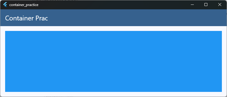
The tap works, but the ripple is hidden because the Container paints over the Material. The recommended solution is to replace the decorated Container with an Ink widget.
Should Every Clickable Widget Have a Ripple?
Not necessarily.
Ripple effects work best for Material Design components such as:
- Buttons
- Cards
- List items
- Navigation tiles
- Menu options
For highly custom interfaces, games, or unique animations, you may prefer GestureDetector with your own visual effects instead.
A ripple animation may seem like a small detail, but it plays an important role in making your app feel responsive and intuitive. Users instantly know their tap has been recognized, creating a smoother and more enjoyable experience.
AnimatedContainer Explained
Adding smooth animations to your app doesn’t have to be complicated.
In fact, Flutter can animate many visual changes automatically using the AnimatedContainer widget.
An AnimatedContainer works just like a regular Container, but whenever one of its properties changes, Flutter smoothly animates the transition instead of changing it instantly.
Here’s a simple example:
class _HomeScreenState extends State<HomeScreen> {
  @override
  Widget build(BuildContext context) {
    final theme = Theme.of(context);

    return Scaffold(
      appBar: AppBar(
        title: const Text('Container Prac'),
        backgroundColor: theme.colorScheme.primary,
        foregroundColor: theme.colorScheme.onPrimary,
      ),
      body: Padding(
        padding: const EdgeInsets.all(16),
        child: AnimatedContainerDemo(),
      ),
    );
  }
}

class AnimatedContainerDemo extends StatefulWidget {
  const AnimatedContainerDemo({super.key});

  @override
  State<AnimatedContainerDemo> createState() => _AnimatedContainerDemoState();
}

class _AnimatedContainerDemoState extends State<AnimatedContainerDemo> {
  bool isExpanded = false;

  @override
  Widget build(BuildContext context) {
    return Center(
      child: GestureDetector(
        onTap: () {
          setState(() {
            isExpanded = !isExpanded;
          });
        },
        child: AnimatedContainer(
          duration: const Duration(milliseconds: 300),
          width: isExpanded ? 250 : 150,
          height: isExpanded ? 150 : 80,
          decoration: BoxDecoration(
            color: isExpanded ? Colors.green : Colors.blue,
            borderRadius: BorderRadius.circular(isExpanded ? 24 : 12),
          ),
          alignment: Alignment.center,
          child: const Text('Tap Me', style: TextStyle(color: Colors.white)),
        ),
      ),
    );
  }
}
Code language: Dart (dart)
Each time you tap the widget, Flutter animates the change in:
- Width
- Height
- Background color
- Border radius
Instead of jumping instantly to the new values, the transition happens smoothly over 300 milliseconds.
What Can AnimatedContainer Animate?
AnimatedContainer can animate many commonly used properties, including:
widthheightpaddingmarginalignmentcolordecorationtransformconstraints
This makes it a great choice for creating polished UI interactions with very little code.
Controlling the Animation Speed
The duration property controls how long the animation takes.
AnimatedContainer(
  duration: const Duration(milliseconds: 500),
  // ...
)
Code language: Dart (dart)
A longer duration creates a slower animation, while a shorter duration makes it feel quicker and more responsive.
You can also customize the animation using the curve property.
AnimatedContainer(
  duration: const Duration(milliseconds: 300),
  curve: Curves.easeInOut,
  // ...
)
Code language: Dart (dart)
Flutter provides many built-in animation curves, such as:
Curves.linearCurves.easeInCurves.easeOutCurves.easeInOutCurves.bounceOutCurves.elasticOut
Choosing the right curve can make an animation feel natural and enjoyable.
As a general rule, AnimatedContainer is perfect for simple UI animations. You don’t need an AnimationController, Tween, or other advanced animation classes.
Just update the widget’s properties with setState(), and Flutter takes care of the animation for you. We’ll use this widget in the next section to build smooth expand and collapse animations.
Expand and Collapse Animations
Expandable sections are everywhere in modern apps.
You’ll find them in FAQs, settings screens, dashboards, product pages, and side menus. They help keep the interface clean by revealing additional information only when the user needs it.
Many developers try to create a Flutter collapsible container by animating the height of an AnimatedContainer.
While that works for simple examples, it can produce temporary overflow errors during the animation if the content changes at the same time.
A better approach is to use AnimatedSize, which automatically animates the widget’s size based on its content.
class ExpandableContainerDemo extends StatefulWidget {
  const ExpandableContainerDemo({super.key});

  @override
  State<ExpandableContainerDemo> createState() =>
      _ExpandableContainerDemoState();
}

class _ExpandableContainerDemoState extends State<ExpandableContainerDemo>
    with TickerProviderStateMixin {
  bool isExpanded = false;

  @override
  Widget build(BuildContext context) {
    return Center(
      child: GestureDetector(
        onTap: () {
          setState(() {
            isExpanded = !isExpanded;
          });
        },
        child: AnimatedSize(
          duration: const Duration(milliseconds: 300),
          curve: Curves.easeInOut,
          child: Container(
            width: 300,
            padding: const EdgeInsets.all(16),
            decoration: BoxDecoration(
              color: Colors.blue,
              borderRadius: BorderRadius.circular(16),
            ),
            child: Column(
              mainAxisSize: MainAxisSize.min,
              crossAxisAlignment: CrossAxisAlignment.start,
              children: [
                const Text(
                  'Tap to Expand',
                  style: TextStyle(color: Colors.white, fontSize: 18),
                ),

                if (isExpanded) ...[
                  const SizedBox(height: 16),
                  const Text(
                    'This content appears when the container expands.',
                    style: TextStyle(color: Colors.white),
                  ),
                ],
              ],
            ),
          ),
        ),
      ),
    );
  }
}
Code language: Dart (dart)
When the user taps the widget, the Column grows to fit its new content. AnimatedSize automatically detects the size change and smoothly animates the transition. You don’t need to calculate or hard-code any heights.
Why AnimatedSize?
Unlike AnimatedContainer, AnimatedSize animates the widget’s natural size.
This means you don’t have to guess how tall the expanded content will be, making it ideal for widgets whose content can change.
It also helps avoid the temporary overflow warnings that can occur when animating a fixed height while simultaneously adding or removing widgets.
When Should You Use AnimatedSize?
AnimatedSize is a great choice for:
- FAQ sections
- Settings panels
- Product descriptions
- Expandable cards
- Chat message details
- Dashboard widgets
Any time the amount of content is dynamic, AnimatedSize usually produces cleaner and more maintainable code.
AnimatedContainer vs AnimatedSize
Although both widgets animate size changes, they solve different problems.
- Use AnimatedContainer when you know the exact width or height you want to animate, or when you’re animating properties like color, padding, margin, border radius, or decoration.
- Use AnimatedSize when the widget should grow or shrink naturally as its content changes.
Choosing the right widget makes your animations smoother, your code simpler, and your layouts more reliable.
Hover Effects
Hover effects make your app feel more interactive, especially on desktop and web platforms where users expect visual feedback as they move the mouse.
A common hover effect is changing the background color when the pointer enters the widget.
class HoverContainerDemo extends StatefulWidget {
  const HoverContainerDemo({super.key});

  @override
  State<HoverContainerDemo> createState() => _HoverContainerDemoState();
}

class _HoverContainerDemoState extends State<HoverContainerDemo> {
  bool isHovered = false;

  @override
  Widget build(BuildContext context) {
    return MouseRegion(
      onEnter: (_) {
        setState(() {
          isHovered = true;
        });
      },
      onExit: (_) {
        setState(() {
          isHovered = false;
        });
      },
      child: AnimatedContainer(
        duration: const Duration(milliseconds: 200),
        width: 220,
        height: 120,
        decoration: BoxDecoration(
          color: isHovered ? Colors.blue.shade700 : Colors.blue,
          borderRadius: BorderRadius.circular(16),
        ),
        alignment: Alignment.center,
        child: const Text('Hover Me', style: TextStyle(color: Colors.white)),
      ),
    );
  }
}
Code language: Dart (dart)
When the mouse pointer enters the widget, the background color changes smoothly. When the pointer leaves, it animates back to its original color.
This is a simple way to create a Flutter Container hover color effect.
Creating a Lift Animation
Many modern interfaces don’t just change color. They also make cards appear to lift off the page.
You can achieve this by combining MouseRegion with a small translation using AnimatedContainer.
AnimatedContainer(
  duration: const Duration(milliseconds: 200),
  transform: Matrix4.translationValues(
    0,
    isHovered ? -8 : 0,
    0,
  ),
  decoration: BoxDecoration(
    color: Colors.blue,
    borderRadius: BorderRadius.circular(16),
    boxShadow: [
      BoxShadow(
        color: Colors.black26,
        blurRadius: isHovered ? 16 : 6,
        offset: Offset(
          0,
          isHovered ? 8 : 4,
        ),
      ),
    ],
  ),
)
Code language: Dart (dart)
As the pointer moves over the widget, the card slides upward by a few pixels while its shadow becomes softer and larger. This subtle animation gives the impression that the card is floating above the page.
Hover Effects on Mobile
If you’re building only for Android or iOS, you generally don’t need hover effects because touch screens don’t have a mouse pointer.
However, if your Flutter app targets:
- Web
- Windows
- macOS
- Linux
adding hover animations can make the interface feel much more polished.
Best Practices
Keep hover animations subtle.
Small changes in color, elevation, scale, or position usually create a better user experience than dramatic effects. Fast animations between 150 and 250 milliseconds also tend to feel the most responsive.
A well-designed hover effect gives users confidence that an element is interactive without distracting them from the rest of the interface.
Build Your First Flutter App with My Free Hands-On Class
You’ve already started learning Flutter. Take the next step with a free practical class where you’ll build a real app from scratch. Enter your email below for instant access.
Transform and Rotation Effects
Small movements can make a user interface feel much more alive.
Flutter lets you move, rotate, scale, and even skew a Container using the transform property. Combined with AnimatedContainer, you can create smooth interactive animations with very little code.
Moving a Container
You can move a widget by applying a translation.
AnimatedContainer(
  duration: const Duration(milliseconds: 200),
  transform: Matrix4.translationValues(
    0,
    isHovered ? -10 : 0,
    0,
  ),
  width: 200,
  height: 100,
  decoration: BoxDecoration(
    color: Colors.blue,
    borderRadius: BorderRadius.circular(16),
  ),
)
Code language: Dart (dart)
This moves the Container 10 pixels upward. It’s a common effect for hover animations and clickable cards.
Rotating a Container
You can also rotate a widget using Matrix4.rotationZ().
import 'dart:math' as math;

AnimatedContainer(
  duration: const Duration(milliseconds: 300),
  transform: Matrix4.rotationZ(isHovered ? 10 * math.pi / 180 : 0),
  width: 200,
  height: 100,
  decoration: BoxDecoration(
    color: Colors.blue,
    borderRadius: BorderRadius.circular(16),
  ),
)
Code language: Dart (dart)
This rotates the Container by 10 degrees.
This is a simple way to create a Flutter Container rotate effect.
Scaling a Container
Scaling makes a widget appear larger or smaller.
AnimatedContainer(
  duration: const Duration(milliseconds: 200),
  transform: Matrix4.diagonal3Values(
    isHovered ? 1.03 : 1.0,
    isHovered ? 1.03 : 1.0,
    1.0,
  ),
  width: 200,
  height: 100,
  decoration: BoxDecoration(
    color: Colors.blue,
    borderRadius: BorderRadius.circular(16),
  ),
)
Code language: Dart (dart)
Here, the Container grows to 105% of its original size.
This is a popular effect for buttons, cards, and images.
Interactive Hover Animation
You can combine translation, scaling, and rotation to create a modern interactive card.
AnimatedContainer(
  duration: const Duration(milliseconds: 250),
  transform: Matrix4.identity()
    ..translateByDouble(0.0, isHovered ? -8.0 : 0.0, 0.0, 1.0)
    ..scaleByDouble(
      isHovered ? 1.03 : 1.0,
      isHovered ? 1.03 : 1.0,
      1.0,
      1.0,
    )
    ..rotateZ(isHovered ? 2 * math.pi / 180 : 0),
  width: 200,
  height: 100,
  decoration: BoxDecoration(
    color: Colors.blue,
    borderRadius: BorderRadius.circular(16),
    boxShadow: [
      BoxShadow(
        color: Colors.black26,
        blurRadius: isHovered ? 20 : 8,
        offset: Offset(0, isHovered ? 10 : 4),
      ),
    ],
  ),
)
Code language: Dart (dart)
When the pointer hovers over the widget, it:
- Moves upward slightly.
- Becomes slightly larger.
- Rotates by a small angle.
These subtle animations make the interface feel responsive without being distracting.
Best Practices
Transform effects are most effective when they’re subtle.
A movement of 4 to 10 pixels, a rotation of 1° to 3°, or a scale between 1.02 and 1.05 is usually enough to create a polished interaction.
Large rotations or dramatic scaling can make the interface feel unstable and may distract users from the content.
As a general rule, use transform animations to support the user experience, not to compete with it. Small, smooth movements often create a more professional result than flashy animations.
Responsive Interactive Cards
Interactive cards are one of the most common UI patterns in Flutter.
You’ll see them in dashboards, product listings, news feeds, portfolios, and settings screens. A well-designed card doesn’t just display information. It also responds to user interactions, making the interface feel polished and engaging.
The best interactive cards combine several small animations instead of relying on one dramatic effect.
For example, a card might:
- Lift slightly when hovered.
- Grow a little larger.
- Display a stronger shadow.
- Change its background color.
- Respond to taps with a ripple animation.
Individually, these effects are subtle. Together, they create a professional user experience.
Here’s a simple example:
class InteractiveCard extends StatefulWidget {
  const InteractiveCard({super.key});

  @override
  State<InteractiveCard> createState() => _InteractiveCardState();
}

class _InteractiveCardState extends State<InteractiveCard> {
  bool isHovered = false;

  @override
  Widget build(BuildContext context) {
    return MouseRegion(
      onEnter: (_) => setState(() => isHovered = true),
      onExit: (_) => setState(() => isHovered = false),
      child: Material(
        borderRadius: BorderRadius.circular(20),
        child: InkWell(
          borderRadius: BorderRadius.circular(20),
          onTap: () {
            print('Card tapped!');
          },
          child: AnimatedContainer(
            duration: const Duration(milliseconds: 250),
            transform: Matrix4.identity()
              ..translateByDouble(0, isHovered ? -8 : 0, 0, 1)
              ..scaleByDouble(
                isHovered ? 1.02 : 1.0,
                isHovered ? 1.02 : 1.0,
                1,
                1,
              ),
            width: 280,
            padding: const EdgeInsets.all(20),
            decoration: BoxDecoration(
              color: isHovered ? Colors.blue.shade700 : Colors.blue,
              borderRadius: BorderRadius.circular(20),
              boxShadow: [
                BoxShadow(
                  color: Colors.black26,
                  blurRadius: isHovered ? 20 : 8,
                  offset: Offset(0, isHovered ? 10 : 4),
                ),
              ],
            ),
            child: const Column(
              mainAxisSize: MainAxisSize.min,
              crossAxisAlignment: CrossAxisAlignment.start,
              children: [
                Text(
                  'FlutterSensei',
                  style: TextStyle(
                    color: Colors.white,
                    fontSize: 20,
                    fontWeight: FontWeight.bold,
                  ),
                ),
                SizedBox(height: 8),
                Text(
                  'Build beautiful Flutter apps with confidence.',
                  style: TextStyle(color: Colors.white70),
                ),
              ],
            ),
          ),
        ),
      ),
    );
  }
}
Code language: Dart (dart)
In this example, a single card combines several techniques you’ve already learned:
MouseRegiondetects hover events.AnimatedContainersmoothly animates visual changes.Matrix4creates a subtle lift and scale effect.InkWelladds a ripple animation when the card is tapped.BoxShadowcreates the illusion of elevation.
Each effect is small, but together they make the interface feel much more responsive.
Keep Interactions Subtle
One common mistake is trying to animate everything.
Large rotations, dramatic scaling, and exaggerated shadows can distract users from the content.
Instead, aim for small refinements:
- Lift by 4 to 8 pixels.
- Scale by 1.02 to 1.03.
- Animate over 200 to 300 milliseconds.
- Use soft shadows instead of harsh ones.
These tiny details are what make many production apps feel smooth and professional without drawing attention to the animations themselves.
When building interactive cards, remember that animation should support the content, not compete with it. The best interfaces feel natural because every movement has a purpose.
Foreground Decoration
So far, we’ve used the decoration property to paint backgrounds, borders, gradients, and shadows. Flutter also provides a less commonly used property called foregroundDecoration.
As the name suggests, it paints on top of the child instead of behind it.
This makes it useful for creating overlays, highlights, dimming effects, and disabled states without modifying the child widget itself.
Here’s a simple example:
Container(
  width: 250,
  height: 150,
  decoration: BoxDecoration(
    color: Colors.blue,
    borderRadius: BorderRadius.circular(16),
  ),
  foregroundDecoration: BoxDecoration(
    color: Colors.black.withValues(alpha: 0.3),
    borderRadius: BorderRadius.circular(16),
  ),
  child: const Center(
    child: Text(
      'FlutterSensei',
      style: TextStyle(color: Colors.white, fontSize: 20),
    ),
  ),
)

Code language: Dart (dart)
In this example, the foregroundDecoration adds a semi-transparent black overlay on top of the container. The child remains visible, but appears slightly dimmed.
Creating an Image Overlay
A common use case is improving text readability on top of an image.
Container(
  width: 300,
  height: 180,
  decoration: BoxDecoration(
    borderRadius: BorderRadius.circular(20),
    image: const DecorationImage(
      image: NetworkImage(
        'https://picsum.photos/600/400',
      ),
      fit: BoxFit.cover,
    ),
  ),
  foregroundDecoration: BoxDecoration(
    color: Colors.black.withValues(alpha: 0.4),
    borderRadius: BorderRadius.circular(20),
  ),
  child: const Align(
    alignment: Alignment.bottomLeft,
    child: Padding(
      padding: EdgeInsets.all(16),
      child: Text(
        'Beautiful Landscapes',
        style: TextStyle(
          color: Colors.white,
          fontSize: 22,
          fontWeight: FontWeight.bold,
        ),
      ),
    ),
  ),
)
Code language: Dart (dart)
Without the overlay, the white text might blend into brighter parts of the image. The foregroundDecoration darkens the image just enough to improve readability.
Creating a Disabled Effect
Another practical use is showing that a widget is disabled.
Container(
  foregroundDecoration: BoxDecoration(
    color: Colors.white.withValues(alpha: 0.6),
  ),
  child: const ListTile(
    leading: Icon(Icons.lock),
    title: Text('Premium Feature'),
  ),
)
Code language: Dart (dart)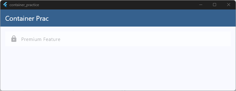
The semi-transparent overlay visually communicates that the content is unavailable without changing the child widget.
When Should You Use foregroundDecoration?
The foregroundDecoration property works well for:
- Dark image overlays
- Loading overlays
- Disabled states
- Selection highlights
- Frosted or tinted effects
- Drawing borders or gradients above content
Since it paints above the child, it’s often cleaner than wrapping the widget with additional Stack widgets just to add a simple overlay.
Although foregroundDecoration isn’t used as frequently as decoration, it’s a powerful tool for building polished, production-ready interfaces while keeping your widget tree clean and easy to read.
Glass Effects and Advanced UI
Glassmorphism has become a popular design trend in modern apps. It gives widgets a frosted glass appearance by combining transparency, blur, soft borders, and subtle shadows.
Flutter makes it easy to create this effect using BackdropFilter, ClipRRect, and a semi-transparent Container.
Here’s a simple example:
import 'dart:ui';

body: Stack(
  children: [
    Image.network(
      'https://picsum.photos/800/600',
      width: double.infinity,
      height: double.infinity,
      fit: BoxFit.cover,
    ),

    Center(
      child: ClipRRect(
        borderRadius: BorderRadius.circular(20),
        child: BackdropFilter(
          filter: ImageFilter.blur(sigmaX: 12, sigmaY: 12),
          child: Container(
            width: 300,
            padding: const EdgeInsets.all(20),
            decoration: BoxDecoration(
              color: Colors.white.withValues(alpha: 0.15),
              borderRadius: BorderRadius.circular(20),
              border: Border.all(
                color: Colors.white.withValues(alpha: 0.3),
              ),
            ),
            child: const Column(
              mainAxisSize: MainAxisSize.min,
              children: [
                Icon(Icons.flutter_dash, size: 48, color: Colors.white),
                SizedBox(height: 12),
                Text(
                  'Glass Card',
                  style: TextStyle(
                    color: Colors.white,
                    fontSize: 22,
                    fontWeight: FontWeight.bold,
                  ),
                ),
              ],
            ),
          ),
        ),
      ),
    ),
  ],
),
Code language: Dart (dart)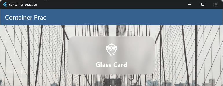
This creates a card with a blurred background, soft transparency, and a subtle border that resembles frosted glass.
Why Use BackdropFilter?
A semi-transparent Container by itself only makes the background visible.
BackdropFilter is what creates the blur effect, making the UI look like you’re viewing the background through a piece of frosted glass.
Without it, the effect feels more like a transparent panel than true glass.
Creating a Modern Glass Card
Glassmorphism often combines several design techniques:
- Semi-transparent background
- Background blur
- Rounded corners
- Thin translucent border
- Soft shadows
- Generous spacing
Together, these elements create a clean, modern interface.
When Should You Use Glass Effects?
Glassmorphism works well for:
- Login screens
- Profile cards
- Dashboards
- Music players
- Floating control panels
- Weather apps
Because the background remains partially visible, glass effects help preserve visual depth while keeping important content readable.
Performance Considerations
Although glassmorphism looks beautiful, BackdropFilter is one of the more expensive visual effects in Flutter because it blurs the pixels behind the widget every frame.
For the best performance:
- Avoid placing many blurred widgets on the screen at the same time.
- Use blur effects only where they add visual value.
- Keep the blur radius (
sigmaXandsigmaY) as low as possible while achieving the desired look. - Test your UI on lower-powered devices if you’re using multiple glass panels.
A single glass card is usually inexpensive, but dozens of overlapping blur effects can affect rendering performance.
Used thoughtfully, glassmorphism can give your Flutter apps a modern, premium feel while still maintaining smooth performance.
Performance Considerations
Flutter makes it easy to build beautiful interfaces with animations, shadows, gradients, and blur effects. However, every visual effect has a cost.
Using these features thoughtfully helps your app stay smooth, even on older devices.
Avoid Unnecessary Rebuilds
Every time you call setState(), Flutter rebuilds the widget and its descendants. For small widgets, this isn’t usually a problem. But rebuilding large parts of the UI for a simple animation can affect performance.
Instead of rebuilding an entire screen, keep your state as close as possible to the widget that actually changes.
Be Careful with Blur Effects
Widgets like BackdropFilter create beautiful glassmorphism effects, but they’re also one of Flutter’s most expensive visual effects.
BackdropFilter(
  filter: ImageFilter.blur(
    sigmaX: 12,
    sigmaY: 12,
  ),
  child: ...
)
Code language: Dart (dart)
A single blurred card is usually fine.
However, placing many blurred widgets inside a scrolling list can reduce rendering performance, especially on lower-powered devices.
Use Shadows Sparingly
Shadows help create depth, but large blur radii require more work from the rendering engine.
BoxShadow(
  color: Colors.black26,
  blurRadius: 30,
)
Code language: Dart (dart)
In many cases, a subtle shadow looks just as good while being less expensive to render.
Keep Animations Short
Animations should feel responsive. Most UI animations work well between 200 and 300 milliseconds.
Long animations can make an interface feel sluggish, while extremely short animations may feel abrupt.
Don’t Animate Everything
Not every property needs to animate.
Ask yourself:
“Does this animation help the user understand what’s happening?”
If the answer is no, it may be better to keep the interface simple. Small, meaningful animations often create a better experience than constant motion.
Prefer Built-in Animated Widgets
Flutter provides many widgets that automatically handle common animations, including:
AnimatedContainerAnimatedOpacityAnimatedAlignAnimatedPaddingAnimatedPositionedAnimatedSizeAnimatedSwitcher
These widgets are easy to use, readable, and optimized for many common UI animations.
Optimize Lists
If you’re displaying many interactive cards, avoid creating every item at once.
Instead of using a Column, use widgets like:
ListView.builderGridView.builder
These lazily build only the widgets currently visible on the screen, improving both memory usage and scrolling performance.
Profile Before You Optimize
Flutter is highly optimized, and most apps don’t need complex performance tuning. Before trying to optimize your code, use Flutter’s built-in tools to identify real bottlenecks.
The Performance Overlay and Flutter DevTools can help you measure rendering performance and find expensive widgets.
As a general rule, write clean, readable code first. Then optimize only the parts of your app that actually need it. This approach keeps your codebase easier to maintain while still delivering a fast and responsive user experience.
Container Anti-Patterns
Container is one of Flutter’s most flexible widgets, but it’s also one of the most overused. Many beginners reach for a Container even when a simpler widget would be a better choice.
Avoiding these common anti-patterns will make your code cleaner, easier to read, and sometimes even more efficient.
1. Using Container for Everything
It’s common to see code like this:
Container(
  child: const Text('Hello Flutter'),
)
Code language: Dart (dart)
In this example, the Container isn’t adding any styling, spacing, or layout behavior.
You can simply write:
const Text('Hello Flutter')
Code language: Dart (dart)
If a Container doesn’t add value, you probably don’t need it.
2. Using Container Only for Padding
Instead of this:
Container(
  padding: const EdgeInsets.all(16),
  child: const Text('Flutter'),
)
Code language: Dart (dart)
Prefer the dedicated Padding widget:
Padding(
  padding: const EdgeInsets.all(16),
  child: const Text('Flutter'),
)
Code language: Dart (dart)
Using purpose-built widgets makes your widget tree easier to understand.
3. Using Container Only for Alignment
Instead of:
Container(
  alignment: Alignment.center,
  child: const Text('Centered'),
)
Code language: Dart (dart)
Use Align or Center:
Center(
  child: const Text('Centered'),
)
Code language: Dart (dart)
These widgets clearly express your intent and are easier to read.
4. Nesting Too Many Containers
This is another common pattern:
Container(
  padding: const EdgeInsets.all(16),
  child: Container(
    margin: const EdgeInsets.all(8),
    child: Container(
      color: Colors.blue,
      child: const Text('Flutter'),
    ),
  ),
)
Code language: Dart (dart)
Although this works, deeply nested Container widgets can make your layouts difficult to follow.
Often, combining Padding, DecoratedBox, Align, or SizedBox results in cleaner and more maintainable code.
5. Using Container for Fixed Space
Instead of creating an empty Container just to add spacing:
Container(
  height: 20,
)
Code language: Dart (dart)
Use SizedBox instead:
const SizedBox(height: 20)
Code language: Dart (dart)
SizedBox clearly communicates that you’re creating empty space.
6. Ignoring Specialized Widgets
Container is incredibly versatile, but Flutter often provides widgets that are more focused on a specific task.
For example:
| Instead of… | Consider using… |
|---|---|
Container for spacing | SizedBox |
Container for padding | Padding |
Container for centering | Center |
Container for alignment | Align |
Container for decoration only | DecoratedBox |
Container with color only | ColoredBox |
Container with fixed size | SizedBox |
These widgets make your code more expressive because each one has a single, clear responsibility.
Write Intentional Widget Trees
One of Flutter’s greatest strengths is its composability. Rather than relying on one widget to do everything, combine small, focused widgets to build your UI.
Container is still an excellent widget, but it shouldn’t be your default choice for every layout task.
Choosing the right widget for the job leads to code that’s easier to read, easier to maintain, and more closely aligned with Flutter’s design philosophy.
Production UI Examples
By now, you’ve learned how to make a Container interactive, animate its properties, add ripple effects, create hover animations, and build modern glassmorphism interfaces.
Let’s put those techniques together and build something closer to what you’d find in a real Flutter application.
Example 1: Interactive Product Card
This example combines several techniques you’ve already learned:
- Hover animation
- Ripple effect
- Rounded corners
- Smooth scaling
- Lift animation
- Soft shadow
Perfect for e-commerce apps, portfolios, and dashboards.
class ProductCard extends StatefulWidget {
  const ProductCard({super.key});

  @override
  State<ProductCard> createState() => _ProductCardState();
}

class _ProductCardState extends State<ProductCard> {
  bool isHovered = false;

  @override
  Widget build(BuildContext context) {
    return MouseRegion(
      onEnter: (_) => setState(() => isHovered = true),
      onExit: (_) => setState(() => isHovered = false),
      child: Material(
        color: Colors.transparent,
        borderRadius: BorderRadius.circular(20),
        child: InkWell(
          borderRadius: BorderRadius.circular(20),
          onTap: () {
            debugPrint('Product tapped!');
          },
          child: AnimatedContainer(
            duration: const Duration(milliseconds: 250),
            curve: Curves.easeOut,
            transform: Matrix4.identity()
              ..translateByDouble(0, isHovered ? -8 : 0, 0, 1)
              ..scaleByDouble(isHovered ? 1.02 : 1, isHovered ? 1.02 : 1, 1, 1),
            width: 280,
            decoration: BoxDecoration(
              color: Colors.white,
              borderRadius: BorderRadius.circular(20),
              boxShadow: [
                BoxShadow(
                  color: Colors.black.withValues(alpha: 0.12),
                  blurRadius: isHovered ? 24 : 12,
                  offset: Offset(0, isHovered ? 12 : 6),
                ),
              ],
            ),
            child: Column(
              crossAxisAlignment: CrossAxisAlignment.start,
              mainAxisSize: MainAxisSize.min,
              children: [
                ClipRRect(
                  borderRadius: const BorderRadius.vertical(
                    top: Radius.circular(20),
                  ),
                  child: Image.network(
                    'https://picsum.photos/500/300',
                    height: 180,
                    width: double.infinity,
                    fit: BoxFit.cover,
                  ),
                ),

                Padding(
                  padding: const EdgeInsets.all(16),
                  child: Column(
                    crossAxisAlignment: CrossAxisAlignment.start,
                    children: [
                      const Text(
                        'Flutter UI Kit',
                        style: TextStyle(
                          fontSize: 20,
                          fontWeight: FontWeight.bold,
                        ),
                      ),

                      const SizedBox(height: 8),

                      Text(
                        'Beautiful widgets and production-ready components.',
                        style: TextStyle(color: Colors.grey.shade700),
                      ),

                      const SizedBox(height: 20),

                      Row(
                        children: [
                          const Text(
                            '\$49',
                            style: TextStyle(
                              fontSize: 24,
                              fontWeight: FontWeight.bold,
                              color: Colors.blue,
                            ),
                          ),

                          const Spacer(),

                          FilledButton(
                            onPressed: () {},
                            child: const Text('Buy Now'),
                          ),
                        ],
                      ),
                    ],
                  ),
                ),
              ],
            ),
          ),
        ),
      ),
    );
  }
}
Code language: Dart (dart)
Demo Video
Instead of using separate widgets for every interaction, a single reusable ProductCard widget keeps your code clean while providing a polished user experience.
Example 2: Glass Dashboard Card
Modern dashboards often use glassmorphism to highlight important information.
This example combines:
BackdropFilter- Glassmorphism
- Rounded corners
- Interactive hover effects
- Ripple animation
- Responsive layout
class GlassDashboardCard extends StatefulWidget {
  const GlassDashboardCard({super.key});

  @override
  State<GlassDashboardCard> createState() => _GlassDashboardCardState();
}

class _GlassDashboardCardState extends State<GlassDashboardCard> {
  bool isHovered = false;

  @override
  Widget build(BuildContext context) {
    final width = MediaQuery.sizeOf(context).width;

    return MouseRegion(
      onEnter: (_) => setState(() => isHovered = true),
      onExit: (_) => setState(() => isHovered = false),
      child: AnimatedContainer(
        duration: const Duration(milliseconds: 250),
        curve: Curves.easeOut,
        transform: Matrix4.identity()
          ..translateByDouble(0, isHovered ? -6 : 0, 0, 1)
          ..scaleByDouble(isHovered ? 1.02 : 1, isHovered ? 1.02 : 1, 1, 1),
        child: Material(
          color: Colors.transparent,
          borderRadius: BorderRadius.circular(24),
          child: InkWell(
            borderRadius: BorderRadius.circular(24),
            onTap: () {
              debugPrint('Dashboard card tapped');
            },
            child: ClipRRect(
              borderRadius: BorderRadius.circular(24),
              child: BackdropFilter(
                filter: ImageFilter.blur(sigmaX: 12, sigmaY: 12),
                child: Container(
                  width: width > 600 ? 380 : double.infinity,
                  padding: const EdgeInsets.all(24),
                  decoration: BoxDecoration(
                    color: Colors.white.withValues(alpha: 0.18),
                    borderRadius: BorderRadius.circular(24),
                    border: Border.all(
                      color: Colors.white.withValues(alpha: 0.25),
                    ),
                    boxShadow: [
                      BoxShadow(
                        color: Colors.black.withValues(alpha: 0.12),
                        blurRadius: isHovered ? 30 : 18,
                        offset: Offset(0, isHovered ? 14 : 8),
                      ),
                    ],
                  ),
                  child: Column(
                    crossAxisAlignment: CrossAxisAlignment.start,
                    mainAxisSize: MainAxisSize.min,
                    children: [
                      Row(
                        children: [
                          Container(
                            padding: const EdgeInsets.all(12),
                            decoration: BoxDecoration(
                              color: Colors.white.withValues(alpha: 0.2),
                              borderRadius: BorderRadius.circular(16),
                            ),
                            child: const Icon(
                              Icons.trending_up,
                              color: Colors.white,
                            ),
                          ),
                          const Spacer(),
                          Icon(
                            Icons.more_horiz,
                            color: Colors.white.withValues(alpha: 0.8),
                          ),
                        ],
                      ),

                      const SizedBox(height: 24),

                      const Text(
                        'Monthly Revenue',
                        style: TextStyle(color: Colors.white70, fontSize: 16),
                      ),

                      const SizedBox(height: 8),

                      const Text(
                        '\$48,920',
                        style: TextStyle(
                          color: Colors.white,
                          fontSize: 34,
                          fontWeight: FontWeight.bold,
                        ),
                      ),

                      const SizedBox(height: 12),

                      Row(
                        children: const [
                          Icon(
                            Icons.arrow_upward,
                            color: Colors.greenAccent,
                            size: 18,
                          ),
                          SizedBox(width: 6),
                          Text(
                            '18% this month',
                            style: TextStyle(color: Colors.greenAccent),
                          ),
                        ],
                      ),
                    ],
                  ),
                ),
              ),
            ),
          ),
        ),
      ),
    );
  }
}
Code language: Dart (dart)
Demo Video
Because this widget is completely reusable, you can display analytics, profile information, weather updates, or statistics simply by changing its content.
More Production Ideas
Once you’re comfortable with these techniques, you can build many other reusable components, including:
- Product cards
- Profile cards
- Dashboard tiles
- Settings cards
- Expandable FAQ panels
- Pricing cards
- Music player controls
- News article cards
- Portfolio cards
- Login panels
The key idea is simple:
Instead of repeatedly styling individual Container widgets throughout your app, build reusable widgets that combine animations, gestures, and modern UI effects into a single component.
That’s how production Flutter applications stay organized as they grow.
After all, users don’t remember individual widgets. They remember smooth, responsive interfaces that feel enjoyable to use.
Ready to Build Real Flutter Apps?
Nice work making it to the end! If this guide helped you, you’ll love my free hands-on Flutter class where we build a real app together, step by step.