Master Flutter typography with TextTheme, TextStyle, Material 3 type scales, custom fonts, and reusable text systems for beautiful, consistent apps.
Ever opened an app and felt like something was just off, but you couldn’t quite put your finger on it?
Nine times out of ten, the culprit is messy typography. When one screen uses a massive, bold font for a subtitle, and the next screen uses a tiny, light font for the exact same thing, your user’s brain has to work twice as hard to read it. It feels chaotic.
Getting your text styles right is one of the fastest ways to make your app look professional.
In Flutter, we manage all of this using a powerful tool called TextTheme. If you are working with Material 3, things have changed quite a bit from the older days of Flutter theming.
In this detailed Material 3 Guide, we are going to break down Flutter typography from scratch.
You will learn exactly how TextTheme works, how to apply it across your entire app safely, and how to avoid the common typography mistakes that trip up most beginners.
Let’s dive in and fix your text styles once and for all!
- Master Flutter typography with TextTheme, TextStyle, Material 3 type scales, custom fonts, and reusable text systems for beautiful, consistent apps.
- What is Typography in Flutter?
- Understanding the Flutter Text Widget
- How Flutter TextTheme works
- Material 2 vs Material 3 Typography
- Understanding Display, Headline, Title, Body and Label styles
- Applying Typography with ThemeData
- Using Typography across the entire app
- Customizing TextTheme safely
- Common Typography Mistakes Beginners Make
- Flutter Typography Best Practices
What is Typography in Flutter?
When we talk about typography in flutter, we are talking about more than just picking a pretty font. Typography is the complete system of arranging text to make your app readable, clear, and beautiful.
Think of it as the visual hierarchy of your app. It tells the user what to read first, what is important, and what is just extra detail.
Flutter follows Google’s Material Design guidelines. In flutter material 3 typography, this system is highly structured. Instead of randomly guessing font sizes or weights on every single screen, Flutter uses a predefined class called Typography.
This system automatically configures three major things for you:
- Font families: The actual typefaces used for the text.
- Font weights: How thick or thin the letters are (like bold, medium, or regular).
- Text scaling: How the text behaves when a user changes their phone’s font size settings for accessibility.
By leveraging this built-in flutter typography class, you do not have to manually style thousands of individual words.
Instead, you define your rules once at the root level of your flutter app typography, and the framework handles the rest. This approach ensures your app looks clean, polished, and consistent on every device.
Understanding the Flutter Text Widget
Before we can dive deep into themes, we need to look at the core building block of text typography: the Text widget itself.
By default, when you drop a Text widget into your layout, it inherits whatever style its parent provides. But if you want to change its look manually, you pass a TextStyle object to its style property.
Let’s look at our boilerplate code to see how this works in practice. Here is a complete, working example where we explicitly pass a custom style to a Text widget inside the Scaffold.
import 'package:flutter/material.dart';

void main() {
  runApp(const MyApp());
}

class MyApp extends StatelessWidget {
  const MyApp({super.key});

  @override
  Widget build(BuildContext context) {
    return MaterialApp(
      title: 'Typography Practice',
      debugShowCheckedModeBanner: false,
      theme: ThemeData(
        useMaterial3: true,
        colorSchemeSeed: Colors.blue,
        brightness: Brightness.light,
      ),
      home: const HomeScreen(),
    );
  }
}

class HomeScreen extends StatefulWidget {
  const HomeScreen({super.key});

  @override
  State<HomeScreen> createState() => _HomeScreenState();
}

class _HomeScreenState extends State<HomeScreen> {
  @override
  Widget build(BuildContext context) {
    return Scaffold(
      body: const Center(
        child: Text(
          'Hello, Flutter!',
          style: TextStyle(
            fontSize: 24.0,
            fontWeight: FontWeight.bold,
            color: Colors.blue,
            letterSpacing: 1.2,
          ),
        ),
      ),
    );
  }
}
Code language: Dart (dart)
The Downside of Hardcoded Styles
This approach works perfectly for a single screen. However, imagine doing this for every single piece of text across fifty different files.
If you want to read more about handling advanced text layouts, check out our Flutter Text Widget Complete Guide.
If you hardcode your styles like this everywhere, two big problems happen:
- Maintenance Nightmare: If you decide to change your primary headline size from 24 to 28, you have to track down and edit every single file manually.
- Broken Dark Mode: Hardcoding
Colors.blueorColors.blackmeans your text won’t adapt when a user switches their phone to dark mode.
This is exactly why we avoid hardcoding TextStyle strings directly on the widget. Instead, we want our Text widgets to look at a global blueprint. That is where TextTheme comes to the rescue.
How Flutter TextTheme works
Think of TextTheme as a centralized dictionary of text styles for your app. Instead of configuring font sizes and colors on individual screens, you define them one time in your global theme. Then, your widgets simply read from that dictionary.
To make this happen, Flutter uses the configuration look-up method Theme.of(context). When a Text widget needs a style, it looks up the widget tree to find the current theme, targets the textTheme, and grabs the exact style type it needs.
Here is a working example using our boilerplate code. Notice how the Text widget no longer hardcodes sizes or colors. Instead, it asks the system for the standard headlineLarge style:
class _HomeScreenState extends State<HomeScreen> {
  @override
  Widget build(BuildContext context) {
    // We grab the text theme from the current context
    final textTheme = Theme.of(context).textTheme;

    return Scaffold(
      body: Center(
        child: Text(
          'This is a Global Headline',
          // The widget automatically adapts to the system theme
          style: textTheme.headlineLarge,
        ),
      ),
    );
  }
}
Code language: Dart (dart)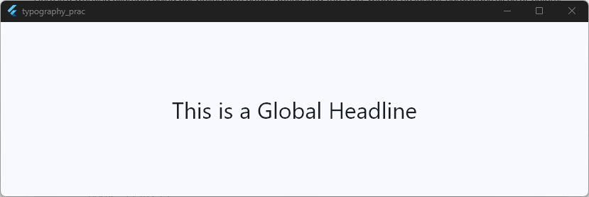
Why This Architecture Wins
Using a proper flutter typography theme completely shifts how you build layouts. Because the text styling points directly to your central theme, it unlocks two immediate benefits:
- Instant Dark Mode Compatibility: Because
headlineLargeknows whether the app is in light or dark mode, the text color flips automatically from dark gray to bright white. You don’t have to write a single line of conditional logic. - Total Brand Control: If you want to change your app’s main font family later, you only have to modify the configuration file once. Every widget using your flutter typography setup updates instantly across the entire application.
Material 2 vs Material 3 Typography
If you are looking at older Flutter tutorials or updating an old codebase, you might notice text styles called headline1, bodyText1, or subtitle1. Those belong to Material 2.
In flutter theme material 3, Google completely redesigned the typography system to make it cleaner, more adaptable, and much easier to understand.
Material 3 does away with the confusing numbered naming system and organizes text styles into five distinct, logical roles.
Here is exactly how the old Material 2 names map to the modern flutter material 3 typography system:
| Material 2 Style (Old) | Material 3 Style (New) | Common Use Case |
headline1 to headline3 | displayLarge to displaySmall | Massive screen headers, dashboard numbers |
headline4 to headline6 | headlineLarge to headlineSmall | Section headers, main app titles |
subtitle1 & subtitle2 | titleLarge to titleSmall | ListItem titles, medium app bar headers |
bodyText1 & bodyText2 | bodyLarge to bodySmall | Long-form reading paragraphs, item descriptions |
caption & button | labelLarge to labelSmall | Text on buttons, form errors, photo captions |
Key Differences You Need to Know
Aside from name changes, Material 3 introduces a highly consistent structural scale. Each of the five main style categories comes in exactly three sizes: Large, Medium, and Small.
Furthermore, when you set useMaterial3: true inside your configuration, the default font weights and tracking configurations shift to match Google’s updated design tokens.
This ensures your typography in flutter looks modern and matches the design language used by top-tier modern apps.
Understanding Display, Headline, Title, Body and Label styles
To truly master flutter material 3 typography, you need to know exactly when to use each of the five core text styles. Let’s break down the purpose of each role, complete with a working example that displays the entire visual hierarchy side by side.
The Five Typographic Roles
- Display: These are the largest text styles in your app. Use them for massive screen headers, landing page hero text, or big numbers on a stats dashboard.
- Headline: Slightly smaller than display styles. Use these for main section headers, page titles, or prominent content blocks.
- Title: These act as medium-emphasis text. They are perfect for
ListTiletitles, card headers, or app bar titles. - Body: The workhorse of your app. Use this for all long-form reading, paragraphs, form input text, and product descriptions.
- Label: These are small, utility-focused text styles. They are designed for button text, form error messages, text tabs, and caption text under images.
The Complete Hierarchy in Action
Here is a working implementation showing how these styles look next to each other using our standard boilerplate code:
class _HomeScreenState extends State<HomeScreen> {
  @override
  Widget build(BuildContext context) {
    final textTheme = Theme.of(context).textTheme;

    return Scaffold(
      body: SingleChildScrollView(
        padding: const EdgeInsets.all(16.0),
        child: Column(
          crossAxisAlignment: CrossAxisAlignment.start,
          children: [
            Text('Display Large', style: textTheme.displayLarge),
            const SizedBox(height: 8),
            Text('Headline Medium', style: textTheme.headlineMedium),
            const SizedBox(height: 8),
            Text('Title Large', style: textTheme.titleLarge),
            const SizedBox(height: 8),
            Text(
              'Body Large Paragraph text goes here.',
              style: textTheme.bodyLarge,
            ),
            const SizedBox(height: 8),
            Text('Label Small Caption', style: textTheme.labelSmall),
          ],
        ),
      ),
    );
  }
}
Code language: Dart (dart)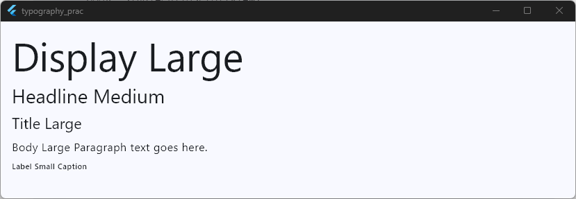
Applying Typography with ThemeData
Now that you understand the different typographic roles, it is time to look at how we actually inject them into our global theme. In Flutter, this is done entirely inside the ThemeData class.
Instead of overriding every single style from scratch, Flutter allows you to supply a configured text system to your main theme builder.
The cleanest way to establish a baseline for your flutter material typography is by using the Typography.material2021() constructor, which provides the official Material 3 layout specifications.
Let’s modify our boilerplate code to explicitly construct and apply a customized, cohesive typographic baseline using ThemeData:
class MyApp extends StatelessWidget {
  const MyApp({super.key});

  @override
  Widget build(BuildContext context) {
    // 1. Fetch the default Material 3 typography configuration geometry
    final m3Typography = Typography.material2021(
      platform: TargetPlatform.windows,
    );

    return MaterialApp(
      title: 'Typography Practice',
      debugShowCheckedModeBanner: false,
      theme: ThemeData(
        useMaterial3: true,
        colorSchemeSeed: Colors.blue,
        brightness: Brightness.light,

        // 2. Bind the typography specifications into the primary theme configurations
        typography: m3Typography,

        // 3. Customize the theme parameters globally
        textTheme: m3Typography.black.copyWith(
          displayLarge: m3Typography.black.displayLarge?.copyWith(
            fontWeight: FontWeight.w900,
            letterSpacing: -1.5,
          ),
          bodyLarge: m3Typography.black.bodyLarge?.copyWith(
            fontSize: 18.0,
            height: 1.4,
          ),
        ),
      ),
      home: const HomeScreen(),
    );
  }
}
Code language: Dart (dart)
class _HomeScreenState extends State<HomeScreen> {
@override
Widget build(BuildContext context) {
final textTheme = Theme.of(context).textTheme;
return Scaffold(
body: Padding(
padding: const EdgeInsets.all(16.0),
child: Column(
crossAxisAlignment: CrossAxisAlignment.start,
children: [
Text('Super Bold Display', style: textTheme.displayLarge),
const SizedBox(height: 16),
Text(
'This body text is globally configured to be larger and have a more comfortable line height for readable viewing.',
style: textTheme.bodyLarge,
),
],
),
),
);
}
}
Code language: Dart (dart)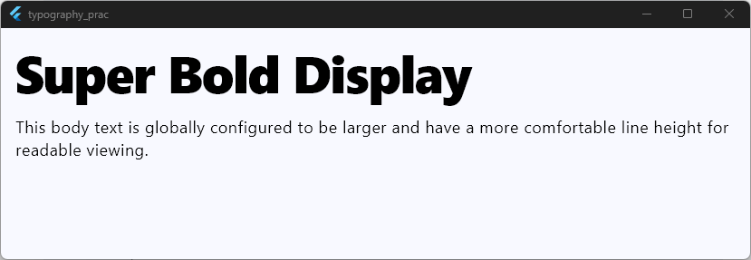
Understanding .black vs .white
When you access fields on a Typography instance, you will notice properties like .black and .white. These do not mean your text will literally be solid black or pure white.
Instead, they represent text style collections designed to contrast cleanly against light or dark background surfaces.
When configuring your primary light theme, pass typography.black. For dark themes, pass typography.white. The framework will then automatically match your text color selections to your layout contrast requirements, ensuring clear readability out of the box.
Using Typography across the entire app
Once you have your global ThemeData set up, consuming those styles across your individual widgets is incredibly simple. The goal is to make sure that no matter where you are in your codebase, your text elements hook directly into your central configuration.
To do this, you simply query the build context using Theme.of(context).textTheme. Flutter’s widgets are smart—many core UI components like ListTile, AppBar, and ElevatedButton automatically look up the text theme internally and apply the correct styles without you needing to write any extra code.
Let’s look at a complete, working example that demonstrates this. We will build a complex dashboard layout where some text styles are automatically handled by the framework, while others are cleanly pulled down manually:
class _HomeScreenState extends State<HomeScreen> {
  @override
  Widget build(BuildContext context) {
    // Accessing our central typographic scale
    final styles = Theme.of(context).textTheme;

    return Scaffold(
      body: ListView(
        padding: const EdgeInsets.all(16.0),
        children: [
          Text('Welcome Back!', style: styles.headlineMedium),
          const SizedBox(height: 4),
          Text('Here is your overview for today.', style: styles.bodyMedium),
          const SizedBox(height: 24),
          Card(
            child: Padding(
              padding: const EdgeInsets.all(16.0),
              child: Column(
                crossAxisAlignment: CrossAxisAlignment.start,
                children: [
                  Text('Monthly Goal Progression', style: styles.titleMedium),
                  const SizedBox(height: 8),
                  // ListTile automatically applies text styles based on Material 3 specifications
                  ListTile(
                    contentPadding: EdgeInsets.zero,
                    title: const Text('Flutter Course Material'),
                    subtitle: const Text(
                      'Typography & TextTheme module completed.',
                    ),
                    trailing: Text('85%', style: styles.labelLarge),
                  ),
                ],
              ),
            ),
          ),
        ],
      ),
    );
  }
}
Code language: Dart (dart)
Writing Scalable Code
By relying on Theme.of(context), you ensure that your code scales smoothly as your application grows.
If you want to dive deeper into structuring highly adaptive layout behaviors, check out our guide on managing Responsive Font Sizes or read through our comprehensive Material 3 Theming Guide.
Keeping your layout styling completely separate from your presentation logic makes your code incredibly modular. Whether you are adding a tiny button or an entirely new feature module, your typography remains uniform, professional, and tightly bound to your design system.
Customizing TextTheme safely
When you want to change how a specific style looks, it can be tempting to just create a completely new TextTheme object from scratch.
Don’t do this! If you build a new TextTheme manually, you destroy all the default font weights, tracking behaviors, and scaling properties that Flutter sets up out of the box.
The safest, cleanest way to alter your typographic rules is by using the copyWith method. This allows you to cherry-pick the exact styles you want to modify while leaving everything else completely untouched.
Let’s look at a working example using our boilerplate code. Here, we safely override just the displayLarge and labelLarge styles without breaking the rest of the application’s typography:
class MyApp extends StatelessWidget {
  const MyApp({super.key});

  @override
  Widget build(BuildContext context) {
    // 1. Capture the existing default theme text layout configurations
    final defaultTextTheme = ThemeData.light().textTheme;

    return MaterialApp(
      title: 'Typography Practice',
      debugShowCheckedModeBanner: false,
      theme: ThemeData(
        useMaterial3: true,
        colorSchemeSeed: Colors.blue,
        brightness: Brightness.light,

        // 2. Use copyWith to safely adjust target styles
        textTheme: defaultTextTheme.copyWith(
          displayLarge: defaultTextTheme.displayLarge?.copyWith(
            fontFamily: 'Serif',
            fontWeight: FontWeight.w900,
            color: Colors.black87,
          ),
          labelLarge: defaultTextTheme.labelLarge?.copyWith(
            letterSpacing: 2.0,
            fontWeight: FontWeight.bold,
          ),
        ),
      ),
      home: const HomeScreen(),
    );
  }
}
Code language: Dart (dart)
class _HomeScreenState extends State<HomeScreen> {
@override
Widget build(BuildContext context) {
final styles = Theme.of(context).textTheme;
return Scaffold(
body: Padding(
padding: const EdgeInsets.all(16.0),
key: const Key('main_content'),
child: Column(
crossAxisAlignment: CrossAxisAlignment.start,
children: [
Text('Custom Title', style: styles.displayLarge),
const SizedBox(height: 16),
Text(
'This body text is perfectly fine because the default copyWith preserved it.',
style: styles.bodyMedium,
),
const SizedBox(height: 16),
ElevatedButton(
onPressed: () {},
child: const Text('TRACK COMPLETED'),
),
],
),
),
);
}
}
Code language: Dart (dart)
Keeping it Clean
If your customization logic starts expanding to include specialized typography packages, you can follow this exact same approach.
For instance, you can safely swap in custom typography sets via assets by visiting our guide on Flutter Custom Fonts, or easily drop in ready-made open-source typography schemes using the Flutter Google Fonts package.
Using copyWith keeps your theme structure safe, predictable, and simple to debug as your design rules grow.
Common Typography Mistakes Beginners Make
Even experienced developers can run into issues with typography when building production layouts. When you are first learning theming best practices, avoiding a few common pitfalls can save you hours of debugging down the road.
Here are the top three mistakes beginners make when handling typography in flutter, along with working examples showing how to fix them.
1. Hardcoding Font Colors (Breaking Dark Mode)
The absolute most common mistake is passing a specific color directly into a widget’s text style. When you hardcode a dark color, your text completely vanishes when the user flips their device into dark mode.
- The Wrong Way:
Text('Hello', style: TextStyle(color: Colors.black)) - The Right Way: Let Flutter handle the color via context, or pull from the primary color scheme.
2. Nesting copyWith on Inline Widgets
If you need a bold headline, don’t re-type the whole font size and family inline. Instead, use copyWith directly on your global context tokens to tweak just the property you need.
- The Wrong Way:
Text('Title', style: TextStyle(fontSize: 24, fontWeight: FontWeight.bold)) - The Right Way:
Text('Title', style: Theme.of(context).textTheme.headlineMedium?.copyWith(fontWeight: FontWeight.bold))
3. Ignoring Accessibility and Text Scaling
When users increase their device’s system font size for better readability, hardcoded text configurations often break, causing layouts to overlap or clip. Using the standard flutter typography scale ensures your text scales gracefully.
The Correct Approach in Code
Let’s see how to correctly structure a layout that avoids all these issues using our boilerplate:
class MyApp extends StatelessWidget {
  const MyApp({super.key});

  @override
  Widget build(BuildContext context) {
    return MaterialApp(
      title: 'Typography Practice',
      debugShowCheckedModeBanner: false,
      // We define both themes so the system colors adapt automatically
      theme: ThemeData(
        useMaterial3: true,
        colorSchemeSeed: Colors.blue,
        brightness: Brightness.light,
      ),
      darkTheme: ThemeData(
        useMaterial3: true,
        colorSchemeSeed: Colors.blue,
        brightness: Brightness.dark,
      ),
      home: const HomeScreen(),
    );
  }
}
Code language: Dart (dart)
class _HomeScreenState extends State<HomeScreen> {
@override
Widget build(BuildContext context) {
final styles = Theme.of(context).textTheme;
return Scaffold(
body: Padding(
padding: const EdgeInsets.all(16.0),
child: Column(
crossAxisAlignment: CrossAxisAlignment.start,
children: [
// Safe inline adjustment that respects global layout scaling
Text(
'Safely Bolded Headline',
style: styles.headlineMedium?.copyWith(
fontWeight: FontWeight.bold,
),
),
const SizedBox(height: 12),
// This text automatically changes color in Dark Mode!
Text(
'This is adaptive body text. Switch your device simulator to dark mode, and watch me cleanly flip to white without breaking.',
style: styles.bodyMedium,
),
],
),
),
);
}
}
Code language: Dart (dart)
Flutter Typography Best Practices
To wrap up our deep dive into flutter material 3 typography, let’s lay out the golden rules you should follow on every production project.
Adhering to these core flutter theming best practices ensures your apps stay highly maintainable and look incredibly polished.
Flutter Typography Best Practices
- Always Extend, Never Rebuild: Use the
.copyWith()method when customizing your text theme parameters. Creating raw, manual configurations drops crucial layout logic like font tracking and responsive scaling parameters. - Let the System Handle Contrast: Avoid hardcoding solid black or white color options directly inside your
TextStylearguments. Instead, rely on context-driven lookups so that your layout naturally shifts when transitioning between light and dark modes. - Respect the Role Scale: Use typography roles exactly as intended. Keep display tokens strictly for hero copy, use headlines for section tags, body styles for descriptions, and labels for utility interactions.
- Keep Layout Constraints Flexible: Avoid limiting your
Textcontainer heights aggressively. Users frequently adjust system-wide accessibility features, so your text blocks must have room to wrap naturally without clipping.
Key Takeaways
- Material 3 simplifies typography: The updated framework replaces the confusing, old Material 2 numbered classes with five clear, easy-to-understand design categories: Display, Headline, Title, Body, and Label.
- Context-driven code scales best: Querying your rules using
Theme.of(context).textThemeseparates styling details from layout presentation logic, allowing you to update your design assets centrally across fifty files at once. - Safe custom themes require
copyWith: Modifying individual properties viacopyWithpreserves crucial underlying system tokens, ensuring your layout remains stable across different devices.
Master Production Architecture
Once your typography system is consistent, the next challenge is using it across complete production apps. In the Flutter implementation class, you’ll build reusable design systems that scale from simple apps to large projects.
You will learn how to build production-grade, highly adaptive responsive applications from the ground up—writing clean code first, and using modern engineering workflows to refine your software architecture flawlessly.
Ready to Build Real Flutter Apps?
Nice work making it to the end! If this guide helped you, you’ll love my free hands-on Flutter class where we build a real app together, step by step.