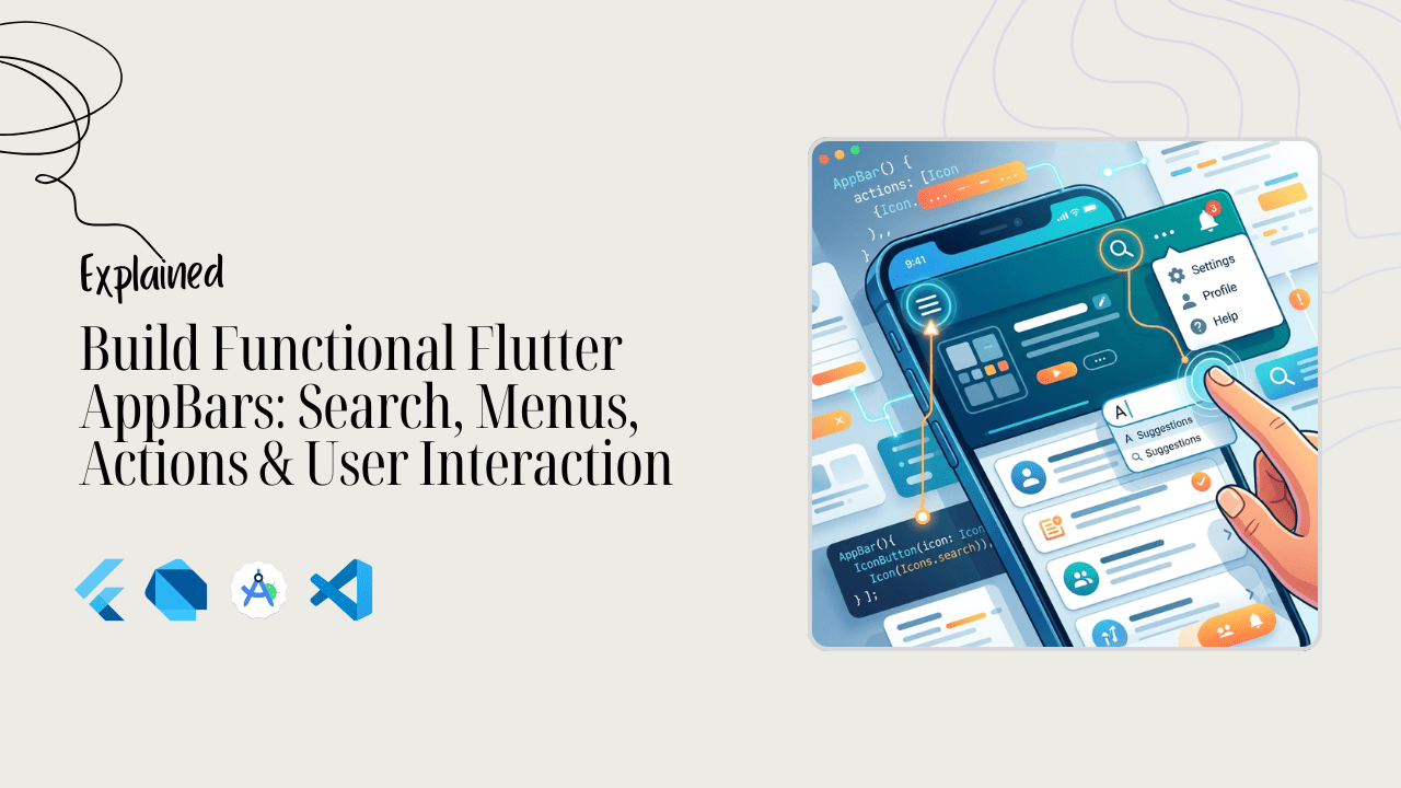
The top of your app screen isn’t just empty space. It is prime real estate.
In Flutter, the AppBar is often the very first thing your users notice. If it is clunky or confusing, users will struggle to navigate your app. But when you build it right, it becomes a powerful control center.
A great AppBar does more than just show a screen title. It guides your users. It lets them search your app instantly, open quick settings, check notifications, or trigger fast actions.
Think of popular production apps like WhatsApp, YouTube, or Spotify. Their top bars are packed with functionality, yet they feel incredibly clean and effortless to use.
In this complete guide, you will learn exactly how to build functional Flutter AppBars. We will break down how to add action buttons correctly, create smooth popup menus, and embed a fully functional search bar.
Whether you want to handle action overflow cleanly or combine your AppBar with a TabBar, we have you covered. Let’s dive in and turn your static top bars into highly interactive UI components!
Want to build together?
By the way, I have a free Flutter mini-class if you want to practice building real-world apps. We’ll look at how these UI pieces connect to APIs, state management, and actual development workflows.
AppBar Actions Explained Simply
Think of the AppBar as the dashboard of your app screen. While the title tells users where they are, the flutter appbar actions are the buttons that let them get things done.
In Flutter, the AppBar widget has a specific slot just for this called the actions property. This property takes a list of widgets, which means you can place multiple interactive icons right at the top edge of your screen.
Because mobile screens have limited space, these actions are traditionally placed on the right side of the bar. In Flutter terminology, these are often referred to as the flutter appbar trailing elements or the flutter appbar right icon.
AppBar(
  title: const Text('My App'),
  actions: [
    // Your action buttons go here
  ],
)
Code language: Dart (dart)
The beauty of using the dedicated actions list is that Flutter automatically aligns, spaces, and formats the icons to match native Material Design guidelines.
This ensures your top bar looks clean and professional across all devices. When a user taps one of these icons—whether it is a search glass, a settings gear, or a shopping cart—it triggers an immediate response, making your app feel snappy and highly interactive.
Adding action buttons correctly
To add an flutter appbar action button the right way, we need to talk about layout and touch targets. It is incredibly frustrating for users when buttons are too small to tap or crammed too close together.
Thankfully, Flutter gives us built-in widgets that handle the heavy lifting for spacing and native touch feedback.
When you want to add a button to the right side of your app bar, your go-to widget is the IconButton. It automatically applies the standard Material padding and gives users that satisfying ripple effect when they tap it.
Let’s look at a clean, production-ready example of how to flutter appbar add button right sides cleanly:
appBar: AppBar(
  title: const Text('Home Screen'),
  backgroundColor: theme.colorScheme.primary,
  foregroundColor: theme.colorScheme.onPrimary,
  actions: <Widget>[
    IconButton(
      icon: const Icon(Icons.share),
      tooltip: 'Share Post',
      onPressed: () {
        // Handle your share logic here
      },
    ),
    IconButton(
      icon: const Icon(Icons.settings),
      tooltip: 'Open Settings',
      onPressed: () {
        // Navigate to settings screen
      },
    ),
  ],
),
Code language: Dart (dart)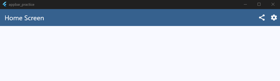
Notice the tooltip property? Don’t skip it. Tooltips are essential for accessibility because they let screen readers know what the button does. Plus, if a desktop or web user hovers over the icon, a small text hint pops up.
If you ever need a text button instead of an icon, wrap a TextButton inside a Center widget or apply minor horizontal padding.
This keeps your text from bumping right against the screen edge and ensures your layout looks polished and professional.
Popup Menus and Dropdown Menus
Sometimes, you have too many options and not enough screen space. That is where a flutter appbar menu comes to the rescue.
Instead of cluttering your top bar with five different icons, you can group secondary choices inside a clean, hidden menu.
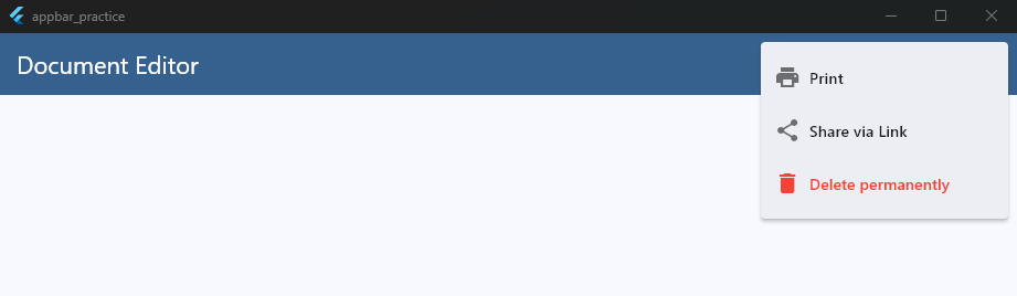
The most standard way to do this in Flutter is by using a flutter appbar popupmenubutton. This widget displays the classic three-dot “overflow” icon that mobile users already know and expect. When tapped, a sleek material menu drops down.
Here is how you add a flutter appbar popup menu to your layout:
appBar: AppBar(
  title: const Text('My Workspace'),
  backgroundColor: theme.colorScheme.primary,
  foregroundColor: theme.colorScheme.onPrimary,
  actions: [
    PopupMenuButton<String>(
      onSelected: (String value) {
        // Handle menu selection logic here
        print('Selected: $value');
      },
      itemBuilder: (BuildContext context) => [
        const PopupMenuItem<String>(
          value: 'profile',
          child: Text('View Profile'),
        ),
        const PopupMenuItem<String>(
          value: 'logout',
          child: Text('Sign Out'),
        ),
      ],
    ),
  ],
),
Code language: Dart (dart)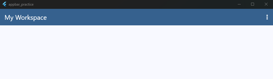

If you prefer a traditional flutter appbar dropdown menu that shows the currently selected item right in the bar, you can wrap a standard DropdownButton inside your actions list.
However, for standard app bars, the popup menu button is usually your best bet. It keeps the design clean and ensures your primary actions stand out without overwhelming the user interface.
Search Bars Inside AppBar
A flutter search bar in appbar layout is one of the most common design patterns you will build. Users expect to find search functionality right at the top of the screen.
In Flutter, you can implement a flutter appbar search experience in two primary ways: by embedding a text field directly into the app bar, or by utilizing the native search delegate.
If you want a permanent, persistent flutter appbar with search bar setup, you can replace the static title widget with a customized TextField.
This keeps the input field visible at all times, which is excellent for search-heavy views. Here is a clean production pattern for a toggleable search bar inside your actions:
class _HomeScreenState extends State<HomeScreen> {
  bool _isSearching = false;
  final TextEditingController _searchController = TextEditingController();

  @override
  Widget build(BuildContext context) {
    final theme = Theme.of(context);

    return Scaffold(
      appBar: AppBar(
        title: _isSearching
            ? TextField(
                controller: _searchController,
                autofocus: true,
                decoration: const InputDecoration(
                  hintText: 'Search items...',
                  border: InputBorder.none,
                  hintStyle: TextStyle(color: Colors.white70),
                ),
                style: const TextStyle(color: Colors.white),
              )
            : const Text('Product Catalog'),
        backgroundColor: theme.colorScheme.primary,
        foregroundColor: theme.colorScheme.onPrimary,
        actions: [
          IconButton(
            icon: Icon(_isSearching ? Icons.close : Icons.search),
            onPressed: () {
              setState(() {
                if (_isSearching) {
                  _isSearching = false;
                  _searchController.clear();
                } else {
                  _isSearching = true;
                }
              });
            },
          ),
        ],
      ),
    );
  }
}
Code language: Dart (dart)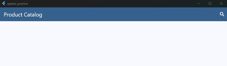
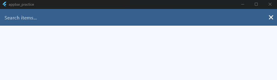
This inline approach gives you full control over the look, feel, and animation of the input field. It works perfectly when you want to filter an existing list on the same screen instantly as the user types.
Search UX Patterns
Building a search feature is only half the battle. Designing an intuitive, frictionless user experience is what separates amateur apps from polished, production-ready products.
When integrating search into your AppBar, you need to carefully consider how users interact with the keyboard, how results load, and how they navigate backward.
Let’s look at the three most successful UX patterns used in top-tier apps today.
1. The Persistent Search Bar
Popularized by apps like Google Maps and Gmail, this pattern drops the traditional solid AppBar background altogether. Instead, a floating card sits directly at the top of the body content.
- Best For: Apps where searching is the primary user intent upon opening the screen.
- UX Benefit: It requires zero taps to reveal the text field, making it incredibly inviting.
- Implementation Tip: Do not use the
AppBarwidget’stitleproperty for this. Instead, use a nested scroll view or aSliverPersistentHeaderto let the floating search bar smoothly slide out of view when the user scrolls down to read content.
2. The Expandable Action Icon
This is the pattern we built in the previous section. The screen starts with a clean title and a simple search icon on the right side. Tapping the icon transforms the title space into a fully functional TextField.
- Best For: E-commerce catalogs, note-taking apps, and messaging histories where browsing is the default behavior, but searching is heavily utilized.
- UX Benefit: Saves vertical screen real estate while keeping the interface beautifully minimal.
- Crucial UX Details: Always set
autofocus: trueon theTextFieldso the soft keyboard pops up instantly when the search icon is clicked. Additionally, swap the search icon for a clear “X” button so users can wipe their query with a single tap.
3. The Full-Screen Search Delegate (showSearch)
Flutter includes a native Material Design search pattern out of the box via the showSearch() function. When triggered, it slides open an entirely separate, dedicated search interface over the current screen.
- Best For: Complex data filtering, global app searches, or platforms that require rich search histories and autocomplete suggestions.
- UX Benefit: It completely isolates the search experience, giving you an entirely clean canvas to show past queries, popular tags, or live filtering results without cluttering your main state management.
Common Search UX Mistakes to Avoid
- Missing Smooth Transitions: Instantly popping a text box into existence feels jarring. Use Flutter’s
AnimatedCrossFadeorAnimatedContainerto gently slide or expand your search bar components. - Ignoring the Hardware Back Button: If a user opens an expandable search bar, hitting the Android system back button should collapse the search field first, rather than instantly closing the entire screen. You can easily manage this behavior by wrapping your view in a
PopScopewidget to intercept the back navigation. - Blocking the UI Thread: If you are querying a local database or a remote API, never block the user interface. Use a debouncer (a mechanism that waits for the user to stop typing for 300–500 milliseconds) before firing off your search requests. Pair this with a subtle
LinearProgressIndicatorplaced directly at the bottom of theAppBarto show users that your app is actively fetching data.
Action Overflow Handling
When building a responsive mobile app, screen width is your most precious resource. While an iPhone Pro Max might have plenty of room to display four action icons in the top bar, a smaller device will quickly run out of space.
If you try to cram too many buttons into your actions list, they will overlap, clip, or break your layout entirely.
Handling action overflow correctly means deciding which buttons are essential for the screen, and which ones can be tucked away cleanly inside a secondary menu.
The Standard Overflow Pattern
The most elegant way to solve this in Flutter is by combining prominent IconButton widgets with a trailing PopupMenuButton.
You keep your top one or two most critical actions visible at all times, and move everything else into the three-dot overflow menu.
Here is a clean implementation showing how to handle overflow gracefully:
appBar: AppBar(
  title: const Text('Document Editor'),
  backgroundColor: theme.colorScheme.primary,
  foregroundColor: theme.colorScheme.onPrimary,
  actions: [
    // Primary Action: Always visible because users do this constantly
    IconButton(
      icon: const Icon(Icons.save),
      tooltip: 'Save Document',
      onPressed: () {},
    ),
    // Secondary Actions: Moved into an overflow menu to protect screen space
    PopupMenuButton<String>(
      tooltip: 'More options',
      onSelected: (value) {
        // Handle overflow action
      },
      itemBuilder: (context) => [
        const PopupMenuItem(
          value: 'print',
          child: Row(
            children: [
              Icon(Icons.print, color: Colors.black54),
              SizedBox(width: 8),
              Text('Print'),
            ],
          ),
        ),
        const PopupMenuItem(
          value: 'share',
          child: Row(
            children: [
              Icon(Icons.share, color: Colors.black54),
              SizedBox(width: 8),
              Text('Share via Link'),
            ],
          ),
        ),
        const PopupMenuItem(
          value: 'delete',
          child: Row(
            children: [
              Icon(Icons.delete, color: Colors.red),
              SizedBox(width: 8),
              Text(
                'Delete permanently',
                style: TextStyle(color: Colors.red),
              ),
            ],
          ),
        ),
      ],
    ),
  ],
),
Code language: Dart (dart)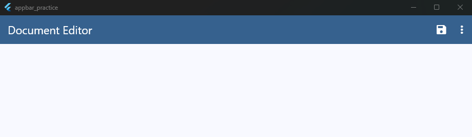
Adapting to Layout Constraints
If you want to get truly professional, you can use a LayoutBuilder around your AppBar actions or check the screen width using MediaQuery.
If the screen width is wide (like a tablet), you can conditionally show all three or four icons out in the open. If the device screen is narrow, you can dynamically wrap those extra icons into the popup menu.
Notification Icons and Badges
Adding a flutter appbar notification bell to your top bar is a classic way to keep users engaged. However, a plain bell icon doesn’t tell the whole story.
To make it truly useful, you need a visual badge that shows the number of unread alerts waiting for them.
Instead of writing complex mathematical stack overlays manually, modern versions of Flutter include a native widget designed exactly for this purpose: the Badge widget. It effortlessly wraps around any icon to display small status dots or real-time counters.
Here is how you can easily implement a notification badge right inside your actions list:
appBar: AppBar(
  title: const Text('Dashboard'),
  backgroundColor: theme.colorScheme.primary,
  foregroundColor: theme.colorScheme.onPrimary,
  actions: [
    IconButton(
      icon: Badge(
        label: const Text('3'), // The number displayed inside the badge
        backgroundColor: Colors.red,
        textColor: Colors.white,
        child: const Icon(Icons.notifications),
      ),
      tooltip: 'Notifications',
      onPressed: () {
        // Navigate to notifications screen
      },
    ),
  ],
),
Code language: Dart (dart)
By passing your Icon into the child property, Flutter automatically handles the relative alignment, ensuring your counter rests perfectly on the upper-right corner of the bell.
If you want to hide the badge entirely when there are zero notifications, simply wrap the Badge or use a conditional statement to pass a standard Icon(Icons.notifications) when your database count hits zero.
Building Reusable Action Menus
As your app grows, you will quickly find yourself copying and pasting the exact same AppBar action buttons across multiple screens.
For example, a “Profile” icon or a “Settings” dropdown might need to look and behave identically on both the Home screen and the Analytics screen.
Writing that code over and over violates the DRY (Don’t Repeat Yourself) principle. It also makes updating your app a total headache.
If you decide to change an icon later, you would have to hunt down every single file to fix it. Instead, you should bundle those actions into a single, clean, reusable widget.
The cleanest approach is to create a custom widget that returns a List<Widget>. This fits flawlessly right into any standard actions property.
Here is a production-ready template for a reusable menu component:
import 'package:flutter/material.dart';

class GlobalActionMenu extends StatelessWidget {
  final VoidCallback onProfileTap;
  final VoidCallback onHelpTap;

  const GlobalActionMenu({
    super.key,
    required this.onProfileTap,
    required this.onHelpTap,
  });

  @override
  Widget build(BuildContext context) {
    return Row(
      mainAxisSize:
          MainAxisSize.min, // Prevents row from taking full screen width
      children: [
        IconButton(
          icon: const Icon(Icons.help_outline),
          tooltip: 'Help & Support',
          onPressed: onHelpTap,
        ),
        PopupMenuButton<String>(
          tooltip: 'Account Menu',
          onSelected: (value) {
            if (value == 'profile') onProfileTap();
          },
          itemBuilder: (context) => [
            const PopupMenuItem(value: 'profile', child: Text('My Profile')),
          ],
        ),
      ],
    );
  }
}
Code language: Dart (dart)
Now, look how incredibly simple and clean your screen code becomes when you pull this global component into your views:
appBar: AppBar(
  title: const Text('Home Feed'),
  backgroundColor: theme.colorScheme.primary,
  foregroundColor: theme.colorScheme.onPrimary,
  actions: [
    GlobalActionMenu(
      onProfileTap: () => Navigator.pushNamed(context, '/profile'),
      onHelpTap: () => Navigator.pushNamed(context, '/support'),
    ),
  ],
),
Code language: Dart (dart)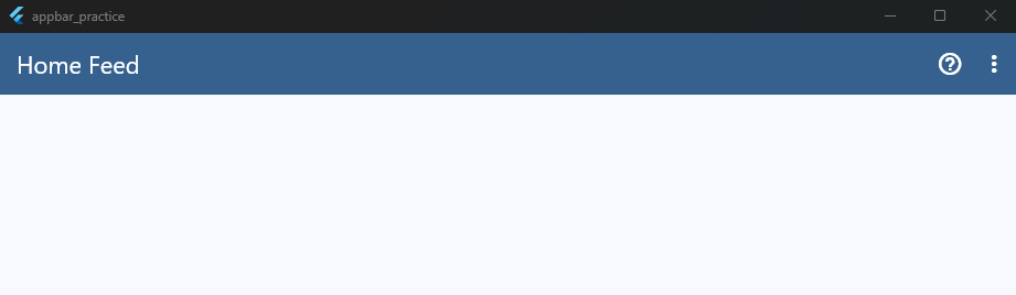
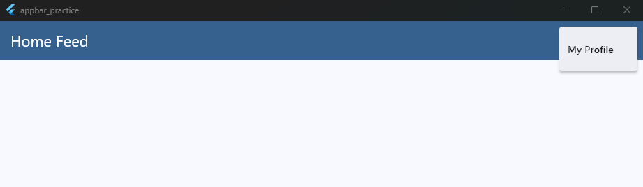
By passing functions as callbacks (onProfileTap and onHelpTap), you keep your UI modular.
The action menu stays responsible for how the buttons look, while your parent screens retain full control over where the navigation goes.
This keeps your codebase incredibly easy to maintain and test as you scale your app layers.
Combining AppBar + TabBar
When you need to organize a lot of content without sending users to a completely different screen, pairing an AppBar with a TabBar is the perfect solution.
This layout lets users swipe smoothly between different sub-categories—like switching between “Chats,” “Status,” and “Calls” in WhatsApp.
In Flutter, you don’t need to hack together custom positioning to make this work. The AppBar has a dedicated bottom slot built exactly for housing navigation tabs.
To keep your code stable and avoid layout crashes, you must wrap your layout structure inside a DefaultTabController. This built-in controller automatically synchronizes your tabs with the swipable views below.
Here is how you combine them correctly:
return DefaultTabController(
  length: 3, // The exact number of tabs you have
  child: Scaffold(
    appBar: AppBar(
      title: const Text('Store Manager'),
      actions: [
        IconButton(icon: const Icon(Icons.search), onPressed: () {}),
      ],
      // This is where the magic happens
      bottom: const TabBar(
        tabs: [
          Tab(icon: Icon(Icons.inventory), text: 'Stock'),
          Tab(icon: Icon(Icons.local_shipping), text: 'Orders'),
          Tab(icon: Icon(Icons.analytics), text: 'Sales'),
        ],
      ),
    ),
    body: const TabBarView(
      children: [
        Center(child: Text('Inventory Content')),
        Center(child: Text('Shipping Orders Content')),
        Center(child: Text('Financial Analytics Content')),
      ],
    ),
  ),
);
Code language: Dart (dart)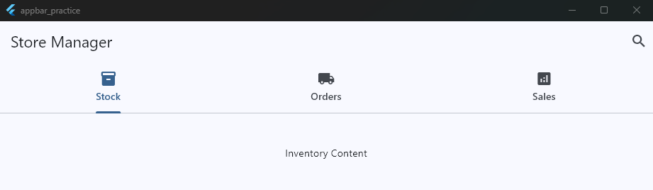
Essential Rules for Tab Integration
- Respect the Bottom Property: The
bottomslot of anAppBarexpects a widget that implementsPreferredSizeWidget. The standard FlutterTabBardoes this perfectly out of the box. - Match Your Lengths: Always make sure the
lengthproperty inside yourDefaultTabControllermatches the exact number of items in yourTabBarlist and yourTabBarViewlist. If they don’t align, Flutter will throw a severe runtime indexing error.
Real-World AppBar Patterns from Production Apps
The best way to master UI design is to look at the apps you already use every day. Large tech platforms spend thousands of hours testing interfaces to find out what works best for users.
By studying their layouts, you can replicate their success inside your own custom Flutter applications.
Let’s tear down how three top-tier production apps structure their top bar real estate.
1. The WhatsApp Structure (Action Heavy + TabBar)
WhatsApp utilizes a highly efficient, multi-layered command center built to manage high-volume messaging interactions.
- The Layout: A distinct primary brand title on the left side, followed by a dense row of actions on the right (frequently featuring a camera icon, a search icon, and a classic three-dot overflow button). Directly beneath this row sits a persistent, full-width
TabBar. - Flutter Translation: This is a classic textbook use case for nesting a
TabBarwithin thebottomslot of your mainAppBar. The action buttons are explicitly mapped as inlineIconButtonentries, while the trailing element drops down into a structuredPopupMenuButtonto store secondary options like “Linked devices” or “Settings.”
2. The YouTube Structure (Dynamic Badges + Branding)
YouTube shifts the balance away from plain text titles, using the top bar to prioritize brand presence and real-time user notification metrics.
- The Layout: The left side completely swaps the default text title for the official corporate visual logo. The trailing right side lines up active streaming icons, the user’s personal profile avatar, and a high-visibility notification bell sporting a prominent unread message counter.
- Flutter Translation: To build this, replace the
titlestring with a clean layout asset likeImage.asset('assets/logo.png'). For the notification tracker, pass anIconButtondirectly into theactionsarray, wrapping the target icon perfectly using Flutter’s nativeBadgecomponent.
3. The Spotify Structure (Contextual Transparency)
Spotify focuses on immersive, content-first layouts where the interface adapts directly to the media asset the user is viewing.
- The Layout: When viewing an album or custom playlist, the top bar starts completely transparent. The artwork sits fully behind it. As the user scrolls down into the tracklist, the bar smoothly transitions into a solid background color while cross-fading the album name directly into view.
- Flutter Translation: Achieve this clean aesthetic by opting out of a standard
AppBarand implementing aCustomScrollViewbuilt with aSliverAppBar. Set properties likepinned: trueandflexibleSpaceto establish a beautiful background gradient that shifts automatically based on scroll offsets.
By applying these industry-proven patterns to your own layouts, you create interfaces that instantly feel familiar, comfortable, and intuitive to your target audience.
Boost your UI skills today!
Join my free Flutter mini-class to master connecting these elements to real APIs and workflows. Ready to build production-grade apps?