Let’s be honest. We’ve all been there.
You build a brand new Flutter app. You run it on your emulator. It works perfectly. But when you look at the top of the screen, something feels off.
It’s the default AppBar.
It looks plain. It looks rigid. In fact, it looks exactly like every other basic tutorial app out there. If you want to build a truly flutter modern appbar, the default settings just won’t cut it.
Your app’s header is the very first thing users see. It sets the tone for the entire user experience. A generic header makes your whole project feel like a basic demo.
But a beautiful, custom header? That immediately makes your app look polished, premium, and professional.
The good news is that flutter appbar ui design doesn’t have to be complicated. You don’t need to settle for flat, boring headers anymore.
In this ultimate guide, we are going to completely transform your app’s top bar. We will move past the basics and dive into advanced visual styling. You will learn exactly how to build:
- Stunning flutter appbar gradient effects.
- Flawless flutter transparent appbar setups that blend with your background.
- Trendy flutter appbar glassmorphism (that beautiful frosted-glass look).
- Dynamic scroll effects, custom shapes, and clean Material 3 styles.
By the end of this post, you’ll know how to turn a standard interface into a visually striking UI that users love.
Let’s dive in and upgrade your UI!
Build Apps That Look Premium, Not Like Demos
Most tutorials only teach you how to build basic, plain-looking apps. Our premium class shows you how to design polished, production-grade Flutter apps that are ready for the real world.
Why Default AppBars Look Outdated
Let’s be completely honest. When you first spin up a brand-new Flutter project using flutter create, that initial app layout feels magical.
But the moment you look closely at the top of the screen, reality sets in. The default AppBar looks incredibly dated.
Out of the box, Flutter’s standard layout gives you a solid, flat block of color cutting right across the top of your user interface. It is rigid, it is blocky, and it screams “tutorial project.”
If your goal is to master flutter appbar ui design, settling for these default configurations is the fastest way to make a brilliant app feel amateur.
Here is exactly why the default setup fails to meet modern design standards:
- The “Flat Block” Isolation: A standard
AppBaracts like a harsh visual wall. It completely cuts off the top of your screen from the content flowing underneath it, destroying any sense of visual continuity. - Lack of Depth and Texture: Modern mobile design relies heavily on subtle lighting, layered materials, and depth. A solid, unyielding background color makes your UI feel completely flat and lifeless.
- Rigid Material 2 Hangovers: Even with modern framework updates, relying purely on default parameters often reverts your app’s layout to old-school Material 2 aesthetics—think heavy, artificial drop shadows and aggressive primary colors that feel miles away from a flutter modern appbar.
Take a look at the most popular apps on your phone right now.
Whether it’s a sleek social media platform, a premium banking app, or a beautifully designed productivity tool, they all treat the top header as an integrated, fluid part of the overall canvas.
They use transparency to let content breathe, smooth gradients to guide the eye, and soft blurs to maintain context.
When you leave the AppBar exactly as it comes, you are telling your users that you didn’t pay attention to the details.
In a highly competitive app market, those details are exactly what separate an app that gets immediately uninstalled from an app that users love interacting with every single day.
To break out of these basic constraints and start building interfaces that look truly premium, we need to master the art of custom styling.
Let’s move past the defaults and explore how adding a flutter appbar gradient can completely shift the mood of your entire user interface.
Creating Gradient AppBars
Now that we know why flat colors look boring, let’s fix it. The easiest way to make a flutter modern appbar stand out is to add a smooth color transition.
A flutter appbar gradient gives your header depth. It draws the eye and instantly makes your app feel more premium.
But if you look at the standard AppBar widget, you will notice there is no gradient property. Instead, we have to use a powerful property called flexibleSpace. This property lets us place any widget we want behind the title and icons.
Here is the cleanest way to build a flutter appbar gradient color effect using a Container and a BoxDecoration:
appBar: AppBar(
  title: const Text('Discover'),
  foregroundColor: theme.colorScheme.onPrimary,
  // We use flexibleSpace to inject our gradient background
  flexibleSpace: Container(
    decoration: const BoxDecoration(
      gradient: LinearGradient(
        colors: [
          Color(0xFFDC143C),
          // Crimson Red
          Color(0xFF8B0000),
          // Dark Red
        ],
        begin: Alignment.topLeft,
        end: Alignment.bottomRight,
      ),
    ),
  ),
),
Code language: Dart (dart)
Why This Works Seamlessly
By wrapping a LinearGradient inside the flexibleSpace, the colors stretch perfectly across the entire header. This includes the status bar area at the very top of the phone screen.
When picking your colors, try to use shades that blend naturally. A harsh jump between two completely different bright colors can look messy.
A subtle shift from a primary color to a slightly darker or lighter shade creates a polished, professional look.
Clean Design Tip
If you are using a rich gradient background, make sure your icons and text contrast well.
If your gradient is dark, use a AppBar(iconTheme: IconThemeData(color: Colors.white)) or a modern custom theme to keep your navigation sharp and highly readable.
Transparent AppBars Explained
Sometimes, the best header design is one that completely disappears.
A flutter transparent appbar is perfect when you want your screen’s background content to sit right at the very top of the device.
This looks incredible when you have a beautiful background image or a rich texture wrapping your entire page canvas. It makes the entire layout feel open, immersive, and premium.
To make a header fully see-through, we need to do three specific things:
- Clear the default
backgroundColor. - Remove the default flutter appbar shadow by setting
elevationto zero. - Tell the
Scaffoldto extend its body behind the header area.
By default, a Scaffold places its body below the top navigation bar. To place a background image completely behind our header, we must set extendBodyBehindAppBar to true.
Here is the exact code to build a gorgeous, seamless layout with a flutter appbar transparent setup:
return Scaffold(
  // This pushes the body all the way to the top of the screen
  extendBodyBehindAppBar: true,
  appBar: AppBar(
    title: const Text('Travel Journal'),
    backgroundColor: Colors.transparent,
    foregroundColor: theme.colorScheme.onPrimary,
    elevation: 0,
    // Removes the shadow completely
  ),
  body: Container(
    width: double.infinity,
    height: double.infinity,
    decoration: const BoxDecoration(
      image: DecorationImage(
        image: NetworkImage(
          'https://images.pexels.com/photos/3218443/pexels-photo-3218443.jpeg',
        ),
        fit: BoxFit.cover,
      ),
    ),
    child: const SafeArea(
      top: false,
      // Allows content to bleed into the top area naturally
      child: Center(
        child: Text(
          'Explore the World',
          style: TextStyle(color: Colors.white, fontSize: 24),
        ),
      ),
    ),
  ),
);
Code language: Dart (dart)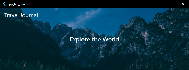
Keep Accessibility in Mind
When you build a transparent interface, your text and action icons will sit directly on top of your background image. If your image has a mix of very bright and very dark spots, your navigation icons might become hard to see.
To keep your design accessible, you can add a subtle, dark overlay gradient on top of your image asset inside the BoxDecoration.
This tiny touch ensures your white title text stays sharp and perfectly readable, no matter what image sits underneath it.
Glassmorphism AppBar Design
If you want to create a truly cutting-edge interface, a completely transparent header isn’t always the best choice. Content rolling underneath can make your text difficult to read.
On the other hand, a solid block of color completely kills your visual depth.
The perfect middle ground? Flutter appbar glassmorphism.
This design style mimics physical frosted glass. It allows the colors of your background image to bleed through beautifully, but blurs them just enough to keep your foreground text and icons completely sharp and readable.
It gives you a sleek, premium, and modern look that makes your app feel instantly professional.
To build a flutter glass appbar or a flutter frosted appbar, we combine a see-through color background with Flutter’s powerful BackdropFilter widget inside the flexibleSpace.
Here is the exact code implementation to achieve a perfect frosted-glass look:
class _HomeScreenState extends State<HomeScreen> {
  @override
  Widget build(BuildContext context) {
    final theme = Theme.of(context);

    return Scaffold(
      extendBodyBehindAppBar: true,
      // Crucial for glassmorphism to show background content
      appBar: AppBar(
        title: const Text(
          'Settings',
          style: TextStyle(fontWeight: FontWeight.bold),
        ),
        backgroundColor: Colors.transparent,
        // Keeps the container transparent
        foregroundColor: theme.colorScheme.onPrimary,
        elevation: 0,
        flexibleSpace: ClipRRect(
          child: BackdropFilter(
            // Adjust the blur sigma values to get the perfect frosted look
            filter: ImageFilter.blur(sigmaX: 10.0, sigmaY: 10.0),
            child: Container(
              color: Colors.white.withValues(alpha: 0.1),
              // Translucent white tint
            ),
          ),
        ),
      ),
      body: Container(
        width: double.infinity,
        height: double.infinity,
        decoration: const BoxDecoration(
          image: DecorationImage(
            image: NetworkImage(
              'https://images.pexels.com/photos/3218443/pexels-photo-3218443.jpeg',
            ),
            fit: BoxFit.cover,
          ),
        ),
        child: ListView.builder(
          itemCount: 20,
          itemBuilder: (context, index) => ListTile(
            title: Text(
              'Setting Item Item $index',
              style: const TextStyle(color: Colors.white70),
            ),
          ),
        ),
      ),
    );
  }
}
Code language: Dart (dart)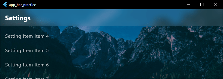
The Secrets to Perfect Glassmorphism
To make your frosted glass look hyper-realistic, keep these three golden design rules in mind:
- Don’t skip the ClipRRect: If you don’t wrap your
BackdropFilterinside aClipRRector a similar clipping widget, the blur effect can bleed outside the bounds of the header and mess up your entire screen layout. - Keep the opacity extremely low: Your translucent tint color (whether you use white or black) should generally sit between
0.05and0.15opacity. If you go higher, the material starts looking like regular flat plastic instead of premium glass. - Contrast is king: When using a white tinted frosted bar, ensure your background content is vibrant or dark enough so your white text stays highly visible as it scrolls underneath.
Rounded AppBars and Border Radius
Sometimes you don’t want your navigation header to look like a standard rigid rectangle.
Shifting away from razor-sharp corners toward smooth, rounded edges can instantly give your user interface a friendly, modern, and card-like appearance.
Adding a flutter appbar rounded corners look is incredibly useful when building dashboard apps, profile pages, or search-centric views where the top bar needs to feel like a distinct, floating element.
To add curves to your header, we make use of the shape property. This property takes a BorderRadius object, allowing us to curve specific edges—like just the bottom-left and bottom-right corners.
Here is the cleanest way to set a custom flutter appbar border radius or a completely distinct flutter appbar shape:
appBar: AppBar(
  title: const Text('My Dashboard'),
  // We use RoundedRectangleBorder to shape the bottom edges of the bar
  shape: const RoundedRectangleBorder(
    borderRadius: BorderRadius.only(
      bottomLeft: Radius.circular(30),
      bottomRight: Radius.circular(30),
    ),
  ),
  backgroundColor: const Color(0xFFDC143C),
  // Crimson Red
  foregroundColor: theme.colorScheme.onError,
),Code language: Dart (dart)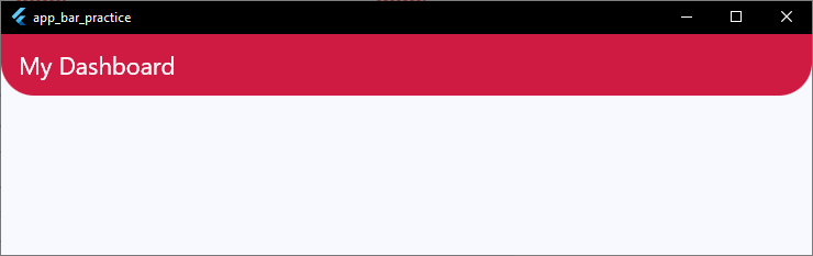
Creating a Floating Card Style
If you want to take your flutter appbar ui design a step further, you can combine a rounded shape with a matching shadow profile.
By curving the bottom edges and adding an intentional elevation, the header lifts off the page canvas like a physical card.
When configuring a rounded shape, remember that content scrolling underneath will be clipped by the curved edges of your bar.
If you don’t want the scrolling list content poking through the empty corners below the curves, ensure your page body matches the background styling of your parent theme seamlessly.
FlexibleSpace Customization
To build a truly custom flutter modern appbar, you need to understand one key property: flexibleSpace.
Think of the standard AppBar as a layered stack. The title and icons sit on the very top layer. The background color sits on the bottom layer. The flexibleSpace is a massive empty canvas that sits right between those two layers.
It expands and contracts to fill the entire height and width of the header.
We’ve already used this property to add gradients and blurs. But you can put almost any layout or widget tree inside it. It is the ultimate tool for pushing your flutter appbar ui design past basic limits.
Here is an example of a deep flutter appbar flexible space setup. It stacks a background design element underneath your navigation elements safely:
appBar: AppBar(
  leading: IconButton(icon: const Icon(Icons.menu), onPressed: () {}),
  title: const Text('Creative Space'),
  actions: [
    IconButton(icon: const Icon(Icons.notifications), onPressed: () {}),
  ],
  foregroundColor: theme.colorScheme.onError,
  // We extend the toolbar height to give our flexible space more breathing room
  toolbarHeight: 80.0,
  flexibleSpace: Container(
    color: const Color(0xFF000000),
    // Pure Black background
    child: Stack(
      children: [
        // A stylized abstract decorative shape positioned in the corner
        Positioned(
          right: -30,
          top: -20,
          child: Container(
            width: 150,
            height: 150,
            decoration: BoxDecoration(
              color: const Color(0xFFDC143C).withValues(alpha: 0.2),
              // Subtle Crimson highlight
              shape: BoxShape.circle,
            ),
          ),
        ),
        // A second design shape to add layered depth
        Positioned(
          left: 40,
          bottom: -10,
          child: Container(
            width: 420,
            height: 420,
            decoration: BoxDecoration(
              color: const Color(0xFFDC143C).withValues(alpha: 0.15),
              shape: BoxShape.circle,
            ),
          ),
        ),
      ],
    ),
  ),
),
Code language: Dart (dart)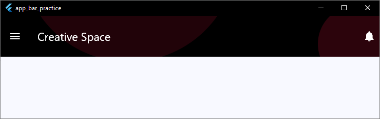
Why FlexibleSpace is Essential for Layout Design
When you use the flexibleSpace property, your layout naturally accounts for the device’s notch and status bar.
It fills out the entire space behind your app bars cleanly, so you never have to worry about manual padding calculations on different devices.
It gives you total freedom. You can use it to build branding layouts, abstract shapes, complex vector graphics, or custom alignment adjustments that match your design requirements perfectly.
Background Images Inside AppBar
Sometimes, a clean background color or gradient isn’t enough to capture the vibe of your app.
If you are building a travel log, a food delivery platform, or a profile page, putting a rich image asset right inside your header can make the UI feel incredibly engaging.
To safely put a flutter appbar background image in your project, we combine our trusty flexibleSpace property with a standard Image widget.
Here is the cleanest way to set an image asset as your header background while using a dark tint overlay to make sure your title text stays perfectly readable:
appBar: AppBar(
  title: const Text(
    'Culinary Arts',
    style: TextStyle(fontWeight: FontWeight.bold, letterSpacing: 1.2),
  ),
  foregroundColor: theme.colorScheme.onPrimary,
  iconTheme: const IconThemeData(color: Colors.white),
  // Increase the height slightly if you want more of the image to show through
  toolbarHeight: 90.0,
  flexibleSpace: Stack(
    children: [
      // The background image asset
      Positioned.fill(
        child: Image.network(
          'https://images.pexels.com/photos/29683253/pexels-photo-29683253/free-photo-of-elegant-pastry-display-with-gourmet-desserts.jpeg?auto=compress&w=1260&h=750&dpr=1',
          fit: BoxFit.cover,
        ),
      ),
      // A semi-transparent dark overlay tint to maintain text contrast
      Positioned.fill(
        child: Container(color: Colors.black.withValues(alpha: 0.4)),
      ),
    ],
  ),
),
Code language: Dart (dart)
Pro Tips for Image Backgrounds
- Always use BoxFit.cover: To prevent your image from stretching out of proportion or leaving awkward white gaps on wider phone screens, ensure your
fitproperty is set toBoxFit.cover. - Never skip the contrast overlay: A raw photograph usually contains random bright and dark pixels. If you place white text directly over a light cloud or a bright plate, your text vanishes. Adding that subtle black
Containerwith a low opacity creates a uniform shadow layer that keeps your typography sharp. - Optimize image sizes: Don’t load a massive 4K photograph just for a small header. Crop and compress your asset to match the header size so your app stays fast and doesn’t waste user memory.
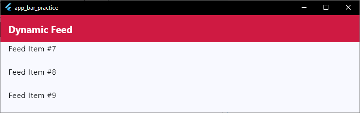
Scroll-Based Color Changes
Have you ever noticed how headers in top-tier apps behave when you scroll?
When a page is at the very top, the header is often completely transparent. But the moment you scroll down, it smoothly transitions into a solid color to separate itself from the content underneath.
Adding a flutter appbar color on scroll effect is a brilliant way to make your app look dynamic and highly polished.
To build a flutter appbar background color change when scrolling, we don’t need a massive, heavy external package.
We can handle it cleanly by wrapping our page body in a NotificationListener to track scrolling updates, and updating a local state variable.
Here is a simple, lightweight implementation to make your header shift colors dynamically:
class _HomeScreenState extends State<HomeScreen> {
  // Track whether the user has scrolled down past our threshold
  bool _isScrolled = false;

  @override
  Widget build(BuildContext context) {
    return Scaffold(
      extendBodyBehindAppBar: true, // Let content flow underneath the header
      appBar: AppBar(
        title: const Text('Dynamic Feed'),
        // Animate the background color change smoothly
        backgroundColor: _isScrolled
            ? const Color(0xFFDC143C)
            : Colors.transparent,
        elevation: _isScrolled ? 4.0 : 0.0,
        // Match icon color to the background state
        iconTheme: IconThemeData(
          color: _isScrolled ? Colors.white : Colors.black,
        ),
        titleTextStyle: TextStyle(
          color: _isScrolled ? Colors.white : Colors.black,
          fontSize: 20,
          fontWeight: FontWeight.bold,
        ),
      ),
      body: NotificationListener<ScrollNotification>(
        onNotification: (ScrollNotification scrollInfo) {
          // Check if the user has scrolled down more than 50 pixels
          if (scrollInfo.metrics.pixels > 50) {
            if (!_isScrolled) {
              setState(() {
                _isScrolled = true;
              });
            }
          } else {
            if (_isScrolled) {
              setState(() {
                _isScrolled = false;
              });
            }
          }
          return true;
        },
        child: ListView.builder(
          itemCount: 30,
          itemBuilder: (context, index) =>
              ListTile(title: Text('Feed Item #${index + 1}')),
        ),
      ),
    );
  }
}
Code language: Dart (dart)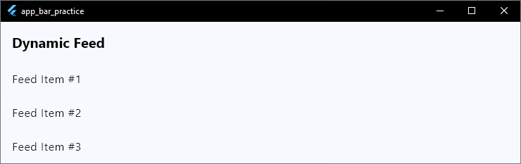
Enhancing the Visual Feedback
If you want an even smoother transition, look into using SliverAppBar combined with a CustomScrollView.
The framework provides built-in mechanisms that handle stretching and fading automatically as slivers move across the viewport canvas.
However, using a NotificationListener on a standard AppBar gives you precise control over exactly when and how the color swap triggers.
It keeps your code base lean, explicit, and easy to maintain.
Shadow and Elevation Control
Elevation is how Flutter handles depth. It simulates physical distance along the Z-axis, lifting your header off the page and casting a natural shadow on the widgets scrolling underneath.
Controlling your flutter appbar shadow profile is a huge part of modern UI styling. In older Material 2 designs, headers had heavy, dark, and blocky drop shadows.
Modern app design, however, prefers a much cleaner look: either zero shadow at all, a completely flat profile, or a subtle, diffuse glow.
To adjust this depth, we use the elevation property alongside shadowColor and surfaceTintColor.
Here is how to take total control over your flutter appbar elevation and shadow styles:
appBar: AppBar(
  title: const Text('Workspace Settings'),
  backgroundColor: Colors.white,
  // Low elevation for a clean, modern look
  elevation: 2.0,
  // Make the shadow soft and subtle instead of harsh black
  shadowColor: Colors.black.withValues(alpha: 0.2),
  // In Material 3, surfaceTintColor can alter the background color when elevated.
  // Set it to transparent if you want your pure background color to stay consistent.
  surfaceTintColor: Colors.transparent,
),
Code language: Dart (dart)
Removing the Shadow Entirely
If you are aiming for a flat design, a transparent layout, or a card-style interface, you usually want to turn the shadow off completely. To do that, simply drop your elevation to zero:

Material 3 Elevation Changes
Keep in mind that under Material 3, the AppBar uses an overlay tint rather than just a drop shadow to show height when content scrolls beneath it.
If you notice your header changing color or picking up an unexpected tint as you scroll, tweaking your surfaceTintColor will fix the issue instantly.
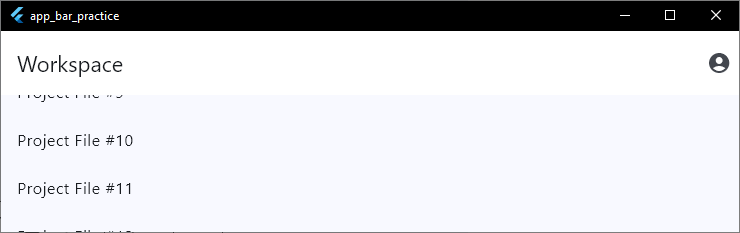
class _HomeScreenState extends State<HomeScreen> {
  @override
  Widget build(BuildContext context) {
    return Scaffold(
      body: CustomScrollView(
        slivers: [
          // Material 3 Large AppBar that collapses beautifully as you scroll
          SliverAppBar.large(
            title: const Text('Workspace'),
            backgroundColor: Colors.white,
            // Keeps the header pinned at the top when collapsed
            pinned: true,
            // Removes the unexpected Material 3 overlay color tint
            surfaceTintColor: Colors.transparent,
            actions: [
              IconButton(
                icon: const Icon(Icons.account_circle),
                onPressed: () {},
              ),
            ],
          ),
          // Your scrollable page body content goes here
          SliverList(
            delegate: SliverChildBuilderDelegate(
              (context, index) =>
                  ListTile(title: Text('Project File #${index + 1}')),
              childCount: 20,
            ),
          ),
        ],
      ),
    );
  }
}
Code language: Dart (dart)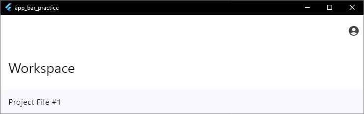
The 4 Flavors of Material 3 AppBars
Depending on your page layout, you can choose from these built-in styles:
- Standard AppBar: Best for simple sub-pages. It features a clean layout with centered or left-aligned text and a flat profile.
- Centered AppBar: Perfect for clean, minimal dashboards or landing pages where the title needs to be the central focus.
- Medium AppBar: Great when your page title is slightly longer. The text sits below the action icons and shrinks smoothly when you scroll.
- Large AppBar: The ultimate premium look for main tabs, profiles, or settings pages. It starts with bold, prominent typography that elegantly scales down into a compact header as the user moves down the page canvas.
Clean Configuration Tips
In Material 3, headers automatically drop their drop shadow and instead use a subtle background tint change to show depth when content scrolls underneath.
If you want to keep your background color exactly the same at all times, remember to set surfaceTintColor: Colors.transparent inside your theme configuration or individual widget parameters.
Wrapping It All Up
Transforming your AppBar is one of the fastest ways to elevate your entire app’s user experience.
By moving away from basic, flat designs and embracing gradients, transparency, and modern Material 3 layouts, you make your projects feel intentional, polished, and real.
But beautiful UI is only half the battle. To truly master mobile development, you need to know how to connect these stunning visuals with real, working code.
If you are ready to take the next step and move past theory, we have something special for you.
Stop Building Basic Demos. Start Building Real Apps.
Most tutorials leave you stuck making plain, unfinished projects. Take our first class for free and learn how to design polished, production-grade Flutter apps that look ready for the App Store.