
Imagine you are building a house. Before you add furniture or paint the walls, you need rooms. You need structures to hold everything together.
In Flutter, that structural block is the Container widget.
If you are just starting your development journey, you might be asking: what is container in flutter? Or perhaps you are wondering why we use container in flutter when there are so many other options.
Don’t worry. Every single Flutter developer has stood exactly where you are standing right now.
The flutter container widget is one of the most powerful and versatile tools in your toolkit. Think of it like a magical box. It can hold a piece of text, give it a background color, add space around it, or even shape it into a perfect circle.
In this ultimate flutter container tutorial, we will break down the flutter container class from top to bottom.
You will learn the core flutter container properties, see real flutter container examples, and finally understand how to use this widget the right way.
Let’s dive in and master the container widget in flutter together!
Claim your free course seat. Skip the fluff.
Ready to turn your widget basics into real mobile apps? Claim your free access to Flutter Foundations and start building products with confidence today.
What Is the Container Widget in Flutter?
At its core, the container widget in flutter is a convenience widget. But what does “convenience” actually mean?
It means the flutter container widget combines several simple widgets into one single, powerful package. Instead of adding five different widgets to style a piece of text, you can just use one Container.
Think of it as a physical box or a shipping container. By itself, an empty container just sits there. It does not show up on the screen. It has no color, no size, and no shape.
But the moment you give it a flutter container child—like a piece of text or an image—the container wraps itself perfectly around that item.
From there, you can use the flutter container api to change how that box looks and behaves. You can:
- Change its width and height.
- Add background colors or gradients.
- Put borders around it.
- Add space inside or outside the box.
In short, the what is the purpose of the container widget in flutter question has a simple answer: It is your go-to tool for wrapping, sizing, spacing, and styling a single piece of user interface.
Why Container Is One of the Most Used Flutter Widgets
Open any production Flutter app, and you will find containers everywhere. But why we use container in flutter so often?
The answer is simple: convenience and speed.
When you build a mobile screen, you rarely just drop raw text onto the page. You want to give that text a background color. You want to round the corners.
You want to push it away from the edge of the screen.
Without the flutter container class, you would have to nest multiple widgets inside each other just to style one item. Your code would look like this:
- A
Paddingwidget…- Inside a
ColoredBoxwidget…- Inside a
SizedBoxwidget…- Inside a
ClipRRefwidget!
- Inside a
- Inside a
- Inside a
That is a lot of typing. It makes your code messy and hard to read.
The container widget in flutter solves this problem. It acts as a single “all-in-one” wrapper. It combines painting, positioning, and sizing into one neat place.
By mastering flutter container properties, you can change the look of your layout with just a few lines of code. It saves you time, keeps your code clean, and gives you total control over your design. It is the ultimate Swiss Army knife for UI development!
Container vs SizedBox
As a beginner, you will quickly notice another widget that changes size: the SizedBox.
This leads to a very common question: flutter container vs sizedbox—which one should you use?
The easiest way to remember the difference is by thinking about weight. A SizedBox is lightweight. A Container is heavyweight.
The Lightweight Winner: SizedBox
Use a SizedBox when you only need to change the size of something. If you just want to force a widget to be exactly 200 pixels wide, or if you just want to put an empty 20-pixel gap between two buttons, use SizedBox.
It is incredibly fast and takes up very little memory.
class _HomeScreenState extends State<HomeScreen> {
  @override
  Widget build(BuildContext context) {
    return Scaffold(
      body: Column(
        children: [
          // Good: Using SizedBox just to create empty space
          SizedBox(height: 20.0),
          // Good: Using SizedBox just to set a fixed size
          SizedBox(
            width: 150.0,
            height: 50.0,
            child: ElevatedButton(onPressed: () {}, child: Text('Click Me')),
          ),
        ],
      ),
    );
  }
}
Code language: Dart (dart)
The Heavyweight Winner: Container
Use a Container when you need to do more than just change the size. If you want to add a background color, draw a border, or add margins, SizedBox cannot help you. You need a Container.
// Good: Using Container because we need styling and margins
Container(
  width: 150.0,
  height: 50.0,
  margin: EdgeInsets.all(10.0),
  decoration: BoxDecoration(
    color: Colors.blue,
    borderRadius: BorderRadius.circular(8.0),
  ),
  child: Center(
    child: Text('Styled Box', style: TextStyle(color: Colors.white)),
  ),
),
Code language: Dart (dart)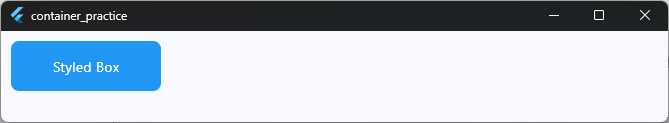
The Golden Rule
Never use a Container if a SizedBox can do the job. Because Container is so powerful, it requires more work from Flutter to draw on the screen. Keeping your code light makes your app run smoother!
Container vs Card
When you want to create a nice-looking block on your screen, you will often choose between a Container and a Card.
While they might look similar at first glance, they serve two very different purposes in your app design.
The Material Design Favorite: Card
A Card is a built-in widget that follows Google’s Material Design rules right out of the box. It automatically comes with slightly rounded corners and a beautiful, soft shadow (called elevation).
Use a Card when you want to display a distinct piece of information, like a user profile or a product item in a shopping list.
// Good: Using a Card for instant Material Design styling
Card(
  elevation: 4.0, // This creates the shadow
  child: Padding(
    padding: EdgeInsets.all(16.0),
    child: Text('This feels like a real card!'),
  ),
),
Code language: Dart (dart)
The Custom Canvas: Container
A Container does not have any shadow or rounded corners by default. It is a blank canvas. If you want a container to look like a card, you have to style it yourself using flutter container properties.
Use a Container when you want complete control. If you need a crazy shape, a bright gradient background, or a specific border thickness, Card will limit you. Container will not.
// Good: Using a Container for custom shapes and gradients
Container(
  padding: EdgeInsets.all(16.0),
  decoration: BoxDecoration(
    gradient: LinearGradient(colors: [Colors.purple, Colors.blue]),
    borderRadius: BorderRadius.circular(20.0), // Custom roundness
  ),
  child: Text(
    'Custom Styled Box',
    style: TextStyle(color: Colors.white),
  ),
),
Code language: Dart (dart)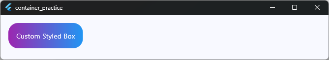
Summary Breakdown
- Card: Great for quick, standard UI elements. It gives you shadows and rounded corners instantly.
- Container: Great for custom designs. It lets you build exactly what you want from scratch.
Container vs DecoratedBox
As you explore flutter container properties, you will discover a property called decoration. Under the hood, when you give a Container a background color or a border, Flutter actually creates a hidden widget called a DecoratedBox.
This brings up an interesting question for the flutter container vs decoratedbox debate: why not just use DecoratedBox directly?
The Specialist: DecoratedBox
A DecoratedBox does exactly one thing: it draws decorations (like colors, gradients, borders, and shadows) either in front of or behind a child widget. It cannot handle sizes, margins, or padding.
Because it only does one thing, it is incredibly lightweight and fast.
// Good: Using DecoratedBox when you only need a background color
DecoratedBox(
  decoration: BoxDecoration(
    color: Colors.amber,
    borderRadius: BorderRadius.circular(4.0),
  ),
  child: Padding(
    padding: EdgeInsets.all(8.0),
    child: Text('Just a simple colored background'),
  ),
),
Code language: Dart (dart)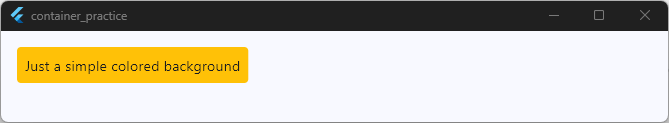
The Multi-Tasker: Container
A Container can do everything a DecoratedBox can do, plus a lot more. If you need a widget that has a blue background and a specific height and 10 pixels of margin on the outside, DecoratedBox cannot help you on its own.
You would have to nest multiple widgets together.
Instead, you use a Container to handle all of those layout needs at the same time.
// Good: Using Container because we need decoration + specific sizing
Container(
  width: 200.0,
  height: 100.0,
  decoration: BoxDecoration(
    color: Colors.blue,
    shape: BoxShape.circle,
  ),
  child: Center(child: Text('Circle')),
),
Code language: Dart (dart)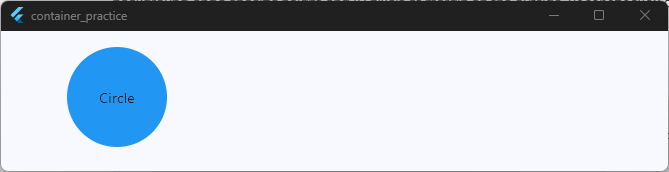
When to Choose Which?
- Use DecoratedBox if you already have your layout sizing handled and you only want to paint a background or a border around a widget.
- Use Container if you need to combine that background styling with width, height, or alignment adjustments.
Container vs Padding
Spacing is everything in mobile design. It gives your app room to breathe. When you want to add space around a widget, you will often find yourself choosing between flutter container vs padding.
Let’s look at how they work and when to use each one.
The Single-Purpose Tool: Padding
The Padding widget does one job, and it does it perfectly. It adds empty space around its child widget. It does not change colors, it does not draw borders, and it does not set widths or heights.
Because it is so focused, it is very lightweight.
// Good: Using Padding just to give the text some breathing room
Padding(
  padding: EdgeInsets.all(16.0),
  child: Text('Hello, Flutter!'),
),
Code language: JavaScript (javascript)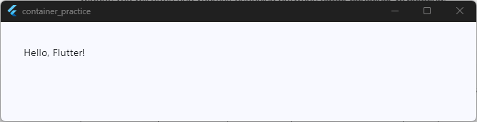
The All-In-One Solution: Container
A Container has a built-in padding property. Under the hood, if you give a Container padding, Flutter just wraps it in a Padding widget for you.
Use a Container when you need to add space and do other visual styling, like adding a background color or a border.
// Good: Using Container because we want padding AND a colored background
Container(
  padding: EdgeInsets.all(16.0), // Space inside the box
  color: Colors.green,
  child: Text(
    'Green Box with Padding',
    style: TextStyle(color: Colors.white),
  ),
),
Code language: Dart (dart)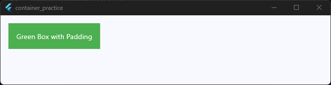
The Best Practice
Always default to the simplest widget possible.
If you only need to add space around a widget to push it away from the edge, use the Padding widget. It makes your code cleaner and faster.
Only use a Container if you need that padding to live alongside background colors, borders, or specific sizes!
Container vs Column
As you start arranging widgets on a screen, it is easy to confuse flutter container vs column. They both help you arrange your UI, but they work in completely different dimensions.
The easiest way to understand the difference is by looking at how many widgets they can hold.
The Single Box: Container
A Container can only hold one single child widget. It uses the child property. You use a container to style, size, or add space around that one specific item.
// A Container only takes ONE child
Container(
  color: Colors.blue,
  child: Text('I am the only child here!'),
),
Code language: Dart (dart)
Build dynamic UI layouts. Skip the fluff.
Ready to see how containers and columns work together inside real apps? Grab your free course access and start building complex screens with confidence today.
The Stack of Boxes: Column
A Column is a layout widget. It does not display background colors or borders. Instead, its main job is to take a list of multiple widgets and stack them vertically (from top to bottom) on the screen. It uses the children property.
// A Column takes a LIST of multiple children
Column(
  children: [
    Text('First Item'),
    Text('Second Item'),
    Text('Third Item'),
  ],
),
Code language: Dart (dart)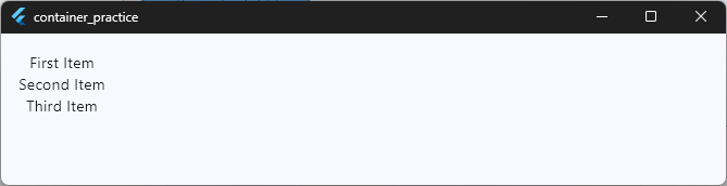
How They Work Together
In real apps, you will constantly use these two widgets together. You will often place multiple Container widgets inside a Column to create a beautiful, vertical list of styled items.
- Use a Column to organize the structure and layout of your page.
- Use a Container to style the individual items inside that layout.
Container vs Scaffold
When you are completely new to Flutter, it can be tricky to figure out where a page begins and ends. This brings us to the ultimate comparison: flutter container vs scaffold.
These two widgets operate at completely different levels of your app’s structure. One is the entire house, while the other is just a brick.
The Foundation: Scaffold
A Scaffold represents a whole screen in your app. It implements the basic Material Design visual layout structure for a page. If you want a top app bar, a bottom navigation bar, a floating action button, or a drawer menu, you must use a Scaffold.
Almost every new screen you build in Flutter will start with a Scaffold at the very root.
return
// Good: Using Scaffold to build a complete app page
Scaffold(
  appBar: AppBar(title: Text('My App Screen')),
  body: Center(child: Text('This is the main body area.')),
);
Code language: Dart (dart)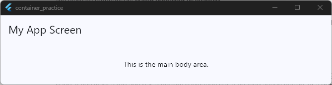
The Piece of Furniture: Container
A Container is just a local utility box. You cannot use a Container to build a top app bar or an app-wide background structure. Instead, you put a Container inside the body of a Scaffold to style specific parts of that screen.
return
// Good: Putting a Container INSIDE a Scaffold body
Scaffold(
  body: Center(
    child: Container(
      padding: EdgeInsets.all(20.0),
      color: Colors.blue,
      child: Text('Styled content inside the page'),
    ),
  ),
);
Code language: Dart (dart)
Summary of the Difference
- Scaffold: The structural framework for an entire screen. It holds your app bars, snack bars, and main pages.
- Container: A localized styling widget used to format individual elements inside that screen.
Understanding Child vs Multiple Children
When you look at the flutter container api, you will notice a key property: child.
One of the biggest mistakes beginners make is trying to pass multiple widgets directly into a single container. They search for keywords like flutter container multiple child or flutter container multiple children hoping to find a hidden trick.
Let’s clear this up right now: A Container can only take a single flutter container child. It is a single box designed to wrap around exactly one thing.
If you try to pass a list of widgets into a container’s child property, your code editor will show an error.
How to Handle Multiple Children
So, what do you do if you want a beautiful container with a background color, but you need it to hold a title, a description, and a button?
You nest a layout widget inside the container!
You give the Container a single child. That child is a widget capable of holding multiple items, like a Column or a Row.
Here is exactly how you do it:
// The Container holds ONE Column, and the Column holds MULTIPLE children
Container(
  padding: EdgeInsets.all(16.0),
  color: Colors.grey[200],
  child: Column(
    mainAxisSize: MainAxisSize.min,
    children: [
      Text(
        'Title Text',
        style: TextStyle(fontWeight: FontWeight.bold),
      ),
      SizedBox(height: 8.0),
      Text('This is the description paragraph.'),
      SizedBox(height: 16.0),
      ElevatedButton(onPressed: () {}, child: Text('Action')),
    ],
  ),
),
Code language: Dart (dart)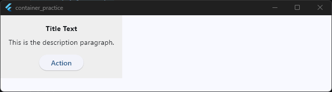
By combining a single-child Container with a multi-child layout widget like a Column, you get the best of both worlds: full styling control on the outside, and a beautiful layout on the inside!
Container Properties Every Beginner Should Know
To truly unlock the power of the flutter container widget, you need to understand its control panel. The flutter container properties allow you to change the shape, size, and spacing of your box.
Here are the most common container properties in flutter that you will use every single day.
1. Width and Height
By default, a container shrinks to fit its child. If you want to force the container to be a specific size, you can set the width and height manually using double values.
Container(
  width: 150.0,
  height: 150.0,
  color: Colors.blue
)
Code language: Dart (dart)
2. Padding and Margin
Spacing can be confusing for beginners. The easiest way to remember the difference is: Padding is inside, Margin is outside.
- Padding: Pushes the child widget inward away from the container’s borders.
- Margin: Pushes the container away from other widgets around it on the screen.
Container(
  margin: EdgeInsets.all(20.0), // Space outside the container
  padding: EdgeInsets.all(10.0), // Space inside the container
  color: Colors.red,
  child: Text('Spacing Example'),
),
Code language: Dart (dart)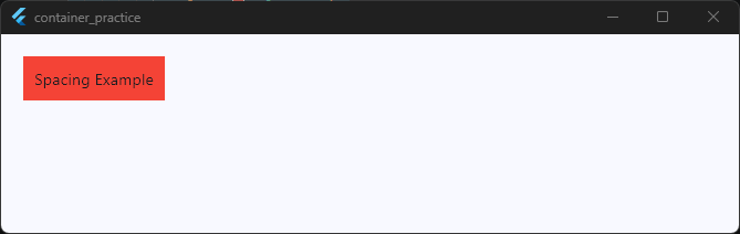
3. Color
This sets the background color of your container. It is the quickest way to make a container visible on your screen during testing.
Important Note: If you are using the
decorationproperty (which we look at next), you must put your color inside the decoration instead of using this top-level property. Otherwise, your app will crash!
4. Decoration
The decoration property is where the real magic happens. It takes a BoxDecoration class. This allows you to add borders, round the corners, add drop shadows, or create beautiful background gradients.
Container(
  width: 100.0,
  height: 100.0,
  decoration: BoxDecoration(
    color: Colors.teal, // Color goes inside decoration here!
    borderRadius: BorderRadius.circular(12.0), // Rounded corners
    border: Border.all(
      color: Colors.black,
      width: 2.0,
    ), // Outer border
  ),
),
Code language: Dart (dart)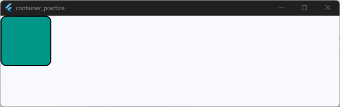
5. Alignment
The alignment property tells the container where to position its child inside itself. For example, you can align a piece of text to the exact center, the top-left corner, or the bottom-right.
Container(
  height: 100.0,
  alignment:
      Alignment.bottomRight, // Pushes the child to the bottom right
  color: Colors.orange,
  child: Text('Corner!'),
),
Code language: Dart (dart)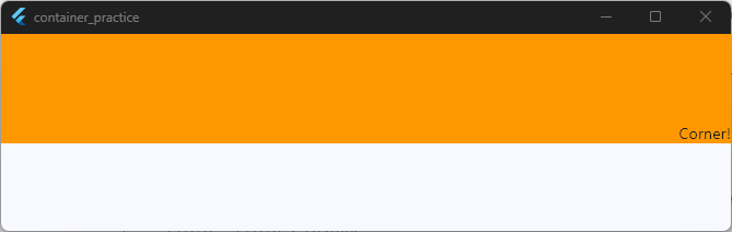
Common Container Mistakes Beginners Make
When you are learning the flutter container class, it is completely normal to trip over a few common bugs. Flutter is a highly structured framework, and Container has a couple of strict rules.
By knowing these mistakes ahead of time, you can save yourself hours of frustrating debugging!
1. The Twin Color Crash (Providing Color in Two Places)
This is the number one mistake every beginner makes. You want to add a background color and round the corners of your container, so you write code that looks like this:
// THIS WILL CRASH YOUR APP!
Container(
  color: Colors.blue,
  decoration: BoxDecoration(
    borderRadius: BorderRadius.circular(10.0),
  ),
),
Code language: Dart (dart)
Why it fails: In Flutter, you cannot set both the top-level color property and the decoration property at the same time.
The Fix: If you use a BoxDecoration, you must move your color inside that box decoration.
//  CORRECT WAY
Container(
  decoration: BoxDecoration(
    color: Colors.blue, // Moved inside!
    borderRadius: BorderRadius.circular(10.0),
  ),
),
Code language: Dart (dart)
2. The Invisible Container (No Child, No Dimensions)
Sometimes you will add a container to your code, give it a background color, and then notice that nothing shows up on your phone screen at all.
Why it fails: If a container has no explicit width, no height, and no child, its size drops to zero pixels. It becomes completely invisible.
The Fix: Always give your container a child widget, or explicitly define its width and height properties so Flutter knows how much space to clear out for it.
3. Nesting Containers Unnecessarily
Beginners often wrap a container inside another container, inside another container to add multiple styles.
// Messy and bad practice
Container(
  padding: EdgeInsets.all(10.0),
  child: Container(
    color: Colors.red,
    child: Container(
      width: 100.0,
      height: 100.0,
    ),
  ),
)
Code language: Dart (dart)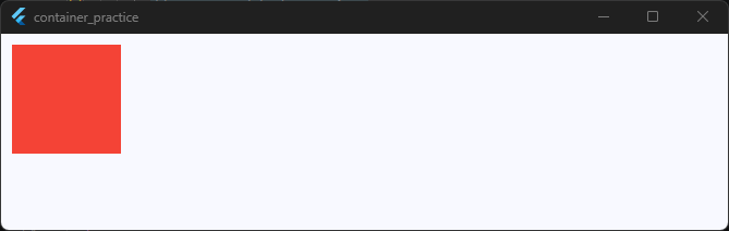
Why it fails: This slows down your app’s performance and makes your code incredibly hard to read.
The Fix: Remember that a single container can handle padding, margins, colors, borders, shapes, and sizes all at once. Try to use just one container per visual box!
When You Should NOT Use Container
Because the flutter container widget is so versatile, it is easy to fall into the trap of using it for everything. However, using a container when a simpler widget exists is a bad habit that can slow down your app.
Here is a quick checklist of when you should step away from the container and use a different tool instead.
1. When You Only Need Space
If you are just trying to put some physical distance between two items in a list or a row, do not use an empty container.
- Use instead:
SizedBox(for fixed gaps) orPadding(to wrap an item). - Why: An empty container runs complex layout logic behind the scenes, whereas
SizedBoxis lightweight and ultra-fast.
2. When You Only Need to Nest a Custom Shape or Shadow
If you are building a list of items that look like standard Material Design surfaces with basic shadows and rounded corners, do not try to build them from scratch using container styling.
- Use instead:
Card. - Why:
Cardgives you beautiful defaults out of the box and matches the native look of iOS and Android apps instantly.
3. When You Need an On-Click Action
Containers do not natively listen for touch events. Beginners often try to find an onTap property inside the flutter container api, but it does not exist.
If you want a styled box that users can click, do not just leave it as a Container.
- Use instead: Wrap your container inside an
InkWellor aGestureDetector. - Why: These widgets add touch responsiveness (and ripple effects in the case of
InkWell) to anything placed inside them.
// Good: Wrapping a styled Container to make it clickable
GestureDetector(
  onTap: () {
    print('Box clicked!');
  },
  child: Container(
    padding: EdgeInsets.all(12.0),
    color: Colors.blue,
    child: Text(
      'Clickable Box',
      style: TextStyle(color: Colors.white),
    ),
  ),
),
Code language: Dart (dart)
Real App Examples Using Container
Now that you know the theory and the properties, let’s look at how the container widget in flutter is used to build real app interfaces.
1. The Instagram-Style Profile Picture Ring
In many social media apps, a user’s profile picture has a colorful border or gradient ring around it to show they have an active story. You can build this easily by nesting an image inside a round Container.
// A circular container acting as a colorful border ring
Container(
  padding: EdgeInsets.all(4.0), // The thickness of the story ring
  decoration: BoxDecoration(
    shape: BoxShape.circle,
    gradient: LinearGradient(
      colors: [Colors.yellow, Colors.pink, Colors.purple],
    ),
  ),
  child: Container(
    padding: EdgeInsets.all(
      2.0,
    ), // White gap between ring and photo
    decoration: BoxDecoration(
      shape: BoxShape.circle,
      color: Colors.white,
    ),
    child: CircleAvatar(
      radius: 40.0,
      backgroundImage: NetworkImage(
        'https://images.pexels.com/photos/1520760/pexels-photo-1520760.jpeg',
      ),
    ),
  ),
),
Code language: Dart (dart)
2. An E-Commerce Product “Sale” Badge
When browsing a shopping app, items often have a small, bright tag that says “SALE” or “50% OFF” sitting in the corner. A small Container is the perfect tool for this.
// A clean, compact badge for an e-commerce store
Container(
  padding: EdgeInsets.symmetric(horizontal: 12.0, vertical: 6.0),
  decoration: BoxDecoration(
    color: Colors.redAccent,
    borderRadius: BorderRadius.circular(20.0), // Rounded pill shape
  ),
  child: Text(
    'SALE - 20% OFF',
    style: TextStyle(
      color: Colors.white,
      fontWeight: FontWeight.bold,
      fontSize: 12.0,
    ),
  ),
),
Code language: Dart (dart)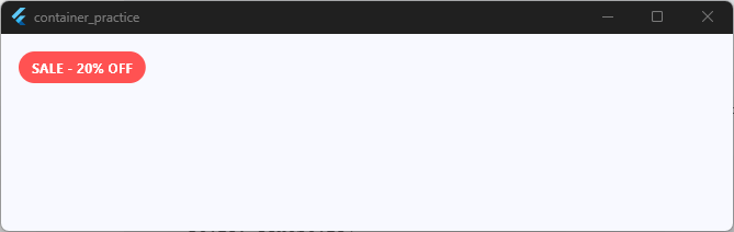
As you can see, once you understand how to mix and match padding, colors, and shapes, the Container becomes your best friend for crafting detailed user interfaces.
Putting Your Knowledge into Action
Mastering the container widget in flutter is your first major milestone as a mobile developer.
Once you understand how to use its size, decoration, and spacing properties correctly, you unlock the ability to design almost anything you see on a phone screen.
Just remember the golden rules we covered today:
- Padding is inside, Margin is outside.
- Never use a
Containerif a simpleSizedBoxorPaddingwidget can do the job. - Always put your
colorinside theBoxDecorationto avoid app crashes.
Take the Next Step in Your Flutter Journey!
Learning how a single box works is a great start. But the real magic happens when you start building real screens, managing application data, and launching actual products to the App Store.
If you are ready to stop guessing and start building production-ready mobile apps from scratch, come join us inside the Flutter Foundations Course.
In this complete, step-by-step implementation program, we skip the fluff and focus entirely on building real-world software.
You will learn exactly how to combine widgets like the Container into stunning, responsive user interfaces that look great on any device.
Build real apps from scratch. Skip the fluff.
Ready to turn your widget basics into production-ready mobile apps? Stop copying tutorials and start building real products with confidence.