Hey! Let’s face it: if you are building an app in Flutter, you are going to use the Container widget. A lot.
But there is a massive difference between a boring, blocky box and a stunning, modern UI element that users love to tap.
Maybe you are trying to give your card a subtle elevation shadow. Maybe you want to blend a vibrant linear gradient background, or push boundaries with that trendy, frosted-glass glassmorphism look.
You know the Container widget exists, but now you want to make it look good.
Welcome to the ultimate Flutter Container Styling Cookbook.
Consider this your go-to visual cheat sheet. We are skipping the dry theory and jumping straight into practical, production-ready code snippets.
From simple rounded corners and sharp single-sided borders to advanced inner shadows and custom shapes, you’ll find exactly what you need to elevate your Flutter UI design game.
Grab your favorite drink, open up VS Code, and let’s turn those plain containers into UI masterpieces!
Learning Flutter One Widget at a Time?
You’ve just seen how powerful Flutter’s UI system can be. If you’re new to Flutter, the fastest way to improve isn’t memorizing widgets—it’s building real projects that combine them together.
Adding Background Colors
Let’s start with the absolute basics: changing the flutter container background color.
When you want to paint the background of your Container, you have two main ways to do it. You can use the color property directly on the container, or you can use the color property inside a BoxDecoration.
There is one golden rule in Flutter you must remember: never use both at the same time! If you provide a color directly to the container and pass a BoxDecoration, your app will throw a nasty red error screen.
Let’s look at how to do this cleanly using our boilerplate.
class _HomeScreenState extends State<HomeScreen> {
  @override
  Widget build(BuildContext context) {
    final theme = Theme.of(context);

    return Scaffold(
      body: Padding(
        padding: const EdgeInsets.all(16),
        child: Container(
          width: 200,
          height: 200,
          // Option 1: Direct color property
          color: Colors.blueAccent,
        ),
      ),
    );
  }
}
Code language: Dart (dart)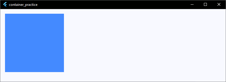
Using BoxDecoration for Colors
If you plan to add rounded corners or borders later, it is best practice to move your background color inside the decoration property using BoxDecoration.
Here is how that looks:
child: Container(
  width: 200,
  height: 200,
  // Option 2: Color inside decoration (Best for advanced styling)
  decoration: BoxDecoration(
    color: theme.colorScheme.primary, // Using your app's theme color
  ),
),
Code language: Dart (dart)
Using theme.colorScheme.primary keeps your app UI consistent and ready for dark mode!
Creating Rounded Corners
Nobody likes sharp, boxy squares in a modern app interface. To make your UI feel smooth and friendly, you’ll want to implement a flutter container rounded corners look.
To achieve this, we use the borderRadius property inside our BoxDecoration. This allows you to soften those sharp edges instantly, giving you smooth flutter container rounded edges.
Remember our golden rule from the last section: because we are using a BoxDecoration to handle the corners, the background color must live inside the decoration too!
Here is how to add uniform rounded corners to your container:
child: Container(
  width: 200,
  height: 200,
  decoration: BoxDecoration(
    color: theme.colorScheme.primaryContainer,
    // This gives all four corners an equal curve
    borderRadius: BorderRadius.circular(16),
  ),
),
Code language: Dart (dart)
Why BorderRadius.circular?
Using BorderRadius.circular(16) is the quickest and cleanest way to get perfectly even, rounded edges all the way around your container. The higher the number, the more circular your corners will become.
BorderRadius.circular(4): Subtle, sharp but professional (great for input fields).BorderRadius.circular(16): Modern, soft, and clean (perfect for product cards).BorderRadius.circular(30): Highly stylized, pill-like edges.
Adding Borders
Now that your container has smooth, rounded corners, let’s make it pop by framing it with a crisp border.
Whether you need a subtle outline for a text field or a bold frame for a card, knowing how to handle a flutter container border is essential.
To add border to container structures, you use the border property inside your BoxDecoration.
Here is the quickest way to wrap your container in a solid, uniform border:
child: Container(
  width: 200,
  height: 200,
  decoration: BoxDecoration(
    color: theme.colorScheme.surface,
    // Add a uniform border around all four sides
    border: Border.all(
      color: theme.colorScheme.outline,
      // Sets the flutter container border color
      width: 2,
      // Sets the thickness of the border
    ),
    borderRadius: BorderRadius.circular(
      16,
    ), // Keeps our rounded corners intact!
  ),
),
Code language: Dart (dart)
Pro-Tips for Perfect Borders
- Color Matching: Always try to link your flutter container border color to your app’s theme (like
theme.colorScheme.outlineortheme.colorScheme.primary) so it automatically looks great in both light and dark modes. - The Border Clash: Keep in mind that the border follows the shape of your
borderRadius. If you have rounded corners, your border will elegantly curve right along with them.
What if you don’t want a border around the whole thing? Let’s look at how to style just a single side next!
One-Side Borders (Top, Bottom, Left)
Sometimes, a full border around all four sides is just too much. You might want a thick accent line on the left side of a warning card, or a clean divider line just at the bottom of a header.
Instead of using Border.all(), you can construct a border side-by-side using the Border constructor. This lets you target specific edges precisely.
Here is how you can add a border to individual sides:
child: Container(
  width: 200,
  height: 200,
  decoration: BoxDecoration(
    color: theme.colorScheme.surface,
    // Define each side manually
    border: Border(
      top: BorderSide(
        color: theme.colorScheme.outlineVariant,
        width: 1,
      ),
      bottom: BorderSide(
        color: theme.colorScheme.primary,
        width: 4,
      ), // Extra thick bottom border
      left: BorderSide(
        color: theme.colorScheme.outlineVariant,
        width: 1,
      ),
      // Right side is omitted, so it won't have a border!
    ),
  ),
),
Code language: Dart (dart)
A Quick Gotcha with One-Side Borders
⚠️ Important Note: When you define custom one-side borders with different widths or colors, Flutter cannot cleanly blend them around rounded corners.
If you try to mix a custom
Border(like the one above) with aBorderRadius.circular(), your app will throw a layout error.
If you need a border on only one side, it’s best to stick with sharp, rectangular edges (BorderRadius.zero) for that container!
What if you do want rounded corners, but only on the top two edges?
Let’s check out border radius variations next!
Border Radius Variations
We’ve already looked at making all four corners uniformly round, but modern UI design often requires more precision.
For example, you might want a top-sheet modal with only the top two corners rounded, or a chat bubble that has rounded edges on three sides but stays sharp on the bottom right.
To get total control over your flutter container border radius, you can move past BorderRadius.circular() and use specialized constructors.
Here are the two most useful variations you will use daily:
1. Rounding Only Specific Sides (BorderRadius.only)
If you want to target specific corners individually, BorderRadius.only is your best friend.
child: Container(
  width: 200,
  height: 200,
  decoration: BoxDecoration(
    color: theme.colorScheme.secondaryContainer,
    borderRadius: const BorderRadius.only(
      topLeft: Radius.circular(24),
      topRight: Radius.circular(24),
      // bottomLeft and bottomRight default to zero (sharp corners)
    ),
  ),
),
Code language: Dart (dart)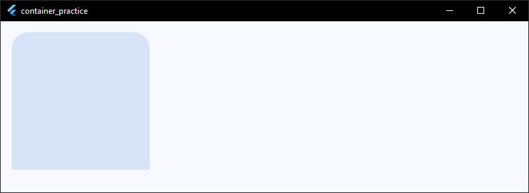
2. Symmetrical Rounding (BorderRadius.vertical or Horizontal)
If you want to quickly style the top half, bottom half, or left/right sides symmetrically, use vertical or horizontal. It keeps your code much cleaner than defining all four corners.
child: Container(
  width: 200,
  height: 200,
  decoration: BoxDecoration(
    color: theme.colorScheme.secondaryContainer,
    // Rounds both the top-left and top-right corners evenly
    borderRadius: const BorderRadius.vertical(top: Radius.circular(16)),
  ),
),
Code language: Dart (dart)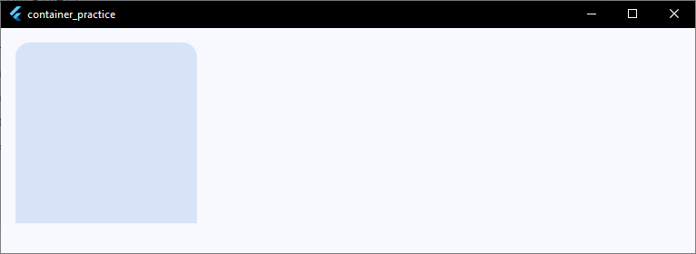
Now that we’ve played around with colors, borders, and corners, let’s step back and look at the engine powering all of this: the BoxDecoration class itself!
BoxDecoration Explained
By now, you’ve probably noticed that almost every cool visual trick we’ve done happens inside the decoration property using a BoxDecoration.
So, what exactly is it?
Think of a standard Container as a raw skeleton. On its own, it only cares about structural things like sizing (width, height), spacing (margin, padding), and constraints.
BoxDecoration is the paint, the texture, and the styling engine that you wrap around that skeleton to make it beautiful.
When you use a flutter container decoration, you unlock a massive library of visual properties. Here is a quick look at the core anatomy of a BoxDecoration:
child: Container(
  decoration: BoxDecoration(
    color: Colors.blue,           // Paints the background shape
    image: DecorationImage(...),    // Layers an image over the background color
    border: Border.all(...),        // Draws a stroke line around the shape
    borderRadius: BorderRadius(...),// Controls the crispness of the corners
    boxShadow: [...],               // Drops a shadow effect underneath
    gradient: LinearGradient(...),  // Blends colors smoothly across the background
    shape: BoxShape.rectangle,      // Defines the base geometry (rectangle or circle)
  ),
),
Code language: Dart (dart)
The Ultimate Rule: The Color Conflict
It’s worth repeating because every Flutter developer trips over this at least once:
🚨 The Golden Rule: The
Containerwidget has its own top-levelcolorproperty purely as a shortcut for quick prototyping.However, the moment you add a
BoxDecoration, the top-levelcolormust be deleted and moved inside theBoxDecoration. If you leave both, Flutter will crash with anAssertionError.
Now that you know how BoxDecoration acts as the command center for your UI styling, let’s explore one of its most popular features: dropping deep, beautiful shadows!
Adding Shadows
Adding a shadow is the perfect way to lift your widgets off the screen, creating depth and a sense of hierarchy.
In Flutter, we achieve this by using the boxShadow property inside BoxDecoration to create a flutter container shadow.
The boxShadow property takes a list of BoxShadow objects, meaning you can stack multiple shadows together to create highly realistic, soft, and modern glow effects.
Here is how you can add a clean, modern flutter add shadow to container effect:
child: Container(
  width: 200,
  height: 200,
  decoration: BoxDecoration(
    color: theme.colorScheme.surface,
    borderRadius: BorderRadius.circular(16),
    // Pass a list of shadows to the flutter container box shadow property
    boxShadow: [
      BoxShadow(
        color: Colors.black.withValues(alpha: 0.1),
        // Subtle shadow color
        spreadRadius: 2,
        // How much the shadow expands
        blurRadius: 10,
        // How soft/blurry the shadow looks
        offset: const Offset(0, 4),
        // Moves shadow: (X = horizontal, Y = vertical)
      ),
    ],
  ),
),
Code language: Dart (dart)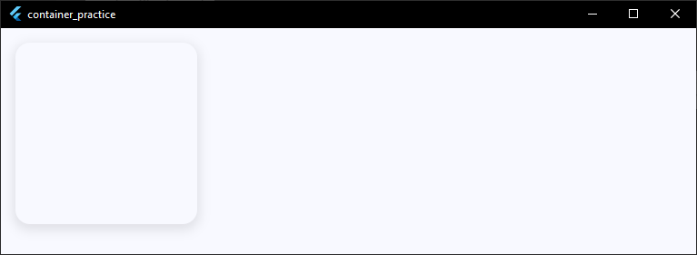
Breaking Down the BoxShadow Properties
To master the flutter container box shadow, you only need to understand four core parameters:
- color: Controls the shade and transparency. Always use an opacity modifier (like
.withValues(alpha: 0.1)) so your shadow doesn’t look like a solid, harsh block. - spreadRadius: This dictates how far the shadow expands outwards from the container before it begins to blur.
- blurRadius: The higher this number, the softer and more diffuse the shadow becomes. A low number creates a sharp, retro shadow.
- offset: Takes an
Offset(x, y). Changing the Y value simulates a light source shining from above, pushing the shadow downwards.
While BoxShadow gives you total pixel-level control, sometimes you want a quick shortcut that matches the material design system. Let’s look at elevation alternatives for containers next!
Elevation Alternatives for Container
If you are used to widgets like Card or PhysicalModel, you might be looking for a direct elevation property on your Container. However, if you look at the properties available, a direct flutter container elevation field doesn’t exist!
Don’t worry—you don’t have to manually calculate complex boxShadow offsets every time you want a standard Material Design lift. You have two fantastic, clean alternatives to achieve a flutter add elevation to container effect.
Alternative 1: The Material Widget (Best Practice)
The easiest way to give a container built-in Material elevation is to wrap it inside a Material widget. The Material widget handles elevation natively, including the perfect shadow physics and scissor clipping for rounded corners.
child: Material(
  elevation: 4,
  // Natively handles material design shadow depth
  borderRadius: BorderRadius.circular(16),
  color: theme.colorScheme.surface,
  // Background color must go on the Material widget
  child: Container(
    width: 200,
    height: 200,
    // Keep your padding or child widgets inside the container!
  ),
),
Code language: Dart (dart)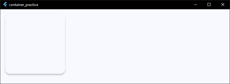
Alternative 2: The Card Widget (Quickest for UI Cards)
If you are building a content card, you can swap out the Container entirely for a Card widget. It comes with built-in elevation, a default background color, and subtle rounded corners right out of the box.
child: Card(
  elevation: 6,
  // Quick, beautiful elevation shortcut
  shape: RoundedRectangleBorder(
    borderRadius: BorderRadius.circular(12),
  ),
  child: Container(
    width: 200,
    height: 200,
    padding: const EdgeInsets.all(16),
    child: const Text("Card Content"),
  ),
),
Code language: Dart (dart)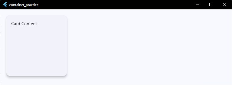
Which One Should You Choose?
- Use
boxShadowwhen you need a highly custom UI design (like a colorful glow or an ultra-soft custom shadow). - Use the
Materialwidget wrapper when you want standard, reliable material elevation while keeping total layout control. - Use the
Cardwidget when you are building standard list items, dashboards, or profile blocks quickly.
Ready to add some vibrant color blends to your designs? Let’s dive into gradient backgrounds next!
Gradient Backgrounds
Solid background colors are clean, but if you want to make your UI look incredibly modern, vibrant, and premium, a flutter container gradient is the way to go.
Instead of a single color, you can use the gradient property inside BoxDecoration to blend multiple colors together. Flutter supports two main types of gradients out of the box: linear and radial.
1. Flutter Container Linear Gradient
A linear gradient transitions colors along a straight line. By default, it moves horizontally from left to right, but you can customize the start and end points to make it move diagonally.
Here is how to create a gorgeous diagonal color sweep:
child: Container(
  width: 200,
  height: 200,
  decoration: BoxDecoration(
    borderRadius: BorderRadius.circular(16),
    // Implementing a flutter container linear gradient
    gradient: LinearGradient(
      begin: Alignment.topLeft,
      // Where the first color starts
      end: Alignment.bottomRight,
      // Where the last color ends
      colors: [
        theme.colorScheme.primary,
        // First color
        theme.colorScheme.tertiary,
        // Second color
      ],
    ),
  ),
),
Code language: Dart (dart)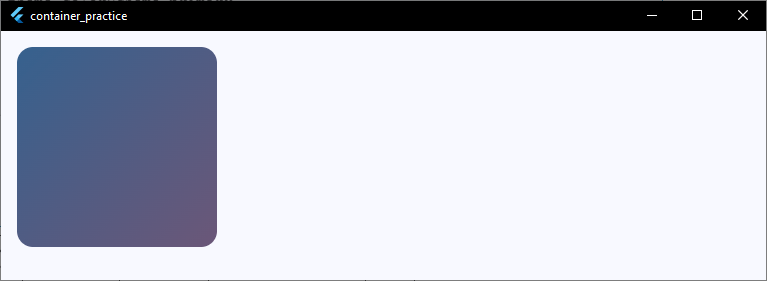
2. Flutter Container Radial Gradient
A radial gradient radiates outward from a central point, creating a circular color bleed. This is fantastic for creating subtle spotlight effects, glowing backgrounds, or futuristic UI cards.
Here is how to set up a radial blend:
child: Container(
  width: 200,
  height: 200,
  decoration: BoxDecoration(
    borderRadius: BorderRadius.circular(16),
    // Implementing a flutter container radial gradient
    gradient: RadialGradient(
      center: Alignment.center,
      // The focal point of the glow
      radius: 0.8,
      // How far the gradient expands outward
      colors: [
        theme.colorScheme.primaryContainer,
        theme.colorScheme.surfaceContainerHighest,
      ],
    ),
  ),
),
Code language: Dart (dart)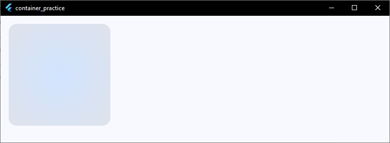
Gradient Pro-Tips
- Keep It Subtle: For a professional look, choose colors that are close to each other on the color wheel (like dark blue to purple) rather than high-contrast combinations (like red to green).
- Text Readability: If you plan on placing text over a bright gradient background, ensure your text color has high contrast (usually white or a very light cream color works best).
Now that you can blend colors across the background, did you know you can apply gradients directly to the borders too? Let’s check out gradient borders next!
Ready to Turn These UI Techniques Into Real Apps?
Borders, gradients, shadows, and glassmorphism are useful skills—but the real challenge is knowing how to combine them into professional app interfaces. Learn Flutter step-by-step with a free beginner training.
Gradient Borders
If you want an ultra-premium, futuristic look, you can take gradients a step further and apply them directly to your outlines.
A flutter container border gradient makes your cards or buttons look like they are glowing or reflecting neon light.
Here is the catch: Flutter’s standard Border.all() doesn’t natively accept a Gradient object. To bypass this, we use a handy utility class called GradientBoxBorder from a popular community package, or we can use custom painting.
However, the cleanest, native way to build a flutter container border gradient without third-party dependencies is by nesting two containers together!
The outer container acts as the gradient frame, and the inner container holds your actual content.
Here is how you can set it up perfectly:
child: Container(
  width: 204,
  // Slightly larger than the inner content to create a 2px border
  height: 204,
  padding: const EdgeInsets.all(2),
  // This padding determines the border thickness!
  decoration: BoxDecoration(
    borderRadius: BorderRadius.circular(16),
    gradient: LinearGradient(
      colors: [theme.colorScheme.primary, theme.colorScheme.tertiary],
    ),
  ),
  child: Container(
    // The inner container mask
    decoration: BoxDecoration(
      color: theme.colorScheme.surface,
      // Matches your app background
      borderRadius: BorderRadius.circular(14),
      // Slightly smaller to look crisp
    ),
    child: const Center(child: Text("Gradient Border")),
  ),
),
Code language: Dart (dart)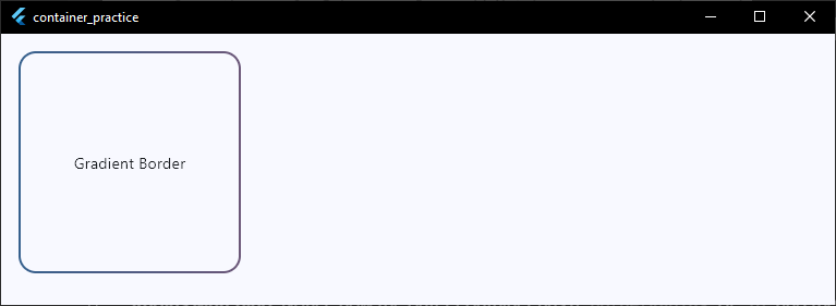
Tips for Perfect Border Gradients
- Radius Matching: Notice how the outer container has a
borderRadiusof16and the inner has14. To keep the border looking uniform around the corners, always subtract your border thickness (padding) from the outer radius! - Interaction States: This nested approach works beautifully for interactive states. You can easily wrap this entire setup in an
InkWellorGestureDetectorto make a gradient-bordered button that reacts to user taps.
Gradients are awesome, but sometimes a picture is worth a thousand words. Let’s look at how to add background images inside your containers next!
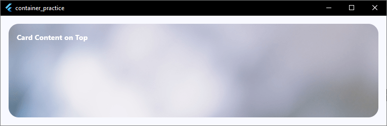
Background Images
Sometimes a solid color or gradient isn’t enough—you need a full texture, a subtle pattern, or a beautiful photograph sitting right behind your UI content.
To add a flutter container background image, we use the image property inside our trusty BoxDecoration.
This expects a DecorationImage widget, which lets you treat an image like a background layer that sits beneath any child text or icons you put inside the container.
Here is how you can set up a background image using an asset from your project:
child: Container(
  width: double.infinity, // Take up full available width
  height: 250,
  decoration: BoxDecoration(
    borderRadius: BorderRadius.circular(20),
    // Implementing a flutter container decoration image
    image: DecorationImage(
      image: const AssetImage('assets/images/card_background.jpg'),
      fit: BoxFit.cover, // Makes the image scale nicely to fill the box
    ),
  ),
  child: const Padding(
    padding: EdgeInsets.all(16),
    child: Text(
      "Card Content on Top",
      style: TextStyle(
        color: Colors.white,
        fontWeight: FontWeight.bold,
      ),
    ),
  ),
),
Code language: Dart (dart)
Image Source: https://www.pexels.com/photo/abstract-bright-blurred-bokeh-shapes-6063468
Making It Look Great with BoxFit
When dealing with a flutter container image, the fit property is your most important tool. It controls how the image stretches or shrinks to fit your container size:
BoxFit.cover(Recommended): Scales the image up or down so it completely fills the container, cropping out excess edges safely. This is perfect for hero headers or full-card backgrounds.BoxFit.contain: Makes sure the entire image is visible inside the container without cropping, which might leave empty space on the sides.BoxFit.fill: Stretches the image forcefully to hit all four edges, which can make your background look distorted.
Asset images are great for static patterns, but what if your app needs to pull images dynamically from the internet? Let’s check out network images inside containers next!
Network Images Inside Containers
Hardcoding assets into your app works great for branding or patterns, but what if you’re building a profile card, a product feed, or a movie streaming dashboard?
You’ll need to load images dynamically using a URL.
To load network images inside containers, you swap out AssetImage for NetworkImage inside your DecorationImage.
Here is how you can pull an image directly from the web and apply it as a container background:
child: Container(
  width: 300,
  height: 200,
  decoration: BoxDecoration(
    color: theme
        .colorScheme
        .surfaceContainerLow, // Fallback color while loading
    borderRadius: BorderRadius.circular(16),
    image: const DecorationImage(
      image: NetworkImage(
        'https://images.unsplash.com/photo-1618005182384-a83a8bd57fbe',
      ),
      fit: BoxFit.cover,
    ),
  ),
),
Code language: Dart (dart)
Pro-Tip: Adding Color Filters for Text Readability
When you load dynamic network images, you never know if the image will be bright, dark, or busy. If you place white text over a bright white network image, your text vanishes!
To fix this, you can use the colorFilter property inside your DecorationImage to instantly apply a subtle dark tint right over the image. This ensures your text remains crisp and readable every time.
child: Container(
  width: 300,
  height: 200,
  decoration: BoxDecoration(
    borderRadius: BorderRadius.circular(16),
    image: const DecorationImage(
      image: NetworkImage(
        'https://images.unsplash.com/photo-1618005182384-a83a8bd57fbe',
      ),
      fit: BoxFit.cover,
      // Adds a 30% black tint over the image
      colorFilter: ColorFilter.mode(Colors.black38, BlendMode.darken),
    ),
  ),
),
Code language: Dart (dart)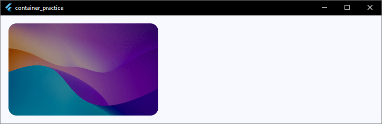
Glassmorphism UI
If you want your app to look ultra-premium, modern, and sleek, glassmorphism is the ultimate design trend to learn. It gives your UI elements a beautiful, translucent “frosted glass” look that lets your background colors peek through softly.
To create a flutter glassmorphism container, we combine a few different concepts we’ve learned: a subtle background opacity, a crisp white border, and a flutter container blur effect.
However, a glass effect only looks good if there is something vibrant behind it to blur!
The best way to set this up is to apply a background image to the entire screen by wrapping your Scaffold in an image-styled container, making the Scaffold background transparent, and then using a widget called BackdropFilter to apply the flutter container glass effect.
Here is how you can build a stunning, complete glassmorphism screen:
class _HomeScreenState extends State<HomeScreen> {
  @override
  Widget build(BuildContext context) {
    final theme = Theme.of(context);

    return Container(
      // 1. Apply a vibrant background image to the outermost container
      decoration: const BoxDecoration(
        image: DecorationImage(
          image: NetworkImage(
            'https://images.unsplash.com/photo-1618005182384-a83a8bd57fbe',
          ),
          fit: BoxFit.cover,
        ),
      ),
      child: Scaffold(
        // 2. Make the Scaffold background transparent so the image shines through
        backgroundColor: Colors.transparent,
        body: Center(
          child: ClipRRect(
            // 3. Clips the blur effect to match the container's corners
            borderRadius: BorderRadius.circular(24),
            child: BackdropFilter(
              // Controls the intensity of the flutter container blur
              filter: ImageFilter.blur(sigmaX: 10.0, sigmaY: 10.0),
              child: Container(
                width: 300,
                height: 200,
                decoration: BoxDecoration(
                  // Gives it that semi-transparent frosted glass base
                  color: Colors.white.withValues(alpha: 0.1),
                  borderRadius: BorderRadius.circular(24),
                  border: Border.all(
                    // A subtle white border makes the glass edges catch the light
                    color: Colors.white.withValues(alpha: 0.2),
                    width: 1.5,
                  ),
                ),
                child: const Center(
                  child: Text(
                    "Glassmorphism Pop!",
                    style: TextStyle(
                      color: Colors.white,
                      fontSize: 18,
                      fontWeight: FontWeight.bold,
                    ),
                  ),
                ),
              ),
            ),
          ),
        ),
      ),
    );
  }
}
Code language: Dart (dart)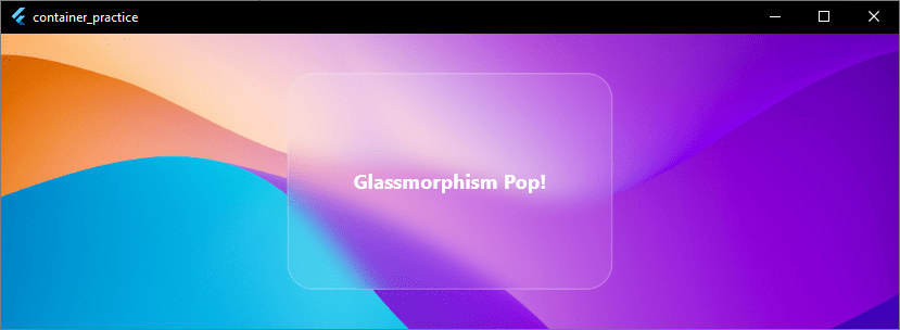
The Secrets to Perfect Glassmorphism
- The Backdrop is Everything: If you put a glassmorphism card over a flat, solid white background, it will just look like a faint grey box. Always place it over vibrant linear gradients or busy photographic backgrounds to really see the frost effect shine.
- Don’t Forget ClipRRect:
BackdropFilterapplies a blur to a square bounding box. If your container has rounded corners, you must wrap theBackdropFilterinside aClipRRectwith the exact same border radius. If you skip this step, your blur will leak out past your smooth rounded edges!
Want to make your glass or solid cards feel recessed directly into the screen? Let’s check out how to build inner shadows next!
Inner Shadows
Standard shadows make your container look like it is floating above the screen. An inner shadow does the exact opposite.
It makes the container look recessed, stamped, or sunken directly into your UI. This is a favorite look for input fields or custom cards.
Flutter’s standard BoxShadow only casts shadows outward. To get an authentic inner shadow natively, we can use a Stack combined with a clipped, oversized container that drops a heavy shadow inward over the edges.
Let’s look at how to build this. We will use a distinct scaffold background color to make our recessed container stand out clearly.
class _HomeScreenState extends State<HomeScreen> {
  @override
  Widget build(BuildContext context) {
    final theme = Theme.of(context);

    return Scaffold(
      // Distinct background to make the container visible
      backgroundColor: theme.colorScheme.surfaceContainer,
      body: Center(
        child: Container(
          width: 250,
          height: 150,
          decoration: BoxDecoration(
            color: theme.colorScheme.surface,
            borderRadius: BorderRadius.circular(16),
          ),
          // Clip everything inside to contain the inner shadow
          child: ClipRRect(
            borderRadius: BorderRadius.circular(16),
            child: Stack(
              children: [
                // The Inner Shadow Layer
                Positioned.fill(
                  child: Container(
                    decoration: BoxDecoration(
                      borderRadius: BorderRadius.circular(16),
                      boxShadow: [
                        BoxShadow(
                          color: theme.colorScheme.shadow.withValues(
                            alpha: 0.3,
                          ),
                          blurRadius: 10,
                          offset: const Offset(3, 3),
                        ),
                        BoxShadow(
                          color: theme.colorScheme.surface,
                          // The secret: Spread a solid color to push the shadow inside
                          spreadRadius: -4,
                          blurRadius: 10,
                        ),
                      ],
                    ),
                  ),
                ),
                // Main Content Layer
                const Center(
                  child: Text(
                    "Recessed Content",
                    style: TextStyle(fontWeight: FontWeight.bold),
                  ),
                ),
              ],
            ),
          ),
        ),
      ),
    );
  }
}
Code language: Dart (dart)
Breaking Down the Trick
- Negative Spread: Setting a negative
spreadRadiuspulls the shadow inward. This keeps it trapped perfectly within the boundaries of the box. - The Stack: Placing the shadow in a
Stackensures your text content stays crisp and bright on top of the shadow layer.
Want to break away from rectangles entirely? Let’s look at how to build perfectly circular containers next!
Circular Containers
Up until now, we’ve been styling rectangular boxes with rounded edges. But what if you need a perfectly round shape?
Circular containers are the backbone of profile avatars, status indicators, and floating action buttons.
Instead of messing around with BorderRadius, the absolute cleanest way to build a flutter container circle is by changing the shape property inside your BoxDecoration.
When you use BoxShape.circle, you tell Flutter to discard the rectangle layout entirely.
Here is how you can build a clean, perfect circle container:
child: Container(
  width: 120,
  height: 120, // Keep width and height equal for a perfect circle!
  decoration: BoxDecoration(
    color: theme.colorScheme.primary,
    shape: BoxShape.circle, // Forces the container into a circle shape
    border: Border.all(color: theme.colorScheme.onPrimary, width: 4),
    boxShadow: [
      BoxShadow(
        color: theme.colorScheme.shadow.withValues(alpha: 0.2),
        blurRadius: 8,
        offset: const Offset(0, 4),
      ),
    ],
  ),
  child: const Center(
    child: Icon(Icons.person, color: Colors.white, size: 40),
  ),
),
Code language: Dart (dart)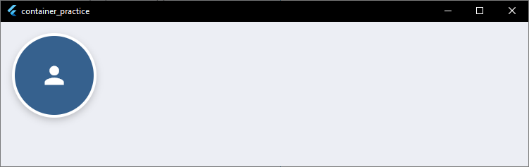
Essential Rules for Circular Containers
- Keep Sizing Equal: If your
widthandheightdo not match,BoxShape.circlewill squish your widget into an oval. Always keep them perfectly identical. - No BorderRadius Allowed: If you set
shape: BoxShape.circleand leave aborderRadiusproperty inside the sameBoxDecoration, your app will throw an error. A circle cannot have a corner radius!
What if a rectangle or a circle still isn’t unique enough for your app’s layout? Let’s explore how to create completely custom shapes next!
Custom Shapes
Circles and rectangles cover most mobile apps. But sometimes your design calls for something truly unique.
You might need a card with a diagonal cut, a speech bubble with a little pointer tail, or a wavy header background.
When a standard flutter container shape isn’t enough, you can break free from traditional boundaries by using a flutter container custom shape.
To do this natively, we wrap our Container inside a ClipPath widget. The ClipPath uses a CustomClipper class to draw a custom geometric path, acting like a cookie cutter for your widget tree.
Here is how to create a cool diagonal-cut ticket or banner card:
child: ClipPath(
  clipper: TicketClipper(), // Our custom geometric outline
  child: Container(
    width: 300,
    height: 150,
    color: theme.colorScheme.primaryContainer,
    child: const Center(
      child: Text(
        "Custom Shape Card",
        style: TextStyle(fontWeight: FontWeight.bold),
      ),
    ),
  ),
),
Code language: Dart (dart)
// Define the custom shape math below your widget
class TicketClipper extends CustomClipper<Path> {
@override
getClip(Size size) {
Path path = Path();
path.lineTo(0, size.height); // Draw down to bottom-left
path.lineTo(
size.width - 40,
size.height,
); // Draw across, leaving room for the cut
path.lineTo(size.width, size.height - 40); // Cut diagonally up-right
path.lineTo(size.width, 0); // Draw up to top-right
path.close(); // Automatically close the loop back to the start
return path;
}
@override
bool shouldReclip(CustomClipper oldClipper) => false;
}
Code language: Dart (dart)
Tips for Custom Shapes
- Use Relative Coordinates: When writing your clipper logic, always use
size.widthandsize.heightinstead of hardcoded pixel numbers. This ensures your custom shape stretches correctly across different phone screen sizes. - Complex Shapes: For highly detailed vector paths (like curves, waves, or custom logos), you can use a tool like an SVG-to-Path converter or look into the popular
morphable_shapecommunity package to save hours of manual math!
Let’s put everything we’ve learned together. Next, we will check out some real-world UI card examples!
Real UI Card Examples
Let’s take all the layout properties we’ve covered and look at how to build clean, modern production-grade user interface cards.
Instead of basic shapes, you can combine gradients, sharp borders, and subtle elevation changes to build cards that look production-ready.
Example 1: The Premium Crypto Wallet Card
This layout combines a sleek horizontal color blend with a subtle shadow map to build a responsive financial asset card.
child: Container(
  width: double.infinity,
  padding: const EdgeInsets.all(24),
  decoration: BoxDecoration(
    borderRadius: BorderRadius.circular(20),
    gradient: LinearGradient(
      begin: Alignment.topLeft,
      end: Alignment.bottomRight,
      colors: [theme.colorScheme.primary, theme.colorScheme.secondary],
    ),
    boxShadow: [
      BoxShadow(
        color: theme.colorScheme.primary.withValues(alpha: 0.3),
        blurRadius: 12,
        offset: const Offset(0, 6),
      ),
    ],
  ),
  child: Column(
    crossAxisAlignment: CrossAxisAlignment.start,
    mainAxisSize: MainAxisSize.min,
    children: [
      Text(
        "Total Balance",
        style: TextStyle(
          color: theme.colorScheme.onPrimary.withValues(alpha: 0.7),
          fontSize: 14,
        ),
      ),
      const SizedBox(height: 8),
      Text(
        "\$48,250.80",
        style: TextStyle(
          color: theme.colorScheme.onPrimary,
          fontSize: 28,
          fontWeight: FontWeight.bold,
        ),
      ),
    ],
  ),
),
Code language: Dart (dart)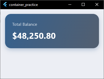
Example 2: The E-Commerce Product Card
This model splits structural layers cleanly to showcase items against a soft background context.
child: Container(
  width: 180,
  decoration: BoxDecoration(
    color: theme.colorScheme.surface,
    borderRadius: BorderRadius.circular(16),
    border: Border.all(
      color: theme.colorScheme.outlineVariant.withValues(alpha: 0.5),
    ),
  ),
  child: Column(
    crossAxisAlignment: CrossAxisAlignment.start,
    children: [
      // Top image space using decorative backgrounds
      Container(
        height: 120,
        decoration: BoxDecoration(
          color: theme.colorScheme.surfaceContainerHighest,
          borderRadius: const BorderRadius.vertical(
            top: Radius.circular(15),
          ),
        ),
        child: const Center(
          child: Icon(Icons.shopping_bag_outlined, size: 40),
        ),
      ),
      // Label block
      Padding(
        padding: const EdgeInsets.all(12),
        child: Column(
          crossAxisAlignment: CrossAxisAlignment.start,
          children: [
            const Text(
              "Wireless Earbuds",
              style: TextStyle(fontWeight: FontWeight.w600),
            ),
            const SizedBox(height: 4),
            Text(
              "\$79.00",
              style: TextStyle(
                color: theme.colorScheme.primary,
                fontWeight: FontWeight.bold,
              ),
            ),
          ],
        ),
      ),
    ],
  ),
),
Code language: Dart (dart)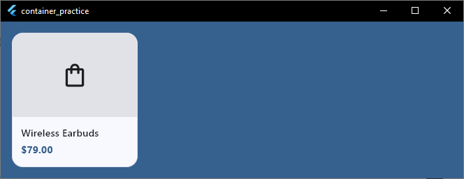
Styling individual widgets is only the first step.
Building a polished, real-world application means seamlessly connecting your UI with state management, fluid navigation, and secure backend integrations.
You Know the Styling. Now Build Something Real.
You’ve learned how to customize Flutter containers with borders, shadows, gradients, images, and glass effects. The next step is applying these techniques inside complete apps that users can actually use.