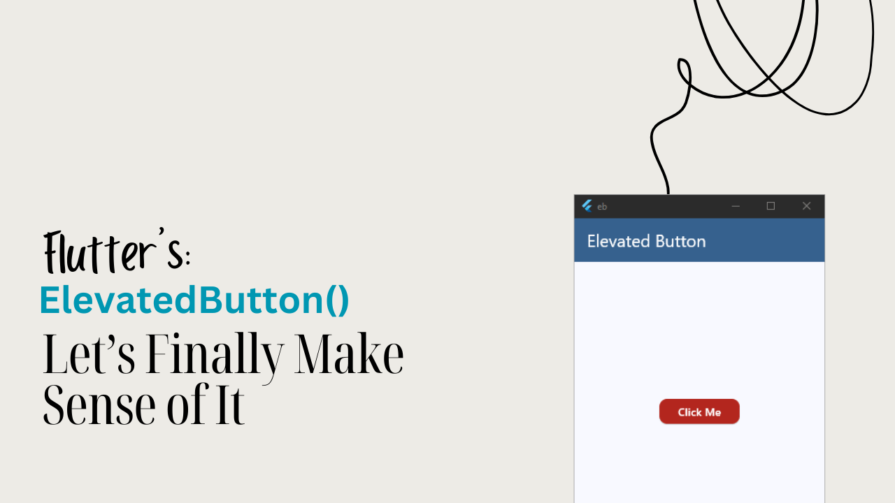
If you’re building a Flutter app, chances are Flutter ElevatedButton is the first button you’ll reach for. It’s modern, accessible, customizable, and follows Material Design by default.
In this guide, you’ll learn everything about Flutter ElevatedButton — from basics to styling, states, icons, and real-world usage examples.
What is Flutter ElevatedButton?
Flutter ElevatedButton is a Material Design button widget that appears raised with a shadow. It’s used for primary actions — the main thing a user should do on a screen.
Think of it as:
“Hey user, this is the most important action here — tap me.”
Flutter replaced the old RaisedButton with ElevatedButton to make buttons more consistent, customizable, and future-proof.
Basic Flutter ElevatedButton Example
Here’s the simplest possible Flutter ElevatedButton:
body: Center(
  child: Padding(
    padding: EdgeInsets.all(16),
    child: Column(
      mainAxisAlignment: MainAxisAlignment.center,
      children: [
        ElevatedButton(onPressed: () {}, child: const Text('Click Me')),
      ],
    ),
  ),
),
Code language: JavaScript (javascript)
What’s happening here?
onPressed: Required callback when the button is tappedchild: Usually aText, but can be any widget
If onPressed is null, the button becomes disabled automatically.
Flutter ElevatedButton Disabled State
body: Center(
  child: Padding(
    padding: EdgeInsets.all(16),
    child: Column(
      mainAxisAlignment: MainAxisAlignment.center,
      children: [
        ElevatedButton(onPressed: null, child: const Text('Click Me')),
      ],
    ),
  ),
),
Code language: JavaScript (javascript)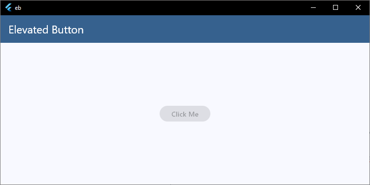
Flutter handles:
- Greyed-out look
- No tap interaction
- Accessibility rules
No extra logic needed. Clean and safe.
Styling Flutter ElevatedButton (ButtonStyle)
This is where most people get confused — so let’s slow it down.
Styled ElevatedButton Example
body: Center(
  child: Padding(
    padding: EdgeInsets.all(16),
    child: Column(
      mainAxisAlignment: MainAxisAlignment.center,
      children: [
        ElevatedButton(
          onPressed: () {},
          style: ElevatedButton.styleFrom(
            backgroundColor: Theme.of(context).colorScheme.error,
            foregroundColor: Theme.of(context).colorScheme.onError,
            padding: EdgeInsets.symmetric(horizontal: 24, vertical: 14),
            shape: RoundedRectangleBorder(
              borderRadius: BorderRadius.circular(12),
            ),
          ),
          child: const Text('Click Me'),
        ),
      ],
    ),
  ),
),
Code language: JavaScript (javascript)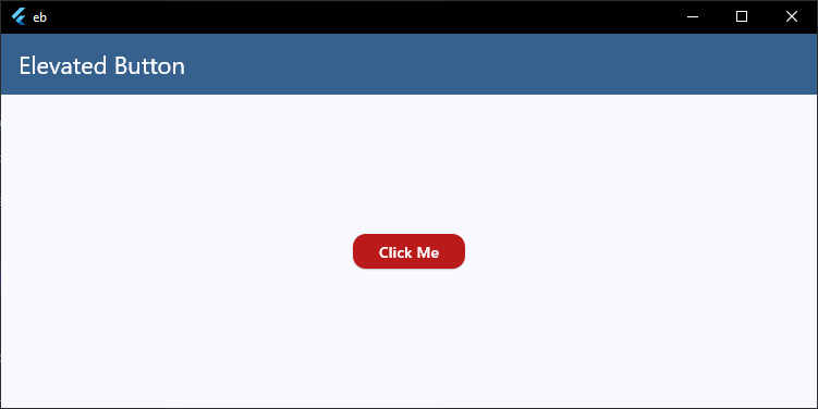
Key Styling Properties
backgroundColor→ button colorforegroundColor→ text & icon colorpadding→ internal spacingshape→ rounded corners or custom shapes
This alone covers 80% of real apps.
Flutter ElevatedButton with Icon
Perfect for actions like Login, Add, Download.
body: Center(
  child: Padding(
    padding: EdgeInsets.all(16),
    child: Column(
      mainAxisAlignment: MainAxisAlignment.center,
      children: [
        ElevatedButton.icon(
          onPressed: () {},
          icon: const Icon(Icons.add),
          label: const Text('Add item'),
        ),
      ],
    ),
  ),
),
Code language: JavaScript (javascript)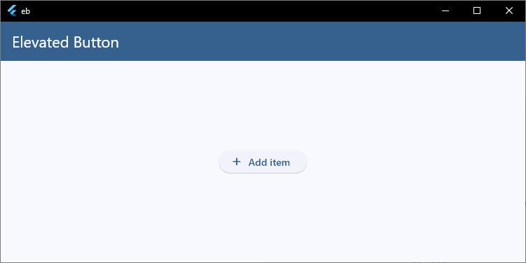
You still style it the same way using style:.
Full-Width ElevatedButton (Common UI Pattern)
body: Center(
  child: Padding(
    padding: EdgeInsets.all(16),
    child: SizedBox(
      width: double.infinity,
      child: ElevatedButton(
        onPressed: () {},
        child: const Text('Continue'),
      ),
    ),
  ),
),
Code language: JavaScript (javascript)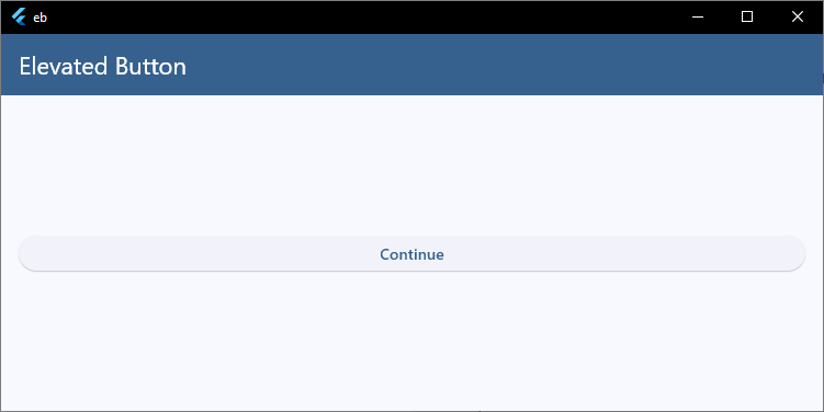
This is widely used in:
- Login screens
- Checkout flows
- Onboarding pages
Handling Press Logic Properly
Avoid putting heavy logic directly inside onPressed.
Bad Practice
onPressed: () {
  // API calls
  // validation
  // navigation
}
Code language: JavaScript (javascript)
Better Practice
onPressed: _submitForm,

void _submitForm() {
  // clean, testable logic
}
Code language: JavaScript (javascript)
Cleaner code = easier debugging.
When Should You Use ElevatedButton?
Use Flutter ElevatedButton when:
- The action is primary
- You want strong visual emphasis
- The user should not miss it
Avoid it for secondary actions — use TextButton instead.
Common Mistakes with Flutter ElevatedButton
- Over-styling every button differently
- Using ElevatedButton for cancel actions
- Ignoring disabled states
- Putting business logic directly inside UI
Keep buttons simple and consistent.
Best Practice: Theme Your ElevatedButtons
Instead of styling every button manually:
theme: ThemeData(
  useMaterial3: true,
  colorScheme: ColorScheme.fromSeed(seedColor: Colors.blue),
  elevatedButtonTheme: ElevatedButtonThemeData(
    style: ElevatedButton.styleFrom(
      backgroundColor: Theme.of(context).colorScheme.error,
      foregroundColor: Theme.of(context).colorScheme.onError,
      shape: RoundedRectangleBorder(
        borderRadius: BorderRadius.circular(10),
      ),
    ),
  ),
),
Code language: CSS (css)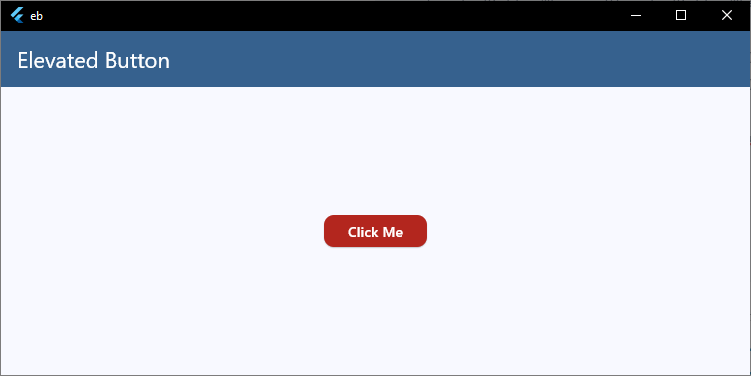
Now all ElevatedButtons follow the same design — clean and scalable.
Final Thoughts
Flutter ElevatedButton is powerful because it’s:
- Simple for beginners
- Flexible for advanced apps
- Consistent with Material Design
- Easy to theme globally
Master this one widget properly, and half your UI problems disappear.
🌱 Keep Building with Flutter
Every widget you learn brings you one step closer to building complete Flutter apps. Join my free Flutter class and let’s continue learning by creating real projects together.