The Text widget is one of the most frequently used widgets in Flutter. Learn what it does, when to use it, and how to display clear, readable text in your apps with confidence.
The Text widget is the simplest way to display text on the screen in Flutter — from labels to titles to full paragraphs.
Almost every app shows text: names, buttons, descriptions, messages, notifications. Mastering the Text widget is the first real step toward building readable, beautiful UIs.
- Where it appears in real apps
- Quick example use case
- Official definition in beginner words
- Core properties
- When Should You Use Text
- Important Properties & Parameters
- Basic Example
- Practical Example (Real App Use)
- Common Mistakes to Avoid
- Tips, Best Practices & Variations
- Summary
- Next Steps
- Build Your First Flutter App with My Free Hands-On Class
- Ready to Build Real Flutter Apps?
Where it appears in real apps
- App titles and headings
- Labels on buttons
- Form fields and instructions
- Paragraphs in news or blog apps
- Chat messages, notifications, and list items
If you see text in any Flutter app, it was almost certainly created with the Text widget.
Quick example use case
A messaging app uses the Text widget to display conversation messages.
A profile screen shows the user’s name, bio, and status using simple Text widgets.
Official definition in beginner words
The Text widget is used to display a string of text on the screen. It can show simple labels or styled text with custom fonts, sizes, colors, spacing, and more.
Type of widget
Text is a Stateless widget.
It doesn’t change by itself — if you want the text to update, you change the data feeding it, not the widget itself.
Core properties
- data — The actual text you want to display.
- style — Controls the appearance (font size, color, weight).
- textAlign — Aligns the text (left, center, right).
- maxLines — Limits how many lines the text can take.
- overflow — Controls what happens when text is too long (ellipsis, fade, clip).
- softWrap — Whether text should wrap to the next line.
Visual Example
import 'package:flutter/material.dart';
void main() {
runApp(const MyApp());
}
class MyApp extends StatelessWidget {
const MyApp({super.key});
@override
Widget build(BuildContext context) {
return MaterialApp(
title: 'Example App',
debugShowCheckedModeBanner: false,
theme: ThemeData(
useMaterial3: true,
colorScheme: ColorScheme.fromSeed(seedColor: Colors.blue),
),
home: const HomeScreen(),
);
}
}
class HomeScreen extends StatefulWidget {
const HomeScreen({super.key});
@override
State<HomeScreen> createState() => _HomeScreenState();
}
class _HomeScreenState extends State<HomeScreen> {
@override
Widget build(BuildContext context) {
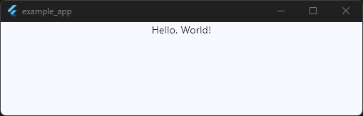
return Scaffold(body: Text('Hello, World!'));
}
}
Code language: JavaScript (javascript)Simple and foundational — everything starts here.
When Should You Use Text
1. When you need to display any kind of information
Headings, descriptions, button labels, status messages — almost everything in an app communicates through text.
Use the Text widget whenever you want words to appear on the screen.
2. When you want to show dynamic content
Text is perfect for showing:
- Usernames
- Scores
- Dates
- API responses
- Form input
As the data changes, the UI updates accordingly (even though Text itself is stateless).
3. When you need to label other UI elements
Buttons, icons, fields, and menus often need a short label.
A simple Text('Save') or Text('Retry') improves clarity instantly.
4. When structuring or styling content
Use Text when you want:
- Titles with larger fonts
- Subtitles with lighter colors
- Paragraphs with spacing
- Custom fonts or themes
It’s the backbone of readable UI design.
5. When building lists or repeating UI
Each list item — like an email subject, note title, or product name — usually contains at least one Text widget.
Important Properties & Parameters
Below are the most commonly used Text properties, explained in plain language with small examples.
1. style
What it does:
Controls how the text looks — font size, color, weight, spacing, etc.
Why it matters:
Good typography makes your UI readable and visually appealing.
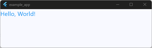
return Scaffold(
  body: Text(
    'Hello, World!',
    style: TextStyle(fontSize: 20, color: Colors.blue),
  ),
);
Code language: JavaScript (javascript)
2. textAlign
What it does:
Aligns the text horizontally: left, right, center, justify.
Why it matters:
Useful for headings, paragraphs, and centered layouts.
return Scaffold(
body: Row(
children: [
Expanded(child: Text('Hello, World!', textAlign: TextAlign.center)),
],
),
);
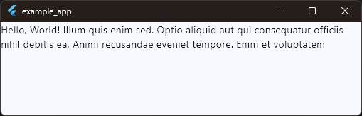
Code language: JavaScript (javascript)3. maxLines
What it does:
Limits how many lines the text can occupy.
Why it matters:
Prevents long text from stretching your layout.
return Scaffold(
body: Row(
children: [
Expanded(
child: Text(
'Hello, World! Illum quis enim sed. Optio aliquid aut qui consequatur officiis nihil debitis ea. Animi recusandae eveniet tempore. Enim et voluptatem explicabo et. Quibusdam hic ipsam nobis est adipisci ipsam omnis.',
maxLines: 2,
),
),
],
),
);
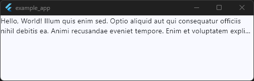
Code language: JavaScript (javascript)4. overflow
What it does:
Tells Flutter what to do if the text doesn’t fit: clip, fade, or show “…”.
Why it matters:
Keeps your UI neat in tight spaces.
return Scaffold(
body: Row(
children: [
Expanded(
child: Text(
'Hello, World! Illum quis enim sed. Optio aliquid aut qui consequatur officiis nihil debitis ea. Animi recusandae eveniet tempore. Enim et voluptatem explicabo et. Quibusdam hic ipsam nobis est adipisci ipsam omnis.',
maxLines: 2,
overflow: TextOverflow.ellipsis,
),
),
],
),
);
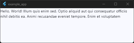
Code language: JavaScript (javascript)5. softWrap
What it does:
Controls whether text should automatically move to the next line.
Why it matters:
Helpful for controlling layout in narrow containers.
return Scaffold(
  body: Row(
    children: [
      Expanded(
        child: Text(
          'Hello, World! Illum quis enim sed. Optio aliquid aut qui consequatur officiis nihil debitis ea. Animi recusandae eveniet tempore. Enim et voluptatem explicabo et. Quibusdam hic ipsam nobis est adipisci ipsam omnis.',
          maxLines: 2,
          softWrap: true,
        ),
      ),
    ],
  ),
);
Code language: JavaScript (javascript)
6. style: TextStyle() sub-properties
Beginners often encounter these early:
- fontSize → Makes text bigger/smaller
- fontWeight → Bold, normal, light
- color → Text color
- letterSpacing → Spacing between characters
- height → Line height
return Scaffold(
  body: Row(
    children: [
      Expanded(
        child: Text(
          'Hello, World! ',
          style: TextStyle(
            fontSize: 18,
            fontWeight: FontWeight.bold,
            letterSpacing: 1.2,
          ),
        ),
      ),
    ],
  ),
);
Code language: JavaScript (javascript)
Build Your First Flutter App with My Free Hands-On Class
You’ve already started learning Flutter. Take the next step with a free practical class where you’ll build a real app from scratch. Enter your email below for instant access.
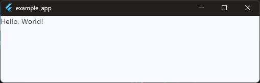
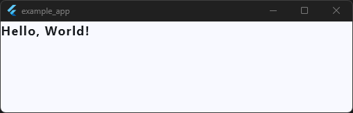
Basic Example
Here’s a simple example of the Text widget inside a Scaffold.
This shows how easy it is to display text on the screen.
import 'package:flutter/material.dart';
void main() {
runApp(const MyApp());
}
class MyApp extends StatelessWidget {
const MyApp({super.key});
@override
Widget build(BuildContext context) {
return MaterialApp(
title: 'Example App',
debugShowCheckedModeBanner: false,
theme: ThemeData(
useMaterial3: true,
colorScheme: ColorScheme.fromSeed(seedColor: Colors.blue),
),
home: const HomeScreen(),
);
}
}
class HomeScreen extends StatefulWidget {
const HomeScreen({super.key});
@override
State<HomeScreen> createState() => _HomeScreenState();
}
class _HomeScreenState extends State<HomeScreen> {
@override
Widget build(BuildContext context) {
return Scaffold(body: Center(child: Text('Hello, Flutter!')));
}
}
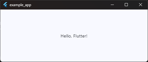
Code language: JavaScript (javascript)What this shows
- How to display simple text on the screen
- How
Textis used inside a normal Flutter layout - How a
Centerwidget helps position it - The most basic structure of a Flutter app
Straightforward, readable, and perfect for new learners.
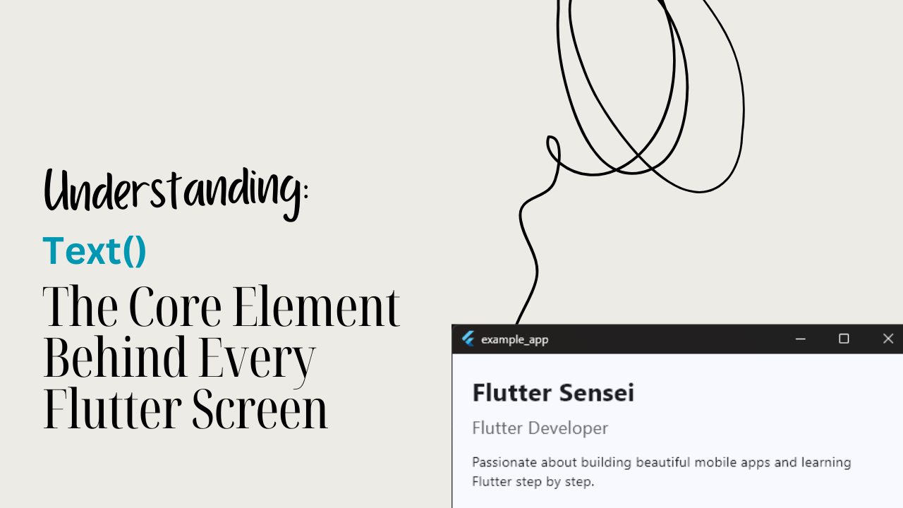
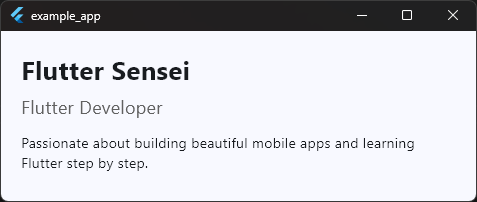
Practical Example (Real App Use)
Imagine you’re building a Profile Screen.
You need to show:
- The user’s name
- Their role or title
- A short bio
Text widgets are perfect for this.
They help create hierarchy (big name, medium subtitle, smaller description) — which improves readability and overall UI design.
import 'package:flutter/material.dart';

void main() {
  runApp(const MyApp());
}

class MyApp extends StatelessWidget {
  const MyApp({super.key});

  @override
  Widget build(BuildContext context) {
    return MaterialApp(
      title: 'Example App',
      debugShowCheckedModeBanner: false,
      theme: ThemeData(
        useMaterial3: true,
        colorScheme: ColorScheme.fromSeed(seedColor: Colors.blue),
      ),
      home: const HomeScreen(),
    );
  }
}

class HomeScreen extends StatefulWidget {
  const HomeScreen({super.key});

  @override
  State<HomeScreen> createState() => _HomeScreenState();
}

class _HomeScreenState extends State<HomeScreen> {
  @override
  Widget build(BuildContext context) {
    return Scaffold(
      body: Padding(
        padding: const EdgeInsets.all(20.0),
        child: Column(
          crossAxisAlignment: CrossAxisAlignment.start,
          children: [
            Text(
              'Flutter Sensei',
              style: TextStyle(fontSize: 26, fontWeight: FontWeight.bold),
            ),
            SizedBox(height: 6),
            Text(
              'Flutter Developer',
              style: TextStyle(fontSize: 18, color: Colors.grey[700]),
            ),
            SizedBox(height: 12),
            Text(
              'Passionate about building beautiful mobile apps and learning Flutter step by step.',
              maxLines: 3,
              overflow: TextOverflow.ellipsis,
            ),
          ],
        ),
      ),
    );
  }
}
Code language: JavaScript (javascript)
How this improves UI/UX
- Hierarchy: Users instantly see what’s important (name > role > description).
- Readability: Larger and bold text draws attention; smaller text provides detail.
- Clarity: The UI feels structured and intentional.
- Responsiveness:
maxLinesandoverflowprevent layout-breaking text.
This is where beginners start to feel the power of well-styled text.
Common Mistakes to Avoid
1. Ignoring text overflow
Mistake:
Writing long text without using maxLines or overflow.
Why it’s a problem:
The text can stretch the layout, overflow the screen, or break designs.
2. Using inconsistent text sizes and styles
Mistake:
Beginners often mix random font sizes, colors, and weights.
Why it matters:
Inconsistent typography makes the UI look unprofessional and messy.
3. Not wrapping long text inside layout widgets
Mistake:
Placing long text directly in a Row without Expanded or Flexible.
Why it matters:
Rows don’t automatically wrap text → layout overflow errors.
4. Overusing bold or large font sizes
Mistake:
Making everything bold or big.
Why it matters:
Loses hierarchy — users can’t tell what’s important.
5. Forgetting about readability
Mistake:
Using low-contrast text colors (light gray on white, dark gray on black).
Why it matters:
Poor readability = poor UX.
Good contrast helps accessibility.
Tips, Best Practices & Variations
1. Combine Text with layout widgets for better structure
The Text widget becomes far more powerful when paired with layout helpers:
- Row / Column → Organize text with other UI elements
- Padding / Margin → Give breathing space for readability
- Expanded / Flexible → Prevent overflow in tight layouts
- Center / Align → Control positioning easily
Beginners often forget that text needs a good layout to shine.
2. Use consistent styling for a professional look
Instead of manually styling each Text widget:
- Use Theme.of(context).textTheme
- Create reusable TextStyle constants
- Define headline, subtitle, body styles for clarity
It keeps your app looking unified and clean.
3. When not to use the Text widget
Avoid using a regular Text widget when:
- You need rich text formatting (bold + italic + different colors in one sentence) → Use
RichTextorText.rich() - You’re building a clickable text link → Use
InkWell+ TextorGestureDetector - You want animated text effects → Use packages like
animated_text_kit
Each of these cases requires more advanced control.
4. Performance notes
Text is lightweight and extremely fast — but:
- Avoid creating very large paragraphs inside tight layouts
- Heavy custom fonts may increase load time
- Repeatedly rebuilding styled text in loops is expensive
For 99% of beginner use cases, it performs flawlessly.
5. Useful alternatives and variations
Sometimes you need more than plain text:
RichText→ For multiple styles in one lineSelectableText→ When users should be able to copy textText.rich()→ A simpler version of rich formattingFittedBox+ Text → For auto-scaling text inside small spacesDefaultTextStyle→ Apply one style to multiple Text widgets at once
These give you more control as your apps grow.
Summary
The Text widget is the simplest and most essential way to display words in a Flutter app. Whether it’s a heading, a short label, a paragraph, or dynamic content from the user, almost every screen you build will rely on it.
Use the Text widget when you need:
- Clear labels or titles
- Readable descriptions and paragraphs
- Dynamic information like names, scores, or messages
- Consistent typography across your UI
It fits naturally into real apps by creating hierarchy, improving readability, and giving structure to your layout. Once you understand how to style and place text properly, your designs instantly start looking cleaner and more professional.
Next Steps
Now that you understand the Text widget, you’re ready to explore more Flutter basics and slowly build cleaner, more polished UI screens.
Ready to Build Real Flutter Apps?
Nice work making it to the end! If this guide helped you, you’ll love my free hands-on Flutter class where we build a real app together, step by step.