Learn how to style text in Flutter using the Text widget and TextStyle. Master font sizes, weights, colours, spacing, alignment, themes and responsive typography with practical examples and best practices.

Have you ever opened a Flutter app on your phone, and the text looked absolute perfection—clean, crisp, and beautifully proportioned—only to test it on a tablet or a smaller device and realize the headings look massive, or worse, completely broken?
If you’ve ever found yourself struggling with layout overflows, wrestling with custom font weights that just won’t render properly, or wondering how to make your UI automatically adapt across mobile, web, and desktop… you are definitely in the right place!
Typography is the heart and soul of your app’s user interface. It’s what guides your user’s eyes, communicates your brand’s voice, and makes your app an absolute delight to use. In this comprehensive guide, we’re going to dive deep into Flutter text styling and responsive typography.
Whether you need to quickly change a flutter font color, master flutter line height and letter spacing, build adaptive text that scales smoothly, or handle screen accessibility like a pro, we’ve got you covered.
Grab your favorite cup of coffee, open up your IDE, and let’s make your Flutter text look stunning everywhere!
- TextStyle basics
- Font size
- Font weight
- Font styles
- Letter spacing
- Line height
- Text color
- Underline and decoration
- Responsive font sizing
- Dynamic font sizes
- Font scaling
- Accessibility considerations
- RichText styling
- Ready to Go Beyond the Basics?
- Take Your Flutter Skills to the Next Level
- Ready to Build Professional Flutter Apps?
TextStyle basics
Let’s kick things off with the foundation of all typography in Flutter: the TextStyle class.
If you want to customize how your text looks—from changing the flutter font color to adjusting size and weight—TextStyle is where the magic happens.
In Flutter, you pass a TextStyle object to the style property of a Text or RichText widget.
Understanding the Basics
By default, Flutter applies styles from your app’s overall theme (Theme.of(context).textTheme). However, when you want to override these defaults for a specific widget, you create a local TextStyle.
Here is how simple it is to apply basic styles:
body: Center(
  child: Text(
    'Hello, Welcome to FlutterSensei!',
    style: TextStyle(
      fontSize: 20.0,
      color: Colors.blue,
      fontWeight: FontWeight.bold,
    ),
  ),
),
Code language: Dart (dart)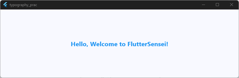
Working Example: App Theme vs. Direct TextStyle
Let’s see this in action using our boilerplate app! In this example, we’ll compare text using the default Material Theme typography style versus custom direct overrides using TextStyle.
import 'package:flutter/material.dart';

void main() {
  runApp(const MyApp());
}

class MyApp extends StatelessWidget {
  const MyApp({super.key});

  @override
  Widget build(BuildContext context) {
    return MaterialApp(
      title: 'Typography Practice',
      debugShowCheckedModeBanner: false,
      theme: ThemeData(
        useMaterial3: true,
        colorSchemeSeed: Colors.blue,
        brightness: Brightness.light,
      ),
      home: const HomeScreen(),
    );
  }
}

class HomeScreen extends StatefulWidget {
  const HomeScreen({super.key});

  @override
  State<HomeScreen> createState() => _HomeScreenState();
}

class _HomeScreenState extends State<HomeScreen> {
  @override
  Widget build(BuildContext context) {
    return Scaffold(
      appBar: AppBar(title: const Text('TextStyle Basics'), centerTitle: true),
      body: Padding(
        padding: const EdgeInsets.all(16.0),
        child: Column(
          crossAxisAlignment: CrossAxisAlignment.start,
          children: [
            // Example 1: Inherited theme style (flutter headlineMedium)
            Text(
              'Headline Medium (Theme Default)',
              style: Theme.of(context).textTheme.headlineMedium,
            ),
            const SizedBox(height: 12),

            // Example 2: Inherited theme style (flutter text bodyLarge)
            Text(
              'Body Large (Theme Default)',
              style: Theme.of(context).textTheme.bodyLarge,
            ),
            const SizedBox(height: 20),

            const Divider(),
            const SizedBox(height: 20),

            // Example 3: Direct custom TextStyle override
            const Text(
              'Custom Styled Text',
              style: TextStyle(
                fontSize: 22.0,
                color: Colors.white,
                fontWeight: FontWeight.w600,
                backgroundColor: Colors.purple, // custom highlight
              ),
            ),
            const SizedBox(height: 12),

            // Example 4: Merging styles with copyWith
            Text(
              'Theme Style + Custom Modifications',
              style: Theme.of(context).textTheme.bodyLarge?.copyWith(
                color: Colors.teal,
                fontWeight: FontWeight.bold,
              ),
            ),
          ],
        ),
      ),
    );
  }
}
Code language: Dart (dart)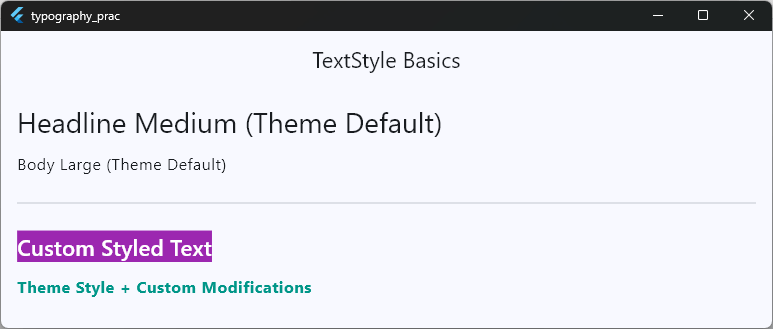
Pro Tip: Always Prefer .copyWith()
When you want to tweak a pre-defined theme style (like flutter text bodyLarge or flutter headlineMedium), don’t re-create the entire TextStyle from scratch!
Instead, use .copyWith(). This preserves all the built-in properties from your global theme—like font family, baseline, and fallback behavior—while letting you change only what you need (such as learning how to flutter change font color or bump up the size).
Best Practice: Keep your code clean by storing reusable
TextStyleconstants in a separate file or sticking closely to your app’s global Typography Fundamentals.
Ready to Go Beyond the Basics?
Learn Flutter the right way with 100+ practical lessons, real projects, and lifetime updates.
⭐ Trusted by 500+ Flutter developers.

Font size
Let’s move on to setting, controlling, and fine-tuning your flutter font size. Adjusting text size is one of the most common tasks in Flutter app development.
However, knowing how to flutter change font size correctly—and following flutter font size best practice guidelines—can make the difference between a clean UI and an unreadable mess.
How Font Size Works in Flutter
In Flutter, font size is defined using double precision floating-point numbers (double). Unlike standard web design, Flutter doesn’t use px, em, or rem units.
Instead, font sizes in Flutter are measured in Logical Pixels. This means a size of 16.0 automatically scales relative to the device screen’s Pixel Ratio (dpr), ensuring your text looks crisp across low-density and high-density screens.
body: Center(
  // Setting a basic fixed font size
  child: const Text(
    'Standard Body Text',
    style: TextStyle(
      fontSize: 16.0, // 16 logical pixels
    ),
  ),
),
Code language: Dart (dart)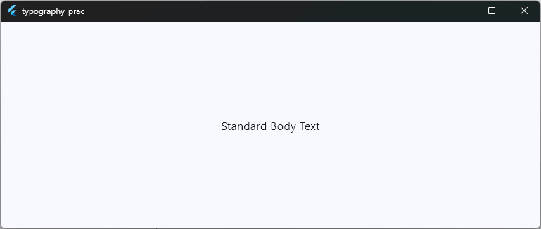
Flutter Font Size Best Practice: Do’s and Don’ts
To keep your code scalable and maintainable, avoid scattering hardcoded numbers throughout your codebase.
- ❌ Don’t hardcode numbers everywhere: Avoid putting
fontSize: 24.0directly inside dozens of widgets across your project. - ✅ Do leverage
TextTheme: Define standard typography scales in yourThemeDataso every screen shares a unified hierarchy. - ✅ Do respect device accessibility: Always ensure text can scale smoothly when users change their device settings (we’ll cover dynamic scaling in section 9!).
Working Example: Applying Font Sizes
Here is a full working example showing how to apply fixed font sizes directly versus inheriting defined scale styles from the theme.
body: SingleChildScrollView(
  padding: const EdgeInsets.all(16.0),
  child: Column(
    crossAxisAlignment: CrossAxisAlignment.start,
    children: [
      // 1. Direct custom font sizes
      const Text(
        'Caption Text (12.0)',
        style: TextStyle(fontSize: 12.0, color: Colors.grey),
      ),
      const SizedBox(height: 8),

      const Text(
        'Regular Body Text (16.0)',
        style: TextStyle(fontSize: 16.0),
      ),
      const SizedBox(height: 8),

      const Text(
        'Section Subtitle (20.0)',
        style: TextStyle(fontSize: 20.0, fontWeight: FontWeight.bold),
      ),
      const SizedBox(height: 8),

      Text(
        'Large Hero Header (32.0)',
        style: TextStyle(fontSize: 32.0, fontWeight: FontWeight.bold),
      ),

      const SizedBox(height: 24),
      const Divider(),
      const SizedBox(height: 16),

      // 2. Best Practice: Accessing Font Sizes through TextTheme
      Text(
        'Display Large (Theme Standard)',
        style: Theme.of(context).textTheme.displayLarge,
      ),
      const SizedBox(height: 8),

      Text(
        'Title Medium (Theme Standard)',
        style: Theme.of(context).textTheme.titleMedium,
      ),
    ],
  ),
),
Code language: Dart (dart)
Quick Tip: Need your font sizes to change dynamically based on mobile, tablet, or desktop screen dimensions? Stay tuned—we’ll explore complete flutter responsive font size strategies in detail in our upcoming sections!
Font weight
Now, let’s talk about giving your text some muscle! Setting the right flutter font weight is key to establishing visual hierarchy. Whether you want subtle body text or punchy headings, Flutter provides total control over text thickness.
Understanding Font Weights in Flutter
Flutter maps font weights to standard numeric values ranging from w100 (Thin) to w900 (Black). You can set these using preset properties like FontWeight.bold or using the explicit numeric scale (FontWeight.w600 for semibold).
| FontWeight Property | Numeric Value | Common Name |
FontWeight.w100 | 100 | Thin |
FontWeight.w300 | 300 | Light |
FontWeight.w400 or .normal | 400 | Regular |
FontWeight.w500 | 500 | Medium |
FontWeight.w600 | 600 | flutter font weight semibold |
FontWeight.w700 or .bold | 700 | flutter font weight bold |
FontWeight.w900 | 900 | Black |
Why is flutter font weight not working for you?
This is one of the most frustrating traps Flutter developers run into! You set FontWeight.w600 or FontWeight.w900, hit hot reload, and… nothing changes.
Here is why this happens:
- Missing Font Variants: The custom font family you declared in
pubspec.yamldoesn’t actually contain a font file for that weight. - Fallback Behavior: When Flutter can’t find the requested weight in your custom font assets, it falls back to the nearest available weight, making your text look identical across different settings.
Fix: Check your
pubspec.yamlfile. Make sure you explicitly register every weight variant (e.g.,weight: 600,weight: 700) under your font family definition!
Working Example: Exploring Font Weights
Here is a full working code snippet demonstrating various weight options:
body: Padding(
  padding: const EdgeInsets.all(16.0),
  child: Column(
    crossAxisAlignment: CrossAxisAlignment.start,
    children: const [
      Text(
        'FontWeight.w100 (Thin)',
        style: TextStyle(fontSize: 18, fontWeight: FontWeight.w100),
      ),
      SizedBox(height: 12),
      Text(
        'FontWeight.w300 (Light)',
        style: TextStyle(fontSize: 18, fontWeight: FontWeight.w300),
      ),
      SizedBox(height: 12),
      Text(
        'FontWeight.normal (Regular 400)',
        style: TextStyle(fontSize: 18, fontWeight: FontWeight.normal),
      ),
      SizedBox(height: 12),
      Text(
        'FontWeight.w500 (Medium)',
        style: TextStyle(fontSize: 18, fontWeight: FontWeight.w500),
      ),
      SizedBox(height: 12),
      // Example: flutter font weight semibold
      Text(
        'FontWeight.w600 (Semibold)',
        style: TextStyle(fontSize: 18, fontWeight: FontWeight.w600),
      ),
      SizedBox(height: 12),
      // Example: flutter font weight bold
      Text(
        'FontWeight.bold (Bold 700)',
        style: TextStyle(fontSize: 18, fontWeight: FontWeight.bold),
      ),
      SizedBox(height: 12),
      Text(
        'FontWeight.w900 (Black)',
        style: TextStyle(fontSize: 18, fontWeight: FontWeight.w900),
      ),
    ],
  ),
),
Code language: Dart (dart)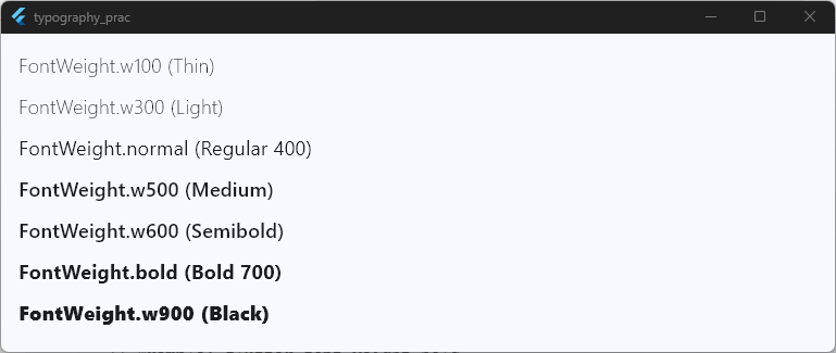
Font styles
Beyond sizing and weight, controlling flutter font styles adds tone and visual emphasis to your text. Whether you need to italicize a book title, quote a user, or combine bold and italic styles together, Flutter makes it seamless.
Understanding fontStyle
In Flutter’s TextStyle, the fontStyle property controls character slant. It accepts two options from the FontStyle enum:
FontStyle.normal: Default upright text.FontStyle.italic: Slanted text used for emphasis, quotes, or captions.
body: Center(
  // Basic italic style
  child: const Text(
    'This is an italicized quote.',
    style: TextStyle(fontStyle: FontStyle.italic),
  ),
),
Code language: Dart (dart)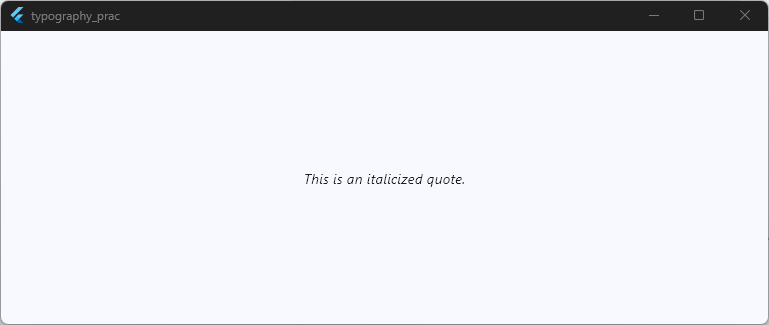
How to Combine Styles (Bold + Italic)
A common question developers ask is: “How do I make text both flutter font style bold and flutter font italic at the same time?”
Because fontWeight and fontStyle are separate properties in TextStyle, you simply declare both on the same widget!
body: Center(
  // Example: Bold + Italic combined
  child: const Text(
    'Important Alert Notice!',
    style: TextStyle(
      fontWeight: FontWeight.bold, // flutter font weight bold
      fontStyle: FontStyle.italic, // flutter font italic
    ),
  ),
),
Code language: Dart (dart)
Note on Custom Fonts: If you use a custom font, Flutter looks for the designated italic file in your
pubspec.yaml(for example,assets/fonts/Roboto-Italic.ttf). If no italic font asset is provided, the engine automatically simulates a slanted look (called “synthetic” or “fake” italic).
Working Example: Font Style Variations
Here is how to test normal, italic, and combined bold-italic styles in our boilerplate app:
body: Padding(
  padding: const EdgeInsets.all(16.0),
  child: Column(
    crossAxisAlignment: CrossAxisAlignment.start,
    children: const [
      // 1. Normal Upright Text
      Text(
        'Standard Upright Text (FontStyle.normal)',
        style: TextStyle(fontSize: 18, fontStyle: FontStyle.normal),
      ),
      SizedBox(height: 16),

      // 2. Italic Text
      Text(
        'Italicized Emphasis Text (FontStyle.italic)',
        style: TextStyle(
          fontSize: 18,
          fontStyle: FontStyle.italic,
          color: Colors.black87,
        ),
      ),
      SizedBox(height: 16),

      // 3. Combined Bold + Italic
      Text(
        'Bold and Italic Combined',
        style: TextStyle(
          fontSize: 18,
          fontWeight: FontWeight.bold,
          fontStyle: FontStyle.italic,
          color: Colors.indigo,
        ),
      ),
    ],
  ),
),
Code language: Dart (dart)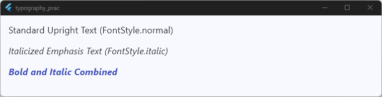
Letter spacing
Now let me show you how adjusting flutter letter spacing can instantly elevate your app’s aesthetic from average to premium.
In typography, horizontal spacing between characters is often called tracking or flutter text kerning. Fine-tuning this space improves readability, creates breathing room for capitalized titles, and gives badges or buttons a sleek, professional touch.
How letterSpacing Works in Flutter
In Flutter’s TextStyle, the letterSpacing property takes a double value representing logical pixels.
- Positive values (
> 0.0): Pushes characters further apart. Great for uppercase subheadings, navigation labels, or badge tags. - Zero (
0.0): Default spacing built into the font asset. - Negative values (
< 0.0): Pulls characters tighter together. Helpful for ultra-large display headlines where wide spacing feels disconnected.
body: Center(
  // Example: Adding extra breathing room between letters
  child: const Text(
    'SPECIAL OFFER',
    style: TextStyle(
      fontSize: 14.0,
      fontWeight: FontWeight.bold,
      letterSpacing: 3.0, // Adds 3 logical pixels between each character
    ),
  ),
),Code language: Dart (dart)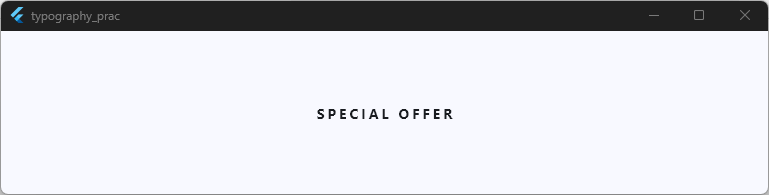
Working Example: Letter Spacing Values
Here is a full working code snippet demonstrating negative, default, moderate, and wide letter spacing in action:
body: Padding(
  padding: const EdgeInsets.all(16.0),
  child: Column(
    crossAxisAlignment: CrossAxisAlignment.start,
    children: [
      // 1. Tight / Negative Letter Spacing
      Text(
        'TIGHT HEADLINE (-1.0)',
        style: TextStyle(
          fontSize: 20,
          fontWeight: FontWeight.bold,
          letterSpacing: -1.0,
        ),
      ),
      const SizedBox(height: 16),

      // 2. Default Letter Spacing
      const Text(
        'DEFAULT SPACING (0.0)',
        style: TextStyle(fontSize: 16, letterSpacing: 0.0),
      ),
      const SizedBox(height: 16),

      // 3. Moderate Letter Spacing (Subtitles)
      const Text(
        'FEATURED CATEGORY (1.5)',
        style: TextStyle(
          fontSize: 14,
          fontWeight: FontWeight.w600,
          letterSpacing: 1.5,
          color: Colors.blueAccent,
        ),
      ),
      const SizedBox(height: 16),

      // 4. Wide Letter Spacing (Badges & Buttons)
      const Text(
        'CONFIRMED',
        style: TextStyle(
          fontSize: 12,
          fontWeight: FontWeight.bold,
          letterSpacing: 4.0,
          color: Colors.green,
        ),
      ),
    ],
  ),
),Code language: Dart (dart)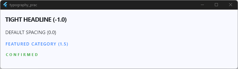
Pro Tip: When working with all-caps text in UI components like buttons, tab bars, or micro-labels, set
letterSpacingbetween1.2and2.5. It drastically enhances legibility at smaller font sizes!
Line height
Let’s dive into flutter line height (also referred to as flutter font height). If letter spacing controls the horizontal flow of your text, line height controls its vertical breathing room.
Getting this right is essential for long-form reading comfort, keeping paragraph blocks readable, and preventing multi-line titles from crashing into each other.
How height Works in Flutter
In Flutter’s TextStyle, the height property doesn’t take a value in logical pixels. Instead, it takes a multiplier that gets multiplied by the current fontSize.
Line Height in Logical Pixels = fontSize X height
For example, if your fontSize is set to 16.0 and your height multiplier is 1.5, the total vertical space occupied by each line of text will be 16.0 X 1.5 = 24.0 logical pixels.
body: Center(
  // Setting a comfortable paragraph line height
  child: const Text(
    'Flutter uses a proportional height multiplier rather than a fixed pixel height.',
    style: TextStyle(
      fontSize: 16.0,
      height:
          1.5, // 16.0 * 1.5 = 24.0 logical pixels total height per line
    ),
  ),
),
Code language: Dart (dart)
Understanding the Height Multiplier Table
| height Multiplier | Visual Effect | Best Use Case |
null (Default) | Native font metrics default (~1.1 to 1.25) | Default short single-line labels |
1.0 | Very tight, exact font box matching | Custom badge alignments, compact icon-and-text rows |
1.2 to 1.3 | Compact line spacing | Large headlines and multi-line titles |
1.4 to 1.6 | Standard comfortable reading room | Body copy, articles, and long description text |
>= 1.8 | Ultra-spacious | Specialized editorial design or callout text |
Working Example: Comparing Line Height Multipliers
Let’s test tight, default, and spacious line heights using multi-line paragraph text in our boilerplate app:
body: SingleChildScrollView(
  padding: const EdgeInsets.all(16.0),
  child: Column(
    crossAxisAlignment: CrossAxisAlignment.start,
    children: const [
      // 1. Tight Line Height (height: 1.0)
      Text(
        'TIGHT (height: 1.0)\nFlutter makes it easy to build cross-platform applications with a single codebase. Notice how close these lines sit together.',
        style: TextStyle(
          fontSize: 15.0,
          height: 1.0,
          color: Colors.redAccent,
        ),
      ),
      SizedBox(height: 20),

      // 2. Default Line Height (height: null)
      Text(
        'DEFAULT (height: null)\nFlutter makes it easy to build cross-platform applications with a single codebase. This uses standard font platform metrics.',
        style: TextStyle(fontSize: 15.0),
      ),
      SizedBox(height: 20),

      // 3. Optimal Reading Line Height (height: 1.5)
      Text(
        'OPTIMAL BODY (height: 1.5)\nFlutter makes it easy to build cross-platform applications with a single codebase. This extra spacing significantly improves overall legibility for body copy.',
        style: TextStyle(
          fontSize: 15.0,
          height: 1.5,
          color: Colors.black87,
        ),
      ),
      SizedBox(height: 20),

      // 4. Spacious Line Height (height: 2.0)
      Text(
        'SPACIOUS (height: 2.0)\nFlutter makes it easy to build cross-platform applications with a single codebase. Very open vertical spacing.',
        style: TextStyle(fontSize: 15.0, height: 2.0, color: Colors.teal),
      ),
    ],
  ),
),
Code language: Dart (dart)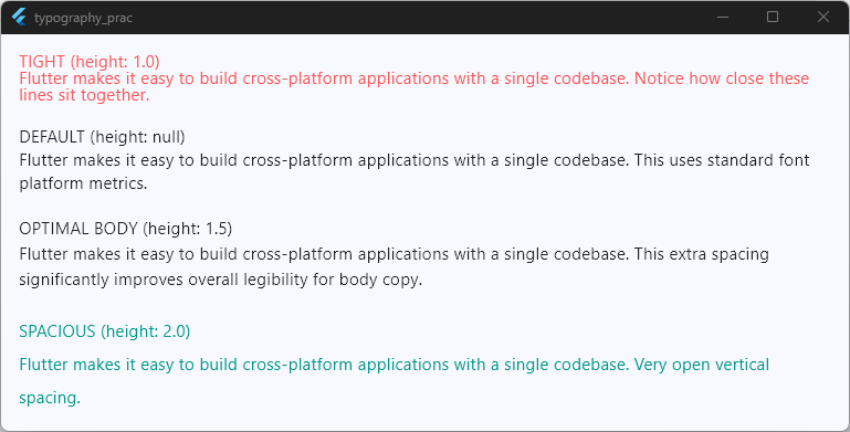
Design Tip: Large display text and main headings naturally look best with tighter line heights (
1.1to1.3), whereas smaller body copy requires wider line heights (1.4to1.6) to keep the user’s eye tracking smoothly from line to line.
Text color
Now let’s talk about adding color to your typography! Setting the right flutter font color not only highlights key information but also ensures your app aligns with your brand while staying easy to read.
How to Change Font Color in Flutter
To flutter change font color, you pass a Color object to the color property inside TextStyle. Flutter gives you a few flexible ways to define colors:
ColorsPalette: Quick built-in Material colors (Colors.red,Colors.blueAccent).Color(0xFF...)Hex Code: Custom brand colors using 8-digit hexadecimal values whereFFrepresents full opacity (e.g.,Color(0xFF1E88E5)).Theme.of(context).colorScheme: Best practice for supporting both Light Mode and Dark Mode automatically.
body: Center(
  // Basic color assignment using standard palette
  child: const Text(
    'Action Required',
    style: TextStyle(color: Colors.redAccent),
  ),
),
Code language: Dart (dart)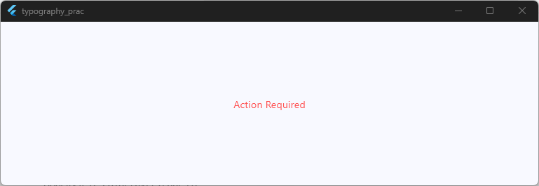
Dark Mode & Accessibility Best Practice
Instead of hardcoding static hex colors everywhere, derive text colors dynamically using your app’s ColorScheme:
body: Center(
  // Automatically adapts to Light and Dark themes!
  child: Text(
    'Dynamic Theme Text',
    style: TextStyle(color: Theme.of(context).colorScheme.onSurface),
  ),
),
Code language: Dart (dart)
This guarantees your text always maintains strong contrast against the screen background, regardless of whether the user switches to dark mode.
Working Example: Font Color Techniques
Here is a full working code snippet demonstrating palette colors, hex codes, opacity, and theme-aware colors:
class _HomeScreenState extends State<HomeScreen> {
  @override
  Widget build(BuildContext context) {
    final colorScheme = Theme.of(context).colorScheme;

    return Scaffold(
      body: Padding(
        padding: const EdgeInsets.all(16.0),
        child: Column(
          crossAxisAlignment: CrossAxisAlignment.start,
          children: [
            // 1. Built-in Material Color
            const Text(
              'Material Palette Color (Colors.teal)',
              style: TextStyle(
                fontSize: 18,
                color: Colors.teal,
                fontWeight: FontWeight.bold,
              ),
            ),
            const SizedBox(height: 16),

            // 2. Custom Hex Color (e.g., Crimson Red #DC143C)
            const Text(
              'Custom Hex Color (0xFFDC143C)',
              style: TextStyle(
                fontSize: 18,
                color: Color(0xFFDC143C),
                fontWeight: FontWeight.bold,
              ),
            ),
            const SizedBox(height: 16),

            // 3. Color with Opacity
            Text(
              'Subtle Secondary Text (Opacity)',
              style: TextStyle(
                fontSize: 16,
                color: Colors.black.withValues(alpha: 0.6),
              ),
            ),
            const SizedBox(height: 16),

            // 4. Dynamic Color Scheme (Theme-Aware Best Practice)
            Text(
              'Theme Primary Color (ColorScheme.primary)',
              style: TextStyle(
                fontSize: 18,
                color: colorScheme.primary,
                fontWeight: FontWeight.bold,
              ),
            ),
          ],
        ),
      ),
    );
  }
}
Code language: Dart (dart)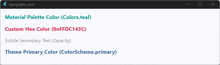
Pro Tip: Need to colorize individual words inside a single paragraph? Don’t break them into multiple
Textwidgets inside aRow! Instead, useRichText, which we will cover in our final section.
Take Your Flutter Skills to the Next Level
Build professional Flutter apps through structured lessons, practical projects, and a complete capstone.
⭐ Trusted by 500+ Flutter developers.
Underline and decoration
Now let’s examine how to apply text decorations in Flutter. Adding visual decorations—such as an underline, strike-through, or overline—is essential for styling hyperlinked text, showing discounted prices, or emphasizing key words in your UI.
Understanding TextDecoration
In Flutter’s TextStyle, the decoration property controls the lines drawn near or across your text. You configure decorations using the TextDecoration class alongside three companion properties:
decoration: Defines the line type (underline,lineThrough,overline, ornone).decorationColor: Sets the color of the decoration line independently from the flutter font color.decorationStyle: Controls the line pattern (solid,dashed,dotted,double, orwavy).decorationThickness: Specifies line weight as a multiplier relative to the default thickness.
body: Center(
  // Setting a custom wavy underline for text
  child: const Text(
    'Interactive Link',
    style: TextStyle(
      fontSize: 18.0,
      color: Colors.blue,
      decoration: TextDecoration.underline,
      decorationColor: Colors.blueAccent,
      decorationStyle: TextDecorationStyle.wavy,
      decorationThickness: 2.0,
    ),
  ),
),
Code language: Dart (dart)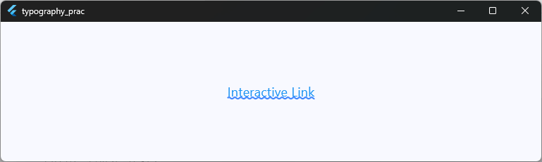
Combining Multiple Text Decorations
You can combine multiple decorations using TextDecoration.combine(). For instance, if you want a price tag to feature both an overline and a strike-through simultaneously, you pass a list of decorations to combine:
body: Center(
  // Combining overline and lineThrough
  child: Text(
    'EXPIRED OFFER',
    style: TextStyle(
      fontSize: 16.0,
      color: Colors.grey,
      decoration: TextDecoration.combine([
        TextDecoration.overline,
        TextDecoration.lineThrough,
      ]),
    ),
  ),
),
Code language: Dart (dart)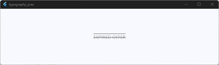
Working Example: Text Decoration Styles
Here is a full working code snippet demonstrating various text decoration configurations using our boilerplate app:
body: Padding(
  padding: const EdgeInsets.all(16.0),
  child: Column(
    crossAxisAlignment: CrossAxisAlignment.start,
    children: [
      // 1. Basic Underline (flutter font style underline)
      const Text(
        'Classic Underlined Text',
        style: TextStyle(
          fontSize: 18,
          decoration: TextDecoration.underline,
        ),
      ),
      const SizedBox(height: 16),

      // 2. Custom Colored & Dashed Underline
      const Text(
        'Custom Dashed Underline',
        style: TextStyle(
          fontSize: 18,
          color: Colors.black87,
          decoration: TextDecoration.underline,
          decorationColor: Colors.orange,
          decorationStyle: TextDecorationStyle.dashed,
          decorationThickness: 2.5,
        ),
      ),
      const SizedBox(height: 16),

      // 3. Strikethrough for E-commerce Original Price
      const Text(
        'Was: \$99.99',
        style: TextStyle(
          fontSize: 16,
          color: Colors.red,
          decoration: TextDecoration.lineThrough,
          decorationColor: Colors.red,
          decorationThickness: 2.0,
        ),
      ),
      const SizedBox(height: 16),

      // 4. Wavy Spell-Check Underline
      const Text(
        'Misspelled Word Example',
        style: TextStyle(
          fontSize: 18,
          decoration: TextDecoration.underline,
          decorationColor: Colors.red,
          decorationStyle: TextDecorationStyle.wavy,
          decorationThickness: 1.5,
        ),
      ),
      const SizedBox(height: 16),

      // 5. Combined Overline and Underline
      Text(
        'Framed Header Text',
        style: TextStyle(
          fontSize: 18,
          fontWeight: FontWeight.bold,
          color: Theme.of(context).colorScheme.primary,
          decoration: TextDecoration.combine([
            TextDecoration.underline,
            TextDecoration.overline,
          ]),
          decorationColor: Theme.of(context).colorScheme.primary,
          decorationThickness: 1.5,
        ),
      ),
    ],
  ),
),
Code language: Dart (dart)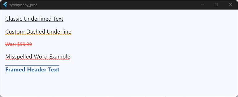
Pro Tip: If your underline feels glued to the bottom of your text characters (like descenders on ‘g’, ‘p’, or ‘y’), increase your
heightproperty slightly (e.g.,height: 1.4). This adds baseline spacing and gives your decoration room to render cleanly!
Responsive font sizing
Now let’s tackle one of the most critical aspects of cross-platform app design: flutter responsive font size strategies.
A title that looks perfect on a compact smartphone can look awkwardly small on an iPad or desktop monitor. Mastering flutter font size responsive techniques ensures your application looks balanced on any viewport.
Understanding Screen Breakpoints vs. Fluid Scale
When building for multiple screen sizes, you have two primary approaches for flutter dynamic font size:
- Breakpoint-Based Sizing: You check the screen width using
MediaQuery.sizeOf(context)and pick discrete font sizes for mobile, tablet, and desktop viewports. - Clamped Fluid Scaling: You calculate the font size dynamically as a small percentage of screen width, bounded by minimum and maximum constraints using
clamp().
Fluid Font Size = (Screen Width X Scale Factor).clamp(Min Size, Max Size)
// Example: Fluid font scale clamped between 18.0 and 28.0
final double screenWidth = MediaQuery.sizeOf(context).width;
final double dynamicFontSize = (screenWidth * 0.045).clamp(18.0, 28.0);
Code language: Dart (dart)
Working Example: MediaQuery & Clamped Responsive Typography
Here is a full working code snippet demonstrating how to implement breakpoint-based font scaling alongside fluid clamped sizing in our boilerplate app:
class _HomeScreenState extends State<HomeScreen> {
  @override
  Widget build(BuildContext context) {
    // 1. Get screen dimensions using performance-optimized MediaQuery
    final double screenWidth = MediaQuery.sizeOf(context).width;

    // 2. Breakpoint logic (Mobile < 600, Tablet 600-1024, Desktop > 1024)
    final double headlineFontSize = screenWidth > 1024
        ? 36.0 // Desktop
        : screenWidth > 600
        ? 28.0 // Tablet
        : 22.0; // Mobile

    // 3. Fluid scaling using clamp(min, max)
    final double fluidFontSize = (screenWidth * 0.04).clamp(16.0, 26.0);

    return Scaffold(
      body: Padding(
        padding: const EdgeInsets.all(16.0),
        child: Column(
          crossAxisAlignment: CrossAxisAlignment.start,
          children: [
            // Screen Width Indicator
            Text(
              'Current Viewport Width: ${screenWidth.toStringAsFixed(1)} px',
              style: const TextStyle(
                fontSize: 14,
                fontWeight: FontWeight.bold,
                color: Colors.grey,
              ),
            ),
            const SizedBox(height: 20),

            // Breakpoint-Based Headline
            Text(
              'Breakpoint Headline (${headlineFontSize.toInt()}px)',
              style: TextStyle(
                fontSize: headlineFontSize,
                fontWeight: FontWeight.bold,
                color: Colors.indigo,
              ),
            ),
            const SizedBox(height: 16),

            // Fluid Clamped Subtitle
            Text(
              'Fluid Clamped Text (${fluidFontSize.toStringAsFixed(1)}px)',
              style: TextStyle(
                fontSize: fluidFontSize,
                fontWeight: FontWeight.w500,
                color: Colors.teal,
              ),
            ),
            const SizedBox(height: 16),

            const Text(
              'Resize your app window or switch device orientation in DevTools to see these fonts scale smoothly!',
              style: TextStyle(fontSize: 14, height: 1.4),
            ),
          ],
        ),
      ),
    );
  }
}
Code language: Dart (dart)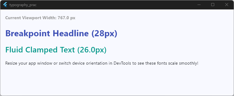
Performance Tip: Always use
MediaQuery.sizeOf(context)instead ofMediaQuery.of(context).size.sizeOfrebuilds your widget only when the screen size changes, preventing unnecessary renders whenever other platform properties (like padding or orientation) change!
Dynamic font sizes
Now let’s look at flutter dynamic font size fitting! While screen breakpoints work great for overall page layouts, what happens when you have a specific UI container—like a fixed-size card, button, or dashboard widget—and you need the text inside to fit perfectly without breaking or overflowing?
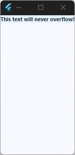
Instead of guessing fixed numbers, Flutter provides layout widgets like FittedBox and community tools like auto_size_text that dynamically scale text down to fit its parent bounds.
Method 1: Using Built-in FittedBox
FittedBox is a core Flutter widget that scales its child down (or up) to fit inside the parent container constraints.
// FittedBox automatically scales down text if it gets too wide!
body: Container(
  width: 200,
  color: Colors.blue.shade50,
  child: const FittedBox(
    fit: BoxFit
        .scaleDown, // Ensures text scales down, but never blows up larger than base size
    child: Text(
      'This text will never overflow!',
      style: TextStyle(fontSize: 24.0, fontWeight: FontWeight.bold),
    ),
  ),
),
Code language: Dart (dart)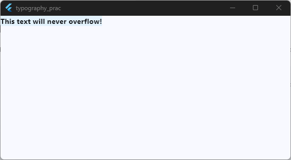
Method 2: Using LayoutBuilder for Dynamic Container Logic
If you want custom step logic based on the container width (rather than the global screen width), wrap your UI in a LayoutBuilder:
body: LayoutBuilder(
  builder: (context, constraints) {
    // Pick font size based on container constraint, not screen size!
    final double dynamicSize = constraints.maxWidth < 150 ? 12.0 : 18.0;
    return Text(
      'Container Width: ${constraints.maxWidth.toInt()}',
      style: TextStyle(fontSize: dynamicSize),
    );
  },
),
Code language: Dart (dart)
Working Example: Fitting Text Safely in Containers
Here is a full working snippet comparing fixed overflowing text versus dynamic FittedBox and LayoutBuilder strategies:
class _HomeScreenState extends State<HomeScreen> {
  double _containerWidth = 220.0;

  @override
  Widget build(BuildContext context) {
    return Scaffold(
      body: Padding(
        padding: const EdgeInsets.all(16.0),
        child: Column(
          crossAxisAlignment: CrossAxisAlignment.start,
          children: [
            const Text(
              'Drag slider to adjust container width:',
              style: TextStyle(fontWeight: FontWeight.bold),
            ),
            Slider(
              value: _containerWidth,
              min: 120.0,
              max: 320.0,
              onChanged: (val) {
                setState(() {
                  _containerWidth = val;
                });
              },
            ),
            const SizedBox(height: 10),

            // 1. FittedBox Dynamic Shrinking
            const Text('1. FittedBox Auto-Fit (BoxFit.scaleDown):'),
            const SizedBox(height: 6),
            Container(
              width: _containerWidth,
              padding: const EdgeInsets.all(8),
              color: Colors.blue.shade100,
              child: const FittedBox(
                fit: BoxFit.scaleDown,
                alignment: Alignment.centerLeft,
                child: Text(
                  '\$1,245,890.50 USD',
                  style: TextStyle(
                    fontSize: 28,
                    fontWeight: FontWeight.bold,
                    color: Colors.blue,
                  ),
                ),
              ),
            ),
            const SizedBox(height: 24),

            // 2. LayoutBuilder Container-Aware Font Size
            const Text('2. LayoutBuilder (Container-Based Font Size):'),
            const SizedBox(height: 6),
            Container(
              width: _containerWidth,
              padding: const EdgeInsets.all(8),
              color: Colors.teal.shade100,
              child: LayoutBuilder(
                builder: (context, constraints) {
                  final double computedSize = constraints.maxWidth > 200
                      ? 18.0
                      : 12.0;
                  return Text(
                    'Container Width: ${constraints.maxWidth.toInt()}px',
                    style: TextStyle(
                      fontSize: computedSize,
                      fontWeight: FontWeight.w600,
                      color: Colors.teal.shade900,
                    ),
                  );
                },
              ),
            ),
          ],
        ),
      ),
    );
  }
}
Code language: Dart (dart)
Pro Tip: Always use
BoxFit.scaleDownwithFittedBoxon text elements! If you useBoxFit.contain, tiny text inside a huge container will stretch up aggressively and look pixelated or giant.
Font scaling
Now let’s examine flutter font scaling.
When users go into their iOS or Android system settings and increase their global text scale (such as turning on Large Text for higher accessibility), your app needs to respond gracefully. Understanding how font scaling works behind the scenes will keep your layouts intact while respecting your users’ display preferences.
Understanding TextScaler in Flutter
In modern Flutter releases, system text scale is managed using the TextScaler class (which replaced the legacy textScaleFactor property).
TextScaler calculates how much a font should scale based on device accessibility settings.
Scaled Font Size = TextScaler.scale(fontSize)
You can retrieve the current device scaler from context using MediaQuery.textScalerOf(context):
// Checking the system text scaling multiplier
final TextScaler textScaler = MediaQuery.textScalerOf(context);
final double effectiveSize = textScaler.scale(16.0); // Returns actual scaled size
Code language: Dart (dart)
Capping Font Scaling to Prevent Broken Layouts
While supporting accessibility scaling is crucial, unbounded text scaling can break tight UI containers like tab bars or bottom navigation labels. You can clamp the scaling range across your app using TextScaler.linear:
// Restricting maximum text scale to 1.5x in a specific sub-tree
MediaQuery(
  data: MediaQuery.of(context).copyWith(
    textScaler: MediaQuery.textScalerOf(context).clamp(
      minScaleFactor: 0.8,
      maxScaleFactor: 1.5, // Caps max text scale at 150%
    ),
  ),
  child: const MyWidget(),
)
Code language: Dart (dart)
Working Example: Font Scaling Inspection and Clamping
Here is a full working code snippet that lets you simulate accessibility font scaling and inspect how TextScaler adjusts font sizes live:
class _HomeScreenState extends State<HomeScreen> {
  double _simulatedScale = 1.0;

  @override
  Widget build(BuildContext context) {
    return Scaffold(
      body: Padding(
        padding: const EdgeInsets.all(16.0),
        child: Column(
          crossAxisAlignment: CrossAxisAlignment.start,
          children: [
            const Text(
              'Simulate Device Text Scale Setting:',
              style: TextStyle(fontWeight: FontWeight.bold),
            ),
            Row(
              children: [
                Expanded(
                  child: Slider(
                    value: _simulatedScale,
                    min: 0.8,
                    max: 2.0,
                    divisions: 12,
                    label: '${_simulatedScale.toStringAsFixed(2)}x',
                    onChanged: (val) {
                      setState(() {
                        _simulatedScale = val;
                      });
                    },
                  ),
                ),
                Text(
                  '${_simulatedScale.toStringAsFixed(2)}x',
                  style: const TextStyle(fontWeight: FontWeight.bold),
                ),
              ],
            ),
            const SizedBox(height: 20),

            // Injecting simulated scale using MediaQuery
            MediaQuery(
              data: MediaQuery.of(
                context,
              ).copyWith(textScaler: TextScaler.linear(_simulatedScale)),
              child: Builder(
                builder: (constrainedContext) {
                  final scaler = MediaQuery.textScalerOf(constrainedContext);
                  final double baseSize = 16.0;
                  final double scaledSize = scaler.scale(baseSize);

                  return Column(
                    crossAxisAlignment: CrossAxisAlignment.start,
                    children: [
                      Text(
                        'Base Size: ${baseSize.toInt()}pt | Scaled Size: ${scaledSize.toStringAsFixed(1)}pt',
                        style: const TextStyle(
                          fontSize: 14,
                          color: Colors.grey,
                          fontWeight: FontWeight.bold,
                        ),
                      ),
                      const SizedBox(height: 12),
                      const Text(
                        'Accessible Body Text Example',
                        style: TextStyle(
                          fontSize: 16.0,
                          fontWeight: FontWeight.w600,
                        ),
                      ),
                      const SizedBox(height: 8),
                      const Text(
                        'This paragraph dynamically adjusts its layout and line heights whenever the user changes their platform font scaling preferences.',
                        style: TextStyle(fontSize: 14.0, height: 1.4),
                      ),
                    ],
                  );
                },
              ),
            ),
          ],
        ),
      ),
    );
  }
}
Code language: Dart (dart)
Design Tip: Avoid hardcoding fixed height
SizedBoxcontainers around text blocks. When font scaling is enabled by the user, fixed height containers will cause text to overflow and display the dreaded red-and-black striped yellow warning!
Accessibility considerations
Now let’s examine accessibility considerations for typography in Flutter. Creating accessible typography ensures that every user—including people with visual impairments or color vision deficiencies—can comfortably read and interact with your app.
Key Principles for Accessible Typography
- Color Contrast Ratios: Ensure your text stands out clearly against its background. The Web Content Accessibility Guidelines (WCAG) recommend:
- AA Compliance: Minimum contrast ratio of 4.5:1 for regular text and 3.0:1 for large text (18pt+ or 14pt+ bold).
- AAA Compliance: Minimum contrast ratio of 7.0:1 for regular text and 4.5:1 for large text.
- Flexible Text Containment: Avoid clipping or wrapping text into fixed heights that cut off letters when text scaling increases.
- Screen Reader Semantics: Use semantic labels or
Semanticswidgets when text represents interactive or graphical elements.
Handling Text Overflow Gracefully
When text expands—either from long strings or accessibility scaling—use overflow and softWrap properties on Text widgets to prevent broken layouts:
body: Text(
  'Very long paragraph text that needs graceful degradation when scaled up...',
  overflow: TextOverflow.ellipsis,
  // Adds "..." when bounds are exceeded
  maxLines: 2,
  // Restricts line count safely
  softWrap: true,
  // Enables standard multi-line wrapping
),
Code language: Dart (dart)
Working Example: Accessible Contrast & Safe Overflow Layouts
Here is a full working code snippet demonstrating proper high-contrast text pairing and safe text overflow handling using our boilerplate app:
body: Padding(
  padding: const EdgeInsets.all(16.0),
  child: Column(
    crossAxisAlignment: CrossAxisAlignment.start,
    children: [
      // 1. Poor vs High Contrast Comparison
      const Text(
        'Color Contrast Comparison:',
        style: TextStyle(fontWeight: FontWeight.bold),
      ),
      const SizedBox(height: 8),

      Container(
        width: double.infinity,
        padding: const EdgeInsets.all(12),
        color: Colors.grey.shade200,
        child: const Column(
          crossAxisAlignment: CrossAxisAlignment.start,
          children: [
            // Bad Contrast
            Text(
              '❌ Low Contrast (Hard to read for low vision users)',
              style: TextStyle(color: Colors.grey, fontSize: 14),
            ),
            SizedBox(height: 8),

            // Good Contrast (AA / AAA Compliant)
            Text(
              '✓ High Contrast (7:1 Ratio - WCAG AAA Compliant)',
              style: TextStyle(
                color: Colors.black,
                fontSize: 14,
                fontWeight: FontWeight.bold,
              ),
            ),
          ],
        ),
      ),

      const SizedBox(height: 24),

      // 2. Safe Text Truncation with Ellipsis
      const Text(
        'Safe Overflow Protection (TextOverflow.ellipsis):',
        style: TextStyle(fontWeight: FontWeight.bold),
      ),
      const SizedBox(height: 8),

      Container(
        width: 250,
        padding: const EdgeInsets.all(12),
        decoration: BoxDecoration(
          border: Border.all(color: Colors.blueAccent),
          borderRadius: BorderRadius.circular(8),
        ),
        child: const Text(
          'This is a very long notification title that would normally overflow if not handled properly with maxLines and ellipsis.',
          maxLines: 2,
          overflow: TextOverflow.ellipsis,
          style: TextStyle(fontSize: 14, height: 1.3),
        ),
      ),
    ],
  ),
),
Code language: Dart (dart)
Best Practice: For an in-depth look at implementing screen readers, semantic labels, and accessible color schemes, check out Flutter’s official Accessibility Guide.
RichText styling
To wrap up our typography masterclass, let’s explore RichText!
Have you ever needed to render a single paragraph where one word is bold, another is a clickable blue link, and a third uses a custom flutter richtext font family? Trying to hack this together using multiple Text widgets inside a Row will quickly cause layout line-wrapping headaches.
This is where RichText and Text.rich() come to the rescue.
Understanding TextSpan Inheritance
RichText works by nesting TextSpan objects inside a parent TextSpan.
Child spans inherit all properties from the parent span (like font size or line height) while overriding only what you explicitly change—such as adding a different color or font weight!
body: Padding(
  padding: const EdgeInsets.all(16.0),
  // Basic inline text styling using Text.rich
  child: Text.rich(
    TextSpan(
      text: 'By signing up, you agree to our ',
      style: TextStyle(color: Colors.black, fontSize: 14.0),
      children: [
        TextSpan(
          text: 'Terms of Service',
          style: TextStyle(
            color: Colors.blue,
            fontWeight: FontWeight.bold,
            decoration: TextDecoration.underline,
          ),
        ),
      ],
    ),
  ),
),
Code language: Dart (dart)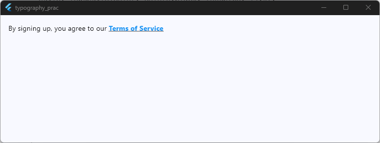
Working Example: Complex Multi-Styled Inline Text
Here is a full working snippet using our boilerplate app to demonstrate mixed colors, weights, custom fonts, and inline clickable spans using RichText:
body: Padding(
  padding: const EdgeInsets.all(16.0),
  child: Column(
    crossAxisAlignment: CrossAxisAlignment.start,
    children: [
      // Example 1: Multi-styled text paragraph
      Text.rich(
        TextSpan(
          text: 'Flutter ',
          style: const TextStyle(fontSize: 18.0, color: Colors.black),
          children: [
            const TextSpan(
              text: 'empowers ',
              style: TextStyle(
                fontStyle: FontStyle.italic,
                color: Colors.purple,
              ),
            ),
            const TextSpan(text: 'developers to build '),
            TextSpan(
              text: 'BEAUTIFUL ',
              style: TextStyle(
                fontWeight: FontWeight.bold,
                letterSpacing: 2.0,
                color: Colors.blue.shade700,
              ),
            ),
            const TextSpan(text: 'apps with ease.'),
          ],
        ),
      ),

      const SizedBox(height: 24),
      const Divider(),
      const SizedBox(height: 16),

      // Example 2: Interactive Hyperlink Span inside paragraph
      RichText(
        text: TextSpan(
          text: 'Don\'t have an account? ',
          style: const TextStyle(fontSize: 16.0, color: Colors.black87),
          children: [
            TextSpan(
              text: 'Sign Up Here',
              style: const TextStyle(
                color: Colors.blue,
                fontWeight: FontWeight.bold,
                decoration: TextDecoration.underline,
              ),
              recognizer: TapGestureRecognizer()
                ..onTap = () {
                  ScaffoldMessenger.of(context).showSnackBar(
                    const SnackBar(
                      content: Text('Sign up button clicked!'),
                    ),
                  );
                },
            ),
          ],
        ),
      ),
    ],
  ),
),
Code language: Dart (dart)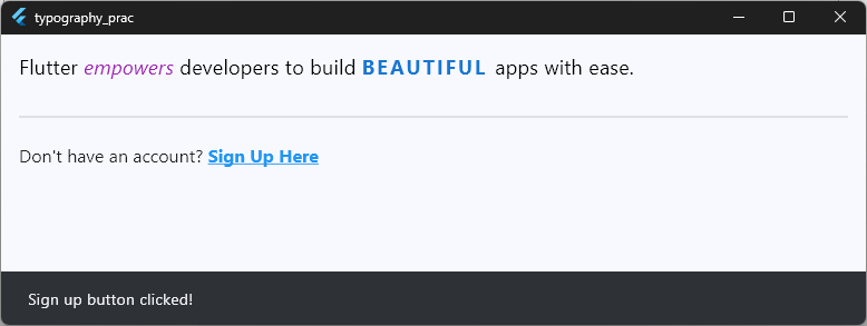
Wrapping Up & Next Steps
Congratulations! You’ve mastered every core pillar of Flutter text styling—from basic sizes and custom font weights to complex line heights, responsive scaling, and inline RichText trees.
Ready to take your app’s typography architecture to the next level? Check out our implementation class, which shows how to create reusable typography components that automatically scale across phones, tablets, and desktop apps!
Ready to Build Professional Flutter Apps?
Turn today’s knowledge into real-world Flutter skills with Flutter Foundations.
⭐ Trusted by 500+ Flutter developers.