Every Flutter app collects information from users at some point. Whether it is a login screen, search bar, profile form, or OTP verification page, text input is everywhere.
That is where the TextField widget comes in. It is one of the most important widgets you’ll use when building real Flutter applications.
Many beginners can create a TextField, but often struggle when they need to read values, update text, manage controllers, or customize the input experience.
In this guide, you’ll learn how Flutter TextField works from the ground up. We’ll cover the most important concepts, common mistakes, and practical examples so you can build forms with confidence.
Ready to Build Your First Flutter App?
TextField is one of the most important widgets in Flutter, and you’ll use it in almost every app. Join my free Flutter class and let’s build your first project together.
- What is a TextField in Flutter?
- TextField vs TextFormField
- Creating Your First Input Field
- Showing Placeholder Text
- Adding Labels and Helper Text
- Reading User Input
- Getting Text from a TextField
- Using TextEditingController
- Setting Default Values
- Updating TextField Values
- Handling Keyboard Types
- TextField Styling Basics
- Common Beginner Mistakes
What is a TextField in Flutter?
A TextField is a Flutter widget that allows users to enter and edit text. It acts as an input box where users can type information such as names, email addresses, passwords, search queries, or messages.
Whenever you need to collect text from a user, you’ll usually use a TextField. It is one of the most commonly used widgets in Flutter applications.
A basic TextField looks like this:
TextField()
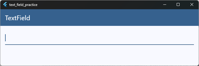
While this creates a working input field, most real applications customize it with labels, placeholders, validation, styling, and keyboard settings.
For example, a simple email input field might look like this:
TextField(
  decoration: InputDecoration(
    labelText: 'Email Address',
  ),
)
Code language: JavaScript (javascript)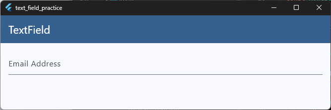
When the user types into a TextField, Flutter automatically updates the displayed text on the screen. You can then read, validate, save, or process that text inside your application.
Think of a TextField as a bridge between your user and your app. It allows users to provide information that your application can use to perform actions, store data, or personalize the user experience.
TextField vs TextFormField
One of the first things Flutter beginners notice is that there are two widgets for text input: TextField and TextFormField.
At first glance, they look very similar. Both allow users to enter and edit text. The main difference is that TextFormField works with Flutter’s Form widget and provides built-in support for validation.
TextField
A TextField is the basic text input widget in Flutter. It is useful when you simply need to collect text without validating it.
TextField(
  decoration: InputDecoration(
    labelText: 'Username',
  ),
)
Code language: JavaScript (javascript)
Common use cases include:
- Search bars
- Chat messages
- Notes
- Filters
- Quick user input
TextFormField
A TextFormField extends the functionality of TextField by adding validation support.
It works together with Flutter’s Form widget, making it ideal for login screens, signup forms, profile editors, and other situations where user input needs to be checked before submission.
Here’s a simple example:
final _formKey = GlobalKey<FormState>();

Form(
  key: _formKey,
  child: Column(
    children: [
      TextFormField(
        decoration: InputDecoration(
          labelText: 'Email',
        ),
        validator: (value) {
          if (value == null || value.isEmpty) {
            return 'Please enter your email';
          }
          return null;
        },
      ),

      ElevatedButton(
        onPressed: () {
          if (_formKey.currentState!.validate()) {
            print('Form is valid');
          }
        },
        child: Text('Submit'),
      ),
    ],
  ),
)
Code language: PHP (php)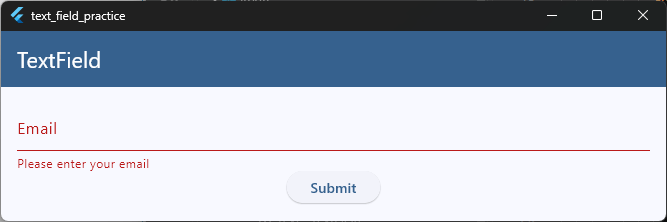
Try running this example and press the Submit button without entering anything. Flutter will automatically display the validation message below the field.
Key Differences
| Feature | TextField | TextFormField |
|---|---|---|
| User text input | ✅ | ✅ |
| Works inside forms | ❌ | ✅ |
| Built-in validation support | ❌ | ✅ |
| Validator callback | ❌ | ✅ |
| Best for simple inputs | ✅ | ✅ |
| Best for login and signup forms | ❌ | ✅ |
Which One Should You Use?
Use TextField when you only need a simple input field and don’t require validation.
Use TextFormField when building forms that need validation, such as login screens, registration forms, checkout pages, or profile forms.
In most production Flutter applications, you’ll often see TextField used for standalone inputs like search bars, while TextFormField is used inside forms where user input must be validated before submission.
We’ll cover validation in much more detail in our Flutter Form Validation Guide.
Creating Your First Input Field
Now that you understand what a TextField is, let’s create your first input field in Flutter.
The simplest possible TextField only requires the widget itself:
TextField()
This creates a working input box where users can type text.
While it works, it doesn’t provide any visual hints about what the user should enter. In real applications, you’ll usually add some decoration to make the field more user-friendly.
For example:
TextField(
  decoration: InputDecoration(
    hintText: 'Enter your name',
  ),
)
Code language: JavaScript (javascript)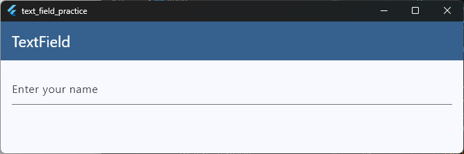
When the app runs, users will see a placeholder message inside the field. The placeholder disappears automatically when they start typing.
You can place a TextField anywhere in your widget tree, such as inside a Column, Row, Container, or form.
Here’s a complete example:
body: SafeArea(
  child: SingleChildScrollView(
    child: Padding(
      padding: const EdgeInsets.all(16),
      child: Column(
        children: [
          TextField(
            decoration: InputDecoration(hintText: 'Enter your name'),
          ),
        ],
      ),
    ),
  ),
),
Code language: JavaScript (javascript)
If you run this code, you’ll see a text input field where users can type their name.
At this point, the field can accept text, but your app isn’t doing anything with that text yet. In the upcoming sections, you’ll learn how to read user input, get text values, and control a TextField using a TextEditingController.
Showing Placeholder Text
A placeholder is a short piece of text displayed inside a TextField before the user enters any value. In Flutter, placeholder text is added using the hintText property of InputDecoration.
TextField(
  decoration: InputDecoration(
    hintText: 'Enter your name',
  ),
)
Code language: JavaScript (javascript)
When the field is empty, Flutter displays the placeholder text inside the input box. Once the user starts typing, the placeholder automatically disappears.
Why Use Placeholder Text?
Placeholder text helps users understand what information should be entered into a field.
For example:
- “Enter your name”
- “Email address”
- “Search products”
- “Enter your phone number”
Without a placeholder, users may not immediately know what the field is intended for.
Example
TextField(
  decoration: InputDecoration(
    hintText: 'Enter your email address',
  ),
)
Code language: JavaScript (javascript)
This displays a helpful message inside the input field until the user begins typing.
Customizing Placeholder Text
You can also change the appearance of the placeholder using the hintStyle property.
TextField(
  decoration: InputDecoration(
    hintText: 'Enter your name',
    hintStyle: TextStyle(
      color: Colors.grey,
      fontStyle: FontStyle.italic,
    ),
  ),
)
Code language: JavaScript (javascript)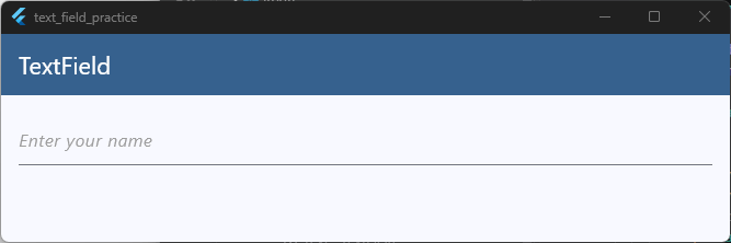
This allows you to customize the color, size, weight, and style of the placeholder text.
Placeholder vs User Input
A common beginner mistake is thinking that hintText becomes the field’s value. It does not. The placeholder is only a visual guide. If the user does not type anything, the field remains empty.
For example, if the placeholder says:
Enter your email
and the user doesn’t type anything, the TextField value is still empty.
When Should You Use Placeholder Text?
Placeholder text is useful for providing quick guidance, but it should not replace proper labels in larger forms.
For important fields such as email addresses, passwords, and phone numbers, many developers use both labels and placeholders to create a better user experience.
We’ll learn how to add labels, helper text, and other form guidance in the next section.
Adding Labels and Helper Text
As your forms become more complex, placeholder text alone is often not enough.
Imagine a login screen with multiple fields. Once a user starts typing, the placeholder disappears. At that point, they may forget what information the field was asking for.
That’s where labels and helper text become useful.
Adding a Label
You can add a label using the labelText property.
TextField(
  decoration: InputDecoration(
    labelText: 'Email Address',
  ),
)
Code language: JavaScript (javascript)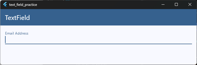
When the field is empty, the label appears inside the TextField. As soon as the user starts typing, Flutter automatically moves the label above the field.
This creates a cleaner experience because users can always see what the field represents.
Adding Helper Text
Sometimes users need a little extra guidance. That’s where helperText comes in.
TextField(
  decoration: InputDecoration(
    labelText: 'Password',
    helperText: 'Use at least 8 characters',
  ),
)
Code language: JavaScript (javascript)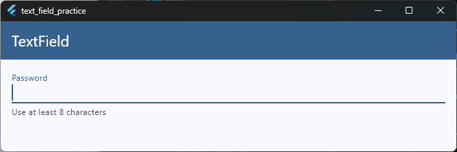
The helper text appears below the TextField and provides additional instructions without getting in the user’s way.
Using Labels and Helper Text Together
In most real-world forms, you’ll often use both.
TextField(
  decoration: InputDecoration(
    labelText: 'Email Address',
    helperText: 'We\'ll never share your email',
  ),
),
Code language: JavaScript (javascript)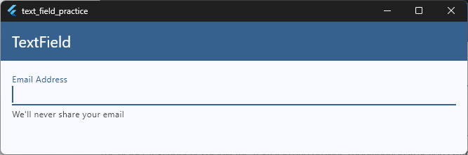
This makes the field much easier to understand compared to using a placeholder alone.
A Real Example
TextField(
  decoration: InputDecoration(
    labelText: 'Username',
    helperText: 'Choose a unique username',
  ),
),
Code language: JavaScript (javascript)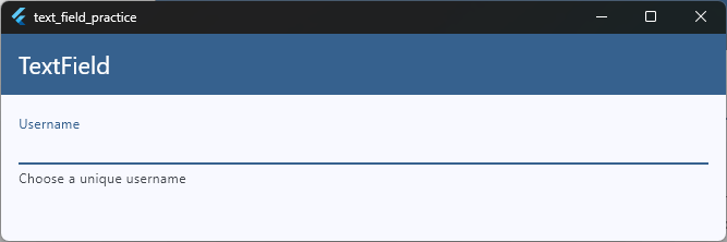
Here:
- The label identifies the field.
- The helper text provides additional guidance.
- The user always knows what information is expected.
Labels, Helper Text, and Validation
Labels and helper text improve usability, but they don’t actually validate anything.
For example, a helper message might say:
Enter a valid email address
But Flutter won’t automatically check whether the email is valid. For that, you’ll need form validation using TextFormField, validators, and the Form widget.
If you’d like to learn Flutter form validation step by step, you can start with the free first lesson inside our Flutter course at https://courses.fluttersensei.com.
The first class walks through a simple Hello World toggle app and helps you get comfortable with Flutter before moving on to forms, validation, and more advanced topics.
In the next section, we’ll learn how to actually read and access the text that users type into a TextField.
Reading User Input
Creating a TextField is only the first step. In most apps, you’ll eventually need to know what the user typed.
For example, you might want to:
- Search for products
- Submit a login form
- Filter a list
- Send a chat message
- Save profile information
To do that, Flutter provides several ways to read user input.
Using onChanged
One of the simplest approaches is the onChanged callback.
Flutter automatically calls this function every time the user types, deletes, or updates text inside the field.
TextField(
  onChanged: (value) {
    print(value);
  },
),
Code language: PHP (php)
As the user types:
H
He
Hel
Hell
Hello
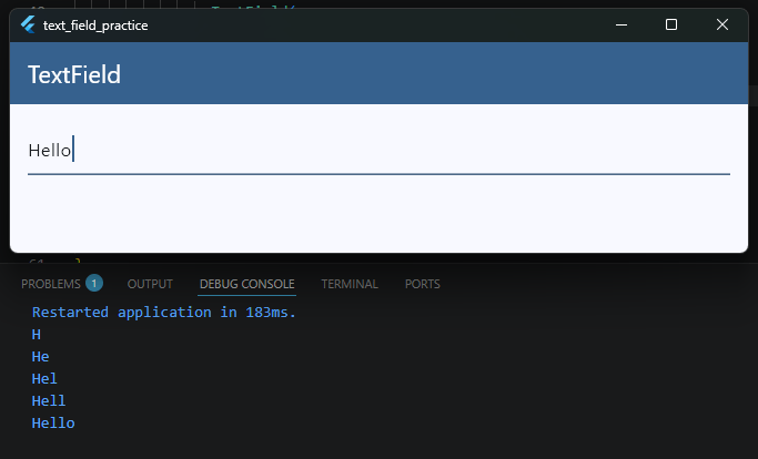
Flutter prints the updated value after every keystroke.
This is useful for features like:
- Live search
- Real-time filtering
- Character counters
- Instant validation
Example
The following example updates a variable whenever the user types.
String username = '';

TextField(
  onChanged: (value) {
    username = value;
  },
)
Code language: JavaScript (javascript)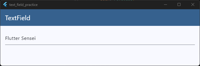
Now the username variable always contains the latest text entered by the user.
Displaying the Entered Text
You can also update the UI as the user types.
String username = '';

child: Column(
  children: [
    TextField(
      onChanged: (value) {
        setState(() {
          username = value;
        });
      },
    ),

    Text('Hello, $username'),
  ],
),
Code language: JavaScript (javascript)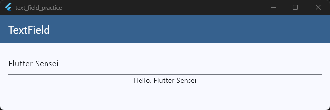
As the user types their name, the text below the field updates automatically.
When Should You Use onChanged?
The onChanged callback is a great choice when you need immediate access to user input.
Use it for:
- Search bars
- Live previews
- Filters
- Dynamic UI updates
- Character counters
However, if you need to access the text later—such as when a user presses a Submit button—there’s a better approach.
That’s where TextEditingController comes in.
In the next section, we’ll learn how to get text from a TextField using a TextEditingController, which is the most common approach used in real Flutter applications.
Getting Text from a TextField
In the previous section, we used the onChanged callback to read user input as it was being typed.
But in many real-world situations, you don’t need the text immediately. Instead, you may want to get the value when the user taps a button.
For example:
- Login forms
- Registration forms
- Search forms
- Profile update screens
To access the text later, Flutter uses a TextEditingController.
Example
final TextEditingController nameController = TextEditingController();
Code language: PHP (php)
Attach the controller to your TextField:
TextField(
  controller: nameController,
  decoration: InputDecoration(labelText: 'Name'),
),
Code language: JavaScript (javascript)
Now you can get the current text whenever you need it. For example, when the user presses a button:
ElevatedButton(
  onPressed: () {
    print(nameController.text);
  },
  child: Text('Get Text'),
),
Code language: PHP (php)
If the user enters:
Flutter Senseithe output will be:
Flutter Sensei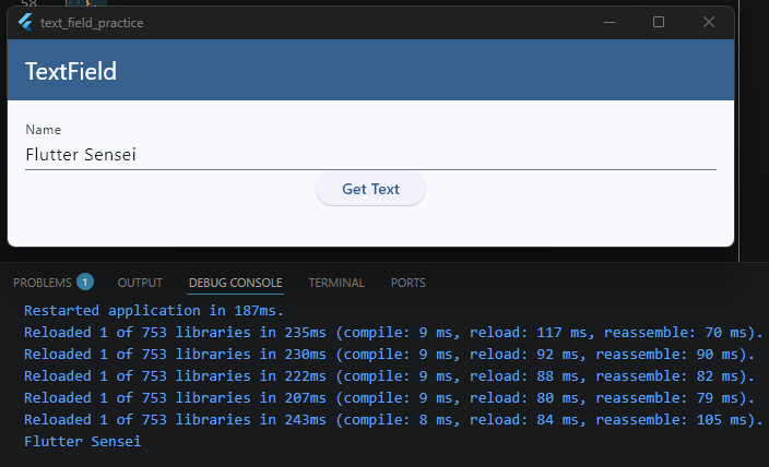
Complete Example
class _HomeScreenState extends State<HomeScreen> {
  final TextEditingController nameController = TextEditingController();

  @override
  Widget build(BuildContext context) {
    final theme = Theme.of(context);

    return Scaffold(
      appBar: AppBar(
        title: const Text('TextField'),
        backgroundColor: theme.colorScheme.primary,
        foregroundColor: theme.colorScheme.onPrimary,
      ),
      body: SafeArea(
        child: SingleChildScrollView(
          child: Padding(
            padding: const EdgeInsets.all(16),
            child: Column(
              children: [
                TextField(
                  controller: nameController,
                  decoration: InputDecoration(labelText: 'Name'),
                ),
                ElevatedButton(
                  onPressed: () {
                    print(nameController.text);
                  },
                  child: Text('Get Text'),
                ),
              ],
            ),
          ),
        ),
      ),
    );
  }
}
Code language: PHP (php)
When the button is pressed, Flutter reads the latest value from the TextField and makes it available through the controller’s text property.
You’ll use this approach frequently when building login forms, signup screens, profile pages, and other forms where values are submitted after the user finishes typing.
In the next section, we’ll take a closer look at TextEditingController and learn why it is one of the most important classes for working with TextFields in Flutter.
Using TextEditingController
If you work with TextFields long enough, you’ll quickly discover that Flutter doesn’t just store text automatically for you.
Instead, Flutter provides a class called TextEditingController that gives you direct access to a TextField’s value and behavior.
Think of a TextEditingController as a remote control for a TextField.
It allows you to:
- Read the current text
- Set text programmatically
- Clear text
- Listen for changes
- Control the cursor position
- Manage text selection
Creating a TextEditingController
To create a controller, simply instantiate the class:
final TextEditingController nameController = TextEditingController();
Code language: PHP (php)
Next, attach it to a TextField:
TextField(
  controller: nameController,
  decoration: InputDecoration(labelText: 'Name'),
),
Code language: JavaScript (javascript)
Once connected, the controller and TextField stay synchronized automatically.
Reading Text
You can access the current value using the text property.
print(nameController.text);
Code language: CSS (css)
This is commonly used when a user taps a Submit, Save, or Login button.
Updating Text Programmatically
A controller can also update the TextField.
nameController.text = 'Flutter Sensei';
Code language: JavaScript (javascript)
When this code runs, the TextField immediately displays the new value.
This is useful when:
- Loading profile data
- Editing existing records
- Prefilling forms
- Restoring saved drafts
Clearing Text
You can remove all text with the clear() method.
nameController.clear();Code language: CSS (css)This is commonly used after submitting forms or sending chat messages.
Complete Example
class _HomeScreenState extends State<HomeScreen> {
final TextEditingController nameController = TextEditingController();

@override
void dispose() {
  nameController.dispose();
  super.dispose();
}

  @override
  Widget build(BuildContext context) {
    final theme = Theme.of(context);

    return Scaffold(
      appBar: AppBar(
        title: const Text('TextField'),
        backgroundColor: theme.colorScheme.primary,
        foregroundColor: theme.colorScheme.onPrimary,
      ),
      body: SafeArea(
        child: SingleChildScrollView(
          child: Padding(
            padding: const EdgeInsets.all(16),
            child: Column(
              children: [
                TextField(
                  controller: nameController,
                  decoration: InputDecoration(labelText: 'Name'),
                ),

                ElevatedButton(
                  onPressed: () {
                    print(nameController.text);
                  },
                  child: Text('Get Text'),
                ),
              ],
            ),
          ),
        ),
      ),
    );
  }
}
Code language: PHP (php)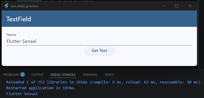
Turn Knowledge into Experience
Every widget you master makes Flutter development feel more natural. Join my free Flutter class and let’s build real projects while learning practical Flutter skills.
Why Controllers Matter in Real Apps
While simple examples often use a single TextField, real applications usually contain multiple inputs that need to be managed together.
For example:
- Notes apps
- Login screens
- Signup forms
- Profile editors
- Task managers
- Chat applications
In these scenarios, TextEditingController becomes one of the most important tools for working with user input.
In our Build a Flutter Notes App mini class, we use TextEditingController extensively to create, edit, update, and manage notes entered by users. It’s a great real-world example of how controllers are used beyond simple demos.
If you’d like to follow along, you can access the course at https://courses.fluttersensei.com, where you’ll also find the free introductory Flutter lessons to help you get started.
Don’t Forget to Dispose Controllers
A common beginner mistake is forgetting to dispose of controllers. Whenever you create a TextEditingController, you should dispose of it when the widget is removed from memory.
@override
void dispose() {
  nameController.dispose();
  super.dispose();
}
Code language: CSS (css)
This helps Flutter clean up resources and prevents memory leaks. As a rule of thumb: if you create a TextEditingController, always remember to dispose of it.
Setting Default Values
Sometimes you don’t want a TextField to start empty.
For example, you might be:
- Editing a user profile
- Updating an existing note
- Displaying saved settings
- Loading data from a database
In these situations, it’s helpful to show an initial value when the screen opens.
Using a TextEditingController
The most common way to set a default value is through a TextEditingController.
final TextEditingController nameController = TextEditingController(
  text: 'Flutter Sensei',
);
Code language: PHP (php)
When this controller is attached to a TextField, the value automatically appears inside the input field.
TextField(
  controller: nameController,
  decoration: InputDecoration(
    labelText: 'Name',
  ),
)
Code language: JavaScript (javascript)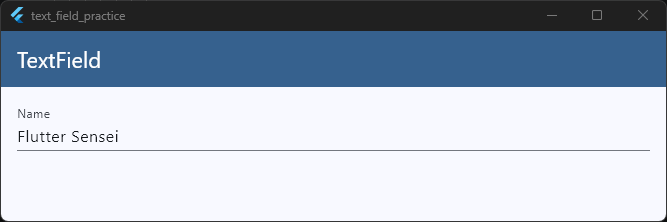
When the screen loads, users will immediately see:
Flutter Sensei
inside the TextField.
Complete Example
class _HomeScreenState extends State<HomeScreen> {
  final TextEditingController nameController = TextEditingController(
    text: 'Flutter Sensei',
  );

  @override
  void dispose() {
    nameController.dispose();
    super.dispose();
  }

  @override
  Widget build(BuildContext context) {
    final theme = Theme.of(context);

    return Scaffold(
      appBar: AppBar(
        title: const Text('TextField'),
        backgroundColor: theme.colorScheme.primary,
        foregroundColor: theme.colorScheme.onPrimary,
      ),
      body: SafeArea(
        child: SingleChildScrollView(
          child: Padding(
            padding: const EdgeInsets.all(16),
            child: Column(
              children: [
                TextField(
                  controller: nameController,
                  decoration: InputDecoration(labelText: 'Name'),
                ),
              ],
            ),
          ),
        ),
      ),
    );
  }
}
Code language: JavaScript (javascript)
Setting Values Later
You can also assign a value after the controller has been created.
nameController.text = 'Flutter Sensei';
Code language: JavaScript (javascript)
This immediately updates the TextField on the screen.
This approach is commonly used when data is loaded from:
- APIs
- Local databases
- SharedPreferences
- User profiles
- Existing records
For example, when a user opens an Edit Profile screen, you might load their saved information and populate the TextFields automatically.
Default Value vs Placeholder Text
Beginners often confuse default values with placeholders.
A placeholder uses hintText:
TextField(
  decoration: InputDecoration(
    hintText: 'Enter your name',
  ),
)
Code language: JavaScript (javascript)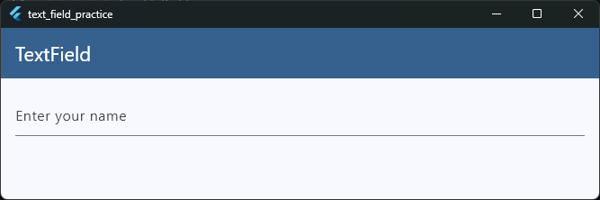
This only shows a visual hint. The TextField is still empty.
A default value uses a controller:
final TextEditingController nameController = TextEditingController(
  text: 'Flutter Sensei',
);
Code language: PHP (php)
This actually places text inside the field.
When Should You Use Default Values?
Default values are useful whenever you’re editing existing data rather than creating new data.
Common examples include:
- Edit Profile screens
- Notes applications
- Task management apps
- Settings pages
- Product edit forms
- Customer information forms
If the user has previously entered information, pre-filling the TextField often creates a much better user experience than forcing them to type everything again.
Updating TextField Values
In the previous section, we learned how to set an initial value using a TextEditingController. But what if you need to change the value after the TextField has already been created?
This is where TextEditingController becomes especially useful. You can update the text at any time by assigning a new value to the controller’s text property.
nameController.text = 'Flutter Sensei';
Code language: JavaScript (javascript)
As soon as this line executes, Flutter automatically updates the TextField on the screen.
Example
Let’s add a button that changes the TextField value when pressed.
ElevatedButton(
  onPressed: () {
    nameController.text = 'Flutter Sensei';
  },
  child: Text('Update Name'),
)
Code language: JavaScript (javascript)
When the user taps the button, the TextField immediately displays the new text.
Complete Example
class _HomeScreenState extends State<HomeScreen> {
  final TextEditingController nameController = TextEditingController();

  @override
  void dispose() {
    nameController.dispose();
    super.dispose();
  }

  @override
  Widget build(BuildContext context) {
    final theme = Theme.of(context);

    return Scaffold(
      appBar: AppBar(
        title: const Text('TextField'),
        backgroundColor: theme.colorScheme.primary,
        foregroundColor: theme.colorScheme.onPrimary,
      ),
      body: SafeArea(
        child: SingleChildScrollView(
          child: Padding(
            padding: const EdgeInsets.all(16),
            child: Column(
              children: [
                TextField(
                  controller: nameController,
                  decoration: const InputDecoration(labelText: 'Name'),
                ),

                const SizedBox(height: 16),

                ElevatedButton(
                  onPressed: () {
                    nameController.text = 'Flutter Sensei';
                  },
                  child: const Text('Update Name'),
                ),
              ],
            ),
          ),
        ),
      ),
    );
  }
}
Code language: JavaScript (javascript)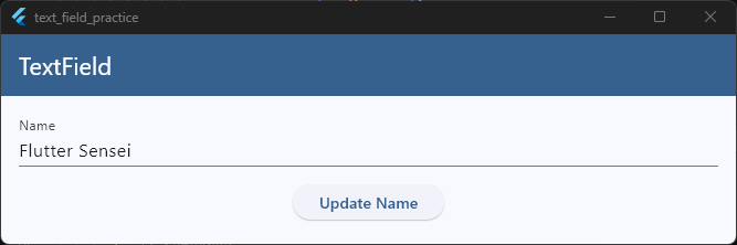
Try running the example and tapping the button. You’ll see the TextField update instantly without rebuilding the entire screen.
Clearing a TextField
Sometimes you may want to remove the text completely. Flutter provides a convenient clear() method for this.
nameController.clear();
Code language: CSS (css)
For example:
ElevatedButton(
  onPressed: () {
    nameController.clear();
  },
  child: Text('Clear'),
)
Code language: JavaScript (javascript)
This is commonly used after:
- Submitting forms
- Sending messages
- Completing searches
- Resetting user input
Updating Values from Data
In real applications, TextField values are often updated from external sources.
For example:
nameController.text = user.name;
This might happen when:
- Loading profile information
- Editing a note
- Fetching data from an API
- Reading from a local database
- Restoring saved settings
Instead of asking users to type everything again, you can automatically populate the field with existing data.
A Small Word of Caution
Updating a TextField programmatically will replace the current value.
For example:
nameController.text = 'Flutter Sensei';
Code language: JavaScript (javascript)
If the user had already typed something, that text will be overwritten.
Because of this, it’s usually best to update TextField values intentionally and only when it makes sense for the user experience.
In the next section, we’ll look at another important TextField feature: choosing the right keyboard type for different kinds of user input.
Handling Keyboard Types
By default, Flutter displays a standard keyboard when a user taps a TextField. However, not every field should use the same keyboard.
For example:
- Email fields should show an email-friendly keyboard.
- Phone number fields should show a numeric keyboard.
- URL fields should make it easier to enter web addresses.
- Number fields should focus on digits instead of letters.
Flutter allows you to customize the keyboard using the keyboardType property.
Email Keyboard
When collecting email addresses, use TextInputType.emailAddress.
TextField(
  keyboardType: TextInputType.emailAddress,
  decoration: InputDecoration(
    labelText: 'Email Address',
  ),
),
Code language: JavaScript (javascript)
On most devices, this keyboard includes shortcuts such as:
@
.
making it faster for users to enter their email.
Phone Number Keyboard
For phone numbers, use:
TextField(
  keyboardType: TextInputType.phone,
  decoration: InputDecoration(labelText: 'Phone Number'),
),
Code language: JavaScript (javascript)
This displays a phone-friendly keypad optimized for entering numbers.
Number Keyboard
If the field should only contain numbers, use:
TextField(
  keyboardType: TextInputType.number,
  decoration: InputDecoration(labelText: 'Age'),
),
Code language: JavaScript (javascript)
This is commonly used for:
- Age
- Quantity
- Price
- PIN codes
- Numeric IDs
URL Keyboard
For website addresses:
TextField(
  keyboardType: TextInputType.url,
  decoration: InputDecoration(labelText: 'Website'),
),
Code language: JavaScript (javascript)
This provides a keyboard optimized for entering URLs.
Multiline Input
If users need to enter longer text, such as notes or comments, you can enable multiple lines.
TextField(
  keyboardType: TextInputType.multiline,
  maxLines: 5,
  decoration: InputDecoration(labelText: 'Description'),
),
Code language: JavaScript (javascript)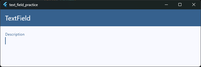
This is useful for:
- Notes
- Feedback forms
- Product descriptions
- Comments
Complete Example
child: Column(
  children: [
    TextField(
      keyboardType: TextInputType.emailAddress,
      decoration: InputDecoration(labelText: 'Email'),
    ),

    SizedBox(height: 16),

    TextField(
      keyboardType: TextInputType.phone,
      decoration: InputDecoration(labelText: 'Phone Number'),
    ),

    SizedBox(height: 16),

    TextField(
      keyboardType: TextInputType.number,
      decoration: InputDecoration(labelText: 'Age'),
    ),
  ],
),
Code language: JavaScript (javascript)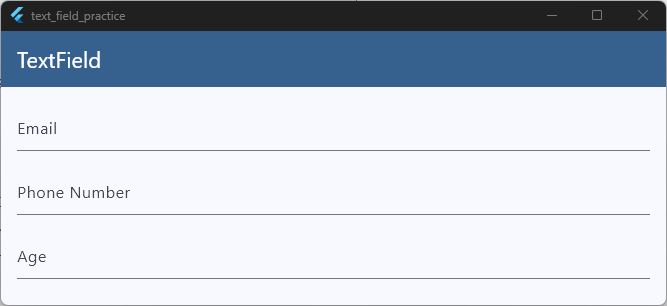
Try tapping each field on a physical device or emulator. You’ll notice that Flutter automatically displays different keyboard layouts depending on the selected input type.
Why Keyboard Types Matter
Choosing the correct keyboard improves the user experience significantly.
Imagine asking users to enter a phone number using a full keyboard or forcing them to switch keyboards just to type an email address. Small inconveniences like these can make forms feel frustrating.
By setting the appropriate keyboardType, you help users enter information faster and more accurately.
Common Keyboard Types
| Keyboard Type | Use Case |
|---|---|
TextInputType.text | General text input |
TextInputType.emailAddress | Email fields |
TextInputType.phone | Phone numbers |
TextInputType.number | Numeric input |
TextInputType.url | Website addresses |
TextInputType.multiline | Notes and comments |
Using the right keyboard type is a small change, but it can make your forms feel much more polished and user-friendly.
TextField Styling Basics
A plain TextField works perfectly fine, but most apps customize its appearance to match their design and improve the user experience.
Flutter makes this easy through the InputDecoration widget. With just a few properties, you can add borders, colors, icons, labels, and much more.
Adding an Outline Border
One of the most common styles is an outlined TextField.
TextField(
  decoration: InputDecoration(
    labelText: 'Name',
    border: OutlineInputBorder(),
  ),
),
Code language: JavaScript (javascript)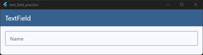
This adds a visible border around the input field, making it easier for users to identify where they should enter information.
Adding a Prefix Icon
Icons can provide visual hints about the purpose of a field.
TextField(
  decoration: InputDecoration(
    labelText: 'Email',
    prefixIcon: Icon(Icons.email),
    border: OutlineInputBorder(),
  ),
),
Code language: JavaScript (javascript)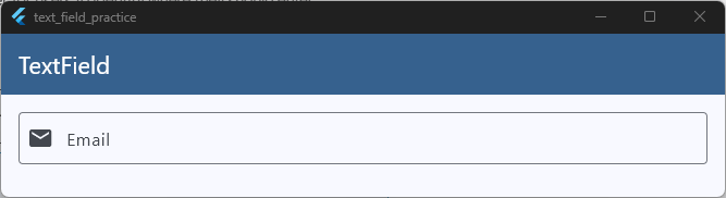
The email icon helps users quickly recognize what information is expected.
Changing the Border Color
You can customize the border when the field is focused.
TextField(
  decoration: InputDecoration(
    labelText: 'Username',
    focusedBorder: OutlineInputBorder(
      borderSide: BorderSide(color: Colors.blue, width: 2),
    ),
  ),
),
Code language: JavaScript (javascript)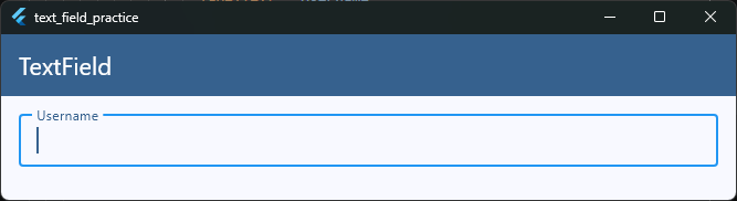
When the user taps the field, the border changes to the specified color.
Styling the Text
You can also customize the text entered by the user.
TextField(
  style: TextStyle(fontSize: 18, fontWeight: FontWeight.w500),
),
Code language: CSS (css)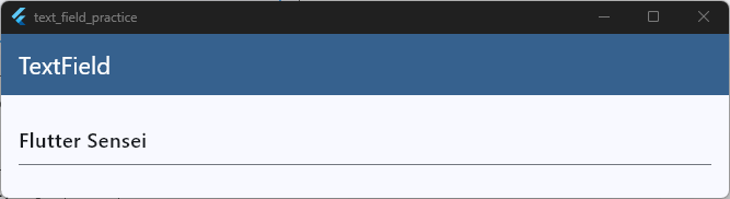
This changes how the typed text appears inside the TextField.
Styling the Label
Labels can be customized as well.
TextField(
  decoration: InputDecoration(
    labelText: 'Name',
    labelStyle: TextStyle(
      color: Colors.blue,
      fontWeight: FontWeight.bold,
    ),
  ),
),
Code language: JavaScript (javascript)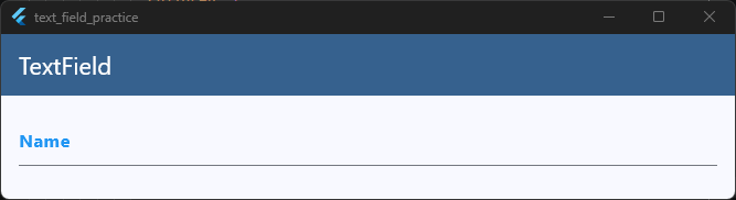
This gives the label a different color and font weight.
A More Polished Example
Here’s a TextField that combines several styling options.
TextField(
  decoration: InputDecoration(
    labelText: 'Email Address',
    hintText: 'Enter your email',
    prefixIcon: Icon(Icons.email),
    border: OutlineInputBorder(),
  ),
),
Code language: JavaScript (javascript)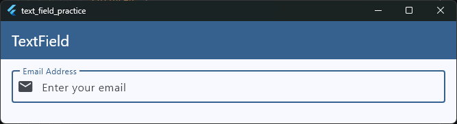
This single TextField includes:
- A label
- A placeholder
- An icon
- A border
These small improvements make the field feel much more professional.
Complete Example
TextField(
  decoration: InputDecoration(
    labelText: 'Full Name',
    hintText: 'Enter your full name',
    prefixIcon: Icon(Icons.person),
    border: OutlineInputBorder(),
  ),
),
Code language: JavaScript (javascript)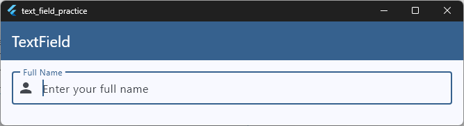
This style is commonly used in:
- Login forms
- Signup screens
- Profile pages
- Checkout forms
- Settings screens
Don’t Worry About Learning Every Property
If you’re feeling overwhelmed by all the customization options, that’s completely normal.
The InputDecoration class contains many properties, and most Flutter developers learn them gradually as they build real applications.
For now, focus on these essentials:
labelTexthintTextprefixIconborderfocusedBorder
These five properties will cover the majority of TextField styling needs in beginner and intermediate Flutter projects.
In the next guide, we’ll take a much deeper dive into TextField customization, themes, borders, colors, states, and advanced styling techniques in our Flutter TextField Styling Guide.
Common Beginner Mistakes
If you’re just getting started with Flutter TextFields, you’re going to make mistakes.
That’s completely normal.
In fact, most Flutter developers have run into the same TextField issues at some point. Let’s look at some of the most common ones and learn how to avoid them.
1. Creating Controllers Inside build()
This is one of the most common mistakes beginners make.
❌ Incorrect:
@override
Widget build(BuildContext context) {
  final controller = TextEditingController();

  return TextField(
    controller: controller,
  );
}
Code language: PHP (php)
Every time Flutter rebuilds the widget, a new controller is created and the old one is discarded.
✅ Correct:
class _HomeScreenState extends State<HomeScreen> {
  final TextEditingController controller =
      TextEditingController();

  @override
  Widget build(BuildContext context) {
    return TextField(
      controller: controller,
    );
  }
}
Code language: PHP (php)
Create controllers inside the State class so they survive rebuilds.
2. Forgetting to Dispose Controllers
Whenever you create a TextEditingController, you should dispose of it when the widget is removed.
❌ Incorrect:
final controller = TextEditingController();
Code language: PHP (php)
✅ Correct:
@override
void dispose() {
  controller.dispose();
  super.dispose();
}
Code language: CSS (css)
This helps Flutter release resources properly.
3. Storing Values Inside build()
You may remember this one from earlier.
❌ Incorrect:
Widget build(BuildContext context) {
  String username = '';

  return TextField(
    onChanged: (value) {
      username = value;
    },
  );
}
Code language: JavaScript (javascript)
The value gets reset every time Flutter rebuilds the widget.
✅ Correct:
class _HomeScreenState extends State<HomeScreen> {
  String username = '';
}
Code language: JavaScript (javascript)
State that should survive rebuilds belongs inside the State class.
4. Confusing hintText with Actual Values
Many beginners think this:
TextField(
  decoration: InputDecoration(
    hintText: 'Enter your email',
  ),
)
Code language: JavaScript (javascript)
means the TextField contains text.
It doesn’t.
hintText is only a visual placeholder. The field remains empty until the user enters something.
If you need an actual value inside the field, use a controller:
final controller = TextEditingController(
  text: 'user@example.com',
);
Code language: PHP (php)
5. Using the Wrong Keyboard Type
Sometimes developers use the default keyboard for every field.
For example:
TextField(
  decoration: InputDecoration(
    labelText: 'Phone Number',
  ),
)
Code language: JavaScript (javascript)
A better approach is:
TextField(
  keyboardType: TextInputType.phone,
  decoration: InputDecoration(
    labelText: 'Phone Number',
  ),
)
Code language: JavaScript (javascript)
This creates a better experience for users.
6. Using TextField When Validation Is Needed
If you’re building a login form, signup page, or checkout form, you’ll usually want validation.
Many beginners start with:
TextField()
and later realize they need validation.
In those cases, TextFormField is often a better choice because it works directly with Flutter’s Form widget.
7. Forgetting That TextField Rebuilds
Flutter rebuilds widgets frequently.
If you accidentally recreate controllers, reset variables, or overwrite values during rebuilds, your TextField may behave unexpectedly.
When something seems strange, ask yourself:
“Am I recreating this value every time build() runs?”
That simple question solves many Flutter bugs.
The Good News
Most TextField problems come from just a handful of mistakes:
- Creating controllers in the wrong place
- Forgetting to dispose controllers
- Resetting state during rebuilds
- Confusing placeholders with actual values
- Using the wrong input widget
Once you understand these concepts, working with TextFields becomes much easier.
At this point, you now know how to create TextFields, read user input, use controllers, set values, update text, choose keyboard types, and apply basic styling.
You’re ready to start building real forms.
As your next step, try creating a complete login form, signup screen, or profile editor. That’s where all of these TextField concepts start coming together in a real Flutter application.
Keep Building with Flutter
You’ve learned how to create and customize TextField widgets. Now let’s bring everything together by building real Flutter apps in my free beginner-friendly class.