We have all been there. You drop a TextField into your Flutter app, and it just looks… off. The padding is bulky. The borders don’t match your brand. Suddenly, you are wrestling with InputDecoration for hours just to make a simple form look clean.
It does not have to be a fight.
You don’t need a massive UI package to get gorgeous, production-ready inputs. Flutter has everything you need built right in. You just need to know how the pieces fit together.
In this guide, we will break down InputDecoration without the headache. We will master colors, borders, and spacing, and even build custom, reusable form inputs that look like real, shipped products—not just tutorial apps.
If you are looking to step past basic tutorial layouts and want to see how real, shipped apps handle complex, responsive designs, you can check out our Production-Quality UI Course Module. It covers the exact design-system workflows and layout practices used by professional mobile teams.
With that in mind, let’s start from the beginning and break down how InputDecoration actually works.
Understanding InputDecoration
To style a TextField in Flutter, you need to master InputDecoration. Think of the TextField as the functional engine that handles user typing, while InputDecoration is the paint job and body kit that controls how it looks.
By default, Flutter applies the Material Design theme to your inputs. This includes a bottom border, a floating label, and specific touch targets. To take full control, you pass an InputDecoration instance to the decoration property of your TextField.
TextField(
  decoration: InputDecoration(
    // All your styling lives here
  ),
)
Code language: JavaScript (javascript)
The Secret to Total Control: isDense
The biggest mistake developers make with flutter textfield inputdecoration is fighting Flutter’s default sizing. Material inputs come with built-in vertical padding to meet accessibility standards. If you want a slim, modern input, this default spacing will get in your way.
The secret weapon is the isDense property.
Setting isDense: true collapses the aggressive default padding. It gives you a clean slate so you can define your own tight, professional spacing.
child: TextField(
  decoration: InputDecoration(
    isDense: true, // Tames the default Material padding
    hintText: 'Enter your email',
  ),
),
Code language: JavaScript (javascript)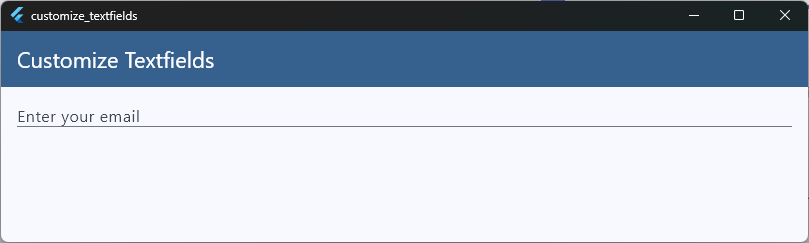
By understanding how InputDecoration wraps your input, you stop guessing which property to tweak. You can confidently change colors, borders, and alignment without breaking the layout.
Labels vs Placeholders
When designing forms, developers often confuse labels and placeholders. While they seem similar, they serve completely different purposes for your users.
- A placeholder (called a
hintTextin Flutter) is a temporary guide. It shows an example of what to type (likename@example.com) and vanishes the moment the user starts typing. - A label (called
labelTextin Flutter) tells the user what the field is (like “Email Address”). In Material Design, it elegantly floats to the top when the field is active.
child: TextField(
  decoration: InputDecoration(
    labelText: 'Email Address', // The permanent descriptor
    hintText: 'name@example.com', // The temporary example
  ),
),
Code language: PHP (php)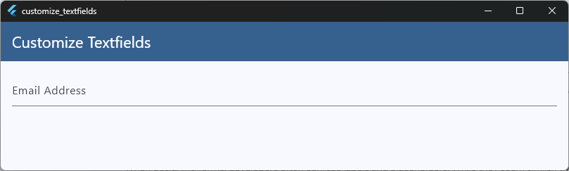
The Pitfall of the Missing Label
A common design mistake is using only a placeholder to save space.
When a user fills out a long form using only hints, the text disappears as they type. If they look back to double-check their details, they can no longer see what information belongs in which box. They have to delete their text just to see the hint again.
Styling Labels and Placeholders
To make your forms look polished, use the flutter textfield label and flutter textfield placeholder style properties. This lets you dim the hint text while keeping the main label highly readable.
decoration: InputDecoration(
  labelText: 'Password',
  labelStyle: TextStyle(
    color: Colors.blueGrey,
    fontWeight: FontWeight.bold,
  ),
  hintText: 'At least 8 characters',
  hintStyle: TextStyle(color: Colors.grey[400], fontSize: 14),
),
Code language: JavaScript (javascript)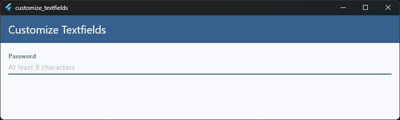
By separating these two elements, your forms stay clean, accessible, and highly professional.
Changing Colors Correctly
Changing colors on a TextField can feel like a game of whack-a-mole. You change the border color, but it stays gray. You tap the input, and it suddenly turns a completely unexpected color.
To fix this, you need to understand that a TextField changes its visual state based on user interaction.
The Three Main States
To get the exact flutter textfield color you want, you must style three primary states individually inside your InputDecoration:
- Enabled State: The input is sitting on the screen, waiting for the user.
- Focused State: The user has tapped the input, and the keyboard is up.
- Error State: The input validation failed (e.g., an invalid email).
The Right Way to Code It
Instead of trying to force a single color onto the whole widget, assign explicit colors to the borders and text styles based on these states:
child: TextField(
  decoration: InputDecoration(
    // 1. Background color
    filled: true,
    fillColor: Colors.grey[100], // Clean, light background
    // 2. Default state border color
    enabledBorder: OutlineInputBorder(
      borderSide: BorderSide(color: Colors.grey[300]!, width: 1.5),
    ),

    // 3. Active state border color
    focusedBorder: OutlineInputBorder(
      borderSide: BorderSide(color: Colors.blue[600]!, width: 2.0),
    ),
  ),
),
Code language: JavaScript (javascript)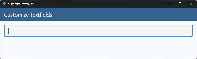
Pro Tip: Never forget to set
filled: true. If you don’t, yourfillColorwill be completely ignored, leaving your background transparent.
Linking to Your App’s Core Theme
If you find yourself copying and pasting these colors across every single screen, stop! You should handle this globally. Check out our deep dive on Flutter Theme System Explained to learn how to set these input colors once at the root of your app so your entire design stays perfectly consistent.
Text Styling Options
Once your colors are locked in, it is time to look at the text inside the input box. Developers often assume all text properties live inside InputDecoration. However, the visual behavior configuration splits into two distinct spaces: what the user types, and the helper labels around it.
For configuring the typed characters, you directly manipulate properties on the underlying class definition layout. For the surrounding text, you configure options inside the decoration.
Styling the Input Text vs. Decorations
To change the flutter textfield style of the text a user actually types, use the style property on the TextField itself. This accepts a standard TextStyle configuration, identical to what you use in a regular Flutter text class.
child: TextField(
  // Controls the appearance of the typed text
  style: TextStyle(
    fontSize: 18.0,
    color: Colors.blueGrey[900],
    fontWeight: FontWeight.w500,
  ),
  decoration: InputDecoration(
    // Controls the surrounding labels
    errorStyle: TextStyle(color: Colors.red[700], fontSize: 12.0),
  ),
),
Code language: JavaScript (javascript)
Essential Typography Tweaks
There are three key style settings that separate amateur forms from beautiful, professional user interfaces:
strutStyle: Keeps line heights perfectly uniform across devices, preventing your layout from jumping when complex characters or symbols are typed.textAlign: By default, text aligns left. For verification codes, PIN entries, or search parameters, changing this toTextAlign.centerimmediately gives your UI a custom, specialized look.- Cursor Customization: Do not use the default OS cursor color. Clean things up by matching your cursor to your primary brand color using the
cursorColor,cursorWidth, andcursorRadiusproperties on theTextField.
child: TextField(
  textAlign: TextAlign.center,
  cursorColor: Colors.blue[600],
  cursorWidth: 2.0,
  cursorRadius: Radius.circular(2.0),
),
Code language: CSS (css)
Grouping these visual treatments guarantees that your text scales dynamically without breaking the container limits or shifting out of center alignment.
Custom Borders
The quickest way to make an app look amateurish is sticking to the default Material line border. A modern UI almost always demands a fully enclosed container, a subtle rounded card, or sometimes no border at all.
To achieve this, you need to swap out Flutter’s default border shapes.
The Border Types: Underline vs. Outline
Flutter gives you two primary classes to shape your inputs: UnderlineInputBorder and OutlineInputBorder.
If you want a modern, box-style input, you will want to use OutlineInputBorder. If you want to strip the borders away entirely for a minimalist, borderless design, use InputBorder.none.
decoration: InputDecoration(
  // Use OutlineInputBorder for clean, boxed designs
  border: OutlineInputBorder(
    borderRadius: BorderRadius.circular(12.0), // Rounded corners
  ),
),
Code language: JavaScript (javascript)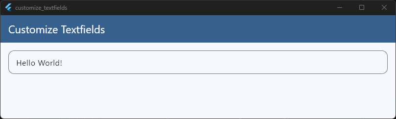
Styling Every State Safely
A common mistake is setting only the base border property. If you want your borders to look sharp when a user interacts with them, you need to define the border for each state explicitly:
border: The fallback border style if no other state is matched.enabledBorder: The border displayed when the field is idle.focusedBorder: The border displayed when the field is active and being typed in.errorBorder: The border displayed when validation fails.
Here is how to combine them for a professional, rounded-corner design system:
decoration: InputDecoration(
  // The idle state
  enabledBorder: OutlineInputBorder(
    borderRadius: BorderRadius.circular(12.0),
    borderSide: BorderSide(color: Colors.grey[300]!, width: 1.5),
  ),

  // The active state
  focusedBorder: OutlineInputBorder(
    borderRadius: BorderRadius.circular(12.0),
    borderSide: BorderSide(color: Colors.blue[600]!, width: 2.0),
  ),

  // The error state
  errorBorder: OutlineInputBorder(
    borderRadius: BorderRadius.circular(12.0),
    borderSide: BorderSide(color: Colors.red[600]!, width: 1.5),
  ),
  focusedErrorBorder: OutlineInputBorder(
    borderRadius: BorderRadius.circular(12.0),
    borderSide: BorderSide(color: Colors.red[600]!, width: 2.0),
  ),
),
Code language: PHP (php)
By explicitly mapping your OutlineInputBorder shapes to these states, your UI components will transition smoothly without unexpected sizing or layout shifts.
Adjusting Padding
If your TextField looks bloated or the text feels choked inside the box, the culprit is padding. By default, Flutter injects a generous amount of internal spacing around the text area to meet standard touch-target accessibility rules.
To take visual control over the layout height and text alignment, you must override this spacing using the contentPadding property.
Working with contentPadding
The flutter textfield padding property accepts an EdgeInsets geometry configuration. This property determines exactly how far the typed text sits from the left, right, top, and bottom borders of the input field container.
decoration: InputDecoration(
  // Customizing internal spacing safely
  contentPadding: EdgeInsets.symmetric(
    horizontal: 16.0, // Generous breathing room on the sides
    vertical: 12.0, // Sleek, modern vertical spacing
  ),
),
Code language: JavaScript (javascript)
Symmetric vs. Asymmetric Spacing
Depending on your layout style, you will want to choose the right EdgeInsets construction:
EdgeInsets.symmetric: The best choice for standard inputs. Keeping your vertical and horizontal values balanced ensures the text remains perfectly centered vertically.EdgeInsets.fromLTRB: Ideal when your input field includes prefix or suffix icons. Often, text fields with leading icons need a slightly smaller left padding value so the text doesn’t sit too far away from the asset icon.
decoration: InputDecoration(
  prefixIcon: Icon(Icons.search),
  contentPadding: EdgeInsets.fromLTRB(8.0, 12.0, 16.0, 12.0),
),
Code language: CSS (css)
Setting explicit edge bounds ensures your fields stay clean, sharp, and uniformly sized across varying screen configurations.
Reducing Default Spacing
Sometimes you need to build a compact layout, like a tight search bar in an app header or a dense data entry sheet. If you try to shrink the height of a TextField by only reducing its vertical contentPadding, you will quickly notice a major issue: the input field refuses to get any smaller.
This happens because Flutter enforces minimum touch-target constraints under the hood. To bypass this, you need to know how to properly apply flutter textfield reduce padding techniques.
Overriding Sizing Constraints
To force the input field to collapse down past its default boundaries, you must use a combination of three key properties inside InputDecoration:
isDense: true– As we covered earlier, this lowers the overall internal spacing baseline.isCollapsed: true– This strips away all default spacing, reducing the padding to absolute zero.constraints– This sets hard caps on the maximum and minimum height and width of the input layout box.
Here is the exact boilerplate layout pattern to create a hyper-compact, custom-height input field:
child: SizedBox(
  height: 40.0, // Force a strict, professional layout height
  child: TextField(
    decoration: InputDecoration(
      isDense: true,
      isCollapsed: true,
      contentPadding: EdgeInsets.symmetric(
        horizontal: 12.0,
        vertical: 10.0,
      ),
      border: OutlineInputBorder(
        borderRadius: BorderRadius.circular(8.0),
      ),
    ),
  ),
),
Code language: JavaScript (javascript)
Important Rule: When you use
isCollapsed: true, you lose the standard spatial arrangement for default label placements. Because it drops internal padding to zero, you must manually provide explicitcontentPaddingvalues to keep your input text from sticking directly to the outer border lines.
Using this combination gives you complete authority over layout height, preventing your interface components from looking clunky or feeling disjointed on smaller device screens.
Building Modern Form Inputs
Now that we have covered the building blocks—colors, borders, and spacing—it is time to piece them together. A truly modern form input does not look like a stock material field. It looks integrated, intentional, and clean.
Let’s build a modern, high-quality form input from scratch. This design uses a neutral background, a subtle crisp border, and clear visual changes when active.
child: Column(
    crossAxisAlignment: CrossAxisAlignment.start,
    children: [
      // 1. External Field Label for a clean look
      Text(
        'Account Password',
        style: TextStyle(
          fontSize: 14.0,
          fontWeight: FontWeight.w600,
          color: Colors.blueGrey[800],
        ),
      ),
      const SizedBox(height: 8.0),

      // 2. The Styled Input Field
      TextField(
        obscureText: true,
        style: const TextStyle(fontSize: 16.0, color: Colors.black87),
        decoration: InputDecoration(
          isDense: true,
          filled: true,
          fillColor: Colors.grey[50],
          hintText: 'Enter your password',
          hintStyle: TextStyle(color: Colors.grey[400], fontSize: 15.0),

          // Prefix Icon for visual hierarchy
          prefixIcon: Icon(
            Icons.lock_outline,
            color: Colors.grey[400],
            size: 22,
          ),

          // Suffix Icon for interaction
          suffixIcon: Icon(
            Icons.visibility_off_outlined,
            color: Colors.grey[400],
            size: 22,
          ),

          contentPadding: const EdgeInsets.symmetric(
            horizontal: 16.0,
            vertical: 14.0,
          ),

          // Discrete subtle border for idle state
          enabledBorder: OutlineInputBorder(
            borderRadius: BorderRadius.circular(10.0),
            borderSide: BorderSide(color: Colors.grey[200]!, width: 1.5),
          ),

          // Crisp primary focus border
          focusedBorder: OutlineInputBorder(
            borderRadius: BorderRadius.circular(10.0),
            borderSide: const BorderSide(color: Colors.blue, width: 2.0),
          ),
        ),
      ),
    ],
  ),
),
Code language: PHP (php)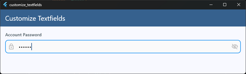
Key Design Details That Make It Work
- External Label: Moving the label outside the
TextFieldusing a simpleColumnlayout keeps the input field itself completely clean and easy to read. - Balanced Content Padding: The horizontal padding (16.0) matches the outer screen margins perfectly, while the vertical padding (14.0) gives the input text breathing room without looking bulky.
- Functional Icons: Adding a
prefixIconandsuffixIcondraws the eye naturally into the text input area, signaling to the user exactly what type of information belongs inside the box.
Cupertino-Style Inputs
If you are aiming for a premium, native iOS feel, standard Material text fields can look out of place. Apple’s design language relies on soft, rounded corner blocks, subtle interior shading, and structural gray borders.
To achieve this style perfectly, you need to step away from TextField and use the specialized flutter cupertino textfield widget instead.
The Anatomy of CupertinoTextField
Unlike its Material counterpart, CupertinoTextField does not use InputDecoration. Instead, it exposes design properties directly on the main widget layer, offering a streamlined styling approach that matches the iOS system defaults perfectly out of the box.
import 'package:flutter/material.dart';
import 'package:flutter/cupertino.dart';

child: CupertinoTextField(
  padding: EdgeInsets.symmetric(horizontal: 16.0, vertical: 12.0),
  placeholder: 'Search templates...',
  placeholderStyle: TextStyle(color: CupertinoColors.placeholderText),
  decoration: BoxDecoration(
    color: CupertinoColors.extraLightBackgroundGray,
    border: Border.all(
      color: CupertinoColors.lightBackgroundGray,
      width: 1.0,
    ),
    borderRadius: BorderRadius.circular(10.0),
  ),
),
Code language: JavaScript (javascript)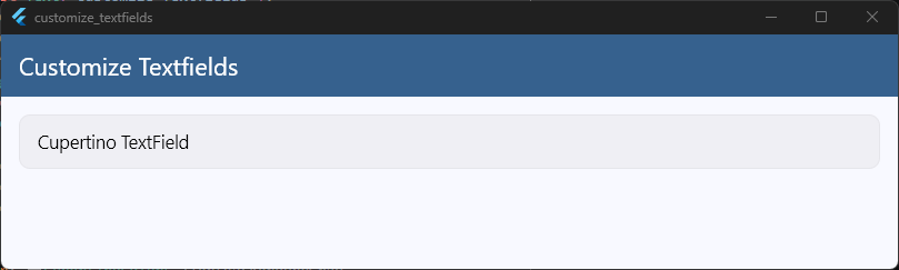
Key Differences to Keep in Mind
When working with Cupertino text inputs, your standard Material muscle memory will need a quick adjustment:
- No More
hintText: The text placeholder configuration uses theplaceholderproperty directly on the widget root. - Pure Containers: Container styling shifts from
InputDecorationto a standard, familiarBoxDecoration. - Platform Specific Styling Classes: To ensure consistent rendering, swap out standard colors for iOS-optimized tokens like
CupertinoColors.activeBlueorCupertinoColors.placeholderText.
Using this dedicated class allows you to capture the distinct, fluid layout aesthetics of native iOS systems without manually overriding heavy Material Design presets.
Matching iOS and Android Designs
If you want your app to look truly professional, you have to decide on a platform design strategy. Should your inputs look exactly the same on every screen? Or should they adapt automatically, changing their shape depending on whether the user is on an Android or iOS device?
For a complete breakdown of this choice, check out our guide on Flutter Material vs Cupertino Widgets. Let’s look at how to handle both approaches cleanly.
Approach 1: The Unified Custom Design System
Most modern production apps (like Spotify, Airbnb, or Slack) don’t use raw native styles. Instead, they build a single, custom design system that looks identical across both iOS and Android.
By using standard Material widgets and styling them heavily with custom OutlineInputBorder shapes and flat background fills, you can bypass platform defaults entirely. This gives your brand a single, unified identity across all hardware platforms.
Approach 2: Native Adaptive Inputs
If your goal is absolute fidelity to the underlying operating system, your input fields must adapt dynamically.
Instead of cluttering your widget trees with ugly, repetitive if (Platform.isIOS) logic checks, you can leverage the built-in adaptive constructors or create a clean layout switcher.
Using the TextField.adaptive() constructor automatically swaps out the underlying architecture on iOS devices:
TextField.adaptive(
  // Automatically switches between Material and Cupertino rendering
  decoration: InputDecoration(
    hintText: 'Enter your username',
  ),
)
Code language: JavaScript (javascript)
When to Pick Which Strategy
- Choose Unified Custom Styles if you are building an app with a strong, highly specific brand identity. It makes your layouts predictable, testing faster, and maintenance simple.
- Choose Adaptive Inputs if you are building a tool-based app (like a system utility, settings panel, or email client) where users expect the application to match the operating system exactly.
Reusable TextField Components
Copying and pasting a 50-line TextField layout configuration across ten different screens is a maintenance nightmare. If your design team decides to change the rounded border corner radius from 10.0 to 12.0, you will have to track down every single instance manually to update it.
To build apps like a seasoned professional, you need to follow core Flutter Design Best Practices. That means abstracting your styled inputs into a single, clean, reusable widget class.
Building the Ultimate Custom Input Wrapper
The goal of a reusable component is simple: encapsulate all the styling details under the hood, while exposing only the functional variables (like controllers, validators, or icons) as parameters.
Here is a production-ready, highly flexible input component configuration:
class CustomTextField extends StatelessWidget {
  final TextEditingController controller;
  final String hintText;
  final String labelText;
  final IconData? prefixIcon;
  final bool isPassword;
  final String? Function(String?)? validator;

  const CustomTextField({
    super.key,
    required this.controller,
    required this.hintText,
    required this.labelText,
    this.prefixIcon,
    this.isPassword = false,
    this.validator,
  });

  @override
  Widget build(BuildContext context) {
    return Column(
      crossAxisAlignment: CrossAxisAlignment.start,
      children: [
        Text(
          labelText,
          style: const TextStyle(
            fontSize: 14.0,
            fontWeight: FontWeight.w600,
            color: Colors.black87,
          ),
        ),
        const SizedBox(height: 6.0),
        TextFormField(
          controller: controller,
          obscureText: isPassword,
          validator: validator,
          decoration: InputDecoration(
            isDense: true,
            filled: true,
            fillColor: Colors.grey[50],
            hintText: hintText,
            hintStyle: TextStyle(color: Colors.grey[400], fontSize: 14.0),
            prefixIcon: prefixIcon != null
                ? Icon(prefixIcon, color: Colors.grey[400], size: 20)
                : null,
            contentPadding: const EdgeInsets.symmetric(
              horizontal: 16.0,
              vertical: 14.0,
            ),
            enabledBorder: OutlineInputBorder(
              borderRadius: BorderRadius.circular(10.0),
              borderSide: BorderSide(color: Colors.grey[200]!, width: 1.5),
            ),
            focusedBorder: OutlineInputBorder(
              borderRadius: BorderRadius.circular(10.0),
              borderSide: const BorderSide(color: Colors.blue, width: 2.0),
            ),
            errorBorder: OutlineInputBorder(
              borderRadius: BorderRadius.circular(10.0),
              borderSide: const BorderSide(color: Colors.red, width: 1.5),
            ),
            focusedErrorBorder: OutlineInputBorder(
              borderRadius: BorderRadius.circular(10.0),
              borderSide: const BorderSide(color: Colors.red, width: 2.0),
            ),
          ),
        ),
      ],
    );
  }
}
Code language: JavaScript (javascript)
How to Use It in Your Layouts
Now, instead of wrestling with messy boilerplate arrays inside your view layouts, you can render a beautiful, fully validated input element in just a few clean lines:
child: CustomTextField(
  controller: emailController,
  labelText: 'Email Address',
  hintText: 'you@example.com',
  prefixIcon: Icons.email_outlined,
  validator: (val) => val!.isEmpty ? 'Email is required' : null,
),
Code language: JavaScript (javascript)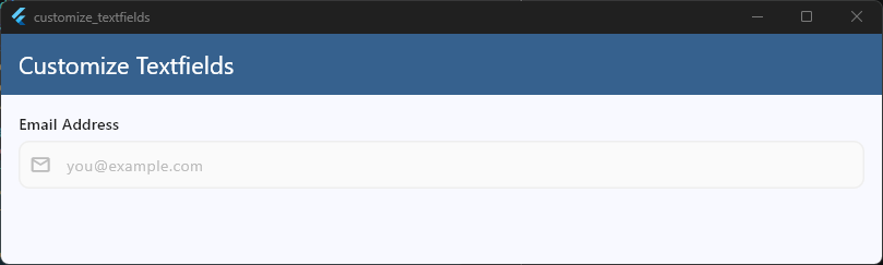
By putting your architecture into custom modules, you keep your features separate, your codebase incredibly clean, and your UI perfectly unified. For a deeper look into structuring these layouts across larger projects, take a look at our architectural breakdown on Building Reusable UI Components.
Ready to take your UI skills to the next level?
Mastering input fields is a great start, but it is just one piece of a much larger puzzle. If you want to stop guessing your way through layout styling and learn how to build production-grade interfaces that look like real, shipped products, check out our Production-Quality UI Course Module.
Instead of building basic tutorial apps, you will dive straight into complex, responsive layouts from scratch. We focus on practical, real-world development—teaching you the exact design-system workflows, advanced state layouts, and clean codebase habits used by top mobile engineering teams.
Upgrade Your Flutter Foundations for the Agentic AI Coding Era
Learn to build rock-solid layout systems and clean components. We teach you how to write predictable, idiomatic Dart code that coordinates perfectly with modern AI terminal and coding tools.