
When people first start building Flutter apps, the AppBar usually feels simple. You add a title, maybe throw in an icon, and move on.
But then reality arrives.
Suddenly the title is off-center on iOS.
The back button appears when you don’t want it.
Your actions feel cramped.
The design looks “default Flutter” instead of polished and professional.
And that’s the moment developers realize:
The Flutter AppBar widget is not just a header. It’s the navigation identity of your entire app.
A well-designed AppBar makes an application feel clean, modern, and trustworthy. A messy one instantly makes even good apps feel unfinished.
In this guide, we’ll break down how the Flutter AppBar actually works, how it connects to Scaffold, and how to customize it properly without fighting the framework every five minutes.
We’ll cover:
- What the Flutter AppBar widget actually does
- How
AppBarandScaffoldwork together - Essential
AppBarproperties in Flutter - Material 3 AppBar updates
- Custom AppBar patterns professionals use
- Reusable AppBar components
- Common beginner mistakes that cause ugly UI
Whether you’re learning flutter appbar basics or trying to build a fully reusable flutter custom appbar widget, this guide will help you understand the why behind the code — not just copy-paste snippets.
Because once you truly understand the AppBar widget in Flutter, your apps immediately start looking more intentional, more polished, and way more production-ready.
Want to Build Professional Flutter Apps?
Get the free Build Your First Android App video class and learn Flutter through practical, beginner-friendly projects.
- Want to Build Professional Flutter Apps?
- What the AppBar Handles Automatically
- The AppBar Is Part of Material Design
- The AppBar Is More Than a Title
- Why Understanding AppBar Properly Matters
- Think of Scaffold as the Screen Structure
- Why You Usually Shouldn't Place AppBar Manually
- AppBar Is Not Just a Container
- The Key Rule to Remember
- The Leading Section
- The Title Section
- The Actions Section
- The Flexible Bottom Area
- AppBar Is Built for Structured Navigation
- Changing the Background Color
- Changing Title and Icon Colors
- Understanding AppBar Themes
- Flutter AppBarTheme vs Individual Styling
- Material 3 Changes AppBar Appearance
- Modern AppBars Usually Use Minimal Elevation
- Theme Consistency Matters More Than Fancy Colors
- Why AppBar Titles Are Not Always Centered
- Using centerTitle
- "Centered" Does Not Always Mean Visually Centered
- How Professionals Fix Visual Imbalance
- Global Title Alignment with AppBarTheme
- Material 3 and Title Alignment
- The Real Goal Is Visual Balance
- Using the actions Property
- Professional Apps Are Built One Component at a Time
- Understanding IconButton Properly
- Multiple Actions in an AppBar
- Using Custom Widgets as Actions
- Styling Action Icons
- Using Popup Menus for Cleaner Navigation
- Good AppBar Actions Feel Intentional
- The Leading Widget
- The Trailing Side Uses actions
- Flutter Automatically Handles Leading Widgets
- Leading Width Can Be Customized
- RTL Languages Change Layout Direction
- Professional AppBars Respect UI Expectations
- Why Flutter Adds the Back Button Automatically
- Removing the Back Button Properly
- Why Not Just Use an Empty Leading Widget?
- Removing the Back Button Without Breaking Navigation
- Replacing the Default Back Button
- Material 3 and Navigation Behavior
- The Real Goal Is Intentional Navigation
- Build Flutter Apps That Feel More Professional
- Why Reusable AppBars Matter
- Creating a Simple Reusable AppBar
- Why PreferredSizeWidget Is Required
- Making the AppBar More Flexible
- Keeping AppBars in Separate Files
- Don’t Over-Abstract Too Early
- Reusable Components Make Apps Feel Cohesive
- The Default AppBar Height
- Why AppBar Height Is Special
- Understanding PreferredSizeWidget
- Creating a Custom Sized AppBar
- Using PreferredSize Directly
- Bigger AppBars Need Better Internal Spacing
- Material 3 Introduced New AppBar Sizes
- PreferredSizeWidget Errors Are Actually Helpful
- Mistake #1: Treating AppBar Like a Normal Container
- Mistake #2: Overcrowding the AppBar
- Mistake #3: Ignoring Visual Balance
- Mistake #4: Hardcoding Colors Everywhere
- Mistake #5: Forgetting PreferredSizeWidget
- Mistake #6: Fighting the Default Navigation Behavior
- Mistake #7: Making the AppBar Too Tall Without Redesigning It
- Mistake #8: Ignoring Material 3 Behavior
- Most AppBar Problems Come From Fighting the Framework
- Enabling Material 3 in Flutter
- AppBars Became Cleaner and More Minimal
- Surface Tinting Confuses Many Developers
- Large and Medium AppBars
- Material 3 Encourages Better Hierarchy
- AppBar Themes Matter More in Material 3
- Material 3 Is Not Just “Different Styling”
- Resources & References
- Ready to Build Apps That Feel Production-Ready?
What the Flutter AppBar Widget Actually Does
At first glance, the Flutter AppBar looks like “just the top bar.” But internally, it’s much more important than that.
The AppBar widget in Flutter is a prebuilt Material Design navigation bar that sits at the top of a screen and helps users understand:
- Where they are
- What screen they’re viewing
- What actions are available
- How to navigate backward or elsewhere
In Flutter, the AppBar is most commonly attached to a Scaffold using the appBar: property:
Scaffold(
  appBar: AppBar(
    title: const Text('Home'),
  ),
)
Code language: JavaScript (javascript)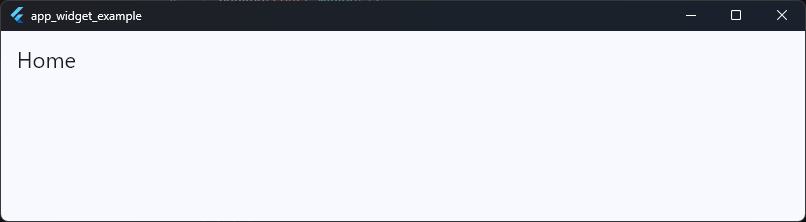
This creates the standard top navigation area used in most Flutter applications.
What the AppBar Handles Automatically
One reason developers love the Flutter AppBar widget is because it already handles a lot of difficult UI behavior for you.
A Flutter Material AppBar automatically manages:
- Safe spacing around status bars
- Toolbar height
- Navigation placement
- Back button behavior
- Elevation and shadows
- Material styling
- Responsive layout behavior
- Theme integration
That means you don’t need to manually calculate padding for notches, status bars, or toolbar alignment. Flutter handles it for you.
The AppBar Is Part of Material Design
The AppBar class in Flutter is built around Google’s Material Design system. That’s why the default behavior feels similar to Android apps like:
- Gmail
- Google Maps
- Play Store
- YouTube
The widget follows Material rules for spacing, animation, elevation, and interaction. In modern Flutter apps, especially with flutter material3 appbar styling, the AppBar can also adapt dynamically to scrolling, surface tinting, and large-screen layouts.
The AppBar Is More Than a Title
Many beginners think an AppBar only displays text. But the widget is actually designed to hold multiple navigation and interaction elements at once.
A professional Flutter AppBar often includes:
- A leading widget (menu or back button)
- A centered or aligned title
- Action buttons
- Search interactions
- Profile avatars
- Tabs
- Custom heights
- Flexible backgrounds
Example:
AppBar(
  leading: IconButton(
    onPressed: () {},
    icon: const Icon(Icons.menu),
  ),
  title: const Text('Dashboard'),
  actions: [
    IconButton(
      onPressed: () {},
      icon: const Icon(Icons.notifications),
    ),
    IconButton(
      onPressed: () {},
      icon: const Icon(Icons.settings),
    ),
  ],
)
Code language: JavaScript (javascript)
This creates a much more functional navigation experience than a simple text header.
Why Understanding AppBar Properly Matters
A surprising number of Flutter UI problems happen because developers treat the AppBar like a random container instead of a structured navigation component.
That usually leads to:
- Misaligned titles
- Strange spacing
- Overflow issues
- Broken back navigation
- Inconsistent screen layouts
- Ugly custom headers
Once you understand what the Flutter AppBar widget is actually responsible for, customization becomes dramatically easier. And more importantly:
Your app immediately starts feeling professional instead of “default tutorial app.”
AppBar vs Scaffold Relationship
One of the biggest beginner misunderstandings in Flutter is thinking the AppBar works independently. It doesn’t.
The Flutter AppBar widget is designed to work with Scaffold.
In fact, the Scaffold is what positions, sizes, and displays the AppBar correctly on the screen.
Think of Scaffold as the Screen Structure
A good mental model is this:
Scaffold= the full page layoutAppBar= the top navigation section inside that layout
The Scaffold manages major screen areas like:
- App bar
- Body content
- Drawer
- Bottom navigation
- Floating action button
- Snackbars
- Bottom sheets
And the AppBar is simply one piece of that structure.
Example:
Scaffold(
  appBar: AppBar(
    title: const Text('Profile'),
  ),
  body: const Center(
    child: Text('Page Content'),
  ),
)
Code language: JavaScript (javascript)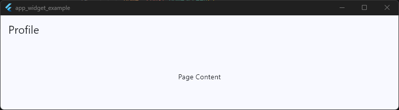
Here’s what happens internally:
Scaffoldcreates the page layout- It reserves space at the top
- It inserts the Flutter AppBar widget there
- The remaining area becomes the
body
Without Scaffold, the AppBar doesn’t know where it should live.
Why You Usually Shouldn’t Place AppBar Manually
Beginners sometimes try this:
Column(
  children: [
    AppBar(
      title: const Text('Home'),
    ),
    Expanded(
      child: Container(),
    ),
  ],
)
Code language: JavaScript (javascript)
This usually causes layout issues or strange behavior.
Why?
Because the AppBar class expects a Scaffold parent that understands:
- Toolbar sizing
- Status bar padding
- Material elevation behavior
- Safe areas
- Scroll interactions
Without Scaffold, Flutter treats the AppBar like a normal widget, and many automatic behaviors stop working correctly.
Scaffold Gives AppBar Its “Smart” Features
When used correctly inside Scaffold, the Flutter Material AppBar gains automatic functionality like:
Automatic Back Buttons
If Flutter detects navigation history, Scaffold + AppBar can automatically show a back arrow.
Scaffold(
  appBar: AppBar(
    title: const Text('Settings'),
  ),
)
Code language: JavaScript (javascript)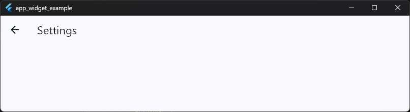
No manual back button needed in many cases.
Proper Safe Area Handling
The AppBar automatically avoids:
- Status bars
- Camera notches
- Dynamic island areas
- System overlays
You don’t need manual padding hacks.
Correct Elevation and Material Rendering
The Scaffold provides the Material environment the AppBar expects. That’s how shadows, overlays, ripple effects, and Material 3 styling work properly.
AppBar Is Not Just a Container
Technically, you can build a custom top bar using Container. But then you must manually handle:
- Status bar spacing
- Toolbar height
- Theme integration
- Navigation logic
- Animations
- Accessibility
- Responsive behavior
That becomes painful fast. The Flutter AppBar widget already solves all of this cleanly.
That’s why professional Flutter apps usually customize the AppBar instead of rebuilding navigation bars from scratch.
The Key Rule to Remember
This relationship is the important takeaway:
Scaffoldcontrols the page structure.AppBarcontrols the top navigation area.
Once that mental model clicks, Flutter layout architecture starts making much more sense.
Basic AppBar Structure Explained
Before customizing anything, it’s important to understand how the Flutter AppBar is actually structured internally.
A lot of AppBar confusion comes from developers adding widgets randomly without understanding what each section is responsible for.
Once you understand the layout structure, customizing the AppBar becomes much easier, and your UI instantly becomes cleaner and more consistent.
At its core, the Flutter AppBar widget is divided into a few major sections:
appBar: AppBar(
  leading: Icon(Icons.menu),
  title: Text('Dashboard'),
  actions: [
    IconButton(onPressed: () {}, icon: Icon(Icons.search)),
    IconButton(onPressed: () {}, icon: Icon(Icons.settings)),
  ],
),
Code language: JavaScript (javascript)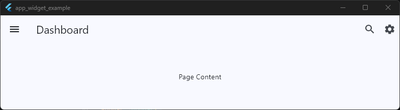
This simple example already contains the three most important AppBar areas.
The Leading Section
The leading area appears at the far left side of the AppBar. This section is usually reserved for navigation-related widgets, such as:
- Back buttons
- Menu icons
- Drawer buttons
- Close buttons
- Profile avatars
Example:
appBar: AppBar(
  leading: IconButton(
    onPressed: () {},
    icon: const Icon(Icons.arrow_back),
  ),
  title: const Text('Back Button Example'),
),
Code language: JavaScript (javascript)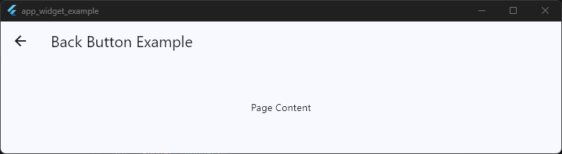
In many Flutter screens, you won’t even need to define this manually because the Flutter Material AppBar can automatically insert a back button when navigation history exists.
That automatic behavior is one reason the AppBar feels so smart out of the box.
The Title Section
The title is the main content area of the AppBar. Most apps use text here, but the title can actually be any widget.
That means you can place:
- Logos
- Search bars
- Row layouts
- Animated widgets
- User greetings
- Dropdowns
Basic example:
title: const Text('Home'),
Code language: JavaScript (javascript)
Custom example:
title: Row(
  children: [
    const CircleAvatar(),
    const SizedBox(width: 12),
    const Text('Welcome Back'),
  ],
),
Code language: JavaScript (javascript)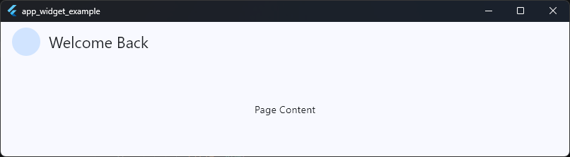
This flexibility is one reason the flutter appbar widget is so widely used in production applications.
It’s not limited to simple titles at all.
The Actions Section
The actions property appears on the far right side of the AppBar. This is typically where you place quick-access controls or screen-specific actions.
Examples include:
- Search
- Notifications
- Settings
- Share buttons
- Shopping cart icons
- More menus
Example:
actions: [
  IconButton(
    onPressed: () {},
    icon: const Icon(Icons.search),
  ),
  IconButton(
    onPressed: () {},
    icon: const Icon(Icons.more_vert),
  ),
],
Code language: JavaScript (javascript)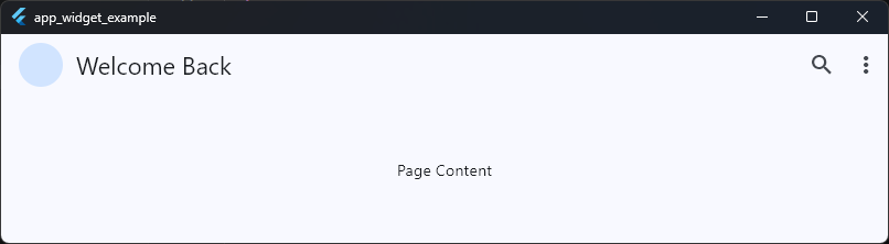
The actions property accepts a list of widgets, which means you’re not limited to icons.
You can add:
- Text buttons
- Avatars
- Switches
- Progress indicators
- Custom widgets
Professionally designed Flutter apps often use this section heavily for user interaction.
The Flexible Bottom Area
Many beginners don’t realize the AppBar also supports a bottom section. This is commonly used for:
- Tabs
- Secondary navigation
- Filters
- Category selectors
Example:
AppBar(
  title: const Text('Messages'),
  bottom: const TabBar(
    tabs: [
      Tab(text: 'Chats'),
      Tab(text: 'Calls'),
    ],
  ),
)
Code language: JavaScript (javascript)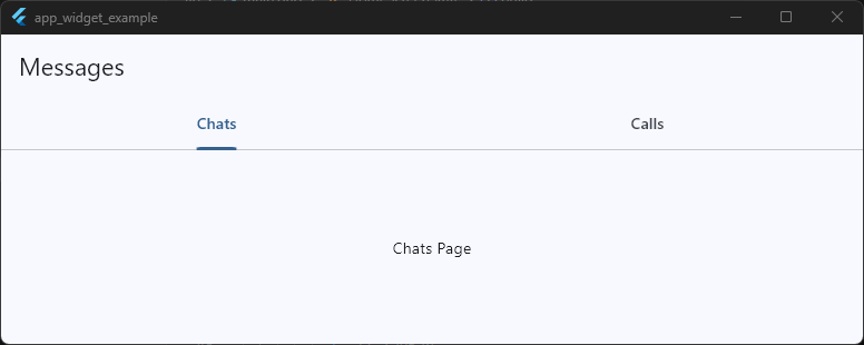
This is how apps like WhatsApp, YouTube, and many Material apps create layered navigation inside the top bar.
AppBar Is Built for Structured Navigation
The important thing to understand is that the Flutter AppBar class is not a random horizontal container. Every section has a purpose:
| Section | Purpose |
|---|---|
leading | Navigation or primary action |
title | Screen identity |
actions | Secondary actions |
bottom | Additional navigation |
Once you start thinking about the AppBar in terms of structure instead of decoration, designing professional navigation bars becomes dramatically easier.
And honestly.. this is usually the point where Flutter UI starts feeling intentional instead of improvised.
Changing AppBar Colors and Themes
One of the fastest ways to make a Flutter app look more polished is learning how to style the AppBar properly.
The default Flutter AppBar is functional, but if every screen uses the stock blue Material bar, the app immediately starts feeling like a beginner tutorial project instead of a real product.
Fortunately, Flutter makes AppBar customization very flexible. You can style:
- Background colors
- Text colors
- Icon colors
- Elevation
- Surface tint
- Shadow behavior
- Theme-wide AppBar styles
- Material 3 appearance
And the best part is that Flutter gives you both screen-level customization and global theme control.
Changing the Background Color
The most common customization is changing the AppBar background color using backgroundColor.
appBar: AppBar(
  title: const Text('Dashboard'),
  backgroundColor: Colors.deepPurple,
  foregroundColor: Colors.white,
),
Code language: JavaScript (javascript)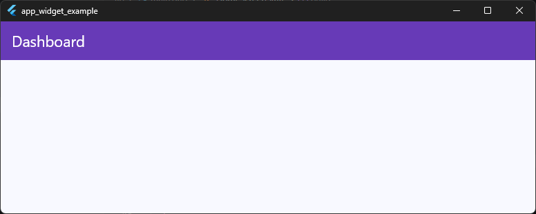
This immediately changes the entire top bar color.
You can use:
- Flutter color constants
- Custom hex colors
- Theme colors
- Dynamic colors
Example with a custom color:
backgroundColor: const Color(0xFF121212),Code language: JavaScript (javascript)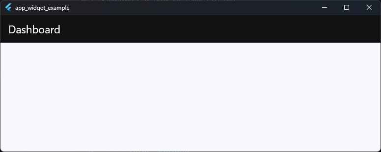
Dark AppBars are extremely common in modern apps because they create a cleaner and more premium look.
Changing Title and Icon Colors
Many beginners change the background color and then wonder why the text becomes unreadable.
That’s because the title and icons also need proper contrast. You can style them using:
foregroundColoriconThemetitleTextStyle
Example:
AppBar(
  backgroundColor: Colors.black,
  foregroundColor: Colors.white,
  title: const Text('Profile'),
)
Code language: JavaScript (javascript)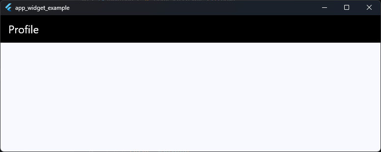
The foregroundColor automatically affects:
- Title text
- Leading icons
- Action icons
This is usually the cleanest approach.
Understanding AppBar Themes
If you style every AppBar manually, your codebase becomes repetitive very quickly. That’s where flutter appbar theme support becomes incredibly useful.
Flutter allows you to define a global AppBarTheme inside your app theme.
Example:
return MaterialApp(
  title: 'App Bar Widget Example',
  debugShowCheckedModeBanner: false,
  theme: ThemeData(
    appBarTheme: const AppBarTheme(
      backgroundColor: Colors.black,
      foregroundColor: Colors.white,
      elevation: 0,
      centerTitle: true,
    ),
  ),
  home: const HomeScreen(),
)
Code language: JavaScript (javascript)
Now every AppBar in the app automatically uses those styles. This is the proper way to maintain visual consistency across large Flutter applications.
Flutter AppBarTheme vs Individual Styling
A simple rule professionals follow:
| Use Case | Best Approach |
|---|---|
| One unique screen | Style AppBar directly |
| Entire app styling | Use AppBarTheme |
| Shared reusable navigation | Create custom AppBar widget |
A lot of developers over-customize individual screens and accidentally create inconsistent UI. Using flutter appbartheme properly helps your app feel unified and intentional.
Material 3 Changes AppBar Appearance
If your app uses Material 3, you may notice something strange. Your AppBar colors don’t look exactly like the color you set. That’s because Flutter Material 3 introduces surface tinting and updated elevation behavior.
Example:
return MaterialApp(
  title: 'AppBar Example',
  debugShowCheckedModeBanner: false,
  theme: ThemeData(
    useMaterial3: true,
Code language: JavaScript (javascript)
With Material 3 enabled, AppBars can apply subtle overlays automatically. Sometimes developers think their colors are “wrong,” but Flutter is actually applying Material 3 styling rules.
To disable the tint effect:
AppBar(
  surfaceTintColor: Colors.transparent,
)
Code language: CSS (css)
This restores a flatter appearance.
Modern AppBars Usually Use Minimal Elevation
Older Material Design heavily used shadows and elevation. Modern Flutter apps often prefer cleaner AppBars with little or no shadow.
Example:
AppBar(
  elevation: 0,
)
This creates a flatter and more modern UI style that works especially well with Material 3.
Theme Consistency Matters More Than Fancy Colors
A professional AppBar is usually not about using flashy gradients or complicated styling. What actually makes an app feel polished is consistency.
Good Flutter apps typically keep:
- Consistent AppBar heights
- Consistent title alignment
- Matching icon colors
- Unified elevation behavior
- Predictable navigation styling
Small visual inconsistencies are surprisingly noticeable to users. And honestly, this is one of those areas where clean design beats “creative” design almost every time.
Centering Titles Correctly
Centering the AppBar title in Flutter sounds simple. Until you try it.
Then suddenly the title looks centered on Android but not on iOS. Or it shifts slightly because of action buttons. Or the back button pushes everything off balance and now your UI feels strangely “crooked.”
This is one of the most common beginner frustrations with the Flutter AppBar. And the confusing part is, Flutter is not broken.
The AppBar is actually following platform-specific design behavior.
Why AppBar Titles Are Not Always Centered
By default, Flutter follows Material Design conventions.
That means:
- Android usually uses left-aligned titles
- iOS often uses centered titles
So depending on the platform, your AppBar may automatically behave differently.
Example:
AppBar(
  title: const Text('Home'),
)
Code language: JavaScript (javascript)
This can produce different visual alignment across devices. For beginners, this often feels inconsistent or buggy.
But Flutter is intentionally adapting to platform design guidelines.
Using centerTitle
If you want consistent title alignment across all platforms, use the centerTitle property.
AppBar(
  centerTitle: true,
  title: const Text('Dashboard'),
)
Code language: JavaScript (javascript)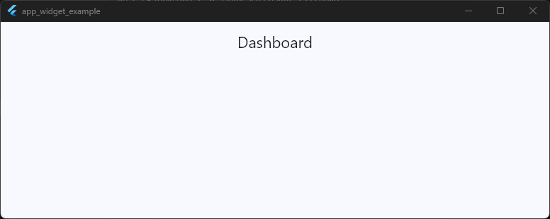
This forces the title into the center regardless of platform. You can also explicitly disable centering:
centerTitle: false,
Code language: JavaScript (javascript)
Simple.
But there’s an important detail most tutorials skip.
“Centered” Does Not Always Mean Visually Centered
Here’s where developers get confused. Even with:
centerTitle: true,
Code language: JavaScript (javascript)
..the title can still look slightly off-center.
Why? Because the AppBar layout must account for:
- Leading widgets
- Action buttons
- Navigation spacing
- Platform padding
- Toolbar constraints
For example:
AppBar(
  centerTitle: true,
  title: const Text('Messages'),
  actions: [
    IconButton(
      onPressed: () {},
      icon: const Icon(Icons.search),
    ),
  ],
)
Code language: JavaScript (javascript)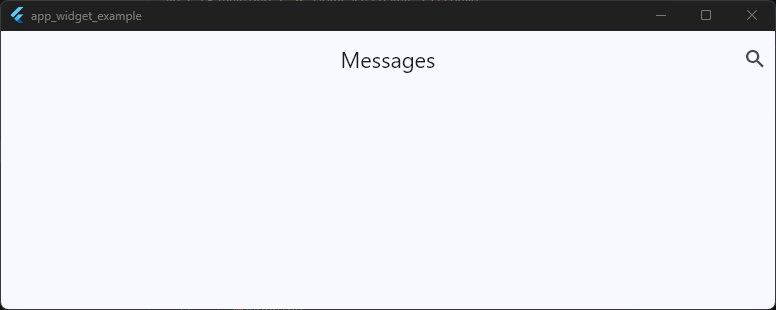
The title is technically centered within the toolbar layout, but visually it may appear shifted because the right side contains actions while the left side does not.
Human eyes notice imbalance very quickly.
How Professionals Fix Visual Imbalance
Professional Flutter apps often balance the layout intentionally. For example:
- Matching icon spacing on both sides
- Using symmetrical actions
- Adding invisible spacing widgets
- Reducing unnecessary actions
Example:
AppBar(
  centerTitle: true,
  leading: IconButton(
    onPressed: () {},
    icon: const Icon(Icons.menu),
  ),
  title: const Text('Home'),
  actions: [
    IconButton(
      onPressed: () {},
      icon: const Icon(Icons.search),
    ),
  ],
)
Code language: JavaScript (javascript)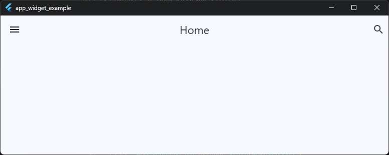
Now the AppBar feels visually balanced because both sides contain similar visual weight. This tiny detail makes a surprisingly big difference in perceived polish.
Global Title Alignment with AppBarTheme
If you want all AppBars in the app to behave consistently, configure it globally using AppBarTheme.
MaterialApp(
  theme: ThemeData(
    appBarTheme: const AppBarTheme(
      centerTitle: true,
    ),
  ),
)Code language: JavaScript (javascript)
This prevents inconsistent title behavior across screens.
Large apps should almost always define this intentionally instead of relying on platform defaults.
Material 3 and Title Alignment
With flutter material3 appbar styling, centered titles are becoming more common in modern UI design, especially in cleaner minimal interfaces.
However, Material 3 also introduces:
- Large AppBars
- Medium AppBars
- Scroll-aware AppBars
So title positioning may behave differently depending on the AppBar type being used. That’s another reason understanding layout structure matters more than blindly toggling properties.
The Real Goal Is Visual Balance
The biggest lesson here is, perfect mathematical centering is not always the same as good visual design. A professional AppBar feels balanced, intentional, and easy to scan. Sometimes that means centering the title.
Sometimes it means aligning it left.
And sometimes the cleanest choice is removing extra icons entirely instead of fighting layout spacing for 20 minutes like a sleep-deprived Flutter gremlin.
Adding Icons and Action Buttons
A plain AppBar title works fine for simple screens. But real applications usually need interaction directly inside the navigation bar.
That’s where icons and action buttons become important.
The Flutter AppBar widget is designed to support quick-access actions without forcing users to navigate through multiple screens or menus.
This is why most professional apps place important controls directly inside the AppBar itself. Common examples include:
- Search buttons
- Notifications
- Settings
- Share actions
- Shopping carts
- Profile avatars
- Overflow menus
These small interactions make an app feel faster, cleaner, and much more modern.
Using the actions Property
In Flutter, AppBar action buttons are added using the actions property. The actions property accepts a list of widgets displayed on the right side of the AppBar.
Example:
AppBar(
  title: const Text('Dashboard'),
  actions: [
    IconButton(
      onPressed: () {},
      icon: const Icon(Icons.search),
    ),
    IconButton(
      onPressed: () {},
      icon: const Icon(Icons.notifications),
    ),
  ],
)
Code language: JavaScript (javascript)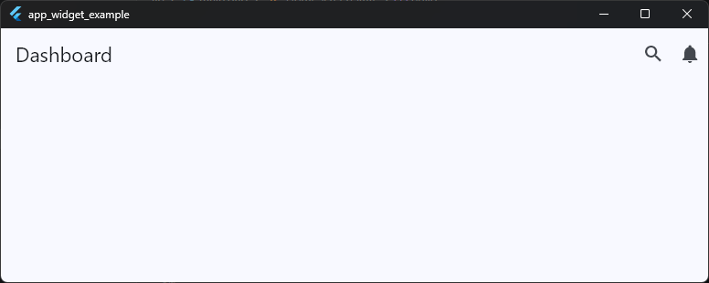
This creates two interactive icons on the trailing side of the AppBar. Most Flutter apps use IconButton here because it already includes:
- Tap animations
- Material ripple effects
- Accessibility support
- Proper sizing
- Touch-friendly padding
That means you should almost always prefer IconButton over manually wrapping icons with GestureDetector.
Professional Apps Are Built One Component at a Time
Get the free Build Your First Android App video class and learn how real Flutter apps are designed, structured, and built.
Understanding IconButton Properly
Many beginners think the icon itself is clickable. Technically, the button widget handles the interaction — not the icon.
Example:
IconButton(
  onPressed: () {
    print('Search tapped');
  },
  icon: const Icon(Icons.search),
)
Code language: PHP (php)
Here:
IconButtonmanages interactionIcononly handles visuals
This distinction matters because Flutter’s Material system expects interactive widgets to provide proper accessibility and touch behavior.
Multiple Actions in an AppBar
The actions property accepts a list, so you can add multiple controls easily.
Example:
AppBar(
  title: const Text('Store'),
  actions: [
    IconButton(
      onPressed: () {},
      icon: const Icon(Icons.favorite_border),
    ),
    IconButton(
      onPressed: () {},
      icon: const Icon(Icons.shopping_cart_outlined),
    ),
    IconButton(
      onPressed: () {},
      icon: const Icon(Icons.more_vert),
    ),
  ],
)
Code language: JavaScript (javascript)
This layout pattern is extremely common in production Flutter applications. However, there’s an important UI rule many beginners ignore:
Too many AppBar actions create clutter very quickly.
A crowded AppBar feels stressful and visually noisy.
Professionally designed apps usually keep AppBar actions minimal and focused.
Using Custom Widgets as Actions
The actions property is not limited to icons. You can place almost any widget there.
Example with a profile avatar:
actions: [
  Padding(
    padding: const EdgeInsets.only(right: 12),
    child: CircleAvatar(
      backgroundColor: Colors.white,
      child: const Icon(Icons.person),
    ),
  ),
],
Code language: JavaScript (javascript)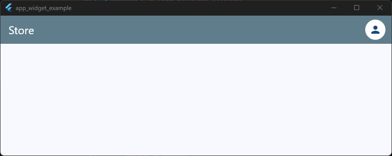
You can also add:
- Text buttons
- Loading indicators
- Switches
- Popup menus
- Animated widgets
This flexibility makes the flutter appbar widget powerful enough for complex navigation systems.
Styling Action Icons
By default, AppBar actions inherit the AppBar’s foreground styling.
Example:
AppBar(
  backgroundColor: Colors.black,
  foregroundColor: Colors.white,
)
Code language: CSS (css)
This automatically updates:
- Action icon colors
- Leading icon colors
- Title text color
You can also style icons individually:
IconButton(
  onPressed: () {},
  icon: const Icon(
    Icons.favorite,
    color: Colors.red,
  ),
)
Code language: CSS (css)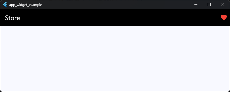
But in larger apps, consistent AppBar styling through themes is usually cleaner.
Using Popup Menus for Cleaner Navigation
Instead of stuffing five icons into the AppBar, professional apps often use overflow menus.
Example:
actions: [
  PopupMenuButton<String>(
    onSelected: (value) {},
    itemBuilder: (context) => [
      const PopupMenuItem(
        value: 'settings',
        child: Text('Settings'),
      ),
      const PopupMenuItem(
        value: 'logout',
        child: Text('Logout'),
      ),
    ],
  ),
]
Code language: JavaScript (javascript)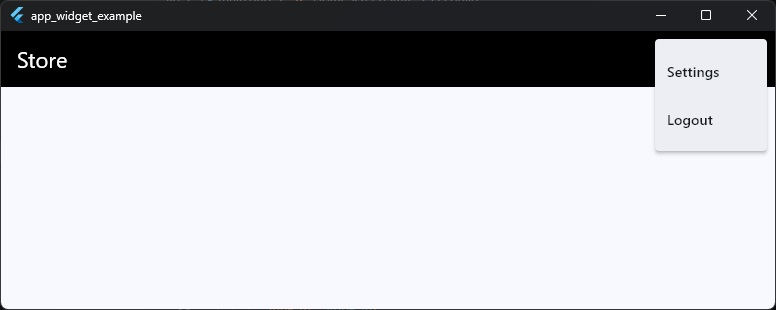
This keeps the AppBar visually clean while still exposing important functionality.
It’s a small UX decision that makes apps feel dramatically more polished.
Good AppBar Actions Feel Intentional
One of the easiest ways to spot an inexperienced UI design is random AppBar icons with no clear priority.
Professional Flutter apps usually ask:
- Which actions matter most?
- What should users access quickly?
- What belongs in a menu instead?
- Is this action relevant on this screen?
The best AppBars are not the ones with the most buttons. They’re the ones where every action feels purposeful, balanced, and easy to understand at a glance.
Leading vs Trailing Widgets Explained
One of the easiest ways to accidentally create a confusing AppBar is misunderstanding the difference between leading and trailing widgets.
These terms sound fancy at first, but the idea is actually simple.
In Flutter AppBar layout terminology:
- Leading = the starting side of the AppBar
- Trailing = the ending side of the AppBar
In left-to-right languages like English:
- Leading → left side
- Trailing → right side
The Flutter AppBar widget uses this structure to organize navigation and actions in a predictable way.
And predictability is extremely important in UI design. Users instinctively expect certain things to appear in certain places.
The Leading Widget
The leading property controls the widget displayed at the start of the AppBar.
Example:
AppBar(
  leading: IconButton(
    onPressed: () {},
    icon: const Icon(Icons.menu),
  ),
  title: const Text('Home'),
)
Code language: JavaScript (javascript)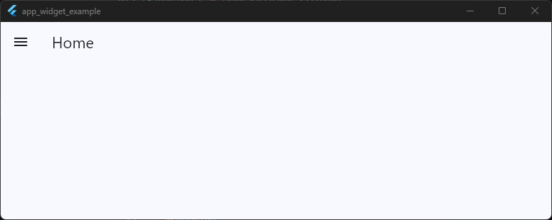
This usually contains navigation-related controls. Common leading widgets include:
- Back buttons
- Drawer menus
- Close buttons
- Navigation icons
- Small profile avatars
The leading area is primarily about screen movement and navigation. That’s why Flutter automatically places back buttons there.
The Trailing Side Uses actions
Flutter doesn’t have a property literally called trailing. Instead, the trailing side is controlled using the actions property.
Example:
AppBar(
  title: const Text('Messages'),
  actions: [
    IconButton(
      onPressed: () {},
      icon: const Icon(Icons.search),
    ),
  ],
)
Code language: JavaScript (javascript)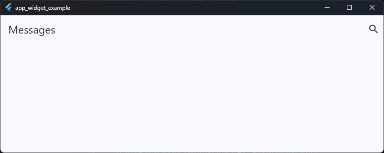
This places widgets on the far right side of the AppBar. These are usually screen-specific actions, not navigation controls.
Common trailing widgets include:
- Search
- Notifications
- Settings
- Share buttons
- More menus
- Shopping carts
This distinction matters because users subconsciously associate placement with meaning.
Navigation vs Actions
A good rule to remember is:
| Area | Purpose |
|---|---|
| Leading | Navigation |
Trailing (actions) | Screen actions |
That means:
Good Leading Examples
- Back arrow
- Hamburger menu
- Close button
Good Trailing Examples
- Search
- Save
- Edit
- Settings
When developers mix these responsibilities randomly, the UI starts feeling awkward very quickly.
Flutter Automatically Handles Leading Widgets
One of the smartest parts of the Flutter Material AppBar is automatic leading behavior.
Example:
AppBar(
  title: const Text('Settings'),
)
Code language: JavaScript (javascript)
If Flutter detects navigation history, it may automatically insert a back button into the leading area.
This behavior comes from the navigation stack managed by Navigator. That’s why many screens already show a back arrow even when you never added one manually.
Honestly, this is one of those Flutter features beginners accidentally fight against for weeks before realizing the framework was trying to help the entire time.
Leading Width Can Be Customized
By default, Flutter reserves a fixed amount of space for the leading widget. Sometimes custom designs need more room.
Example:
AppBar(
  leadingWidth: 100,
  leading: Row(
    children: [
      IconButton(
        onPressed: () {},
        icon: const Icon(Icons.menu),
      ),
      const CircleAvatar(),
    ],
  ),
)
Code language: JavaScript (javascript)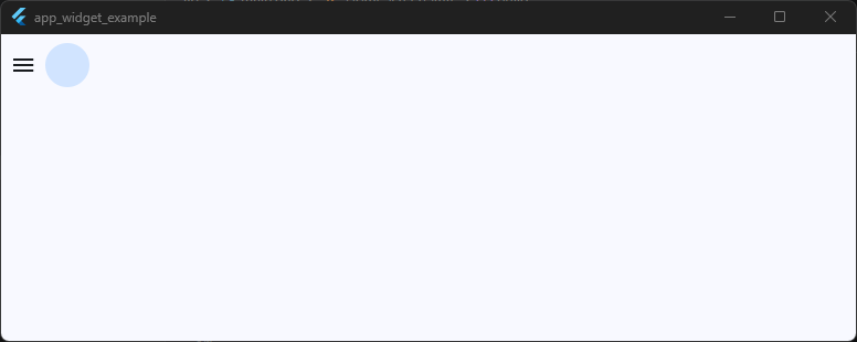
This is useful for more advanced custom AppBar layouts. But use it carefully.
Oversized leading sections can easily break visual balance.
RTL Languages Change Layout Direction
Flutter also supports right-to-left languages automatically. In RTL layouts:
- Leading moves to the right
- Trailing moves to the left
That’s why Flutter uses the terms leading and trailing instead of hardcoding “left” and “right.” It’s part of Flutter’s internationalization-friendly design system.
Professional AppBars Respect UI Expectations
One reason polished apps feel intuitive is because they follow established navigation patterns consistently.
Users expect:
- Navigation controls near the leading side
- Quick actions on the trailing side
- Titles in predictable positions
When those expectations are broken without good reason, apps immediately feel harder to use. The Flutter AppBar class already provides a strong structure for this.
The trick is learning when to customize the layout… and when to simply let the framework do its job instead of turning the AppBar into a tiny overcrowded control panel fighting for survival.
Removing the Default Back Button
One of the first “wait… why is Flutter doing that?” moments many developers experience is opening a new screen and suddenly seeing a back button appear automatically.
You didn’t add it.
You didn’t style it.
And yet there it is.
That’s because the Flutter AppBar automatically inserts a back button when the current route can navigate backward.
This behavior comes from Flutter’s navigation system and is usually extremely helpful. But sometimes you don’t want the default back button.
For example:
- Login screens
- Success pages
- Onboarding flows
- Custom navigation layouts
- Full-screen experiences
- Modal-style pages
In these situations, removing the automatic back button gives you cleaner control over the UI.
Why Flutter Adds the Back Button Automatically
When you navigate to a new screen using:
Navigator.push(
  context,
  MaterialPageRoute(
    builder: (_) => const SettingsPage(),
  ),
)
Code language: JavaScript (javascript)
Flutter adds that screen to the navigation stack.
The AppBar then detects:
“This screen can pop back to a previous route.”
So it automatically inserts a back arrow into the leading area.
Example:
AppBar(
  title: const Text('Settings'),
)
Code language: JavaScript (javascript)
Even without specifying leading, Flutter may show the back button automatically. This behavior is controlled internally by the automaticallyImplyLeading property.
Removing the Back Button Properly
The cleanest way to remove the default back button is:
AppBar(
  automaticallyImplyLeading: false,
  title: const Text('Login'),
)
Code language: JavaScript (javascript)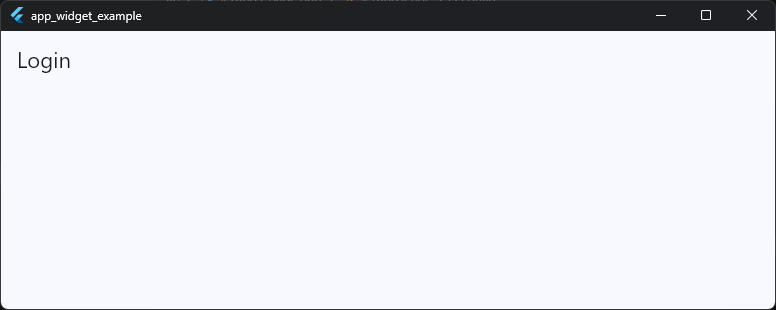
This tells Flutter:
“Do not insert automatic navigation widgets.”
Now the AppBar appears without the back arrow. This is the most common and recommended approach.
Why Not Just Use an Empty Leading Widget?
Some beginners try this:
leading: Container(),
Code language: HTTP (http)
Technically, it works.
But it’s not ideal.
Why?
Because Flutter still reserves space for the leading area, which can create awkward title alignment or unnecessary spacing.
Using:
automaticallyImplyLeading: false,
Code language: JavaScript (javascript)
is cleaner and more intentional.
It removes both:
- The automatic button
- The automatic leading behavior
Removing the Back Button Without Breaking Navigation
Here’s an important UX consideration:
Just because you can remove the back button doesn’t always mean you should.
Users rely heavily on navigation consistency.
Removing the back button carelessly can make apps feel confusing or “trapped.”
Professional apps usually remove back navigation only when:
- The flow is intentionally linear
- Returning would break the experience
- Alternative navigation exists
- The screen is a root page
Good navigation design is less about visual minimalism and more about helping users feel oriented.
Replacing the Default Back Button
Sometimes developers don’t want to remove navigation entirely — they just want a custom design.
In that case, disable the automatic button and provide your own leading widget.
Example:
AppBar(
  automaticallyImplyLeading: false,
  leading: IconButton(
    onPressed: () {
      Navigator.pop(context);
    },
    icon: const Icon(Icons.close),
  ),
  title: const Text('Edit Profile'),
)
Code language: JavaScript (javascript)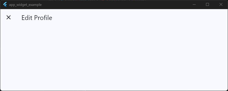
This is very common in:
- Modal pages
- Custom iOS-style layouts
- Full-screen dialogs
- Modern Material 3 designs
You still preserve navigation behavior while gaining full visual control.
Material 3 and Navigation Behavior
With flutter material3 appbar styling, many apps now prefer cleaner top bars with simplified navigation patterns.
That often means:
- Minimal icons
- Lower visual weight
- Cleaner spacing
- Contextual navigation controls
But even in Material 3, navigation clarity still matters more than aesthetic trends. A beautiful AppBar that confuses users is still a bad AppBar.
The Real Goal Is Intentional Navigation
The key thing to understand is this:
Flutter’s automatic back button is not random.
It’s part of a larger navigation system designed to make apps feel predictable and easy to use. So when you remove it, do it intentionally.
Not because “the arrow looked ugly,” but because the screen genuinely needs a different navigation experience.
That mindset is what separates thoughtful UI design from accidental UI chaos.
Build Flutter Apps That Feel More Professional
Learn practical Flutter UI patterns used in real apps. This free class covers cleaner layouts, polished navigation, and production-ready design decisions.
Creating Reusable Custom AppBar Widgets
One of the biggest mistakes beginners make in Flutter is copying the same AppBar code into every screen.
At first it feels harmless. Then the app grows.
Suddenly you have:
- 14 slightly different AppBars
- inconsistent spacing
- random icon styling
- duplicated code everywhere
- title alignment bugs on some screens
- different elevations across the app
And now changing one navigation style requires editing fifteen files manually. This is exactly why professional Flutter apps create reusable AppBar components.
A reusable flutter custom appbar widget keeps your navigation consistent, easier to maintain, and dramatically cleaner.
Why Reusable AppBars Matter
Good UI systems are built around consistency.
Most production apps share common AppBar behavior like:
- Same background color
- Same title styling
- Same icon theme
- Same elevation
- Same spacing
- Same back button behavior
Instead of rewriting those properties repeatedly, you create one reusable AppBar widget and use it everywhere.
This is one of the easiest ways to make a Flutter codebase feel more professional.
Creating a Simple Reusable AppBar
A common beginner-friendly approach is creating a separate widget file.
Example:
import 'package:flutter/material.dart';

class CustomAppBar extends StatelessWidget
    implements PreferredSizeWidget {
  final String title;

  const CustomAppBar({
    super.key,
    required this.title,
  });

  @override
  Widget build(BuildContext context) {
    return AppBar(
      title: Text(title),
      centerTitle: true,
      elevation: 0,
    );
  }

  @override
  Size get preferredSize =>
      const Size.fromHeight(kToolbarHeight);
}
Code language: JavaScript (javascript)
Now you can reuse it anywhere:
Scaffold(
  appBar: const CustomAppBar(
    title: 'Dashboard',
  ),
)
Code language: JavaScript (javascript)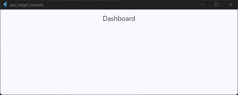
This immediately reduces duplicated AppBar code across the project.
Why PreferredSizeWidget Is Required
This part confuses many developers at first. Why does the custom widget need:
implements PreferredSizeWidget
Because the Scaffold expects the appBar property to know its height in advance.
The Flutter AppBar class already implements PreferredSizeWidget, so when creating a custom wrapper, your widget must provide that sizing information too.
That’s what this does:
@override
Size get preferredSize =>
    const Size.fromHeight(kToolbarHeight);
Code language: CSS (css)
Without it, Flutter won’t know how tall the AppBar should be. And yes.. this is one of those Flutter errors that looks terrifying until you understand it once.
Then it suddenly becomes completely logical.
Making the AppBar More Flexible
Reusable widgets become truly useful when they support customization.
Example:
class CustomAppBar extends StatelessWidget
    implements PreferredSizeWidget {
  final String title;
  final List<Widget>? actions;

  const CustomAppBar({
    super.key,
    required this.title,
    this.actions,
  });

  @override
  Widget build(BuildContext context) {
    return AppBar(
      title: Text(title),
      centerTitle: true,
      actions: actions,
    );
  }

  @override
  Size get preferredSize =>
      const Size.fromHeight(kToolbarHeight);
}
Code language: PHP (php)
Usage:
Scaffold(
  appBar: CustomAppBar(
    title: 'Profile',
    actions: [
      IconButton(
        onPressed: () {},
        icon: const Icon(Icons.settings),
      ),
    ],
  ),
)
Code language: JavaScript (javascript)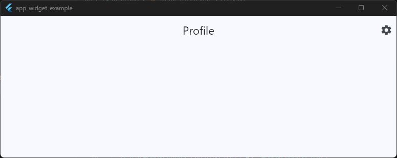
Now the AppBar stays consistent while still allowing screen-specific actions. That balance is important.
Reusable does not mean rigid.
Keeping AppBars in Separate Files
In larger projects, reusable AppBars are usually stored separately.
Example structure:
lib/
 ├── widgets/
 │    ├── custom_app_bar.dart
This approach makes your Flutter app architecture cleaner and easier to scale.
Many developers specifically search for:
flutter appbar in separate fileflutter reusable appbarflutter appbar component
because this pattern becomes extremely valuable as projects grow.
Don’t Over-Abstract Too Early
Here’s an important engineering lesson. Not every AppBar needs a massive abstraction layer.
Some developers create insanely complicated “universal AppBar systems” that become harder to maintain than the original code duplication.
A good reusable AppBar should:
- solve repetition
- improve consistency
- reduce boilerplate
- remain easy to understand
If your AppBar component requires twelve parameters and three enums just to show a title… the abstraction may have gone too far.
Reusable Components Make Apps Feel Cohesive
One subtle reason professional apps feel polished is because their navigation behaves consistently across every screen.
The spacing feels familiar.
The icons feel predictable.
The transitions feel unified.
That usually happens because the team built reusable UI components instead of improvising each screen independently.
And honestly, the AppBar is one of the best places to start building that habit as a Flutter developer.
AppBar Sizing and PreferredSizeWidget
Most developers don’t think about AppBar sizing until they try to customize it.
Then suddenly Flutter throws an error mentioning PreferredSizeWidget, toolbar heights stop behaving correctly, and the AppBar starts acting like it personally took offense to your layout decisions.
This section is where the AppBar architecture starts becoming a little more “Flutter-ish.”
But once you understand it, custom navigation bars become much easier to build correctly.
The Default AppBar Height
By default, the Flutter AppBar uses a standard Material toolbar height.
AppBar(
  title: const Text('Home'),
)
Code language: JavaScript (javascript)
Internally, Flutter uses:
kToolbarHeight
which is:
56.0
Code language: CSS (css)
This gives the AppBar a consistent Material Design height across applications.
Most standard Flutter apps use this default sizing without needing any customization.
Why AppBar Height Is Special
Unlike normal widgets, the AppBar cannot simply size itself dynamically inside a Scaffold.
The Scaffold needs to know the AppBar height before layout happens.
That’s why the AppBar implements:
PreferredSizeWidget
This interface tells Flutter:
“Here’s the size I would like to be.”
The Scaffold reads that preferred size and reserves space for the AppBar at the top of the screen. Without this system, the Scaffold wouldn’t know how much vertical space to allocate.
Understanding PreferredSizeWidget
PreferredSizeWidget is not a visual widget.
It’s simply a contract.
Any widget used as a Scaffold AppBar must provide:
Size get preferredSize
Code language: JavaScript (javascript)
The Flutter AppBar class already does this internally. That’s why normal AppBars work automatically.
But when you create a custom AppBar wrapper, you must implement it yourself.
Creating a Custom Sized AppBar
Example:
class CustomAppBar extends StatelessWidget implements PreferredSizeWidget {
  const CustomAppBar({super.key});

  @override
  Widget build(BuildContext context) {
    return AppBar(
      title: const Text('Dashboard'),
      backgroundColor: Colors.black12,
    );
  }

  @override
  Size get preferredSize => const Size.fromHeight(80);
}
Code language: PHP (php)
Now the AppBar height becomes 80.
Usage:
Scaffold(
  appBar: const CustomAppBar(),
)
Code language: JavaScript (javascript)
This is the correct architecture for reusable custom AppBars in Flutter.
Using PreferredSize Directly
Flutter also provides a helper widget called PreferredSize. This is useful when you only need quick sizing customization.
Example:
Scaffold(
  appBar: PreferredSize(
    preferredSize: const Size.fromHeight(80),
    child: AppBar(
      title: const Text('Profile'),
    ),
  ),
)
Code language: JavaScript (javascript)
This wraps the AppBar and overrides its preferred height. It’s simple and useful for one-off layouts.
Bigger AppBars Need Better Internal Spacing
One common beginner mistake is increasing AppBar height without adjusting its internal content.
Example:
preferredSize: const Size.fromHeight(100),
Code language: JavaScript (javascript)
Now the AppBar becomes taller… but the title still sits awkwardly in the middle with lots of empty space.
Professionally designed larger AppBars usually include:
- custom padding
- flexible layouts
- larger typography
- bottom widgets
- scroll-aware behavior
Simply making the AppBar taller does not automatically make it look better.
Material 3 Introduced New AppBar Sizes
With flutter material3 appbar, Flutter introduced newer AppBar variations like:
- Small AppBar
- Medium AppBar
- Large AppBar
These support more adaptive modern layouts and scrolling behaviors.
Examples include:
SliverAppBar.medium(
  title: Text('Inbox'),
)
Code language: JavaScript (javascript)
and:
SliverAppBar.large(
  title: Text('Library'),
)
Code language: JavaScript (javascript)
These are part of Material 3’s more flexible navigation design system.
Modern Flutter apps increasingly use these larger layouts for cleaner visual hierarchy.
PreferredSizeWidget Errors Are Actually Helpful
When beginners first see errors related to PreferredSizeWidget, they often assume Flutter is being overly complicated.
But the requirement actually exists for a very logical reason: The Scaffold needs predictable layout sizing.
Once you understand that relationship, the architecture makes perfect sense.
And honestly, this is one of those moments where Flutter starts feeling less like “magic framework behavior” and more like a very structured UI system with clear layout rules.
Common Beginner AppBar Mistakes
The Flutter AppBar widget looks deceptively simple. Which is exactly why beginners accidentally break it in creative and deeply confusing ways.
Most AppBar problems are not caused by Flutter bugs. They usually come from misunderstanding how the AppBar is designed to work inside the Material layout system.
The good news is that once you know the common mistakes, they become very easy to avoid.
And honestly… almost every Flutter developer makes at least a few of these early on.
Mistake #1: Treating AppBar Like a Normal Container
One of the most common beginner mistakes is trying to use the AppBar outside a Scaffold.
Example:
Column(
  children: [
    AppBar(
      title: const Text('Home'),
    ),
  ],
)
Code language: JavaScript (javascript)
This often causes strange spacing and layout behavior. Why? Because the Flutter AppBar widget expects a Material page structure managed by Scaffold.
The Scaffold handles:
- Safe areas
- Toolbar positioning
- Elevation rendering
- Status bar spacing
- Navigation integration
Without it, the AppBar loses many of its built-in behaviors.
If you truly need a fully custom top section outside Scaffold, it’s usually better to build a custom widget from scratch instead of forcing AppBar into layouts it wasn’t designed for.
Mistake #2: Overcrowding the AppBar
Beginners often try to place everything into the AppBar at once.
Example:
- Search icon
- Notifications
- Settings
- Avatar
- Theme switch
- Language selector
- Random extra menu
Now the AppBar looks like a tiny control center fighting for oxygen. Professional AppBars are usually minimal and focused.
A clean navigation bar helps users quickly understand:
- where they are
- what actions matter most
- what to do next
Too many actions create visual stress very quickly.
Mistake #3: Ignoring Visual Balance
Another common issue is uneven layout weight.
Example:
AppBar(
  centerTitle: true,
  title: const Text('Home'),
  actions: [
    IconButton(
      onPressed: () {},
      icon: const Icon(Icons.search),
    ),
  ],
)
Code language: JavaScript (javascript)
Technically centered. Visually awkward. Because the right side contains an icon while the left side is empty. The human eye notices imbalance immediately.
Professional Flutter apps pay close attention to spacing symmetry and visual weight, especially in navigation bars.
Mistake #4: Hardcoding Colors Everywhere
Many beginners style every AppBar individually.
Example:
AppBar(
  backgroundColor: Colors.black,
)
Code language: CSS (css)
Then another screen uses a slightly different black.
Then another uses a different elevation.
Then another changes icon colors.
Eventually the app loses visual consistency. A better approach is using:
AppBarTheme
inside your app theme.
This keeps navigation styling unified across the project.
Mistake #5: Forgetting PreferredSizeWidget
This error attacks almost every Flutter developer at least once. You create a custom AppBar widget:
class CustomHeader extends StatelessWidget {
Code language: JavaScript (javascript)
Then Flutter throws an error because the widget does not implement:
PreferredSizeWidget
The reason is simple:
The Scaffold needs to know the AppBar height before layout happens.
Once developers understand that relationship, the error becomes much less mysterious.
Still annoying the first time though. Flutter definitely delivers that message with the emotional warmth of a tax document.
Mistake #6: Fighting the Default Navigation Behavior
Some beginners manually add back buttons to every screen:
leading: IconButton(
  onPressed: () {
    Navigator.pop(context);
  },
  icon: const Icon(Icons.arrow_back),
),
Code language: JavaScript (javascript)
Even though Flutter would have added one automatically.
The result is often:
- duplicate back buttons
- inconsistent navigation
- unnecessary code
The Flutter Material AppBar already handles navigation intelligently in many situations.
Understanding the framework’s defaults saves a lot of effort.
Mistake #7: Making the AppBar Too Tall Without Redesigning It
Increasing AppBar height alone rarely improves the UI.
Example:
preferredSize: const Size.fromHeight(120),
Code language: JavaScript (javascript)
Now there’s just… empty vertical space.
Larger AppBars need supporting layout changes like:
- larger typography
- flexible spacing
- bottom widgets
- scroll behavior
- better visual hierarchy
Good UI scaling is about proportion, not just dimensions.
Mistake #8: Ignoring Material 3 Behavior
With flutter material3 appbar, some AppBar styling behaves differently than older tutorials expect. Developers often get confused by:
- surface tinting
- elevation overlays
- new color behavior
- updated spacing
- large AppBar variants
Many outdated tutorials still target older Material behavior, which creates confusion for newer Flutter developers. Understanding whether your app uses Material 2 or Material 3 is now very important for AppBar styling consistency.
Most AppBar Problems Come From Fighting the Framework
The biggest mindset shift for beginners is realizing this: Flutter’s AppBar is already highly engineered.
It already solves:
- accessibility
- responsive spacing
- navigation structure
- Material behavior
- platform adaptation
Professional Flutter development is often less about “forcing custom UI” and more about understanding the system well enough to customize it intelligently.
Once that clicks, AppBar customization becomes dramatically less frustrating — and your apps start feeling polished much faster.
Material 3 AppBar Updates
If you’ve followed older Flutter tutorials, you may notice that modern AppBars behave a little differently now.
Colors look softer.
Elevations feel flatter.
Spacing changes slightly.
Large scrolling AppBars appear more often.
That’s because Flutter has been gradually moving toward Material 3, Google’s newer design system. And the Flutter AppBar widget received some major updates as part of that transition.
For developers, this is important because many older AppBar tutorials were written for Material 2 behavior. If your project uses Material 3, some things may look or behave differently even when the code is technically correct.
Enabling Material 3 in Flutter
Material 3 is enabled through your app theme.
Example:
MaterialApp(
  theme: ThemeData(
    useMaterial3: true,
  ),
)
Code language: JavaScript (javascript)
Once enabled, Flutter automatically updates many Material widgets, including:
- AppBar
- Buttons
- Cards
- Navigation bars
- Menus
- Dialogs
This means your AppBar styling can change significantly without modifying the AppBar code itself.
AppBars Became Cleaner and More Minimal
Material 2 AppBars often relied heavily on:
- strong shadows
- elevated surfaces
- bold color blocks
Material 3 moves toward a softer and more layered visual style. Modern flutter material3 appbar layouts typically use:
- lower elevation
- cleaner spacing
- softer surfaces
- less visual noise
- more adaptive color behavior
This creates interfaces that feel calmer and more modern.
Many professional Flutter apps now intentionally use flatter AppBars with minimal visual clutter.
Surface Tinting Confuses Many Developers
One of the biggest Material 3 changes is surface tinting. Beginners often set an AppBar color and then wonder:
“Why does this color look different from the exact value I used?”
Material 3 applies subtle overlays based on elevation and theme surfaces.
Example:
AppBar(
  backgroundColor: Colors.white,
)
Code language: CSS (css)
Even with pure white, the AppBar may appear slightly tinted depending on elevation behavior.
To remove this effect:
AppBar(
  surfaceTintColor: Colors.transparent,
)
Code language: CSS (css)
This restores a flatter appearance similar to older Material behavior.
Understanding this single property saves an absurd amount of confusion.
Large and Medium AppBars
Material 3 introduced more flexible AppBar sizes.
Flutter now includes:
- Small AppBars
- Medium AppBars
- Large AppBars
These are especially useful for modern scrolling layouts.
Example:
SliverAppBar.medium(
  title: const Text('Inbox'),
)
Code language: JavaScript (javascript)
Large variant:
SliverAppBar.large(
  title: const Text('Library'),
)
Code language: JavaScript (javascript)
These AppBars expand and collapse naturally during scrolling, creating smoother navigation experiences.
This design style is now very common in modern mobile apps.
Material 3 Encourages Better Hierarchy
Older AppBars often looked visually heavy.
Material 3 focuses more on:
- content hierarchy
- spacing rhythm
- adaptive layouts
- typography clarity
- responsive surfaces
The AppBar is no longer treated like a giant colored strip at the top of the screen. Instead, it behaves more like part of a layered interface system.
This subtle shift makes apps feel significantly more modern.
AppBar Themes Matter More in Material 3
Because Material 3 relies heavily on dynamic styling behavior, centralized themes become even more important.
Using:
AppBarThemehelps maintain consistency across:
- colors
- typography
- elevation
- icon styling
- surface behavior
Without a consistent theme strategy, Material 3 apps can quickly feel visually inconsistent.
Material 3 Is Not Just “Different Styling”
A lot of developers think Material 3 is simply a visual redesign. But it’s actually a broader shift toward:
- adaptive UI systems
- responsive components
- accessibility improvements
- cleaner interactions
- scalable layouts
The Flutter AppBar evolved alongside that philosophy.
Which means modern AppBar design is less about decorating a toolbar… and more about building navigation that feels lightweight, structured, and easy to interact with.
And honestly, once you spend some time with properly designed Material 3 AppBars, going back to the old “giant blue rectangle with heavy shadow” era starts feeling surprisingly ancient.
Resources & References
While writing this guide, we referenced Flutter’s official documentation and Material Design guidelines to ensure modern best practices and Material 3 behavior were accurately covered.
Helpful resources:
- Flutter AppBar Documentation
- Flutter AppBarTheme Documentation
- Flutter Scaffold Documentation
- Material 3 Top App Bar Guidelines
- Flutter Material 3 Migration Guide
A well-designed AppBar does more than hold a title — it shapes how users experience navigation throughout your entire app. Once you understand how Flutter’s AppBar system works, building polished and reusable navigation becomes dramatically easier.
Ready to Build Apps That Feel Production-Ready?
Get the free Build Your First Android App video class and learn how professional Flutter apps come together through real-world projects.