
The AppBar is the bar that sits at the top of a screen (inside a Scaffold) and shows the screen title, navigation controls (like back buttons) and action buttons.
Why a beginner should care
Because almost every app uses an AppBar — it gives users context (what screen they’re on), navigation (back/home), and quick actions (search, settings). Learning it early makes your apps look and behave like real apps.
Where it appears in real apps
- The top of most mobile app screens (home, settings, profile).
- Within web apps that mimic mobile layouts.
- On list/detail screens: list pages show a title, detail pages often show a back button and actions.
- Screens that need quick-access features (search, add, share).
Quick example use case
A note-taking app uses an AppBar to show “Notes” as the title, a search icon to filter notes, and an add button to create a new note.
A product details page shows a back arrow in the AppBar and a favorite (heart) action for quick bookmarking.
Official definition in beginner words
The AppBar is a built-in Flutter widget that creates the top bar of your app’s screen. It usually shows a title, buttons, and sometimes menus, making the screen feel structured and easy to navigate.
Type of widget
AppBar is a Stateless widget. It doesn’t manage any internal state — it simply displays whatever you configure: title, colors, icons, elevation, etc.
Core properties
- title — The main text shown in the center/left of the bar.
- leading — A back button or any widget placed at the start of the AppBar.
- actions — A row of widgets/icons placed at the right side.
- backgroundColor — Controls the color of the AppBar.
- elevation — Controls the shadow under the bar.
- centerTitle — Whether the title should be centered.
- toolbarHeight — Sets how tall the AppBar should be.
Visual Example
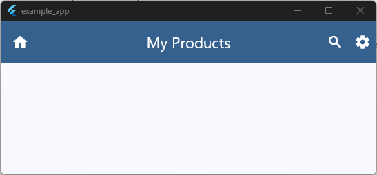
appBar: AppBar(
  leading: const Icon(Icons.home),
  title: const Text('My Products'),
  backgroundColor: Theme.of(context).colorScheme.primary,
  foregroundColor: Theme.of(context).colorScheme.onPrimary,
  elevation: 3,
  centerTitle: true,
  toolbarHeight: 60,
  actions: [
    IconButton(
      icon: const Icon(Icons.search),
      onPressed: () {
        // Handle search action here
      },
    ),
    IconButton(
      icon: const Icon(Icons.settings),
      onPressed: () {
        // Handle settings action here
      },
    ),
  ],
),
Code language: JavaScript (javascript)
It’s the “top section” of your app where navigation lives.
When Should You Use AppBar?
Use an AppBar whenever you want the top of your screen to guide the user — with navigation, titles, or quick actions. Here are the most common scenarios:
1. When your screen needs a clear title
If you want users to instantly know where they are (Home, Settings, Profile, Notes), an AppBar gives that visual clarity.
2. When the screen needs navigation controls
Use an AppBar when you want:
- A back button
- A menu button
- A drawer icon
- Any “go back / open something” action
It keeps navigation consistent across your app.
3. When you need action buttons at the top
If the screen requires quick actions — like search, share, refresh, adding items — the AppBar’s actions property is the perfect place.
4. When the screen is part of a multi-page flow
In apps with lists → details, or tabs → inner screens, an AppBar helps users move between screens smoothly and recognize context.
5. When your UI needs structure and hierarchy
Even if you aren’t adding buttons or menus, an AppBar creates a familiar header that makes your app feel professional and organized.
Important Properties & Parameters
Below are the most commonly used AppBar properties — explained in simple words, with a tiny example.
1. title
What it does?
Shows the main text of the screen inside the AppBar.
Why it matters:
Users instantly understand which page they’re on.
AppBar(
  title: Text('Home'),
)
Code language: JavaScript (javascript)
2. leading
What it does:
Adds a widget (usually a back button or menu icon) at the start of the AppBar.
Why it matters:
Helps users navigate or open side menus.
AppBar(
  leading: Icon(Icons.menu),
  title: Text('Dashboard'),
)
Code language: JavaScript (javascript)
3. actions
What it does:
Shows widgets (usually icons) on the right side of the AppBar.
Why it matters:
Quick access to features like search, add, refresh, or settings.
AppBar(
  title: Text('Notes'),
  actions: [
    IconButton(
      icon: Icon(Icons.search),
      onPressed: () {},
    ),
  ],
)
Code language: JavaScript (javascript)
4. backgroundColor
What it does:
Sets the color of the AppBar.
Why it matters:
Creates the visual style and brand feel of your app.
AppBar(
  title: Text('Music'),
  backgroundColor: Colors.deepPurple,
)
Code language: JavaScript (javascript)
5. centerTitle
What it does:
Controls whether the title is centered.
Why it matters:
Some apps (especially iOS styles) prefer centered titles.
AppBar(
  title: Text('Profile'),
  centerTitle: true,
)
Code language: JavaScript (javascript)
6. elevation
What it does:
Adds a shadow under the AppBar.
Why it matters:
Gives a sense of depth and separation from the rest of the screen.
AppBar(
  title: Text('Gallery'),
  elevation: 4,
)
Code language: JavaScript (javascript)
7. toolbarHeight
What it does:
Adjusts the height of the AppBar.
Why it matters:
Useful when you need more space for custom widgets or simply a taller header.
AppBar(
  title: Text('Recipes'),
  toolbarHeight: 80,
)
Code language: JavaScript (javascript)
Basic Example
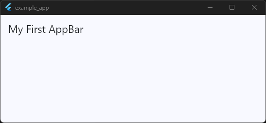
Here’s a minimal example showing how the AppBar works inside a Scaffold. This is usually the first place beginners will use it.
import 'package:flutter/material.dart';

void main() {
  runApp(const MyApp());
}

class MyApp extends StatelessWidget {
  const MyApp({super.key});

  @override
  Widget build(BuildContext context) {
    return MaterialApp(
      title: 'Example App',
      debugShowCheckedModeBanner: false,
      theme: ThemeData(
        useMaterial3: true,
        colorScheme: ColorScheme.fromSeed(seedColor: Colors.blue),
      ),
      home: const HomeScreen(),
    );
  }
}

class HomeScreen extends StatefulWidget {
  const HomeScreen({super.key});

  @override
  State<HomeScreen> createState() => _HomeScreenState();
}

class _HomeScreenState extends State<HomeScreen> {
  @override
  Widget build(BuildContext context) {
    return Scaffold(appBar: AppBar(title: const Text('My First AppBar')));
  }
}
Code language: JavaScript (javascript)
What this shows
- How the
AppBarsits at the top of the screen - How a simple title is added
- How it fits naturally inside a
Scaffold - The basic structure of a real Flutter screen
Super clean. Super easy for a beginner to copy and run.
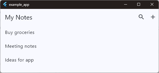
Practical Example (Real App Use)
Let’s imagine a Notes App where the user can view a list of notes. A good AppBar here should do three things:
- Show the page title (“My Notes”)
- Provide quick actions (like Search or Add)
- Give a clean, professional feel to the screen
The AppBar becomes the screen’s “command center,” improving navigation and usability.
Example: Notes List Screen with Search + Add Actions
import 'package:flutter/material.dart';

void main() {
  runApp(const MyApp());
}

class MyApp extends StatelessWidget {
  const MyApp({super.key});

  @override
  Widget build(BuildContext context) {
    return MaterialApp(
      title: 'Example App',
      debugShowCheckedModeBanner: false,
      theme: ThemeData(
        useMaterial3: true,
        colorScheme: ColorScheme.fromSeed(seedColor: Colors.blue),
      ),
      home: const HomeScreen(),
    );
  }
}

class HomeScreen extends StatefulWidget {
  const HomeScreen({super.key});

  @override
  State<HomeScreen> createState() => _HomeScreenState();
}

class _HomeScreenState extends State<HomeScreen> {
  @override
  Widget build(BuildContext context) {
    return Scaffold(
      appBar: AppBar(
        title: Text('My Notes'),
        actions: [
          IconButton(
            icon: Icon(Icons.search),
            onPressed: () {
              // Open search bar or filter notes
            },
          ),
          IconButton(
            icon: Icon(Icons.add),
            onPressed: () {
              // Navigate to create new note
            },
          ),
        ],
      ),
      body: ListView(
        children: const [
          ListTile(title: Text('Buy groceries')),
          ListTile(title: Text('Meeting notes')),
          ListTile(title: Text('Ideas for app')),
        ],
      ),
    );
  }
}
Code language: JavaScript (javascript)
How this improves UI/UX
- Clear context: User instantly knows they’re on the Notes page.
- Quick access: Search and Add are placed exactly where users expect them.
- Consistent navigation: The AppBar creates a familiar, reliable top section for every screen.
- Professional feel: Even simple apps look polished when the AppBar is used effectively.
Common Mistakes to Avoid
1. Using AppBar without a Scaffold
Mistake:
Beginners sometimes try to place an AppBar directly inside a regular widget tree.
Why it’s wrong:AppBar is designed to live inside a Scaffold — without it, it won’t behave like a proper top bar.
2. Forgetting that actions must be a list
Mistake:
Adding a single widget directly inside actions: instead of using [].
Why it matters:
Flutter expects actions: [].
Using it incorrectly causes errors.
3. Forcing too many widgets into the AppBar
Mistake:
Beginners pack in long titles, multiple icons, dropdowns, and extra widgets.
Why it matters:
AppBars become cluttered quickly.
A clean AppBar improves usability and readability.
4. Not handling tap actions properly
Mistake:
Adding icons (like search or add) but leaving the onPressed empty or using print statements only.
Why it matters:
Buttons should perform real actions (navigate, open dialogs, filter content).
Good UX starts with meaningful interactions.
5. Forgetting platform differences
Mistake:
Not realizing Android often aligns titles left while iOS aligns them center.
Why it matters:
Ignoring this can make your app feel “off” on one platform.
(Using centerTitle: true can help match iOS expectations.)
Tips, Best Practices & Variations
1. Combine AppBar with other screen-level widgets
- Use
Scaffoldto give the AppBar its proper structure. - Pair it with
Drawerfor navigation. - Combine it with
TabBarinsidebottom:for multi-page interfaces. - Add a
PreferredSizewidget when customizing height or adding custom widgets.
These combinations turn a simple AppBar into a full navigation experience.
2. Keep your AppBar clean
Beginners often try to add too many buttons.
A good rule:
Three icons max → Search, Add, Settings.
Anything more deserves a menu or a separate screen.
Cluttered AppBars break UX.
3. When not to use an AppBar
Avoid using an AppBar when:
- You’re building a fullscreen experience (e.g., video player, image viewer).
- The screen uses a custom header (like a large hero image).
- You need a completely immersive UI (games, onboarding screens).
In these cases, custom widgets or SliverAppBar is more appropriate.
4. Performance notes
The AppBar itself is very lightweight — it doesn’t cause performance issues.
But the content inside it can:
- Too many icons → expensive repainting
- Heavy widgets → slows down layout
- Dynamic animations inside AppBar → unnecessary overhead
Keep it simple for smooth performance.
5. Consider these alternatives
Sometimes AppBar is not the best fit.
Here are widgets to think about:
SliverAppBar— For scrollable screens with collapsing headers.CupertinoNavigationBar— For iOS-style apps.- Custom headers — When branding or design requires a unique look.
Summary
The AppBar is the familiar top bar you see in almost every app — showing the screen title, navigation icons, and quick actions. It makes your UI feel structured, professional, and easy for users to understand.
Use an AppBar whenever your screen needs:
- A clear title
- A back button or menu
- Quick actions like search, add, or settings
- A consistent top layout across the app
It fits naturally inside a Scaffold and plays a big role in real app design, from simple list screens to fully featured apps.
Once a you understand how to use the AppBar, you immediately unlock the ability to build clean, user-friendly interfaces.
Next Steps
Now that you understand the AppBar, you’re ready to explore more Flutter widgets and slowly build up your real development confidence.
Want the Fastest Way to Learn by Doing?
If you prefer learning through real projects, not theory:
Check out my Flutter Level-1 Mini Class Bundle
10 beginner-friendly apps you can build step-by-step.
Perfect if you want:
- A structured path
- Project-focused learning
- Clear explanations
- Small, digestible lessons
Practice Exercise
Try this small challenge to solidify your learning:
Task:
Build a screen with an AppBar that includes:
- A title (“Task Manager”)
- A leading back button
- Two action icons (add + filter)
- A different backgroundColor
- A body with a placeholder text
Goal:
Get comfortable customizing properties and organizing your screen layout.
You’ve Learned the Basics. Now Build Real Flutter Screens
Now that you understand how the appBar widget works, it’s time to use it inside a real Flutter project. Join the free mini class and build your first Android app step by step with modern AI tools.