When you first start learning Flutter, creating a text box feels a bit like magic. You drop a TextField widget onto your screen, and boom—your user can type! It is an awesome milestone for any beginner.
But as you start moving from basic practices to building real-world apps, you quickly notice that just letting someone type isn’t always enough.
Think about your favorite apps. When you open a chat screen, the typing box automatically grows taller when you type a long message. When you open a login page, the keyboard pops up right away without making you tap the field. And when you type a verification code, the cursor instantly jumps to the next box all by itself.
To make your app feel smooth, professional, and friendly, you need to teach your inputs how to behave intelligently.
If you have already looked at our Ultimate Guide to Flutter TextFields, you know how to read text using controllers. If you have explored our guide on Flutter TextField Customization, you know how to use isDense to style them beautifully without fighting InputDecoration.
In this post, we are going to step past those basics. You will learn how to listen to inputs in real-time, handle multi-line layouts safely, manage focus, and build the exact input experiences that production apps use every day.
Detecting Text Changes in Real-Time
When a user types inside your app, you often need to know exactly what they are entering the moment they type it.
Think of a search bar that filters a list with every single keystroke, or a password field that checks if the input is long enough while the user is still typing.
In Flutter, you have two primary ways to listen to these changes: a quick way and a structured way.
Method 1: The Quick Way (onChanged)
The absolute simplest way to see what a user is typing is by using the onChanged property directly on your TextField.
Whenever the user adds or deletes a character, this callback triggers and hands you the fresh string:
TextField(
  onChanged: (text) {
    print("The user typed: $text");
    // You can update your UI state or filter a list right here!
  },
)
Code language: PHP (php)
When to use onChanged:
- Quick, real-time lookups (like basic search filters).
- Simple character counters (e.g., showing “12/50 characters”).
- Enabling or disabling a button based on whether the field is empty.
Method 2: The Structured Way (TextEditingController)
While onChanged is great for a quick look, it has a limitation: it only tells you what changed inside the widget.
If you want to clear the text box with a button, set an initial value, or listen to the text from outside the TextField, you need a controller.
As we discussed in our foundational Flutter TextField Guide, you should always create your controller inside initState and dispose of it in the dispose method to keep your app lag-free.
To listen to changes using a controller, you attach a listener in your initState:
class _HomeScreenState extends State<HomeScreen> {
  final TextEditingController _myController = TextEditingController();

  @override
  void initState() {
    super.initState();
    // Start listening to text changes
    _myController.addListener(_printLatestValue);
  }

  @override
  void dispose() {
    // Always clean up the controller when the widget is removed
    _myController.dispose();
    super.dispose();
  }

  void _printLatestValue() {
    print("Controller text: ${_myController.text}");
  }

  @override
  Widget build(BuildContext context) {
    final theme = Theme.of(context);

    return Scaffold(
      appBar: AppBar(
        title: const Text('TextField Validation'),
        backgroundColor: theme.colorScheme.primary,
        foregroundColor: theme.colorScheme.onPrimary,
      ),
      body: Padding(
        padding: const EdgeInsets.all(16),
        child: Column(
          children: [
            TextField(
              controller: _myController,
            ),
          ],
        ),
      ),
    );
  }
}
Code language: JavaScript (javascript)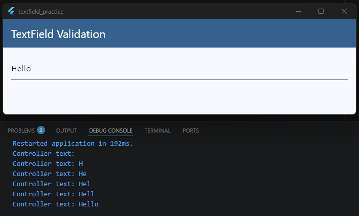
When to use a Controller Listener:
- You need to read the text value from multiple places in your code.
- You need to manipulate the text programmatically (like auto-formatting a phone number as the user types).
A Quick Performance Reminder: Whether you use
onChangedor a listener, running heavy logic or callingsetState()on every single keystroke can slow your app down.If you are validating user input, make sure to read ourFlutter Form Validation Guideto see how to handle errors cleanly without hurting your app’s performance.
Using onChanged Effectively
Now that you know how to capture text changes, let’s talk about how to use onChanged in real-world scenarios.
It is one of the most powerful properties on a TextField, but if it isn’t used carefully, it can easily slow down your app or cause a choppy user experience.
The Trap: Real-Time API Searches
Imagine you are building a search bar for a movie app. If a user types “Spiderman”, onChanged will trigger 9 separate times—once for “S”, once for “Sp”, once for “Spi”, and so on.
If you trigger a network API call inside onChanged immediately, your app will send 9 separate backend requests in less than two seconds!
This wastes mobile data, drains the battery, and can cause old search results to pop up over new ones if the network responses arrive out of order.
To handle this effectively, you need a technique called Debouncing. Debouncing means waiting until the user stops typing for a brief moment (like 500 milliseconds) before running your heavy logic or API search.
Putting It All Together
Let’s look at exactly how we integrate this debouncing logic into our core _HomeScreenState example so you can see the whole picture:
import 'dart:async'; // 1. Don't forget to import this at the very top of your file!
import 'package:flutter/material.dart';

class HomeScreen extends StatefulWidget {
  const HomeScreen({super.key});

  @override
  State<HomeScreen> createState() => _HomeScreenState();
}

class _HomeScreenState extends State<HomeScreen> {
  // 2. Define the timer variable inside your State class
  Timer? _debounceTimer;

  // 3. Create the function that handles the timing logic
  void _onSearchChanged(String query) {
    // Cancel the previous timer if the user types another character before 500ms
    if (_debounceTimer?.isActive ?? false) _debounceTimer!.cancel();

    // Start a fresh 500ms countdown
    _debounceTimer = Timer(const Duration(milliseconds: 500), () {
      print("User stopped typing! Searching backend for: $query");
      // This is where you would call your API or filter your list safely
    });
  }

  @override
  void dispose() {
    // 4. Always cancel your timers when the widget is destroyed to prevent memory leaks!
    _debounceTimer?.cancel();
    super.dispose();
  }

  @override
  Widget build(BuildContext context) {
    final theme = Theme.of(context);

    return Scaffold(
      appBar: AppBar(
        title: const Text('TextField Validation'),
        backgroundColor: theme.colorScheme.primary,
        foregroundColor: theme.colorScheme.onPrimary,
      ),
      body: Padding(
        padding: const EdgeInsets.all(16),
        child: Column(
          children: [
            TextField(
              // 5. Pass your function directly to onChanged
              onChanged: _onSearchChanged,
              decoration: const InputDecoration(
                labelText: 'Search items...',
                border: OutlineInputBorder(),
              ),
            ),
          ],
        ),
      ),
    );
  }
}
Code language: JavaScript (javascript)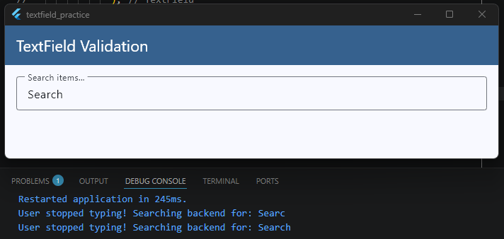
Key Takeaways for this Setup
- The State Class Level: We declare
_debounceTimerat the top of our state class so the app can remember and track the active countdown across multiple keystrokes. - The
onChangedLink: Every time a new letter is typed, Flutter calls_onSearchChanged. It immediately kills the old countdown timer and spins up a brand new 500-millisecond countdown. - The
disposeCleanup: Just like clearing out text controllers, it is best practice to call_debounceTimer?.cancel()inside yourdispose()method so background timers don’t keep running if the user leaves the screen.
Validation Tip: While
onChangedis amazing for tracking keystrokes, using it to show aggressive error messages (like flashing “Invalid Email” the second someone types their first letter) can frustrate users. If you want to see how to structure error handling properly with better timing, take a look at our completeFlutter Form Validation Guide.
Handling Focus Events
Have you ever opened an app and noticed that the keyboard instantly popped up, ready for you to type? Or have you noticed how a text field’s border changes color the exact moment you tap inside it?
All of this is controlled by Focus. Knowing how to manage focus allows you to control which input field is active, when the keyboard should appear, and how your app responds when a user interacts with different parts of the screen.
In Flutter, we manage this using a class called a FocusNode.
What is a FocusNode?
Think of a FocusNode as an invisible manager assigned to a specific widget. It keeps track of whether that widget is currently highlighted (has focus) or ignored (lost focus).
Let’s look at how to add a FocusNode to our core _HomeScreenState example to see how it works in practice:
class _HomeScreenState extends State<HomeScreen> {
  // 1. Create the FocusNode instance
  final FocusNode _myFocusNode = FocusNode();

  @override
  void initState() {
    super.initState();
    // 2. Add a listener to detect when focus changes
    _myFocusNode.addListener(_onFocusChange);
  }

  @override
  void dispose() {
    // 3. Always clean up FocusNodes to prevent memory leaks!
    _myFocusNode.removeListener(_onFocusChange);
    _myFocusNode.dispose();
    super.dispose();
  }

  void _onFocusChange() {
    if (_myFocusNode.hasFocus) {
      print("The user tapped inside the TextField! (Gained Focus)");
    } else {
      print("The user tapped away! (Lost Focus)");
    }
  }

  @override
  Widget build(BuildContext context) {
    final theme = Theme.of(context);

    return Scaffold(
      appBar: AppBar(
        title: const Text('TextField Validation'),
        backgroundColor: theme.colorScheme.primary,
        foregroundColor: theme.colorScheme.onPrimary,
      ),
      body: Padding(
        padding: const EdgeInsets.all(16),
        child: Column(
          children: [
            TextField(
              // 4. Attach the FocusNode to your TextField
              focusNode: _myFocusNode,
              decoration: const InputDecoration(
                labelText: 'Click to focus...',
                border: OutlineInputBorder(),
              ),
            ),
          ],
        ),
      ),
    );
  }
}
Code language: JavaScript (javascript)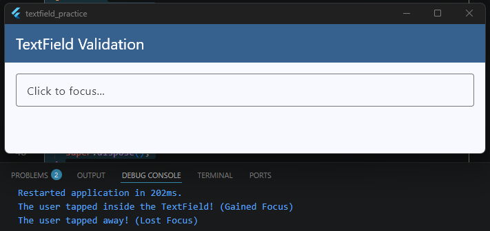
Real-World Focus Tricks
Once you have a FocusNode attached, you can do some really cool things to improve your app’s user experience:
1. Autofocus on Screen Load
If you want the keyboard to open automatically the split-second a screen opens (like a search screen), you don’t even need a controller setup. Just set autofocus: true on your widget:
TextField(
  autofocus: true,
)
Code language: JavaScript (javascript)
2. Requesting Focus Programmatically
If you want to force the cursor to jump into a specific text box after a user clicks a button, you can use your custom node:
ElevatedButton(
  onPressed: () {
    // This tells Flutter to instantly open the keyboard and highlight our field
    _myFocusNode.requestFocus();
  },
  child: const Text('Focus Input Field'),
)
Code language: JavaScript (javascript)
3. Unfocusing (Hiding the Keyboard)
Sometimes, when a user scrolls down a page or taps empty space on the screen, you want the keyboard to slide away. You can remove focus like this:
_myFocusNode.unfocus();
Code language: CSS (css)
Managing focus properly prevents your users from constantly having to manually tap tiny text boxes on their screens.
If you want to dive deeper into styling changes when a field becomes active, jump over to our Flutter TextField Customization Guide where we explore setting up unique focusedBorder states.
Working with onSubmitted
When a user finishes typing into an input field—like entering a search keyword or filling out a password—their natural instinct is to tap the action button at the bottom right corner of their mobile keyboard.
Depending on the situation, that button might say Done, Search, Go, or Next.
In Flutter, the onSubmitted property is a callback that triggers the exact moment a user taps that keyboard action button. It gives you direct access to the final text value so you can immediately process it.
Integrating onSubmitted Into Our Example
Let’s look at how to wire up onSubmitted inside our core _HomeScreenState example to handle a clean form submission:
class _HomeScreenState extends State<HomeScreen> {
  // A helper function to handle the final text submission
  void _handleSubmit(String finalValue) {
    // Trim any accidental whitespace typing errors
    final cleanValue = finalValue.trim();

    if (cleanValue.isEmpty) {
      print("Cannot submit an empty field!");
      return;
    }

    print("Form submitted successfully! Final value: $cleanValue");
    // This is the perfect spot to trigger your login API,
    // database save, or route navigation logic!
  }

  @override
  Widget build(BuildContext context) {
    final theme = Theme.of(context);

    return Scaffold(
      appBar: AppBar(
        title: const Text('TextField Validation'),
        backgroundColor: theme.colorScheme.primary,
        foregroundColor: theme.colorScheme.onPrimary,
      ),
      body: Padding(
        padding: const EdgeInsets.all(16),
        child: Column(
          children: [
            TextField(
              // 1. Change the visual look of the keyboard button
              textInputAction: TextInputAction.search,

              // 2. Pass your submission handler function
              onSubmitted: _handleSubmit,

              decoration: const InputDecoration(
                labelText: 'Type search query and press enter...',
                border: OutlineInputBorder(),
              ),
            ),
          ],
        ),
      ),
    );
  }
}
Code language: PHP (php)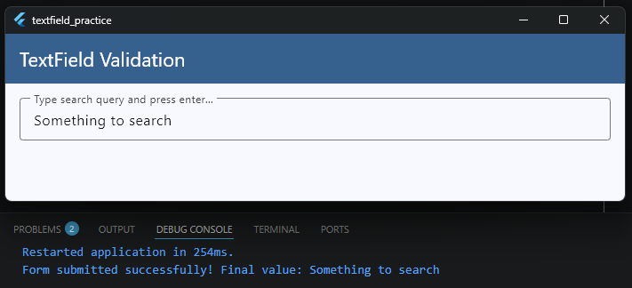
Controlling the Keyboard Style (textInputAction)
By default, Flutter decides which button icon to show on the virtual keyboard. However, you can explicitly control this using the textInputAction property to match your app’s exact user experience context:
TextInputAction.search: Changes the button to a magnifying glass icon or a “Search” label. Ideal for search bars.TextInputAction.done: Changes the button to a checkmark or “Done”. Closes the virtual keyboard automatically when tapped.TextInputAction.next: Changes the button to a right-facing arrow or “Next”. Great for moving the cursor from an email field straight down into a password field.
Using onSubmitted alongside a thoughtful textInputAction keeps your users moving through your app smoothly without forcing them to manually dismiss the keyboard overlay.
Validation Note: If you are using
onSubmittedto trigger a final check across multiple input fields at once, you might find a traditionalFormwidget easier to manage.Head over to ourFlutter Form Validation Guideto see how to bundle inputs together for clean, complete validation flows.
Getting the Cursor Position
Have you ever wondered how advanced apps insert text exactly where your cursor is currently sitting?
For example, if you are building a chat app or a text editor, and the user taps an emoji button, you don’t want that emoji to blindly drop at the very end of the text. You want it to appear exactly where they are currently typing.
To achieve this level of control, we need to inspect a hidden property inside our TextEditingController called value (which is a TextEditingValue object).
Understanding TextEditingValue
The TextEditingValue object holds three important pieces of information about what is happening inside your TextField:
text: The actual string of characters currently typed.selection: Where the cursor is sitting, or what range of text is currently highlighted by the user.composing: The text range currently being handled by the operating system’s keyboard (like active auto-correct suggestions).
To find the exact location of the cursor, we look at selection.baseOffset. This gives us an index number representing exactly how many characters into the text the cursor is currently placed.
Integrating Cursor Tracking into Our Example
Let’s look at how to read the cursor position inside our core _HomeScreenState example. We will use a listener on our controller to read the position dynamically as the user moves around or types:
class _HomeScreenState extends State<HomeScreen> {
  // 1. Create your controller
  final TextEditingController _myController = TextEditingController();
  int _currentCursorIndex = 0;

  @override
  void initState() {
    super.initState();
    // 2. Listen to controller updates (this fires on text changes AND cursor moves)
    _myController.addListener(_updateCursorPosition);
  }

  @override
  void dispose() {
    // 3. Clean up the controller
    _myController.dispose();
    super.dispose();
  }

  void _updateCursorPosition() {
    setState(() {
      // 4. Read the baseOffset to get the current cursor index position
      _currentCursorIndex = _myController.selection.baseOffset;
    });
  }

  @override
  Widget build(BuildContext context) {
    final theme = Theme.of(context);

    return Scaffold(
      appBar: AppBar(
        title: const Text('TextField Validation'),
        backgroundColor: theme.colorScheme.primary,
        foregroundColor: theme.colorScheme.onPrimary,
      ),
      body: Padding(
        padding: const EdgeInsets.all(16),
        child: Column(
          crossAxisAlignment: CrossAxisAlignment.start,
          children: [
            TextField(
              controller: _myController,
              decoration: const InputDecoration(
                labelText: 'Move the cursor around...',
                border: OutlineInputBorder(),
              ),
            ),
            const SizedBox(height: 16),
            // Display the position to the user
            Text(
              'Cursor Index Position: $_currentCursorIndex',
              style: theme.textTheme.bodyLarge,
            ),
          ],
        ),
      ),
    );
  }
}
Code language: JavaScript (javascript)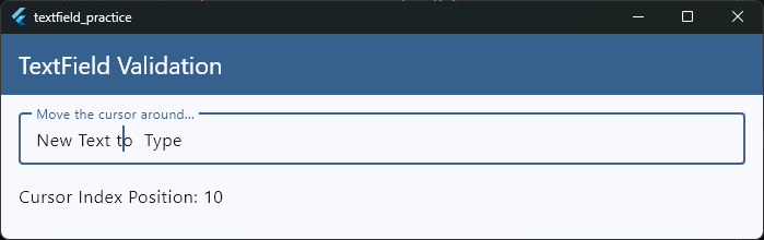
Practical Use Case: Inserting Text at Cursor Position
Knowing the index is great, but how do you use it? Here is a quick example of a function that inserts a specific string (like an emoji) exactly where the cursor is sitting, then puts the cursor right back after the new text:
void _insertEmoji(String emoji) {
  final text = _myController.text;
  final selection = _myController.selection;

  // Find the cursor position (default to 0 if nothing is selected)
  int start = selection.start;
  if (start < 0) start = 0;

  // Insert the emoji string into the original text
  final newText = text.substring(0, start) + emoji + text.substring(start);

  // Update the controller with the new text and set the new cursor position
  _myController.value = TextEditingValue(
    text: newText,
    selection: TextSelection.collapsed(offset: start + emoji.length),
  );
}Code language: PHP (php)
By mastering TextEditingValue, you step out of basic form inputs and start unlocking the power required to build custom document editors, markdown parsers, or custom chat interfaces.
Multi-line TextFields
By default, a TextField in Flutter is built to handle a single line of text. If you keep typing past the edge of the screen, the text simply slides to the left, disappearing out of view.
While this is exactly what you want for an email or password field, it completely breaks the user experience if you are building a bio page, a notes app, or a chat input field. For those features, you want a box that wraps text naturally and grows taller as the user types more content.
Expanding TextFields Automatically
Let’s look at how to easily turn our core _HomeScreenState example into a dynamic, expanding text area:
class _HomeScreenState extends State<HomeScreen> {
  @override
  Widget build(BuildContext context) {
    final theme = Theme.of(context);

    return Scaffold(
      appBar: AppBar(
        title: const Text('TextField Validation'),
        backgroundColor: theme.colorScheme.primary,
        foregroundColor: theme.colorScheme.onPrimary,
      ),
      body: Padding(
        padding: const EdgeInsets.all(16),
        child: Column(
          children: [
            TextField(
              // 1. Tell the keyboard to optimize for long paragraphs
              keyboardType: TextInputType.multiline,

              // 2. Set the starting height constraint
              minLines: 1,

              // 3. Allow it to grow dynamically as lines are added
              maxLines: 5,

              decoration: const InputDecoration(
                labelText: 'Type your message or notes here...',
                alignLabelWithHint:
                    true, // Keeps the label at the top left corner
                border: OutlineInputBorder(),
              ),
            ),
          ],
        ),
      ),
    );
  }
}Code language: PHP (php)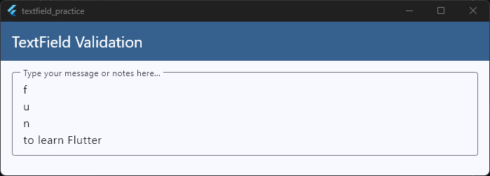
Understanding the Line Constraints
To control how your multi-line field behaves, you need to configure three primary parameters:
keyboardType: TextInputType.multiline: This changes the layout of the virtual keyboard so that the bottom-right action button acts as a physical “Enter” key, allowing users to create line breaks instead of accidentally submitting the form.minLines&maxLines: SettingminLines: 1andmaxLines: 5means the input box will start out small. If the text hits the edge of the screen, it wraps downwards, growing taller until it reaches exactly 5 lines high. If the user keeps typing past that point, the box stops growing and safely turns into an internal scrolling box.- The Infinite Growth Trick: If you want a notes tool or text editor where the field grows forever without any restrictions, set
maxLines: null.
Ready to Build Real-World App Features?
Learning to control layouts, handle complex user input states, and link them to responsive interfaces is exactly what shifts you from a beginner to a confident app developer.
If you want to stop piecing together snippets and start building complete production-ready apps from scratch—including dynamic chat interfaces, authentication flows, and full multi-screen architectures—join us inside the Flutter Foundations Course.
Master Real-World Flutter Inputs & Architecture
Learn to build complex forms, smooth animations, and complete production-ready apps from scratch.
Wrapping Long Text
When you expand a TextField to support multi-line input, you also have to think about how characters fit together visually on the screen. If a user types an incredibly long word, an unspaced link, or a continuous string of text, you need to decide exactly how Flutter should break those characters apart when they hit the edge of the container.
In Flutter, we control this layout behavior using the clipBehavior and text style configurations, ensuring long text wraps cleanly without spilling over or clipping awkwardly.
Understanding Text Wrapping Behavior
By default, Flutter’s TextField automatically wraps standard text based on soft breaks—meaning it waits for a space between words before pushing the next word down to the next line.
However, if you are building an app layout with tight spacing constraints (like a compact sidebar, a split-screen design, or a custom chat card), you can control how overflowing text behaves visually using your container properties and text styling.
Let’s look at how text wrapping fits into our core _HomeScreenState example:
class _HomeScreenState extends State<HomeScreen> {
  @override
  Widget build(BuildContext context) {
    final theme = Theme.of(context);

    return Scaffold(
      appBar: AppBar(
        title: const Text('TextField Validation'),
        backgroundColor: theme.colorScheme.primary,
        foregroundColor: theme.colorScheme.onPrimary,
      ),
      body: Padding(
        padding: const EdgeInsets.all(16),
        child: Column(
          children: [
            TextField(
              keyboardType: TextInputType.multiline,
              minLines: 2,
              maxLines: null, // Grows forever down the screen
              // 1. Controls how overlapping content is visually clipped at the edges
              clipBehavior: Clip.antiAlias,

              style: const TextStyle(
                fontSize: 16,
                height: 1.5, // Adds breathing room between wrapped sentences
              ),

              decoration: const InputDecoration(
                labelText: 'Paste long URLs or text here...',
                border: OutlineInputBorder(),
              ),
            ),
          ],
        ),
      ),
    );
  }
}
Code language: PHP (php)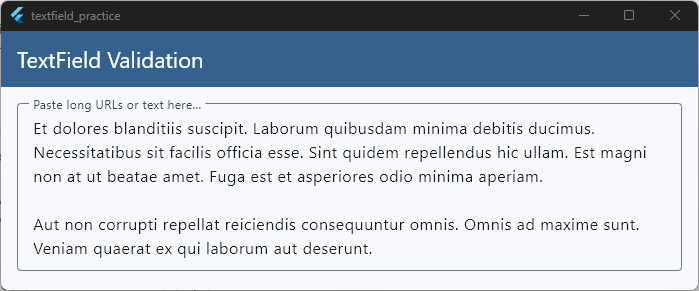
Tips for Perfect Text Layouts
When dealing with large blocks of wrapped text, a few small design choices make a massive difference for complete beginners:
- Line Height (
height): In yourTextStyle, setting a property likeheight: 1.5adds subtle vertical padding between your wrapped lines of text. This keeps long paragraphs from looking squished together and makes them significantly easier to read on small mobile screens. - The Parent Constraints: A
TextFieldrelies on its parent widget to know when to wrap text. If you place a multi-line input field inside a horizontally scrolling container or an unconstrainedRow, it will lose its boundaries and stretch infinitely to the right instead of wrapping downward. Always make sure your text fields live inside bounded areas like aColumn,Padding, or anExpandedwidget.
Managing boundaries and constraints correctly ensures that no matter how chaotic or long a user’s input string is, your layout remains pixel-perfect and beautifully intact.
Managing Input State
When you build a basic form, managing what the user types is fairly straightforward. But as your apps grow larger, you will run into a common challenge: State Management.
For example, if a user types their shipping address on page one, clicks “Next” to choose a payment method on page two, and then goes back to page one, how do you make sure their address is still sitting in that text box?
If you store your text values entirely inside a local StatefulWidget, that information will completely vanish the moment the screen changes. To prevent this, you need to manage your input state properly.
Understanding the Three Levels of Input State
Depending on your app’s complexity, you can store your text input data in three different places:
| State Level | Where It Lives | Best Used For |
| Local Widget State | Inside a StatefulWidget using a TextEditingController. | Quick, temporary screens like a single login page or a simple search box. |
| Form-Level State | Inside a global FormState key (Form widget). | Multi-field validation, resetting an entire form with a single click. |
| Global App State | Inside a state management solution (like Bloc, Provider, or Riverpod). | Multi-step checkouts, drafting a profile update, or persisting data across pages. |
Integrating State Capture into Our Example
To manage state reliably, you should sync your TextField values into a separate data model or state variable rather than relying on the widget to hold the data.
Let’s look at how to cleanly capture and preserve input changes inside our core _HomeScreenState architecture:
class _HomeScreenState extends State<HomeScreen> {
  // 1. Create your controller to manage the local widget state
  final TextEditingController _usernameController = TextEditingController();

  // 2. Create a clean data variable to hold the captured state
  String _savedUsername = '';

  @override
  void initState() {
    super.initState();
    // Pre-populate the input field if data already exists
    _usernameController.text = _savedUsername;
  }

  @override
  void dispose() {
    // 3. Always clean up controllers to prevent memory leaks
    _usernameController.dispose();
    super.dispose();
  }

  void _saveDataToState() {
    setState(() {
      // 4. Commit the current text field value to your application state
      _savedUsername = _usernameController.text.trim();
    });

    print("Username saved safely to state: $_savedUsername");
  }

  @override
  Widget build(BuildContext context) {
    final theme = Theme.of(context);

    return Scaffold(
      appBar: AppBar(
        title: const Text('TextField Validation'),
        backgroundColor: theme.colorScheme.primary,
        foregroundColor: theme.colorScheme.onPrimary,
      ),
      body: Padding(
        padding: const EdgeInsets.all(16),
        child: Column(
          children: [
            TextField(
              controller: _usernameController,
              decoration: const InputDecoration(
                labelText: 'Enter Username',
                border: OutlineInputBorder(),
              ),
            ),
            const SizedBox(height: 16),
            ElevatedButton(
              onPressed: _saveDataToState,
              style: ElevatedButton.styleFrom(
                backgroundColor: theme.colorScheme.primary,
                foregroundColor: theme.colorScheme.onPrimary,
              ),
              child: const Text('Save Progress'),
            ),
          ],
        ),
      ),
    );
  }
}
Code language: JavaScript (javascript)
Best Practices for Input State Cleanliness
- Don’t Instantiate Controllers in Build: As we highlight in our foundational Flutter TextField Guide, never initialize a
TextEditingControllerinside yourbuild()method. If you do, the controller will re-create itself every time the screen updates, causing the cursor to jump erratically and resetting the user’s progress. - Syncing with External State Providers: If you are using global architecture state managers, listen to your text input changes using
onChanged, and pass those updates directly into your state functions (likecontext.read<MyBloc>().updateText(value)). This keeps your data decoupled from the UI layer entirely.
By separating the text string from the visual input widget, you guarantee that your user’s hard-typed text is safe, structured, and easy to manipulate across your entire app flow.
Building OTP Input Fields
A One-Time Password (OTP) or verification PIN screen is a staple feature in modern production apps.
From a user’s perspective, it should feel completely effortless: you type a digit, the focus instantly jumps to the next box, and when you type the final number, the app automatically submits the code.
To build this smooth user experience in Flutter, we combine three core concepts we’ve already covered: FocusNodes, onChanged monitoring, and Keyboard Management.
Designing a Clean 4-Digit OTP Layout
While an OTP in a production app is typically 4 or 6 digits long, writing out the exact same text field properties over and over would make your code messy and hard to read.
To solve this, we can use a private helper function called _buildOTPBox. This allows us to write our clean input styling just once, and then reuse it to build all 4 slots.
Additionally, to fix the common layout issue where input boxes drift away to opposite sides of a row, we bundle the fields inside a centered SizedBox with a fixed width of 300. This keeps your verification boxes neatly grouped together right in the center of the screen.
Let’s look at the complete, production-ready implementation inside our _HomeScreenState structure:
class _HomeScreenState extends State<HomeScreen> {
  // 1. Create a controller and FocusNode for all 4 boxes
  final TextEditingController _b1Controller = TextEditingController();
  final TextEditingController _b2Controller = TextEditingController();
  final TextEditingController _b3Controller = TextEditingController();
  final TextEditingController _b4Controller = TextEditingController();

  final FocusNode _b1Focus = FocusNode();
  final FocusNode _b2Focus = FocusNode();
  final FocusNode _b3Focus = FocusNode();
  final FocusNode _b4Focus = FocusNode();

  @override
  void dispose() {
    // 2. Clean up all 8 resources to protect app performance
    _b1Controller.dispose();
    _b2Controller.dispose();
    _b3Controller.dispose();
    _b4Controller.dispose();
    _b1Focus.dispose();
    _b2Focus.dispose();
    _b3Focus.dispose();
    _b4Focus.dispose();
    super.dispose();
  }

  @override
  Widget build(BuildContext context) {
    final theme = Theme.of(context);

    return Scaffold(
      appBar: AppBar(
        title: const Text('TextField Validation'),
        backgroundColor: theme.colorScheme.primary,
        foregroundColor: theme.colorScheme.onPrimary,
      ),
      body: Padding(
        padding: const EdgeInsets.all(16),
        child: Column(
          mainAxisAlignment: MainAxisAlignment.center,
          children: [
            Text(
              'Enter Verification Code',
              style: theme.textTheme.headlineSmall,
            ),
            const SizedBox(height: 24),

            // 3. Bundle the 4 inputs in the center with a fixed width boundary
            Center(
              child: SizedBox(
                width:
                    300, // Restricts the row so the 4 fields stay perfectly grouped
                child: Row(
                  mainAxisAlignment: MainAxisAlignment.spaceBetween,
                  children: [
                    // --- BOX 1 ---
                    _buildOTPBox(
                      controller: _b1Controller,
                      focusNode: _b1Focus,
                      nextFocusNode: _b2Focus,
                      autoFocus: true,
                    ),

                    // --- BOX 2 ---
                    _buildOTPBox(
                      controller: _b2Controller,
                      focusNode: _b2Focus,
                      nextFocusNode: _b3Focus,
                      previousFocusNode: _b1Focus,
                    ),

                    // --- BOX 3 ---
                    _buildOTPBox(
                      controller: _b3Controller,
                      focusNode: _b3Focus,
                      nextFocusNode: _b4Focus,
                      previousFocusNode: _b2Focus,
                    ),

                    // --- BOX 4 ---
                    _buildOTPBox(
                      controller: _b4Controller,
                      focusNode: _b4Focus,
                      previousFocusNode: _b3Focus,
                      onLastDigitEntered: () {
                        // Combine all single characters into a complete verification string
                        final fullCode =
                            _b1Controller.text +
                            _b2Controller.text +
                            _b3Controller.text +
                            _b4Controller.text;
                        print("Complete 4-Digit Code Submitted: $fullCode");

                        // Close the keyboard safely
                        _b4Focus.unfocus();
                      },
                    ),
                  ],
                ),
              ),
            ),
          ],
        ),
      ),
    );
  }

  // 4. A clean, reusable helper function to prevent messy code duplication
  Widget _buildOTPBox({
    required TextEditingController controller,
    required FocusNode focusNode,
    FocusNode? nextFocusNode,
    FocusNode? previousFocusNode,
    bool autoFocus = false,
    VoidCallback? onLastDigitEntered,
  }) {
    return SizedBox(
      width: 60,
      child: TextField(
        controller: controller,
        focusNode: focusNode,
        autofocus: autoFocus,
        textAlign: TextAlign.center,
        keyboardType: TextInputType.number,
        maxLength: 1,
        inputFormatters: [FilteringTextInputFormatter.digitsOnly],
        style: const TextStyle(fontSize: 24, fontWeight: FontWeight.bold),
        decoration: const InputDecoration(
          counterText:
              "", // Removes the standard character counter string below the box
          border: OutlineInputBorder(),
        ),
        onChanged: (value) {
          if (value.isNotEmpty) {
            // A number was entered! Jump forward to the next slot
            if (nextFocusNode != null) {
              FocusScope.of(context).requestFocus(nextFocusNode);
            } else if (onLastDigitEntered != null) {
              onLastDigitEntered();
            }
          } else {
            // The value is empty, meaning the user hit backspace! Jump backward
            if (previousFocusNode != null) {
              FocusScope.of(context).requestFocus(previousFocusNode);
            }
          }
        },
      ),
    );
  }
}
Code language: PHP (php)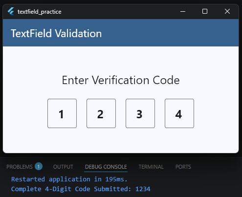
Crucial Polish for a Clean OTP Screen
When building this layout yourself, there are a few subtle properties inside the helper method that keep the user experience seamless:
- Hiding the Counter (
counterText: ""): SettingmaxLength: 1tells Flutter to restrict text entry, but it also adds a small indicator string (like “0/1”) beneath the border. Clearing it with an empty string keeps your layout clean. - Formatters (
FilteringTextInputFormatter.digitsOnly): WhilekeyboardType: TextInputType.numberopens the numeric keyboard layout on mobile phones, it doesn’t stop letters from being typed if someone uses an external hardware keyboard. Formatters fully block non-digit inputs at the logic layer. - Bi-Directional Focus Navigation: Notice the conditional statements inside
onChanged. When a slot is filled, focus jumps forward automatically. If a user makes a typo and hits backspace, the code detects that the value is empty and instantly throws the active cursor backward to the previous box so they can correct their entry without manual tapping.
Using a reusable widget architecture coupled with sequential focus shifting turns a complex authentication screen into an intuitive, elegant interaction pattern.
Custom Text Editing Behavior
Sometimes, simply reading text or managing focus isn’t quite enough. In advanced production apps, you might need to completely override how text is handled as the user types.
Think about an app that automatically formats a credit card number with spaces every four digits, or an app that converts a user’s input entirely into capital letters in real-time.
To build these experiences, Flutter provides a powerful tool called TextInputFormatter.
What is a TextInputFormatter?
A TextInputFormatter acts like a security guard standing between the user’s keyboard and your TextField.
Before the character a user typed actually appears on the screen, the formatter inspects it. It can then choose to allow it, block it completely, or modify it.
Flutter comes with a few built-in formatters (like the FilteringTextInputFormatter.digitsOnly we used on our OTP screen), but you can easily build your own custom behavior by extending the base class.
Integrating a Custom Formatter Into Our Example
Let’s say we want to build an input field that automatically forces all typed letters to become uppercase, which is incredibly useful for fields like promo codes, flight numbers, or vehicle license plates.
Let’s look at how to write a custom formatter and plug it straight into our core _HomeScreenState example:
class _HomeScreenState extends State<HomeScreen> {
  @override
  Widget build(BuildContext context) {
    final theme = Theme.of(context);

    return Scaffold(
      appBar: AppBar(
        title: const Text('TextField Validation'),
        backgroundColor: theme.colorScheme.primary,
        foregroundColor: theme.colorScheme.onPrimary,
      ),
      body: Padding(
        padding: const EdgeInsets.all(16),
        child: Column(
          children: [
            TextField(
              // 2. Add your custom formatter to the inputFormatters list
              inputFormatters: [UpperCaseTextFormatter()],
              decoration: const InputDecoration(
                labelText: 'Enter Promo Code (Auto-Uppercase)',
                border: OutlineInputBorder(),
              ),
            ),
          ],
        ),
      ),
    );
  }
}

// 3. Create your custom formatter class
class UpperCaseTextFormatter extends TextInputFormatter {
  @override
  TextEditingValue formatEditUpdate(
    TextEditingValue oldValue, // The state of the text BEFORE the keystroke
    TextEditingValue newValue, // The state of the text AFTER the keystroke
  ) {
    // Return a brand new TextEditingValue with the text forced to uppercase
    return TextEditingValue(
      text: newValue.text.toUpperCase(),
      // Crucial: Keep the cursor position exactly where the user expects it
      selection: newValue.selection,
    );
  }
}
Code language: PHP (php)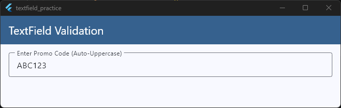
Why the Selection Property Matters
When writing custom text editing behavior, the biggest mistake beginners make is only updating the text property and forgetting about the selection property.
The selection property tracks where the cursor is sitting. If you don’t pass newValue.selection back to Flutter, the cursor will automatically reset and snap back to the very beginning of the text field (index 0) after every single letter the user types!
By preserving newValue.selection, you ensure that the text changes smoothly in the background while the cursor continues to behave naturally for the user.
Using custom formatters allows you to keep your input data clean and formatted correctly at the source, preventing you from having to clean up messy user strings later on in your backend logic.
Performance Considerations
When you are building rich, interactive input screens, it is easy to accidentally introduce stuttering or lag. Because a mobile screen updates 60 to 120 times every single second, writing inefficient input logic can cause your app to drop frames, resulting in a choppy experience for your users.
Let’s look at the two biggest performance bottlenecks when working with TextField widgets and how to avoid them completely.
1. The Heavy Rebuild Trap
Whenever you call setState() inside a widget, Flutter completely redraws that entire widget and its children.
If you call setState() inside an onChanged callback to update a character counter or a search query, your entire screen rebuilds with every single keystroke.
If your screen contains complex layouts, large lists, or heavy graphics, this will quickly cause noticeable input lag.
The Solution: Isolation
To prevent the entire screen from lagging, isolate your TextField logic. Move the input field and its local state into a small, standalone StatefulWidget.
This ensures that when a user types, only that tiny text box rebuilds, leaving the rest of your screen completely untouched and lightning-fast.
2. Orphaned Resources (Memory Leaks)
Every time you create a TextEditingController or a FocusNode, they register themselves deeply with the operating system’s underlying text input services to listen for hardware and software keyboard signals.
If you leave a screen without explicitly telling Flutter to destroy these objects, they stay stuck in your phone’s memory forever. This is called a memory leak.
If a user opens and closes a login or profile screen multiple times, your app will consume more and more system memory until the operating system eventually forces your app to crash.
The Solution: The Lifecycle Routine
Always follow a strict cleanup routine in your stateful components. For every controller or node you initialize in initState, make sure you destroy it inside dispose:
@override
void dispose() {
  // Hard-stop and delete resources from memory
  _myController.dispose();
  _myFocusNode.dispose();
  super.dispose();
}
Code language: JavaScript (javascript)
By keeping your UI rebuilds isolated and cleanly destroying your background resources, your text fields will remain butter-smooth, responsive, and production-ready.
Ready to Build Production-Ready Flutter Apps?
Mastering input architecture, avoiding performance traps, and writing clean, maintainable code is what separates a beginner from a professional developer.
If you want to stop guessing, avoid common structural mistakes, and learn exactly how to build full, production-grade applications step-by-step from scratch, join us inside the Flutter Foundations Course.
Master Real-World Flutter Inputs & Architecture
Learn to build complex forms, smooth animations, and complete production-ready apps from scratch.