
Ever spent way too long trying to center a title in your Flutter AppBar?
You change the code. You hot reload. Nothing happens. Or worse, it looks perfect on iOS but completely breaks on Android.
Then you try to add an action button, and suddenly your spacing is entirely ruined. You add a little padding, and now you have an overflow error.
It feels like you are wrestling with the framework just to make a header look right.
Here is the truth: Flutter’s AppBar is incredibly powerful, but its layout rules can feel like a total mystery.
In this guide, we are going to fix that. We will break down exactly how flutter appbar alignment, padding, and sizing work under the hood.
No more guessing numbers. No more trial and error. Just clean, polished layouts that look great on every device.
Let’s dive in and fix your AppBar problems once and for all!
Learn Flutter the Way Real Apps Are Built
Struggling with messy AppBar spacing and layout shifts across devices? You don’t have to tackle it alone.
Join our free mini class on Agentic AI Development and discover how to use AI coding partners to debug alignment issues and refine your UI layouts step by step.
Why AppBar Alignment Feels Confusing
If you have ever felt like the AppBar has a mind of its own, you are not alone. It can be incredibly frustrating.
You write your layout code, it looks great on your screen, and then it looks completely different on another device.
The main reason for this confusion is simple: Flutter tries to be too smart for its own good.
By default, the AppBar automatically adapts to the platform your app is running on. It mimics native Android behavior on Android devices and native iOS behavior on iPhones.
While this sounds like a great feature, it creates a massive headache for developers who want a consistent, unified design.
Under the hood, the AppBar isn’t just a simple container. It is a tightly controlled horizontal layout split into three distinct zones:
- The Leading Widget: Usually your menu drawer or back button.
- The Title: Your main text or logo.
- The Actions: Your search icons, profile buttons, or settings menus.
Because Flutter dynamically changes how these three zones interact based on the operating system, your layout can easily shift without your permission.
Let’s look at exactly how this happens across different platforms so you can finally take back control.
Ready to look at the biggest culprit? Let’s move to the next section: Center title issues across Android vs iOS and how a single line of code fixes it.
Center Title Issues Across Android vs iOS
Have you ever run your app on an Android emulator and an iOS simulator side by side? If you have, you probably noticed a weird layout shift right at the top of your screen.
On iOS, your AppBar title is perfectly centered. On Android, it suddenly snaps to the left.
This happens because Flutter respects the design guidelines of each platform by default. Apple’s Human Interface Guidelines say titles should be centered.
Google’s Material Design guidelines state that titles should be left-aligned next to the back button.
If you are trying to rank for flutter appbar title align left or flutter appbar title left, you might think you need to wrap your text in an alignment widget or a Row.
But if you try to force it manually with alignment widgets, things get messy quickly.
The One-Line Fix
Thankfully, you don’t need complex math or conditional layout code to make your design consistent. Flutter gives us a direct property inside the AppBar constructor to override this platform behavior completely.
To force your title to stay in the middle on every single device, use flutter appbar center title:
appBar: AppBar(
  centerTitle: true,
  // Forces the title to center on both Android and iOS
  title: Text('My App'),
  backgroundColor: theme.colorScheme.primary,
  foregroundColor: theme.colorScheme.onPrimary,
),
Code language: Dart (dart)
If you want the opposite—a consistent, clean, left-aligned look across all platforms—just set it to false:
appBar: AppBar(
  centerTitle: false,
  // Forces the title to align left on both Android and iOS
  title: Text('My App'),
  backgroundColor: theme.colorScheme.primary,
  foregroundColor: theme.colorScheme.onPrimary,
),
Code language: Dart (dart)
By explicitly setting this property, you stop Flutter from guessing.
Now, whether your user opens the app on a cheap Android phone or the latest iPhone, your flutter appbar text center alignment will look exactly the same.
Now that the title is sitting exactly where you want it, let’s talk about the buttons on the right side.
Fixing Action Button Spacing
Once your title is in place, you’ll probably want to add some icons on the right side—like a search icon, a notifications bell, or a profile picture. In Flutter, we pass these into the actions property.
But as soon as you add more than one icon, you might notice a problem. The icons either hug each other too tightly, or they press right up against the very edge of the screen. It looks cramped and unprofessional.
If you are struggling with flutter appbar actions spacing, your first instinct might be to throw a SizedBox between every single icon. While that works, it makes your code messy and hard to maintain.
The Right Way to Handle Flutter AppBar Actions Padding
Instead of adding manual gaps between every single widget, the cleanest approach is to use a Padding widget directly inside your action list, or wrap the icons in a way that gives them room to breathe.
Let’s look at a clean, real-world example of handling flutter appbar horizontal padding for your action items:
appBar: AppBar(
  title: Text('Dashboard'),
  backgroundColor: theme.colorScheme.primary,
  foregroundColor: theme.colorScheme.onPrimary,
  actions: [
    IconButton(icon: Icon(Icons.search), onPressed: () {}),
    // Adding targeted padding to the last icon to keep it away from the screen edge
    Padding(
      padding: const EdgeInsets.only(right: 16.0),
      // For more complex internal layouts, check out our Flutter Row vs Column Layout Guide
      child: IconButton(
        icon: Icon(Icons.notifications),
        onPressed: () {},
      ),
    ),
  ],
),
Code language: Dart (dart)
By adding a specific right padding to your final action widget, you instantly fix that cramped, edge-of-the-screen look.
If you want uniform space around all your buttons, you can wrap your entire actions list or individual icons with a light, consistent EdgeInsets.symmetric padding.
Managing your flutter appbar actions padding this way keeps your layout clean, readable, and perfectly balanced.
Speaking of padding, what happens when you need to adjust the space around the entire AppBar, or fix vertical crowding?
Let’s jump into the next section: Adding padding correctly. Ready?
Adding Padding Correctly
When your AppBar content feels a bit too close to the top, bottom, or sides of the screen, your first instinct is probably to wrap the entire AppBar widget inside a Padding widget.
If you try that, Flutter will instantly throw a massive layout error.
This happens because the Scaffold expects the appBar property to receive a widget that implements PreferredSizeWidget. A standard Padding widget does not implement this, which completely breaks the layout engine.
To fix flutter appbar padding issues without breaking your app, you have to apply the padding inside the AppBar components themselves.
Master Your Margins: Horizontal vs. Vertical Padding
Depending on your UI design, you might want to adjust space on the sides or fix vertical crowding. Here is how to handle both safely:
1. Horizontal Space (flutter appbar horizontal padding)
If your title or icons are hugging the screen edges, you can use the built-in titleSpacing property to adjust horizontal gaps automatically, or wrap your specific title widget in a padding block:
appBar: AppBar(
  titleSpacing: 20.0,
  // Adjusts horizontal spacing for the title zone instantly
  title: Padding(
    padding: const EdgeInsets.symmetric(horizontal: 8.0),
    child: Text('Polished Layout'),
  ),
  backgroundColor: theme.colorScheme.primary,
  foregroundColor: theme.colorScheme.onPrimary,
),
Code language: Dart (dart)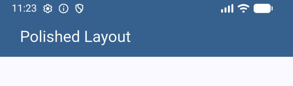
2. Vertical Space (flutter appbar vertical padding)
If your text or icons feel squished vertically, adding manual padding inside the title or actions is a quick fix.
However, if you need a deeper container adjustments, you should look into our Flutter Container Padding & Margin Explained guide to see how spacing behaves inside nested constraints.
By applying padding inside the available slots instead of wrapping the whole bar, you keep your layout completely safe from rendering errors while getting that clean, spacious look.
Now that you know how to space things out generally, let’s look at a specific layout conflict that bites almost every developer: Leading width and title spacing.
Leading Width and Title Spacing
Have you ever added a custom back button or a menu icon to your AppBar, only to watch your title completely smash into it?
Or maybe you notice a massive, ugly gap between your leading icon and your text that you just can’t seem to get rid of.
This happens because the AppBar allocates a fixed, default square area for the leading widget (usually 56 pixels wide).
If your custom icon or text is wider than that, it clips or overflows. If it’s narrower, it leaves a strange vacuum of empty space.
To fix this and perfectly manage the flutter appbar space between leading and title, you need to use two properties together: leadingWidth and titleSpacing.
Taking Control of the Layout Slots
Instead of guessing padding values, you can explicitly tell Flutter exactly how much room to give your leading widget using flutter appbar leading width.
Here is how to safely orchestrate your flutter appbar leading padding and title positioning:
appBar: AppBar(
  // 1. Give your leading widget the exact width it needs
  leadingWidth: 84.0,
  leading: Padding(
    padding: const EdgeInsets.only(left: 16.0),
    child: Row(
      children: [
        Icon(Icons.arrow_back),
        Text('Back', style: TextStyle(fontSize: 14)),
      ],
    ),
  ),
  // 2. Control the gap right before the title starts
  titleSpacing: 0.0,
  // Set to 0 to pull the title closer to the leading widget
  title: Text('Settings'),
  backgroundColor: theme.colorScheme.primary,
  foregroundColor: theme.colorScheme.onPrimary,
),
Code language: Dart (dart)
By default, titleSpacing adds a standard chunk of horizontal space after the leading slot. By setting titleSpacing: 0.0, you completely remove that ghost gap.
This gives you total creative control. You can use your leadingWidth to dictate exactly where the leading zone ends, ensuring your layout remains crisp, intentional, and entirely predictable.
Now that we have horizontal spacing completely locked down, let’s talk about the vertical axis.
Next up: Changing AppBar height properly and unpacking the mystery of the PreferredSizeWidget.
Changing AppBar Height Properly
Sometimes, the standard, default height of the AppBar just isn’t enough. You might want a massive, modern header for a profile screen, or a compact bar to save screen space.
If you try to change the height by wrapping your AppBar in a standard Container and setting a height property, you will face the exact same layout crash we talked about earlier.
Flutter’s Scaffold demands a widget that matches a very specific type: a PreferredSizeWidget.
To safely change your flutter appbar height or create a flutter appbar dynamic height, you have to wrap your AppBar inside a specialized widget called PreferredSize.
How to Use PreferredSizeWidget Correctly
The PreferredSize widget acts as a wrapper that passes the exact height layout requirements down to the Scaffold without breaking the framework rules.
Here is how you change your flutter toolbar height properly using a flutter appbar preferredsizewidget:
return Scaffold(
  appBar: PreferredSize(
    // 1. Set the custom height size you want here (e.g., 90.0 pixels)
    preferredSize: const Size.fromHeight(90.0),
    child: AppBar(
      title: const Text('Custom Height AppBar'),
      centerTitle: true,
      // You can add more vertical elements or bottom tabs comfortably now!
      backgroundColor: theme.colorScheme.primary,
      foregroundColor: theme.colorScheme.onPrimary,
    ),
  ),
  body: Center(child: Text('Content goes here')),
);
Code language: Dart (dart)
By wrapping it this way, Flutter instantly allocates 90 pixels of vertical space for the top header area.
If you want to dive deeper into how this widget calculates sizing under the hood, make sure to read comprehensive Flutter PreferredSizeWidget Tutorial.
Now that you can change the overall height, what happens when elements inside don’t align correctly vertically?
Let’s check out the next section: Vertical alignment fixes.
Toolbar Height vs PreferredSizeWidget
When you start customizing the vertical size of your header, you might run into two terms that sound exactly alike but do completely different things: toolbarHeight and PreferredSizeWidget.
Mixing these two up is a massive reason why headers suddenly look warped or cut off. Let’s clear up the confusion so you know exactly which one to use.
The Key Difference
PreferredSizeWidget(The Container): This tells theScaffoldhow much total structural room to clear out at the top of the screen. Think of it as reserving a plot of land. If you usePreferredSize, you are altering the physical boundary of the app bar area.toolbarHeight(The Content Area): This is a direct property inside the standardAppBarwidget. It tells Flutter how tall the actual row containing your leading icon, title, and actions should be.
Why Changing Just One Can Ruin Your Layout
If you use PreferredSize to make a massive 120-pixel tall header, but leave the toolbarHeight at its default value (which is 56 pixels), your text and buttons will stay squished inside a tiny 56-pixel strip right in the middle of your giant header.
To get a perfectly proportioned layout, you often want to scale them together. Here is how to use flutter toolbar height alongside a flutter appbar preferredsizewidget for a clean layout:
return Scaffold(
  appBar: PreferredSize(
    // 1. Reserve 100 pixels of total space at the top of the screen
    preferredSize: const Size.fromHeight(100.0),
    child: AppBar(
      // 2. Expand the internal content row to match the new height
      toolbarHeight: 100.0,
      title: const Text('Perfectly Proportioned'),
      centerTitle: true,
      backgroundColor: theme.colorScheme.primary,
      foregroundColor: theme.colorScheme.onPrimary,
    ),
  ),
);
Code language: Dart (dart)
By matching your toolbar height to your preferred size, your components have the freedom to utilize the entire vertical space safely without getting clipped or looking awkwardly floated.
Now that the heights match up perfectly, let’s talk about positioning things vertically within that space.
Next up: Vertical alignment fixes.
Vertical Alignment Fixes
Once you change your AppBar height, you might notice your title or icons are floating in the wrong place.
Maybe your text is hugging the very top edge, or your custom icons aren’t aligned with your text baseline.
When elements aren’t centered vertically, it instantly makes an app feel unpolished.
If you are dealing with a stubborn flutter appbar overflow or alignment shift on the vertical axis, the solution comes down to understanding how Flutter stacks elements inside the toolbar.
How to Center Elements Vertically
By default, Flutter centers the leading, title, and actions vertically within whatever toolbarHeight you define.
If things still look off-center, it’s usually because the widgets inside those slots have their own internal alignment or fixed heights.
Here are the three quickest ways to fix vertical alignment issues:
1. Use the Center Widget
If your custom title text or logo is shifting upwards, wrap it directly in a Center widget. This forces the layout engine to ignore default constraints and center the asset perfectly within the title slot.
2. Align via Row CrossAxisAlignment
If you are using a Row inside your title to combine an icon and text, make sure to set your cross-axis alignment. (For a deep dive into how rows handle this, check out our Flutter Row vs Column Layout Guide).
appBar: AppBar(
  toolbarHeight: 80.0,
  title: Row(
    // Forces the icon and text to align perfectly along their vertical center line
    crossAxisAlignment: CrossAxisAlignment.center,
    children: [
      Icon(Icons.star),
      SizedBox(width: 8),
      Text('Premium Feature'),
    ],
  ),
  backgroundColor: theme.colorScheme.primary,
  foregroundColor: theme.colorScheme.onPrimary,
),
Code language: Dart (dart)
3. Use Align for Precise Tweak Control
If you want an element slightly higher or lower for a specific design look, use the Align widget with a fractional offset:
appBar: AppBar(
  title: Align(
    alignment: Alignment(0.0, 0.2),
    // Subtle shift downward on the vertical axis
    child: Text('Custom Aligned'),
  ),
  backgroundColor: theme.colorScheme.primary,
  foregroundColor: theme.colorScheme.onPrimary,
),
Code language: Dart (dart)
By controlling the internal alignments of your slot widgets, you can make sure your layout stays perfectly balanced, no matter how tall or short your AppBar becomes.
Now that everything is lined up vertically, let’s talk about what happens when things get too big for the screen.
Next up: Handling overflow issues and fixing the dreaded flutter appbar title overflow error!
Handling Overflow Issues
There is nothing worse than opening your app on a smaller device and seeing that ugly, dreaded yellow-and-black striped banner.
A flutter appbar overflow or flutter appbar title overflow usually happens when you try to cram too much into a tight space. If your title text is too long, or if you have too many action items, the layout runs out of horizontal room and breaks.
Smashing the Yellow Screen of Death
To prevent text clipping and overflow errors, you need to tell Flutter exactly how to handle content that exceeds the screen width. Here are the two best ways to keep your layouts completely bulletproof:
1. Use Flexible or Expanded in Custom Rows
If you are building a custom title with icons and text inside a Row, always wrap your text widget in a Flexible or Expanded widget. This forces the text to stay within the boundaries of the remaining screen space instead of pushing past it.
2. Master the Text Overflow Property
You can gracefully handle long text strings by clipping them or turning them into ellipses (...). This is incredibly useful for dynamic titles like user names or product names.
Here is how to implement a clean fix:
appBar: AppBar(
  title: Text(
    'This is an incredibly long title that would definitely break on smaller screens',
    // Truncates the text with '...' at the end instead of overflowing
    overflow: TextOverflow.ellipsis,
    maxLines: 1,
  ),
  backgroundColor: theme.colorScheme.primary,
  foregroundColor: theme.colorScheme.onPrimary,
),
Code language: Dart (dart)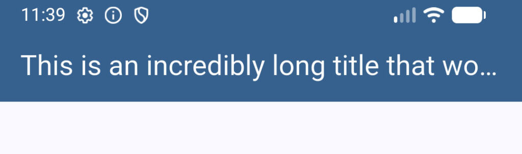
By ensuring your text has an explicit overflow rule, you protect your app from sudden layout crashes when running on smaller screen sizes.
Now that we can handle long content safely, how do we make sure our AppBars look stunning on every screen size from a small phone to a massive tablet?
Let’s jump into the final section: Making responsive AppBars.
Making Responsive AppBars
A truly professional app doesn’t just look good on your specific testing device—it adapts seamlessly to any screen size.
Whether a user opens your app on a compact phone, a massive tablet, or an ultrawide desktop screen, your AppBar layout should adjust beautifully.
If you don’t build responsiveness into your top header, your alignment will look warped on larger layouts. Icons will feel isolated on the far right, and text will look lost on the left.
To make a truly flexible design, you need to step away from hardcoded values and tap into Flutter’s responsiveness system.
Scaling Layouts Fluidly
The cleanest way to build a responsive header is by reading the screen dimensions dynamically using MediaQuery.
This allows you to scale padding, margins, and layout behaviors based on the physical real estate available.
Here is how you can use a flutter mediaquery & responsive ui strategy to adjust your content layout on the fly:
class _HomeScreenState extends State<HomeScreen> {
  @override
  Widget build(BuildContext context) {
    final theme = Theme.of(context);

    // 1. Check the width of the current screen dynamically
    double screenWidth = MediaQuery.of(context).size.width;

    // 2. Determine if the device is a tablet or desktop
    bool isWideScreen = screenWidth > 600;

    return Scaffold(
      appBar: AppBar(
        // Conditionally adjust the layout padding based on screen size
        titleSpacing: isWideScreen ? 32.0 : 16.0,
        title: Text('Responsive Portal'),
        backgroundColor: theme.colorScheme.primary,
        foregroundColor: theme.colorScheme.onPrimary,
        actions: [
          IconButton(icon: Icon(Icons.search), onPressed: () {}),
          // On wide screens, show an extra action button that would cramp a phone
          if (isWideScreen)
            TextButton.icon(
              icon: Icon(Icons.logout),
              label: Text('Sign Out'),
              onPressed: () {},
            ),
        ],
      ),
    );
  }
}
Code language: Dart (dart)

By querying the screen state, you can toggle features on and off, expand margins, or even dynamically adjust your flutter appbar height so it fits the device perfectly.
Instead of fighting the layout engine, you are working with it to deliver a smooth, tailored experience for every single user.
Stop Wrestling with Layouts
Fixing your AppBar layout doesn’t have to be a guessing game of random numbers and endless hot reloads.
Once you understand how Flutter manages its leading width, toolbar height, and platform defaults, you can build clean, polished headers that look amazing on every single device.
Take these fixes, drop them into your current project, and watch your UI instantly look a hundred times more professional!
Want to Build Polished UI Layouts Even Faster?
Let’s be honest: spending hours debugging a single pixel of spacing or fighting broken alignments is incredibly frustrating. It slows down your progress and takes the fun out of building apps.
If you want to skip the trial-and-error phase entirely, check out our Foundation Course.
It is the fastest path to mastering Flutter UI. You will learn how to build production-ready, beautiful layouts from scratch without wasting time on frustrating layout bugs.
Click here to join the class and fast-track your Flutter journey today!
Learn Flutter the Way Real Apps Are Built
Now that you understand professional Flutter AppBar alignment, it’s time to apply those layout concepts with speed.
Join the free mini class on Agentic AI Development and start using AI coding partners to debug and refine your UI layouts step by step.